Updated March 21, 2023
Introduction to Types of Data Visualization
Data Visualization is defined as the pictorial representation of the data to provide the fact-based analysis to decision-makers as text data might not be able to reveal the pattern or trends needed to recognize data; based upon the visualization, it is classified into 6 different types, i.e. Temporal (data is linear and one dimensional), Hierarchical (it visualizes ordered groups within a larger group ), Network (involve visualization for the connection of datasets to datasets), Multidimensional (contrast of temporal type), Geospatial( involves geospatial or spatial maps) and Miscellaneous.
What is Data Visualization?
Data visualization is a methodology by which the data in raw format is portrayed to bring out the meaning of that. With the advent of big data, it has become imperative to build a meaningful way of showcasing the data so that the amount of data doesn’t become overwhelming. The part of portraying the data can be used for various purposes, such as finding trends/commonalities/patterns in data, building models for machine learning, or being used for a simple operation like aggregation.
Different Types of Data Visualization
Data visualization is broadly classified into 6 different types. Though the area of data visualization is ever-growing, it won’t be a surprise if the number of categories increases.
| Temporal: Data for these types of visualization should satisfy both conditions: data represented should be linear and should be one-dimensional. These visualization types are represented through lines that might overlap and have a common start and finish data point. | ||
| Scatter Plots | Uses dots to represent a data point. The most common in today’s world is machine learning during exploratory data analysis. | 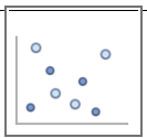 |
| Pie Chart | This type of visualization includes circular graphics where the arc length signifies the magnitude. | 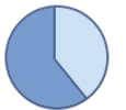 |
| Polar area diagram | Like Pie chart, the Polar area diagram is a circular plot, except the sector angles are equal in length, and the distance of extending from center signifies the magnitude. | 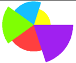 |
| Line graphs | Like the scatter plot, the data is represented by points, except joined by lines to maintain continuity. | 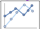 |
| Timelines | In this way, we display a list of data points in chronological order of time. | |
| Time series sequences | In time series, we represent the magnitude of data in a 2-D graph in chronological order of timestamp in data. | 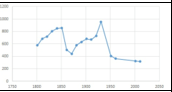 |
| Hierarchical: These types of visualizations portray ordered groups within a larger group. In simple language, the main intuition behind these visualizations is the clusters can be displayed if the flow of the clusters starts from a single point. | ||
| Tree Diagram | In a tree diagram, the hierarchical flow is represented in the form of a tree, as the name suggests. Few terminologies for this representation are:
– Root Node: Origination point. – Child node: Has a parent above – Leaf node: No more child node. |
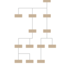 |
| Ring Charts / Sunburst Diagram | The tree representation in the Tree diagram is converted into a radial basis. This type helps in presenting the tree in a concise size. The innermost circle is the root node. And the area of the child node signifies the % of data. | 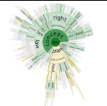 |
| TreeMap | The tree is represented in the form of rectangles closely packed. The area signifies the quantity contained. | 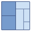 |
| Circle Packing | Similar to a treemap, it uses circular packing instead of rectangles. | 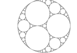 |
| Network: The visualization of these type connects datasets to datasets. These visualizations portray how these datasets relate to one another within a network. | ||
| Matrix charts | This type of visualization is widely used to find the connection between different variables within themselves. For example, correlation plot. | 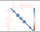 |
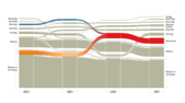
| Alluvial diagrams | This is a type of flow diagram in which the changes in the flow of the network are represented over intervals as desired by the user. |
|
| Word cloud | This is typically used for representing text data. The words are closely packed, and the size of the text signifies the frequency of the word. |
|
| node-link diagrams | Here the nodes are represented as dots, and the connection between nodes is presented. | 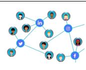 |
| Multidimensional: In contrast to the temporal type of visualization, these types can have multiple dimensions. In this, we can use 2 or more features to create a 3-D visualization through concurrent layers. These will enable the user to present key takeaways by breaking a lot of non-useful data. | ||
| Scatter plots | In multi-dimensional data, we select any 2 features and then plot them in a 2-D scatter plot. By doing this we would have nC2 = n(n-1)/2 graphs. | 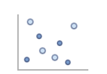 |
| Stacked bar graphs | The representation segment bars on top of each other. It can be either a 100% Stacked Bar graph where the segregation is represented in % or a simple stacked bar graph, which denotes the actual magnitude. | 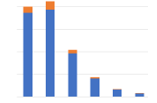 |
| Parallel Co-ordinate plot | In this representation, a backdrop is drawn, and n parallel lines are drawn (for n-dimensional data). | 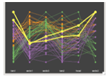 |
| Geospatial: These visualizations relates to present real-life physical location by crossing it over with maps (It may be a geospatial or spatial map). The intuition behind these visualizations is to create a holistic view of performance. | ||
| Flow map | The movement of information or objects from one location to another is presented where the size of the arrow signifies the amount. | 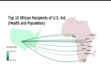 |
| Choropleth Map | The geospatial map is colored on the basis of a particular data variable. | 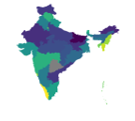 |
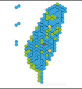
| Cartogram | This type of representation uses the thematic variable for mapping. These maps distort reality to present information. This means that on a particular variable, the maps are exaggerated. For example, the image on the left is a spatial map distorted to a bee-hive structure.
|
 |
| Heat Map | These are very similar to Choropleth in the geospatial genre but can be used in areas apart from geospatial as well. | 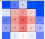 |
| Miscellaneous: These visualizations can’t be generalized in a particularly large group. So instead of forming smaller groups for the individual type, we group it into miscellaneous. Few examples are below: | ||
| Open-High-Low-Close chart | This type of graphs is typically used for stock price representation. The increasing trend is called as Bullish and decreasing as Bearish. | 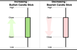 |
| Kagi-Chart | Typically the demand-supply of an asset is represented using this chart. | 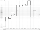 |

Conclusion
From the above types of visualization, we see that broadly there are 6 types of groups. The list above is not an exhaustive list, but a few which are widely used. In the coming times, as and when new types get added to the list, the groups might increase. That’s it for types of visualization. We would continue on what parameters to look at during fixing on the type of visualization.
Recommended Articles
This is a guide to the Type of Data Visualization. Here we discuss the basic concept with different types of Data Visualization in detail. You can also go through our other suggested articles to learn more –