Updated March 24, 2023
Heat Map in Power BI
Heat map, as the name, says that it is a kind of visualization that is used when we need to project the density of data on a map for any given points. Heat Map in Power BI is the customized type of data visualization which is directly not available in the Visualization section. We all have seen in news channels when the reporter shows weather forecast they always show the area or region with different temperatures ranging from low to high with some red-yellow color contours. There is one more scenario when we see a cricket match. They always project the batsman’s scoring area in the Wagon wheel heat map. The area with the highest score is colored in dark whereas an area with the lowest score in a light color.
We will see, similar kind of Heat Map here in this article which we could implement in our regular work.
How to Use Power BI Heat Map?
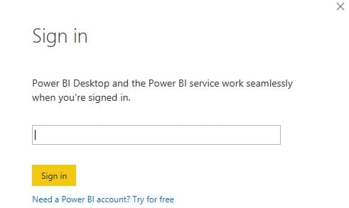
To get Power BI Heat Map, first, open Power BI Desktop and login in using Sign in option.
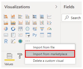
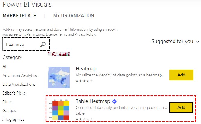
We can use Corporate or Student ID only to access this feature. Once we get into the Power BI server, then click on 3 dots at the end of the Visualization section to import custom visuals. And select Import From Marketplace”.
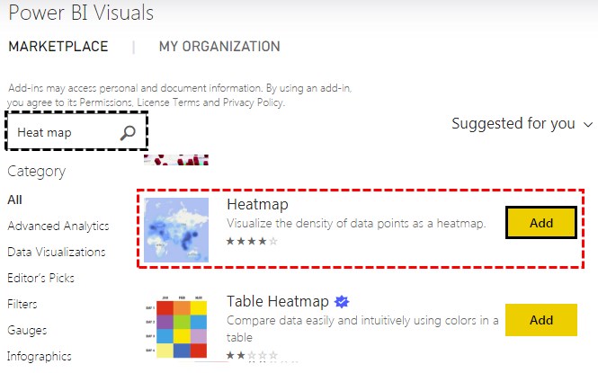
This will take us to Power BI Marketplace. Search for Heat Map in the search option and select Heatmap and to get that, click on Add.
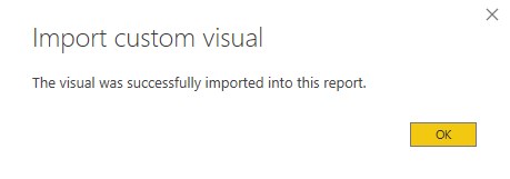
Upon successful import, we will get the message as shown below.
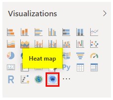
We will be able to see the Heat map under the visualization section then.
Example #1
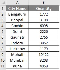
To create a heat map, we will need data. So you can download the excel workbook from the below link which is used for this example.
Now we have City name and Quantities sold in those cities as shown below.
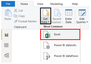
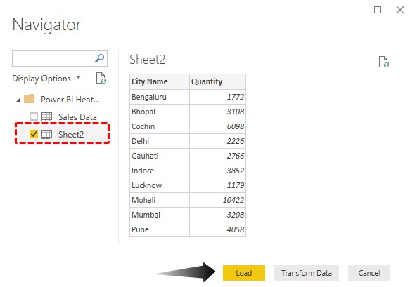
- Now we will upload this data into Power BI. Click on Get Data option and select the source of the file. Here, our data is in Excel.
- Browse the file and open it. Select the sheet with the data and then click on Load.
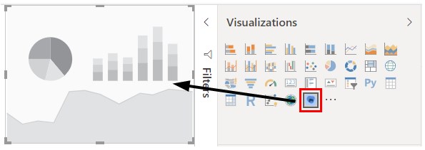
- Once the data is loaded then we are good to go. Next, select the Heat Map from the Visualization section as shown below.
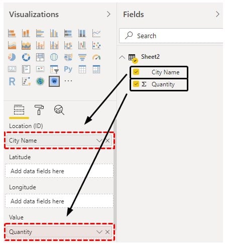
- Now drag the required fields in Visualization. Put City name into Location ID and Quantity into Value.
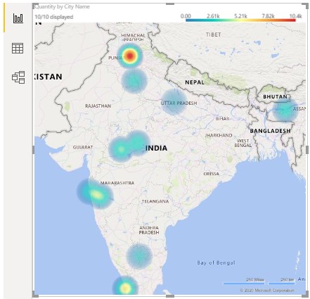
- We will then get our basic first heat map view as shown below.
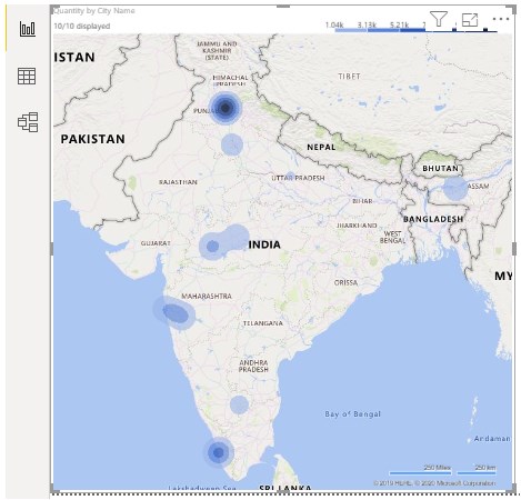
- Now, let’s change this into Heat Map. For this, go to the Format section and change the type from Contour to Heat as shown below.
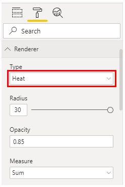
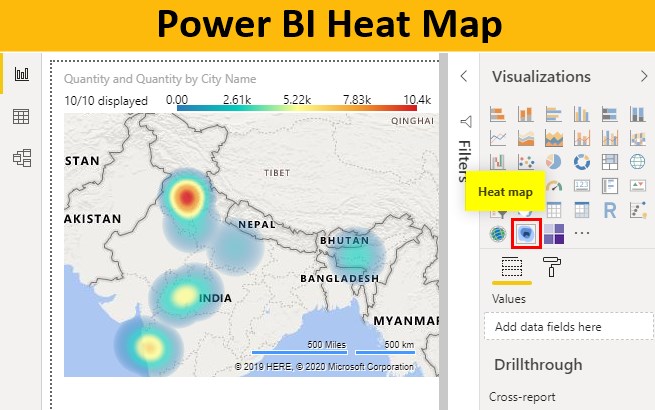
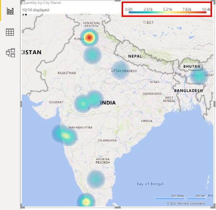
- We will see, as we selected Heat from Renderer type the map got changed to actual Heat Map. Where we can notice that Mohali is the city with the most number of sales. And the color of Mohali got changed to Red heat.
- If we try to understand the created Heat map then we will notice on the right top header, there is a list of legends that show which city is at the high notch of selling maximum quantities at that range. This is the easiest way to understand the map by seeing the colors.
Example #2
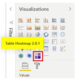
When we search the heat map into the search bar of Power BI Market place, we found Table Heatmap as well. Table heat map is also a kind of Heat Map which is in the form for Table. We will add this Table heat map into our visualization with the same process.
- This is where Table Heatmap will be found in visualization.
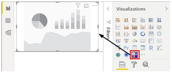
- Open a new page for Table heat map and Select the Table Heatmap from the above list.
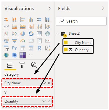
- Now drag the City Name and Quantity fields into Category and Y section.
- We will see, in the form of Table, all the city names and quantity sold are highlighted in the color and tabular form.
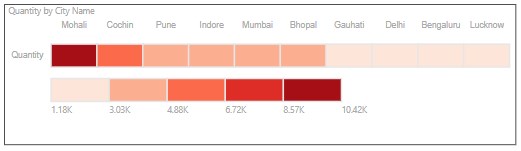
If we notice, we will observe the above line where city names are mentioned are ranging from Dark red to light red color. And the second line is starting from light red shade to dark red color which indicates which color region has observed what range of sale. Darker the color, higher the sale.
- If we want to make any changes into created Table Heat Map, then this could easily be done using the Format option available under the visualization section.
Note: Power BI Heat Map file can also be downloaded from the link below and the final output can be viewed.
Pros of Power BI Heat Map
- We can use Heat Map in Power BI to project any type of view where numbers or quantities are involved.
- Heat Map is easy to create.
- Upon further formatting above created Heat Maps, we can make them look much better.
Things to Remember
- Heat Map only accepts numbers.
- Choose the color in the heat map which represents the Heat or density.
- Heat Maps in Power BI are the customized visualization that we can be accessed only from Power BI Marketplace.
- Marketplace has various types of visualization charts that are uncommonly used. Common charts are only seen in the visualization section.
Recommended Articles
This is a guide to Power BI Heat Map. Here we discuss how to Use Power BI Heat Map along with practical examples and downloadable Power BI template. You may also look at the following articles to learn more –
