Introduction To Online Forms Service
The result of online promotions through Google Adwords, Twitter, Facebook, and banner ads all end up on a landing page. The marketer needs to keep the tools ready to capture information about the visitor, prospective customer, or client. The most commonly used method is to use the Online Forms service that seeks the name, email address, gender, mobile number, and company name, and in the end, they need to click the ‘ Submit button.
The challenge for the company or the marketer is to make the online forms service easy to fill and submit so that the company gets one more entry into its database that has the potential to become a customer. Since the online forms service is where your customers directly connect with you, some time and effort should be made so that more people fill out the forms rather than bounce off the page.
8 Tips to get better results with Online Forms Service
Here are eight tips to get better results with Online Forms Service and how to make it a money-making asset for the company:
1. Make it simple and reduce the number of fields
The life of the average consumer is burdened with filling out forms and has become part of daily life- whether it is opening a bank account, a new mobile phone connection, applying for jobs, submitting applications to government and semi-government agencies, income tax forms, and so on. Most people dread the sight of forms! That is very true indeed.
Even joining a new institution entails filling in the information, pasting photos, and attaching documents. So it is the marketer’s job to make life simple for the prospective customer or client. Make the web forms simple with fewer fields, eg. name, email, space for comments or remarks, and a submit button. Research has shown that the fewer fields to fill, the higher the response will be. After analyzing the contact forms of 40,000 of its customers, HubSpot, found that reducing fields from four to three led to a 50% conversion growth. Another company raised conversions by 120% by reducing fields from 11 to four.
Apart from the time and effort required, many customers will be hesitant to reveal personal information such as gender, age, job, or address to a company with which it is getting into contact for the first time. Some forms have mandatory fields marked with an asterisk* and others marked optional. However, that goes against the principle of simplicity outlined above and is best avoided in marketing promotions.
2. Pay attention to the design of forms and placement & make it creative
You created an excellent display banner or a Facebook post to attract a visitor to your landing page. If the landing page looks dull or boring or doesn’t reflect the branding seen in your website or ad, chances are that visitors may not be interested in going further. Pay attention to using colors, fonts, logos, headlines, and white space.
The new trends are to provide some more information about the product in a few lines of description and in some cases with slides or video which adds value to the marketing effort. The headline itself can be a call-to-action (CTA) such as ‘Start your Free Trial Now’ without going for flamboyant headlines that finally lead to a CTA.
Some landing pages have a video beside the forms. The forms should be adequately spaced and not direct users to enter phone numbers in a particular way. Ghost text in forms can help users to fill in the name and other details quicker. In the phone number field area code, a phone number can be represented in xxx-xx-xxxxxxxxxx to enable ease of entry.
Most forms have a column for the First Name and Last name but it would be better if they can be combined into one. Best conversions are obtained if forms are on the right-hand side with the description on the left. Some forms are seen placed on the left with a description on the right. Most importantly place the forms above the first half of the web page for more conversions. Headlines should be compelling, and simple and can be supplemented with subheads and intro. Bulleted texts are easier to read and understand in the descriptive part. Leave adequate white space for ease of reading and navigation within the page.

For small businesses unable to invest money into design, there are online free tools with a collection of templates that can be customized to your requirements. For example, SurveyMonkey provides easy ways to create online forms website, embed them on the web page, and collect data and payments.
3. Make offers unambiguous with a clear call-to-action
The visitor has taken the pains to fill out the form and submit it to you, it is their privilege to let them know what they can expect out of this initiative. It should appear immediately after the submission of the form. An ideal way is to thank them for submitting or registering and a specialist or concerned expert may contact them by email or phone. Or if by registering they become eligible for a free one-month subscription, it should be clearly mentioned. Or it could be a free email newsletter or a download of an e-book. There should be a clear call-to-action- instead of a normal ‘Submit’ button, marketers can use ‘Subscribe now’, ‘Register Now, and ‘Upgrade Now’ to get better results.
According to Unbounce provides landing page templates, never put a ‘Submit’ button while Click Here, and Go are the best options for getting more conversions. Submitting can reduce conversions by at least three percent.
Also, ensure that phone number fields are avoided unless it is absolutely essential. According to Ryan Engley, not many people entertain the idea of some unknown company official calling them.
Unlike printed forms where there is an opportunity to get clarification in spot fillings, online forms services are filled remotely and submitted. There is no time or person at hand to clarify – hence all fields should be simple and clear to fill.
4. Make it mobile-friendly too
With the increasing use of smartphones and tabs, it is very likely that a large number of users may be entering your site through mobile. Make sure the landing page and the online forms website are friendly for mobile users too. The use of radio buttons and drop-down menus can help with ease of selection. The forms should be vertically aligned on the right or left for mobile users to scroll and fill in data.
According to the content marketing expert, Neil Patel, it is better to have a mobile design first so that you can eliminate less relevant input fields. It will also make the forms easier to use. Thinking of mobile design first helps in finalizing the interface. If the country and geographical information have to be inputted why not use the GPS of the phone to input that data? The idea is to make the job of filling out forms less cumbersome for the mobile user. When the design is done keeping the mobile user in mind, the web forms could also be very user-friendly, according to experts.
5. Keep track of your conversions: Like
In any marketing campaign, there should be tracking and monitoring of results of online forms service too. Online forms websites are part of a marketing campaign and form analytics tools are available to keep track of the percentage of conversions. If there are a large number of hits on your ad or web page but resulting conversions are low, it is time to evaluate the design of the online forms service.
Some analytics tools help users to do A/B testing or split testing – using two versions of headlines, and field placements and submitting buttons, descriptions, or form templates to evaluate which brings better results. One example is the Unbounce tool which is easy to set up and operate. With technical advances in tool design, it no longer requires a number of crunching or technical knowledge to set up analytics tools.
6. Be transparent about the use of data
In this era where data privacy is of utmost importance, marketers need to specify how personal information such as names and emails will be used by the company. Clearly specify that it will not be used for marketing promotion for other companies. It is important to create trust in the user before they can part with their personal information.
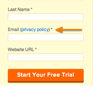
You can have a link to your privacy policy next to the email or the call-to-action button. It will provide that much confidence to users who are only beginning to get comfortable with the company.
Too personal details such as annual income or family details if needed can be collected at a later stage of the sales conversion process. Don’t be in a hurry to convert, users need time to evaluate and decide before availing of your product or service.
7. Let the online forms go to the right departments and be properly acknowledged
There are a variety of reasons why users may be submitting online forms service – it could be for a job, for registering a complaint, to know more about a product, or for a technical query. The company must have a backend mechanism to ensure that it ensure that it goes to the concerned department and is acknowledged. If it is a customer service-related submission, it must go to the customer service department or if a new sales order it should go to sales or quality issue, it must go to the concerned department.
Apart from a message thanking them for the submission on the web page itself, it can be followed up by an email and a mobile message confirming receipt and assurance regarding what action would be taken on this issue. Proper acknowledgment builds trust and eliminates the need for the user to call them up for confirming it.
If online form pages contain toll-free numbers, it should be mentioned whether they are operational 24 hrs or only during office hours. Chat also needs to specify if the call center agent is available throughout to answer a query.
8. Some fields that must be avoided
Available analytics and research have identified a set of fields that should be avoided in online forms websites to get maximum conversions. They are age, telephone number, geographical location (state, city), and street address.
Some research data shows conversion drops when there is drop-down data included in the form. However, some analysts point out that drop-down menus enable ease of selection and filling of forms.
The use of smart form fields helps the user in filling the forms easier the next time he returns to the landing page although some companies may seek more information the first time form is submitted.
Conclusion
Using web forms requires some effort and understanding of the market and buyer persona but more importantly what motivates a user to sign up for a product or service? With a large number of free tools available to set up online forms websites and analytics such as HubSpot’s Lead In, it is possible for small and medium businesses to set them up and do more business.
Online forms websites can also be placed in strategic positions on homepages in web pages but in such cases, the quality of design and field placements may have an impact on how many visitors use it.
It is better not to use formal language but a more personal CTA such as, ’Yes, I want this offer, ‘Save Your Seat for Webinar, ‘Claim your Coupon Now’ or ‘Redeem your discount now.
If an online forms website is created without proper preparation and not monitored it may not bring the desired revenue to the company, but when properly used it can turn out to be a money-spinner. Making your web forms simpler and more functional can help in your Conversion Rate Optimisation (CRO) efforts. CRO refers to the ratio of conversions versus the number of visitors to the site. Every page, every blog, and every section of a company site should ideally be helpful in navigating to a page that provides more information or contact info.
CRO is both an art and a science, therefore it requires live testing using A/B or split testing. Fortunately, now there is a number of case studies to analyze and find out which suits best for your brand and campaign.
Recommended Articles
This has been a guide to look at 8 tips to get better results with Online Forms Service and how to make it a money-making asset for the company. These are the following external link related to the online forms service.