Updated March 1, 2023

Introduction to Matplotlib Legend
In this article, we will learn about a method called ‘Legend’ in Python and matplotlib. We will be creating labels using the ‘Legend’ method. Before we start creating labels for our plots, let us quickly understand what is the significance of creating plots and why we need labels for them.
- Plots are created for visualizing the data and get the inference out of it in a single view
- Plots are very useful in understanding any correlation between our variables, which we can utilize further in statistical concepts like linear regression&multiple regression
- As multiple functions can be drawn in a single plot; ‘labels’ are the way to provide information about different functions in the plot and labels are created using ‘Legends’ in Python.
Examples to Implement Matplotlib Legend
Let us now understand how to create plots and give them labels, in python using matplotlib:
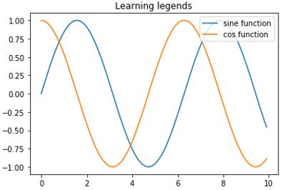
Example #1
Importing Python libraries:
import numpy as np [importing 'numpy']
import matplotlib.pyplot as plt  [importing ‘matplotlib’]
Next, let us define our functions for the plot. For this example, we will use sine and cosine functions
a = np.arange(0, 10, 0.1)
b = np.sin(a) [creating a sine wave]
c = np.arange(0, 10, 0.1)
d = np.cos(c) [creating a cos function]
z = plt.subplot(111) [creating subplots to include both functions in single plot]
z.plot(a,b, label = "sine function") [drawing the plot and defining the label for sine wave]
z.plot(c,d, label = "cos function") [drawing the plot and defining the label for sine wave]
plt.title ('Learning legends') [giving a name to our plot]
plt.legend (loc=1)   [loc is used to control the direction of legend]
plt.show() [calling show() to display our pot]
Code:
import numpy as np
import matplotlib.pyplot as plt
a = np.arange(0, 10, 0.1)
b = np.sin(a)
c = np.arange(0, 10, 0.1)
d = np.cos(c)
z = plt.subplot(111)
z.plot(a,b, label = "sine function")
z.plot(c,d, label = "cos function")
plt.title ('Learning legends')
plt.legend (loc=1)
plt.show()
Output:
Let us change the value of loc to 3 and see how our output changes.
Our code will essentially be the same as above, with only change that loc will now be 3:
plt.legend (loc= 3)This is how our output will look like in python:
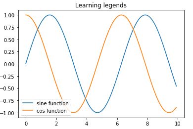
Note that our label box is now in the bottom left. So, we can get the direction as per our requirement, by changing the value of ‘loc’.
Example #2
Next, we will understand how to set our label box outside the plot. We will create a new plot of 2 straight lines to understand this:
Importing Python libraries:
Next we will understand how to set our label box outside the plot. We will create a new plot of 2 straight lines to understand this.
import matplotlib.pyplot as plt[importing 'matplotlib']
import numpy as np[importing 'numpy']
a = [12, 14, 16, 18, 20, 22, 24, 26, 28, 30][Defining our variables to create straight lines]
b = [4.1, 8.1, 12.1, 16.1, 20.1, 24.1, 28.1, 32.1, 36.1, 40.1]
c = [5.2, 10.2, 15.2, 20.2, 25.2, 30.2, 35.2, 40.2, 45.2, 50.2]
fig = plt.figure()
z = plt.subplot(111)[creating subplots to include both functions in single plot]
z.plot(a, c, label='Line 1')[drawing the plot and defining the label for first line]
z.plot(b, c, label='Line 2')[drawing the plot and defining the label for second line]
plt.title('Legend outside the plot')[giving a name to our plot]
Note that In next line of code, we have added a couple of new arguments. Passing these pre-defined codes as an argument will help us to create the label box outside our plot
z.legend(loc='upper center', bbox_to_anchor=(0.5, -0.05), ncol = 2)[ncol = 2, will draw a label box with 2 columns]
plt.show() [Finally, displaying our plot]
Code:
import matplotlib.pyplot as plt
import numpy as np
a = [12, 14, 16, 18, 20, 22, 24, 26, 28, 30]
b = [4.1, 8.1, 12.1, 16.1, 20.1, 24.1, 28.1, 32.1, 36.1, 40.1]
c = [5.2, 10.2, 15.2, 20.2, 25.2, 30.2, 35.2, 40.2, 45.2, 50.2]
fig = plt.figure()
z = plt.subplot(111)
z.plot(a, c, label='Line 1')
z.plot(b, c, label='Line 2')
plt.title('Legend outside the plot')
z.legend(loc='upper center', bbox_to_anchor=(0.5, -0.05), ncol = 2)
plt.show()
Output:
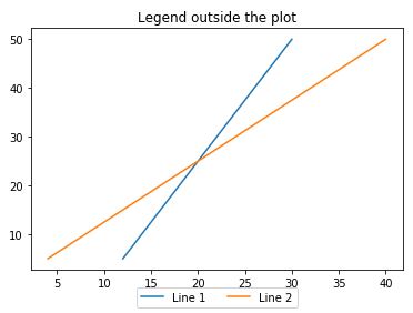
Explanation: As we can see in our output, the label box is now outside the plot and with 2 columns.
Conclusion
Plots become very handy when we are trying to understand the data intuitively. They help us in understanding any relation between the variables and also to have a high-level understanding of data without actually viewing it. The ‘Legend’ method in matplotlib is used to create labels for the plots, which help us in differentiating the functions drawn in the plot.
Recommended Articles
This is a guide to Matplotlib Legend. Here we discuss an introduction to Matplotlib Legend, along with examples in detail explanation for better understanding. You can also go through our other related articles to learn more –
