Updated August 24, 2023
Histogram in Excel
Histogram Chart in Excel is a data analysis tool used to show the periodic rise and drop in the data with the help of vertical columns. We can find the Histogram chart option if we use Excel 2016. Still, for the older version of MS Excel, such as 2013 and 2010, we need to find this option in the Data Analysis option, which is available under the Data Analysis option.
Uses of Histogram Chart in Excel
A histogram is a graphical representation of the distribution of numerical data. A histogram is a column chart that shows the frequency of data in a certain range in a simpler way. It provides the visualization of numerical data by using the number of data points that fall within a specified range of values (also called “bins”).
A histogram chart in Excel is classified or made up of 5 parts:
- Title: The title describes the information about the histogram.
- X-axis: The X-axis is the grouped interval that shows the scale of values in which the measurements lie.
- Y-axis: The Y-axis is the scale showing the times the values occurred within the intervals corresponding to the X-axis.
- The bars: This parameter has a height and width. The height of the bar shows the number of times the values occurred within the interval. The width of the bars shows the interval or distance, or covered area.
- Legend: This provides additional information about measurements.
Why is the Histogram Chart Important in Excel?
There are many benefits to using a Histogram chart in Excel.
- The histogram chart shows the visual representation of data distribution.
- A histogram chart displays a large amount of data and the occurrence of data values.
- Easy to determine the median and data distribution.
Types/Shapes of Histogram Chart
It depends on the distribution of data; the histogram can be of the following type:
- Normal Distribution
- A Bimodal Distribution
- A Right Skewed Distribution
- A Left Skewed Distribution
- A Random Distribution
Now we will explain the shapes of the Histogram chart in Excel.
Normal Distribution
It is also known as bell-shaped distribution. In a normal distribution, the points are as likely to occur on one side of the average as on another. This looks like the below image:

A Bimodal Distribution
There are two peaks. This is also called Double peaked distribution in this dist. Under this distribution in one data set, the results of two processes with different distributions are combined. The data is separated and analyzed like a normal distribution. This looks like the below image:

A Right Skewed Distribution
In this distribution, a large number of data values occur on the left side and a fewer number of data values on the right side. This is also called a positively skewed distribution. This distribution occurs when the data has a range boundary on the left-hand side of the histogram. For example, a boundary of 0. This dist. It looks like the below image:

A Left Skewed Distribution
This is also called a negatively skewed distribution. In this distribution, a large number of data values occur on the right side and a fewer number of data values on the left side. This distribution occurs when the data has a range boundary on the right-hand side of the histogram. For example, a boundary such as 100. This dist. It looks like the below image:

A Random Distribution
This is also called a multimodal distribution. In this dist., several processes with normal distributions are combined. This has several peaks; thus, the data should be separated and analyzed separately. This dist. It looks like the below image:

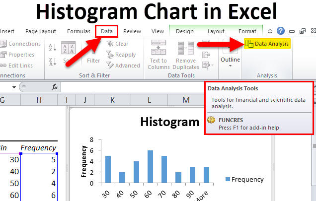
Where is the Histogram Chart Found in Excel?
The histogram chart option is found under Analysis ToolPak. The Analysis ToolPak is a Microsoft Excel data analysis add-in. This add-in is not loaded automatically on Excel. Before using this, we need to load it first.
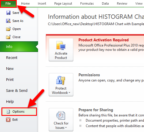
Steps to load the Analysis ToolPak add-in:
- Click on the File tab. Choose the Options button.
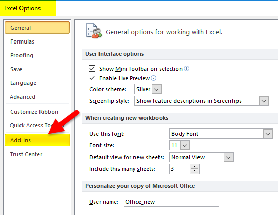
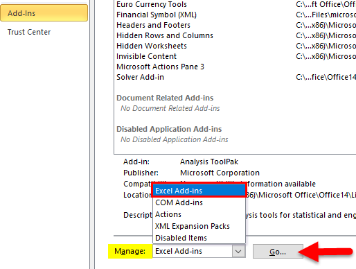
- The Excel Options Dialog box will open. Click on the Add-Ins button on the left sidebar.
- This will open the below Add-Ins dialog box.
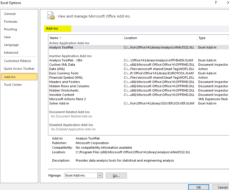
- Select the Excel Add-ins option under the Manage field and click on the Go button.
- This will open an Add-Ins dialog box.
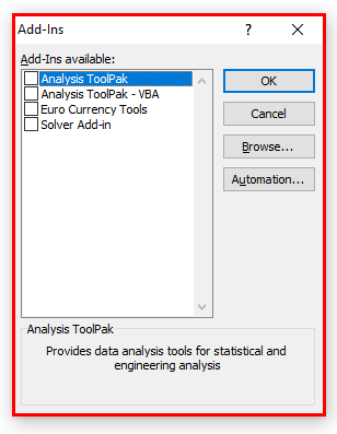
- Choose the Analysis ToolPak box and click on the OK button.
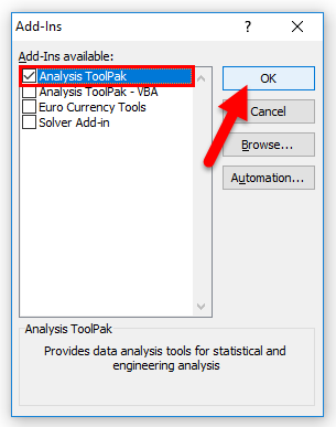
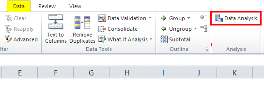
- The Analysis ToolPak is loaded in excel now and will be available under the DATA tab with the name Data Analysis.
How to Create a Histogram Chart in Excel?
Before creating a histogram chart in Excel, we must create the bins in a separate column.
Bins represent the intervals into which we want to group the data set. These intervals should be consecutive, non-overlapping, and of equal size.
There are two ways to create a histogram chart in Excel:
- If you are working on Excel 2016, there is a built-in histogram chart option.
- If you are working on Excel 2013, 2010, or earlier versions, you can create a histogram using Data Analysis ToolPak.
Creating a Histogram Chart in Excel 2016
- Excel 2016 adds a histogram chart option as an inbuilt chart under the chart section.
- Select the entire dataset.
- Click the INSERT tab.
- In the Charts section, click on the ‘Insert Static Chart’ option.
- In the HISTOGRAM section, click on the HISTOGRAM chart icon.
- The histogram chart would appear based on your dataset.
- You can do the formatting by clicking the right click on a chart on the vertical axis and choosing the Format Axis option.
Creating a Histogram Chart in Excel 2013, 2010, or Earlier Version
Download the Data Analysis ToolPak as shown in the above steps. You also can activate this ToolPak in Excel 2016 version too.
Examples of Histogram Chart in Excel
Histogram Chart in Excel is very simple and easy to use. Let us understand the working of the Histogram Chart in Excel with some examples.
Example #1
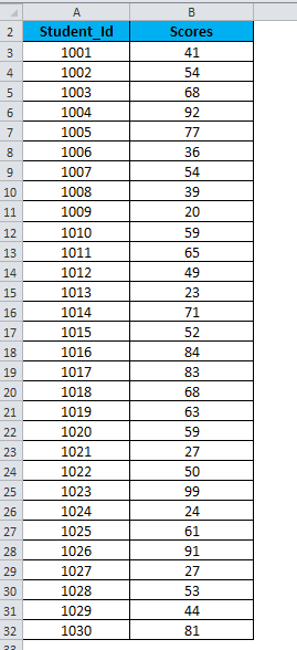
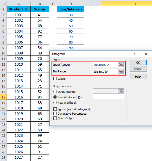
Let’s create a dataset of scores (out of 100) of 30 students as shown below:
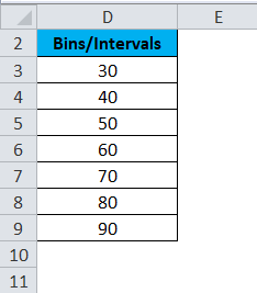
For creating a histogram, we need to create the intervals at which we want to find the frequency. These intervals are called bins.
Below are the bins or score intervals for the above data set.
Please follow the below steps to create the Histogram chart in Excel:
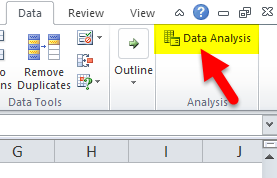
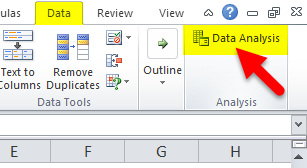
- Click on the Data tab.
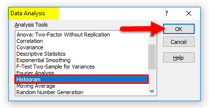
- Now go to the Analysis tab on the extreme right side. Click on the Data Analysis option.
- It will open a Data Analysis dialog box. Choose the Histogram option and click on OK.
- A Histogram dialog box will open.
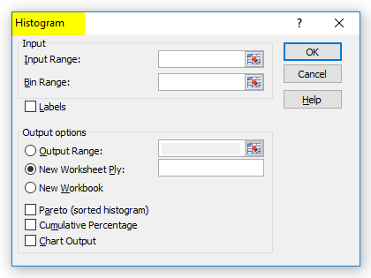
- In the Histogram dialog box, we will enter the following details:
Select the Input Range (as per our example – with the scores column B)
Select the Bin Range ( Intervals column D)
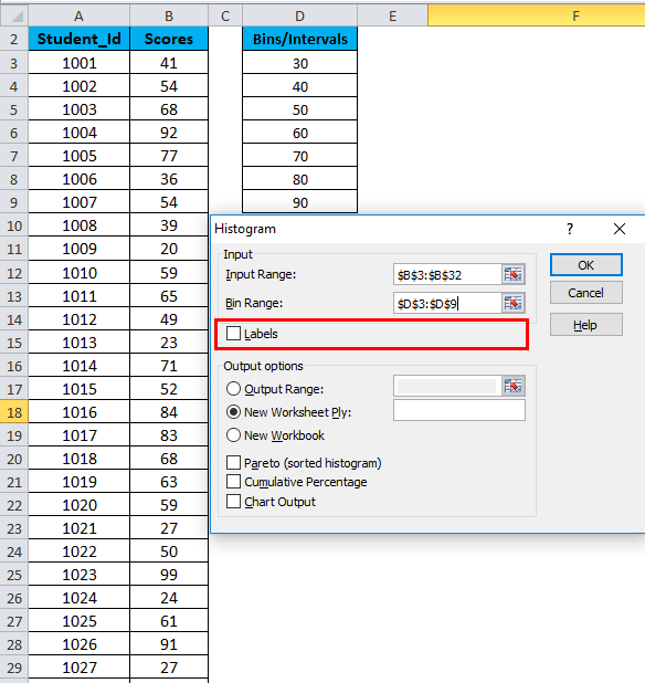
- If you want to include the column headings in the chart, click Labels. Otherwise, leave it as it is unticked.
- Click on Output Range. If you want to grab a histogram in the same sheet, then specify the cell address or Click on New Worksheet.
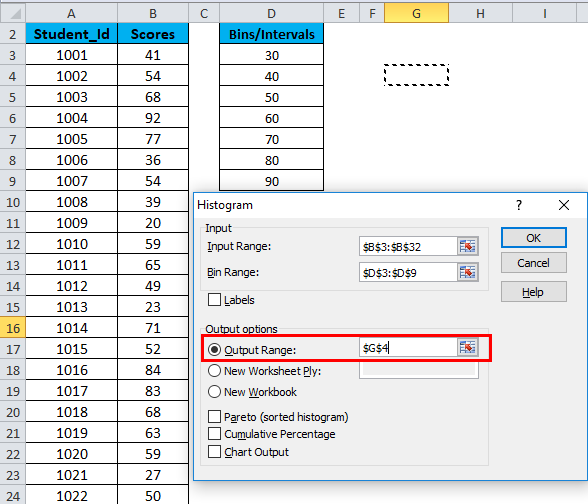
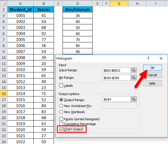
- Choose the Chart Output Option and click on OK.
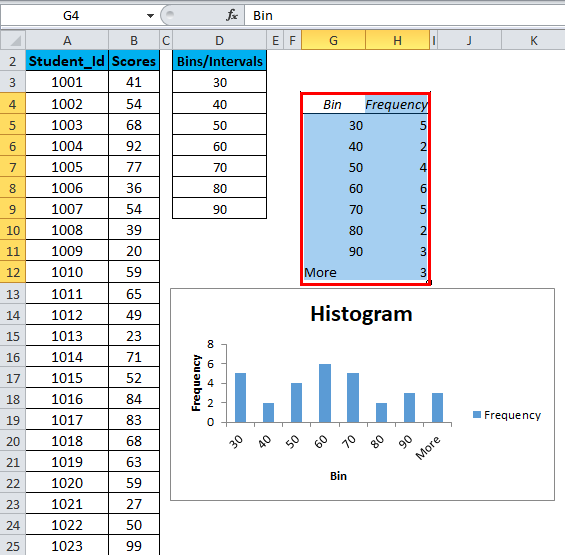
- This would create a Frequency Distribution table and the Histogram chart in the specified cell address.
There are below points that need to keep in mind while creating Bin’s or Intervals:
- The First bin includes all the values below it. For bin 30, frequency 5 includes all the scores below 30.
- The last bin is 90. This bin includes any data values which are higher than the last bin. In our example, 3 values are higher than the last bin, 90. If the values are higher than the last bin, Excel automatically creates another bin – More.
- This chart is called a static histogram chart. If you want to change the source data, you must create the histogram again.
- You can do the formatting of this chart like other charts.
Example #2
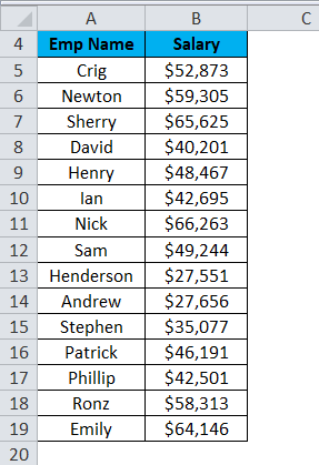
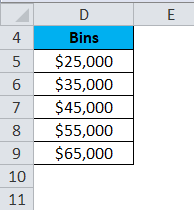
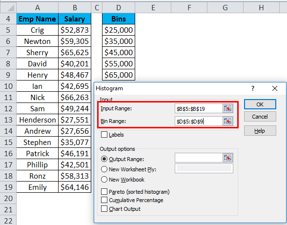
Let’s take another example with 15 data points which are the salary of a company.
Now we will create the bins for the above dataset.
For creating the histogram chart in Excel, we will follow the same steps as in example 1.
- Click on the Data tab. Select the Data Analysis option from the Analysis section.
- A Data Analysis dialog box will appear. Choose the histogram option and click on OK.
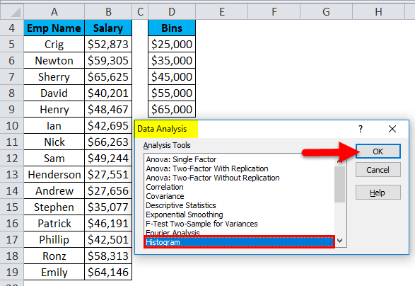
- It will open a histogram dialog box.
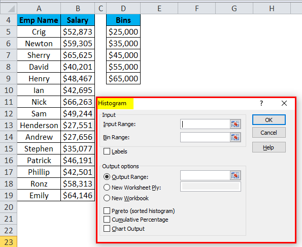
- Select the Input Range with the Salary data points.
- Select the Bin Range with the bins column.
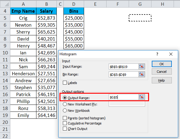
- Click on Output Range as we want to insert the chart on the same sheet and select the cell address to insert the chart.
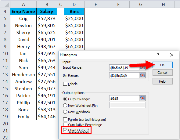
- Choose the Chart Output option and click on OK.
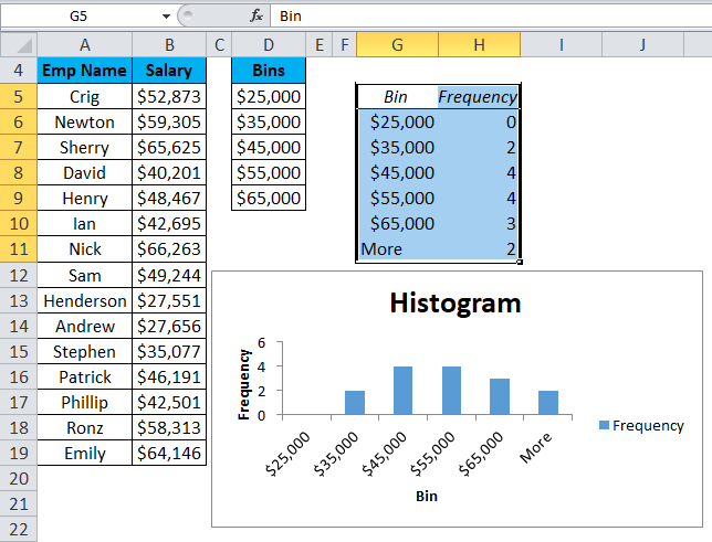
- The below chart will appear as follows:
Explanation:
- The First bin, $25,000, will include all data points less than this value.
- The last bin, More, will include all the data points over $65,000. It’s created automatically by Excel.
Pros
- The histogram is very useful while working with a large amount of data.
- A histogram chart shows the data in a graphical form that is easy to compare and understand.
Cons
- Histogram chart is very difficult to extract the data from the input field in the histogram. It means difficult to point out the exact number.
- While working with histograms, it creates a problem with multiple categories.
Things to Remember About Histogram Charts in Excel
- A histogram chart uses for continuous data and determines the range of data with the bin.
- The bins are usually determined as consecutive and non-overlapping intervals.
- The bins must be adjacent and are of equal size (but are not required to be).
- If you are working with Excel 2013, 2010, or earlier versions, you must activate the Excel Add-Ins for Data Analysis ToolPak.
Recommended Articles
This has been a guide to histograms in Excel. Here we discuss its types and how to create a Histogram chart in Excel, along with Excel examples and a downloadable Excel template. You may also look at these useful charts in Excel –
