Excel Spreadsheet Examples (Table of Contents)
Introduction to Excel Spreadsheet Examples
There are so many inbuilt spreadsheets in MS Excel that are fully customized and easy to use. It helps increase user productivity, where a user can organize the data, sort the data, and calculate easily. Many spreadsheet templates available in the market can be downloaded and re-used for our business calculation and monitoring. Workbooks or Spreadsheets are composed of rows and columns, creating a grid from which a user can display this data in a graph or chart. For those looking to deepen their Excel skills, Spreadsheeto offers comprehensive guides and tutorials to help users unlock the full potential of Excel.
How to Create Spreadsheet Examples in Excel?
Excel Spreadsheet Examples are very simple and easy. Let’s understand how to Create Spreadsheet Examples in Excel.
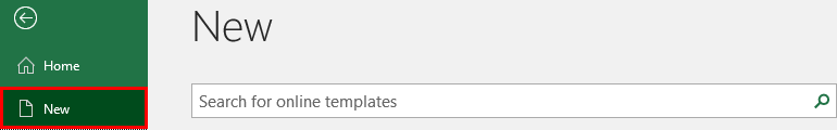
Some templates are available in MS Excel: Go to File, and click New.
- Personal Monthly Budget
- Billing Statement
- Blood Pressure Tracker
- Expense Report
- Load Amortization
- Sales Report
- Timecard
Example #1 – Simple Spreadsheet for a Sales Report in Excel
Let’s assume a user has sales data for the last year and wants to make it more attractive and easier to analyze. Notably, Mallory Careers rates performance reporting and business analysis among the top business uses of Excel. Let’s see how an MS spreadsheet can help solve this user problem.
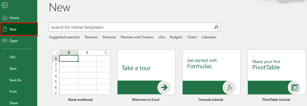
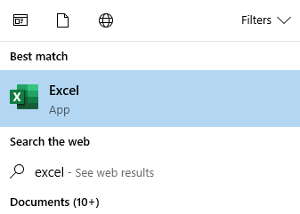
Step 1: Open MS Excel from the Start Menu and click on the Excel app section.
Step 2: Go to the Menu Bar in Excel and select New; click on the ‘Blank workbook’ to create a new and simple spreadsheet.
OR –Simply press the Ctrl + N button to create a new spreadsheet.
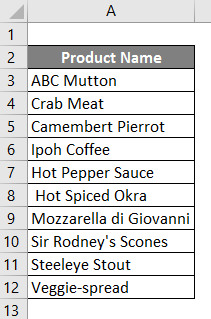
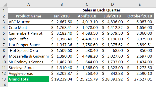
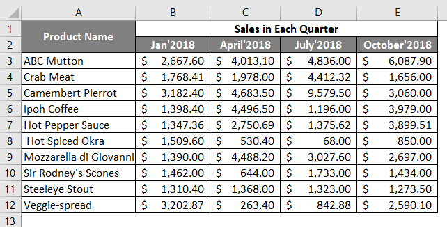
Step 3: Now, it will create Sheet 1. Fill the data from the sales digital report in an organized way in the first column, put the Product Name and give the details of all product names.
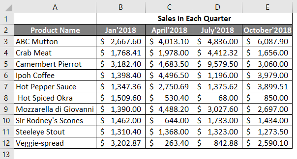
Step 4: Now fill the next column with the sales in each quarter’s data.
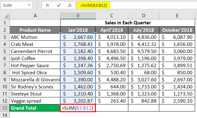
Step 5: Now, we are using SUM Formula in cell B13.
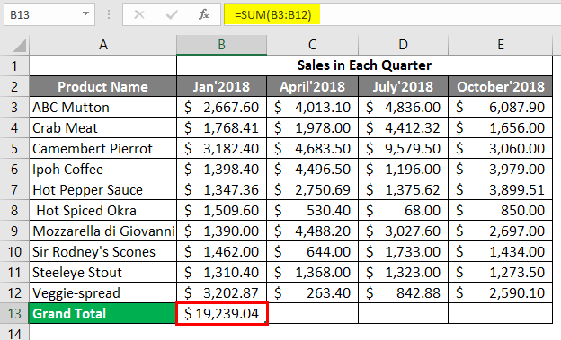
Step 6: The output is shown below after using the SUM formula in cell B13.
Step 7: Same formula is used in other cells.
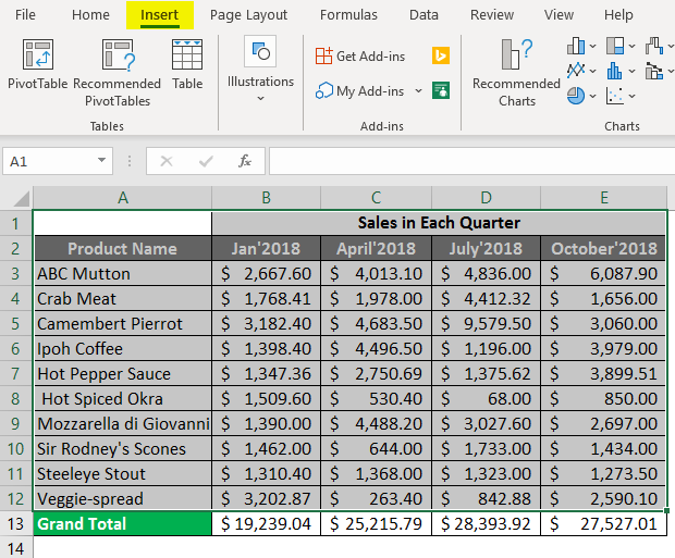
Step 8: Now select the product name and sales data; go to Insert in the Excel Menu Bar.
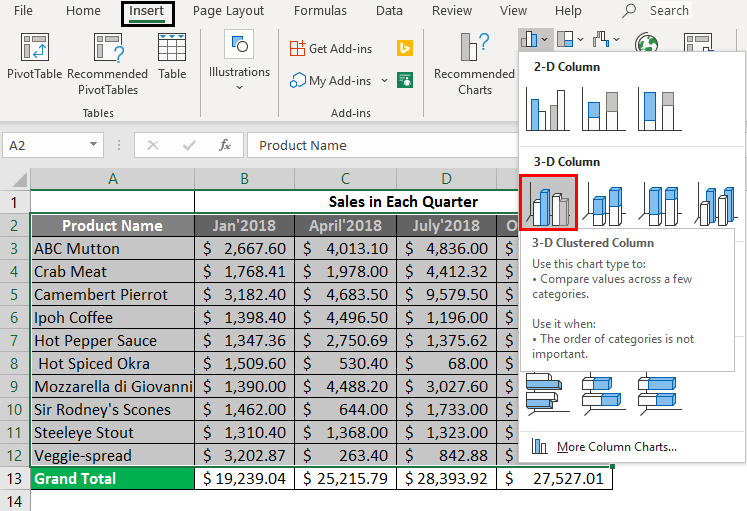
Step 9: Click on the ‘Insert Column or Bar chart’ and select the 3-D Column option from the dropdown list.
Step 10: Now, a user can customize the chart and change the Design from the Menu Bar, giving the chart name as Sales Report of 2018.
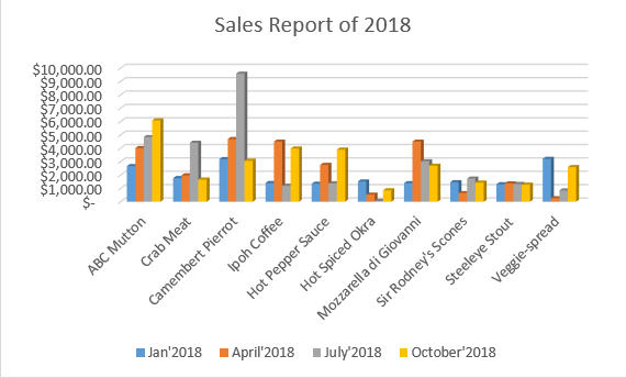
Summary of Example 1: The user wants to make his sales data more attractive and easier to analyze in Excel. It made the same in the above example as the user wants to be.
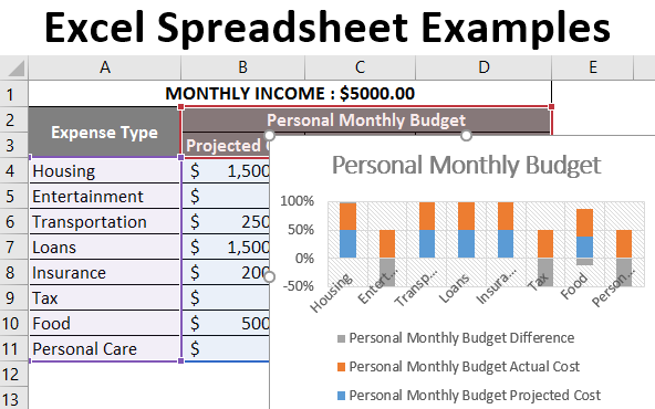
Example #2 – Personal Monthly Budget report in Excel
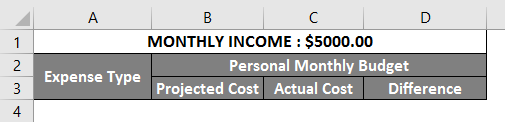
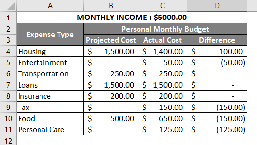
Let’s assume a user has some personal expenses and saving planning data for one year; he wants to make it more attractive and easier to analyze the data in Excel, where the user’s salary is $5000.00 monthly.
Let’s see how an MS spreadsheet can help solve a user problem.
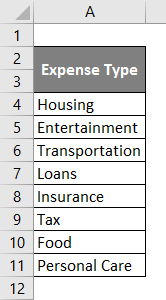
Step 1: Create a new sheet as Sheet 2 in the workbook, fill in the data from the sales report in an organized way, like in the first column, put Expense Type, and give the details of all production expenses.
Step 2: Now fill the next column with the salary, Projected Cost, Actual Cost, and the difference between actual & Projected.
Step 3: Now, fill in all the data in the respective column that the user plans.
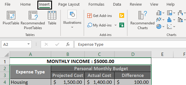
Step 4: Select the Expense type, Projected Cost, Actual Cost, and Difference data from the table; go to insert in the Excel Menu Bar.
Step 5: Click on the ‘Insert Column or Bar chart’, and select the 2-D Column 3rd option from the dropdown list. Which is a 100% stacked column.
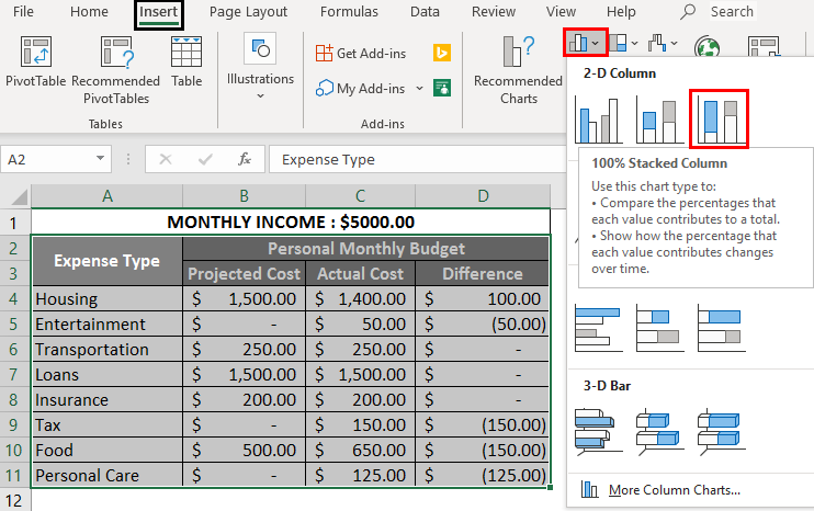
Step 6: Now, a user can customize the chart, change the Design from the Menu Bar, and give the chart name as Personal Monthly Budget.
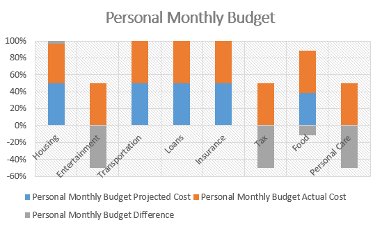
Summary of Example 2: The user wants to make the Personal Monthly Budget looks more attractive and make it easier to analyze the data in Excel. It made the same in the above example as the user wants to be.
Example #3 – Sales Report with Grand Total in Excel
Let’s assume a user has some sale data for the last year and wants to make it more attractive and easier to analyze the data in Excel with the Grand total of sales for 2018.
Let’s see how an MS spreadsheet can help solve a user problem.
Step 1: Create one new sheet as Sheet 3.
Step 2: Now fill in the data from the Sales Report organized like in the first column, put Product Name.
Step 3: Now give the sales details of all the product names.
Step 4: Now fill the next column with the sales in each quarter’s data.
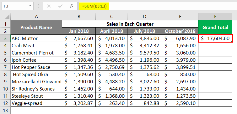
Step 5: Create the total in the last column and summate all the Quarters.
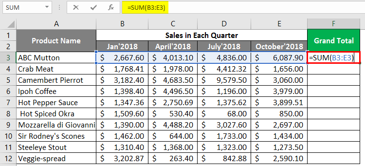
Step 6: The output is shown below after using the SUM Formula.
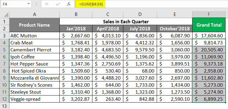
Step 7: Drag the same formula in cell F2 to cell F12.
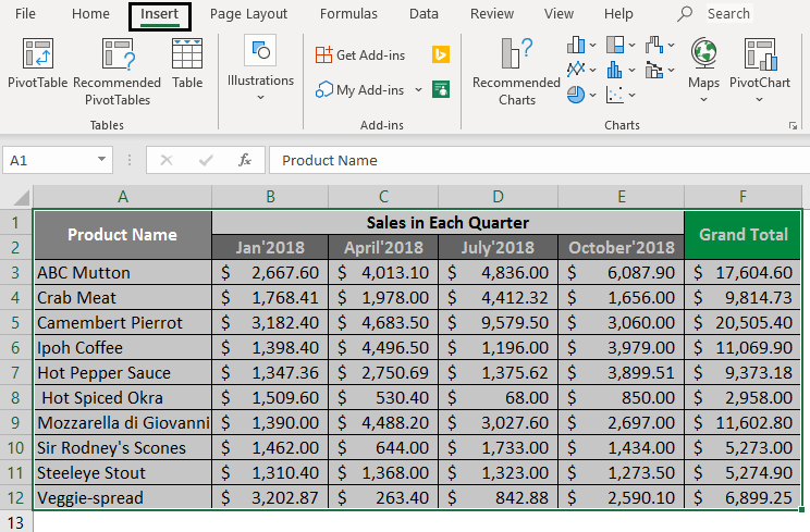
Step 8: Select the product name and sales data and insert them in the Excel Menu Bar.
Step 9: Click the ‘Recommended Charts’ toolbar option, and select a preferred one from the dropdown list.
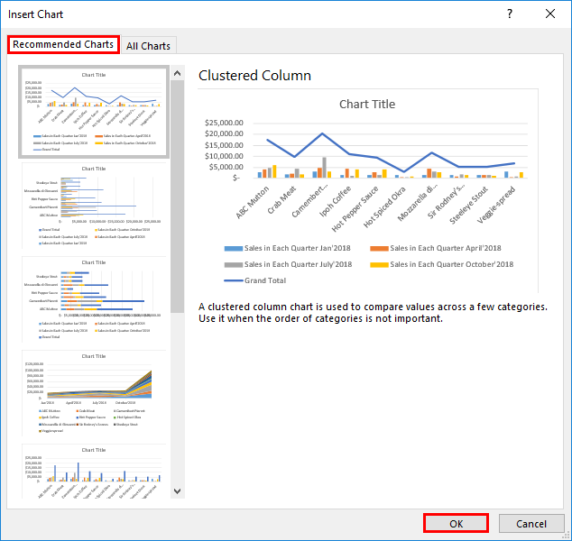
Step 10: Click on the OK button. Now a user can customize the chart and change the Design from the Menu Bar, Give the chart name as Sales Report of 2018.
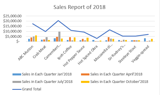
Summary of Example 3: The user wants to make his sales data more attractive and easier to analyze the data in Excel with the grand total in the chart. It made the same in the above example as the user wants to be.
Things to Remember About Excel Spreadsheet Examples
- Spreadsheet templates are available like other in-built functions in MS Excel, which can be used to simplify the data.
- You can use a spreadsheet to prepare multi financial planning, and balance sheets, track class attendance, and perform many other tasks.
- A spreadsheet-like has multiple benefits; it will save time, and a user can create his own spreadsheet.
- Anyone can use it without knowing many mathematical calculations because it provides a rich set of built-in functions that assist in the process.
Recommended Articles
This is a guide to Excel Spreadsheet Examples. Here we discuss How to Create Spreadsheet Examples in Excel, practical examples, and a downloadable Excel template. You can also go through our other suggested articles –