Updated June 6, 2023
Introduction to Project Timeline in Excel
How often have you been in a situation when you have to mention the list of tasks in your project and the duration it takes to complete those tasks? If you are a working professional, you frequently may have come up with a situation like this. And it is a very tedious job to make and stick to this schedule. The project timeline, or the project timeline, is simply a list of tasks you are scheduled to do within given time bounds. It contains a list of tasks, start time, and end time. There is an easy way to represent a project timeline in Excel through graphical representation. We have a “Gantt Chart” in Excel to help make project timelines.
Gantt Chart is a type of bar chart (uses stack bar graphs to create Gantt Chart) in Excel and is named after the person who invented it, Henry Laurence Gantt. As already discussed, it is most useful in Project Management.
There are two ways in which we can create Project Timeline in Excel.
- By using stack bar charts and then converting those into Gantt charts.
- By using the inbuilt Excel Gantt Project Timeline/Project Planner template.
How to Use Project Timeline in Excel?
Project Timeline in Excel is very simple and easy. Let’s understand how to use the Project Timeline in Excel with some examples.
Example #1 – Project Timeline Using Stack Bar Graphs
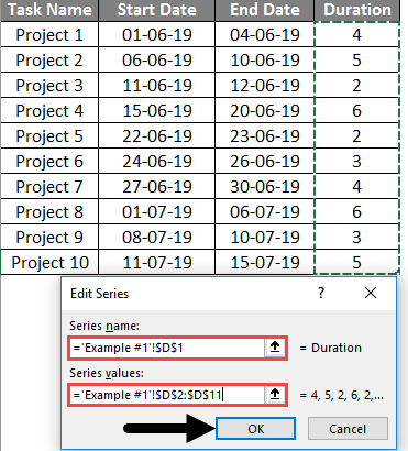
Suppose you have a list of tasks in tabular form in Excel, as shown in the screenshot below:
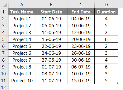
In this table, we have the Task Name, Start Date of the task, End Date of the task, and duration (in the number of days) it takes to complete the task. The duration can be inputted manually, or you can use a formula as [End Date – Start Date + 1]. Here +1 allows Excel to count the Start Date while calculating the Duration.
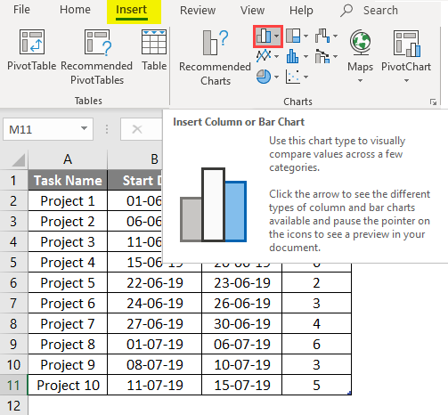
- Go to Excel Ribbon > Click Insert > Select Insert Column or Bar Chart option.
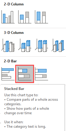
- Select Stacked Bar under the 2D-Bar option.
- When you click that chart button, you can see an empty Excel chart is generated as follows. Right-click on it and choose Select Data.
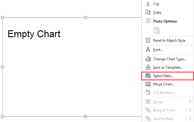
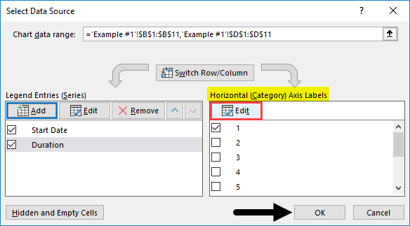
- A Select Data Source popping window will appear. Under Legend Entries (Series), click on Add tab.
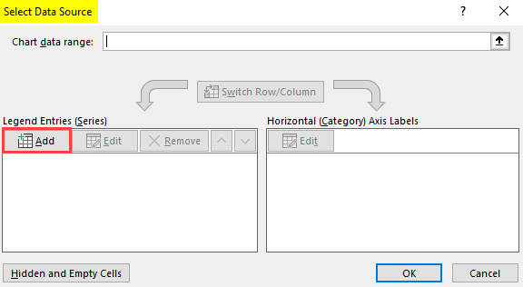
- A new pop up window, Edit Series, will appear on the front. Under the Series name, select Start Date (cell B1). Under Series values, select a range of data from the Start Date column (Column B, B2:B11). Click OK.
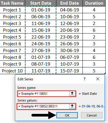
- Now add Duration as a Series name and Duration values as Series values by clicking Add button one more time, same as the above step.
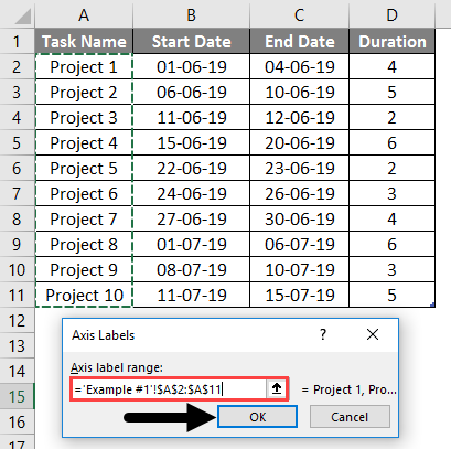
- Now, click Edit under Horizontal (Category) Axis Labels. It will open up a new pop-up window, Axis Labels. Select Task Name Range of cells from cell A2 to A11 under Axis label range and click OK. It will add Project 1 to Project 10 as a label (name) to every stack.
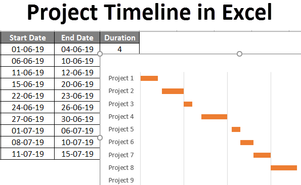
You can see a stacked bar chart below with start date as labels on X-Axis, Duration as Value for stacks, and Task Name as labels for Y-Axis.
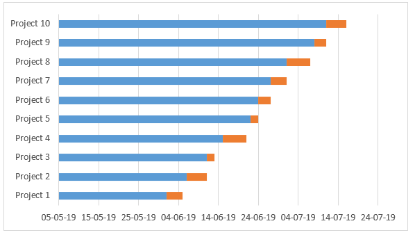
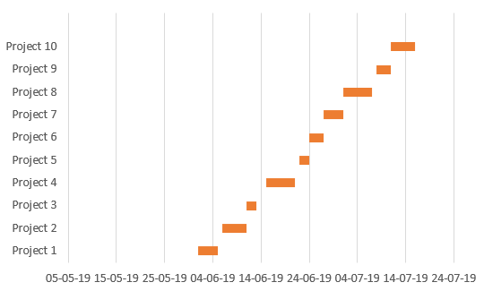
Now, these blue bars are nothing but the start date bars. We don’t want those in our timeline graph. Therefore, we need to remove those.
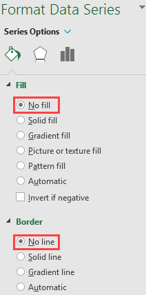
- Select blue bars and right-click on those to select Format Data Series.
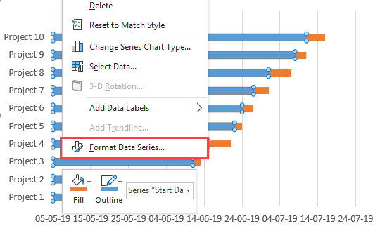
- Under Format Data Series, select No Fill under the Fill section and No Line under the Border section to make the blue bars invisible.
Now, the graph looks like below:
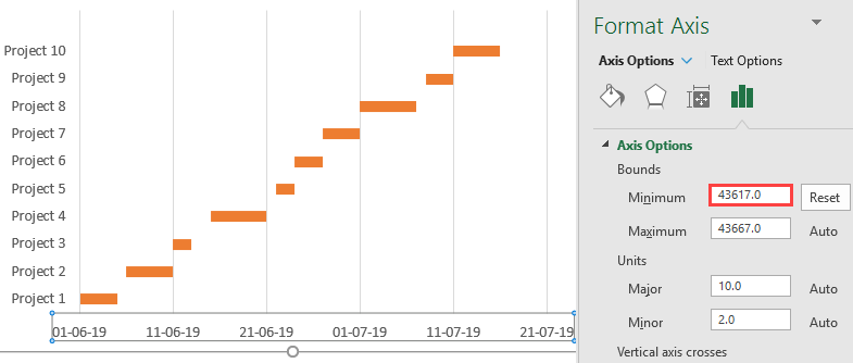
- Change the Minimum bound of this graph using the Format Axis pane to remove the white space at the start of the graph. Ideally, you can put the minimum bound as equal to the value of the first date in the Start Date column.
- Now, remove spaces within each timeline to make it look nicer. Under SERIES OPTIONS in Format Data Series, set Series Overlap to 100% and Gap Width as 10% for Plot Series.
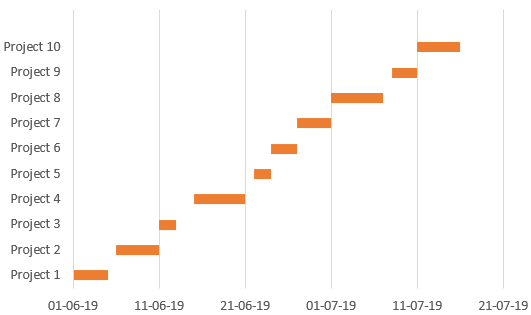
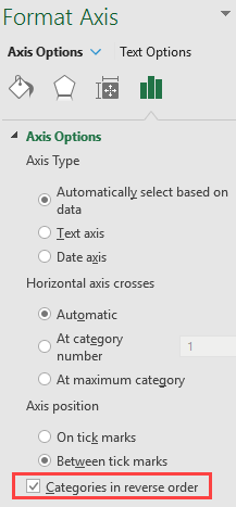
- Now, reverse the project order so that Project 1 appears as first and Project 10 last.
Using Format Axis on Y-Axis, check Categories in reverse order option under Axis Options to make this graph look in chronological order.
Your timeline chart looks like the one in the below screenshot.
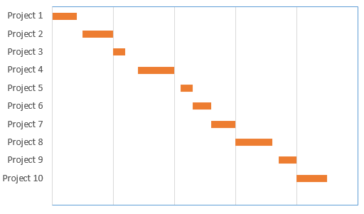
This is how we can create a timeline chart using stack bars.
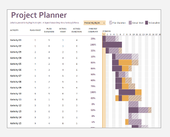
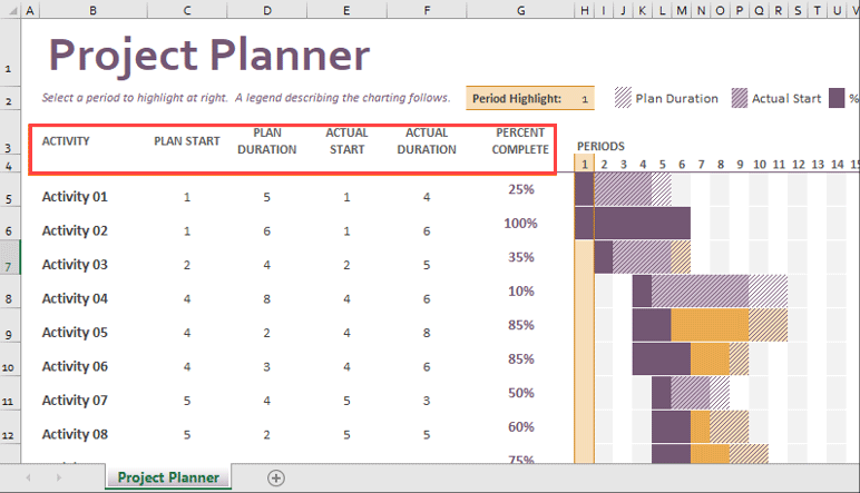
Example 2- In-built Gantt Project Planning Template
As you all know, excel is well known for its simplicity. There are more simple ways in recent versions of Excel, which have a separate template for Gantt Project Planning. Let’s see Project Timeline using the Excel In-Built Gantt project template. You can use it directly and give your data inputs for a Gantt Visualization. It reduces the steps we covered in the first example and is a time saver.
- Go to File Menu and Click the New tab on the vertical ribbon on the left side.
- In Search Box, type Gantt Project Planner and hit the search button to search the template dedicated to Project Planning.
- You can double click the template to get opened and fill in the details as per the header, which reflects a change in horizontal bars placed there.
In this article, we learned how to create a graphical project timeline in Excel. Let’s conclude with some key points to remember:
Things to Remember
- Henry Laurence Gantt developed the Project Timeline Chart, also known as the Gantt Chart, specifically for project timeline management purposes.
- Horizontal bars on the Gantt chart represent the duration (In the number of days or time) it takes to complete any particular activity or project.
- This chart doesn’t provide more detailed information about the project. It doesn’t provide any real-time monitoring of the project/task. It only shows the duration it takes to complete the task and whether the task is on the duration or not.
Recommended Articles
This is a guide to Project Timeline in Excel. Here we discuss how to use Project Timeline in Excel, practical examples, and a downloadable Excel template. You can also go through our other suggested articles –
