Excel Frequency Distribution (Table of Contents)
- Frequency Distribution in Excel
- Frequency Formula in Excel
- How to Make Frequency Distribution in Excel?
Frequency Distribution in Excel
Frequency Distribution in Excel is used to give an impression of how the data is spread out. This can be done using a Histogram which gives the proper vision of how the data is being distributed. To create Frequency Distribution in Excel, we must have Data Analysis Toolpak, which we can activate from the Add-Ins option in the Developer menu tab. Once it is activated, select the Histogram from Data Analysis, and select the data we want to project.
Frequency Formula in Excel
Below is the Frequency Formula in Excel :
The Frequency Function has two arguments as below:
- Data array: A set of array values where it is used to count the frequencies. If the data array values are zero (i.e., Null values), then the frequency function in Excel returns an array of zero values.
- Bins array: A set of array values that are used to group the values in the data array. If the bin array values are zero (i.e., Null values), it will return the array elements from the data array.
How to Make Frequency Distribution in Excel?
Frequency Distribution in Excel is very simple and easy to use. Let’s understand the working of Excel Frequency Distribution by some examples.
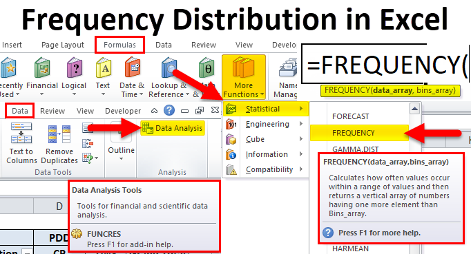
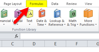
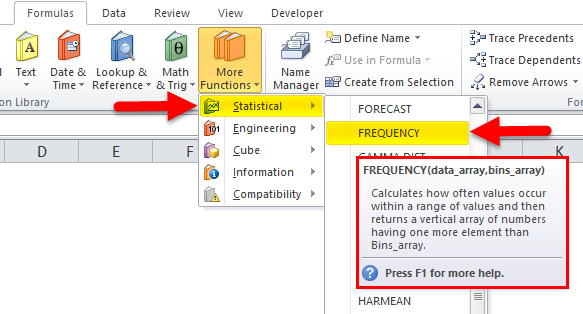
In Excel, we can find the “frequency function” in the Formulas menu, which comes under the statistical category, by following the below steps as follows.
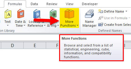
- Go to the Formula menu.
- Click on More Function.
- Under the Statistical category, choose Frequency Function, as shown in the below screenshot.
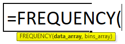
- We will get the Frequency Function Dialogue box as shown below.
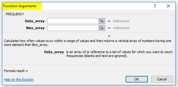
Where data array is an array or set of values where we want to count frequencies, and Bins_array is an array or set of values where we want to group the values in the data array.
Example #1
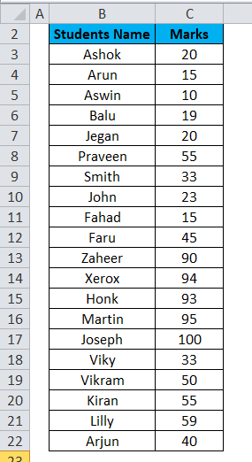
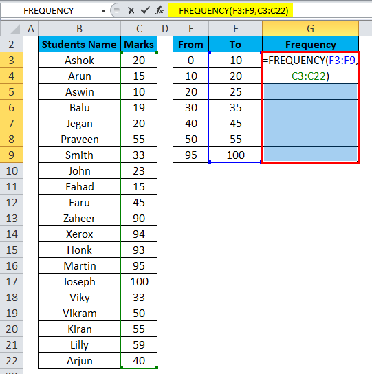
In this example, we will see how to find the frequency with the available student database.
Let’s consider the following example, which displays the scores of students:
We must group the data with students’ marks to calculate frequency, as shown below.
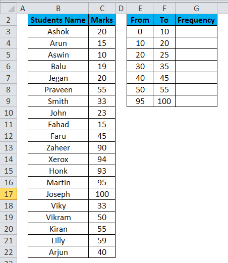
Using the frequency function, we will group the data by following the steps below.
- Create a new column named frequency.
- Use the frequency formulation on the G column by selecting G3 to G9.
- Here we need to select the entire frequency column then only the frequency function will work properly, or we will get an error value.
- As shown in the above screenshot, we have selected column as data array and Bin array as Student marks =FREQUENCY (F3:F9, C3:C22) and go for CTRL+SHIFT+ENTER.
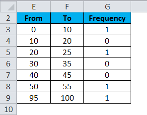
- So that we will get the values in all the columns.
- Once we hit the CTRL+SHIFT+ENTER, we can see the open and closing parenthesis, as shown below.
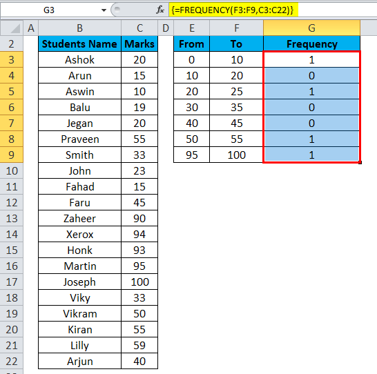
Now using the Excel Frequency Distribution, we have grouped the student’s marks with mark wise which shows students have scored marks with 0-10, we have 1 student, 20-25, we have 1 student, 50-55, we have 1 student and 95-100 we have 1 student as shown below.
Example #2
Excel Frequency Distribution Using Pivot Table
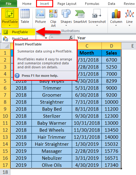
This example shows how to make Excel frequency distribution using graphical data with the available sales database.
One of the easiest ways to make Excel frequency distribution is using the pivot table so that we can create graphical data.
Consider the below sales data, which has a year-wise sale. Now we will see how to use this using a pivot table with the following steps.

- Create a Pivot Table for the above sales data. To create a pivot table, we must go to the insert menu and select pivot table.
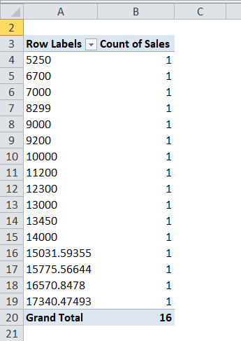
- Drag down the Sales in Row Labels. Drag down the same sales in Values.
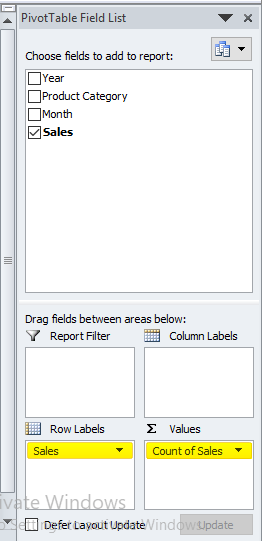
- Ensure we have selected the pivot field setting to count to get the sales count numbers shown below.
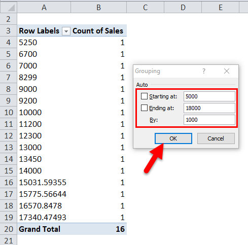
- Click on the row label sales number and right-click, then Choose the Group option.
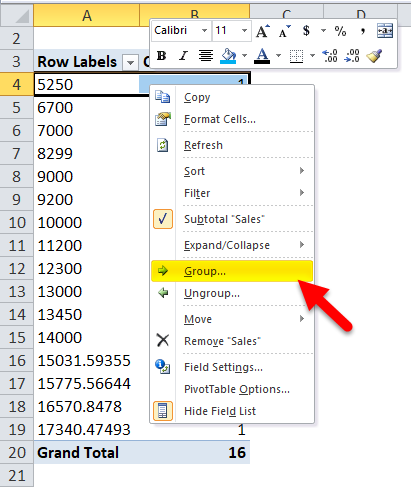
- So that we will get the grouping dialogue box as shown below:
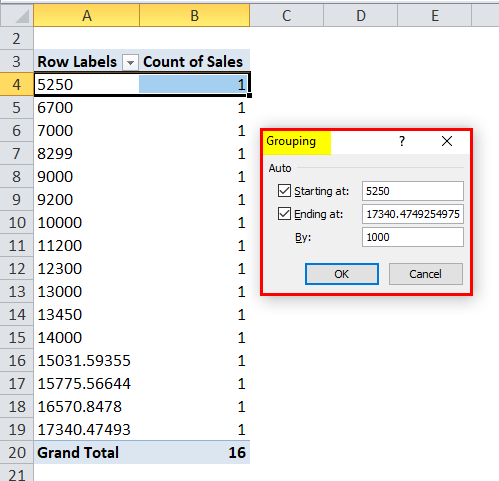
- Edit the grouping numbers starting at 5000 and ending at 18000, and it Group By 1000 and then click ok.
- After that, we will get the below-following result where sales data has been grouped by 1000 as shown below:
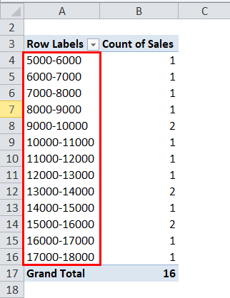
We can enhance the professional display of the grouped Sales data by presenting it in a graphical format, showcasing the Minimum to Maximum values grouped by 1000.
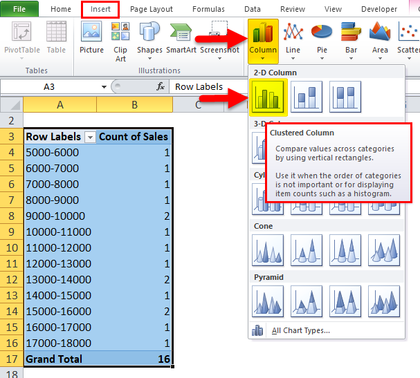
- Go to the Insert menu and select the Column chart.
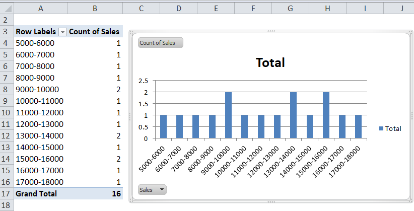
- So the output will be as follows:
Example #3
Excel Frequency Distribution Using Histogram
Using the pivot table, we have grouped the sales data; now, we will see how to make historical sales data by Frequency Distribution in Excel.
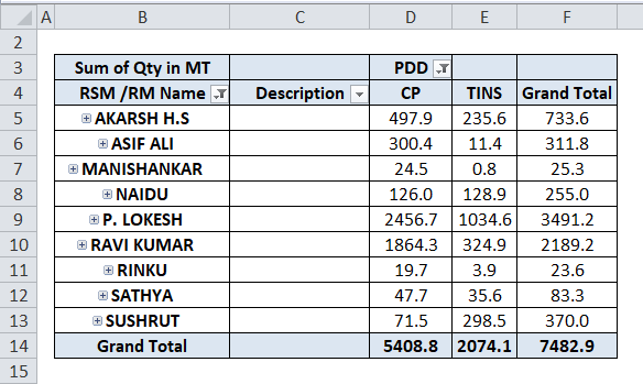
Consider the sales data below for creating a histogram with Sales Person Name with corresponding sales values. CP is nothing, but Consumer Pack and Tins are range values, i.e., how many tins have been sold out for specific salespersons.
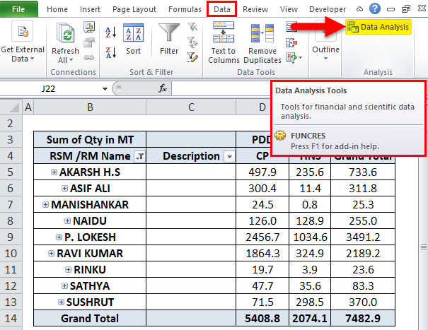
We can find a histogram in the data analysis group under the data menu, which is nothing but add-ins. We will see how to apply histograms by following the below steps.
- Go to Data Menu on the right top to find the data analysis. Click on the data analysis, which is highlighted as shown below.
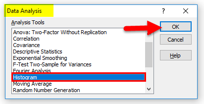
- So that we will get the below dialogue box, choose the Histogram option and Click ok.
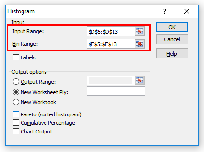
- We will get the below histogram dialogue box.
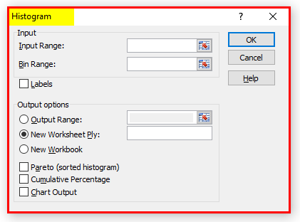
- Give the Input Range and Bin Range as shown below.
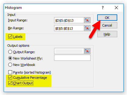
- Ensure we have a checkmark for all options like label option, Cumulative Percentage, and Chart Output, and then Click OK.
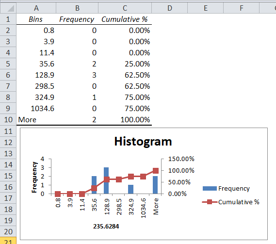
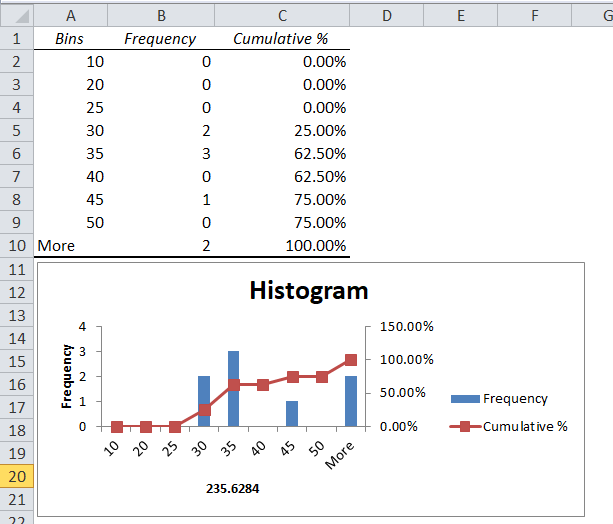
- In the below chart, we got the output showing the cumulative percentage and frequency.
We can display the above histogram more professionally by editing the sales data as follows.
- Right-click on the histogram chart and click on Select Data.
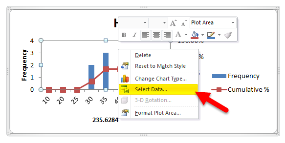
- We will get the dialogue box to change the Ranges. Click on edit.
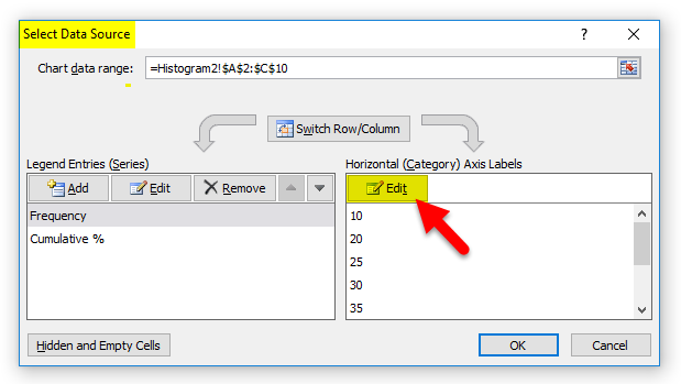
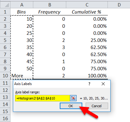
- So that we can edit the ranges we need to give, edit the Bins value to what exactly we need to specify the range so that we will get the appropriate result, and then click ok.
- So the result will be as below.
Things to Remember about Excel Frequency Distribution
- In Excel Frequency distribution, while grouping, we might lose some of the data; hence, make sure we are grouping correctly.
- While using Excel frequency distribution, ensure that classes are equal in size with upper limit and lower limit values.
Recommended Articles
This has been a guide to Frequency Distribution in Excel. Here we discuss the Frequency Formula in Excel, how to make Frequency Distribution in Excel, and practical examples and downloadable Excel templates. You can also go through our other suggested articles –
