Updated June 17, 2023
Introduction to CSS Transparent Border
CSS Transparent border means that the behind object can be seen if we apply the border as transparent or rgba. Transparent border property beautifies the HTML page by making behind objects distinctly visible.
Real-time scenario: If any web page wants an image border or text border that wants to be transparent, then without any doubt, we use the transparent property or rgba property.
History of Transparent keyword in CSS
- The transparent keyword was first introduced in the CSS1 version.
- Transparent keywords can be used for background color and border.
How Does Transparent Border Work in CSS?
- The transparent border is applied using the transparent keyword and the rgba property.
- If we take the border as transparent, then the entire border will disappear, and the background will display in place of the border.
- If we take the border as rgba, we can set how much background we wish to see.
- Most of the time, they are applied with images for accuracy.
Syntax 1:
div
{
border: value1 value2 transparent;//border values
}- Value1: Sets the border size like 2px, 3px, 4px etc. values
- Value2: Sets the border type like solid, dashed, double, groove, ridge, dotted, etc.
- Transparent: Makes the background visible.
Syntax 2:
div
{
border: value1 value2 rgba(value1, value2, value3, value4);//border values
}- Value1: Gives red color between 0 to 255 or 0 to 100%
- Value2: Gives green color between 0 to 255 or 0 to 100%
- Value3: Gives blue color between 0 to 255 or 0 to 100%
- Value4: An alpha parameter that gives transparency between 0 and 1. 0 means fully transparent, and 1 means fully opaque.
Examples of CSS Transparent Border
Given below are the examples of CSS Transparent Border:
Example #1
Transparent with Paragraphs.
HTML Code: TransparentParagraphText.html
<!DOCTYPE html>
<html>
<head>
<meta charset="ISO-8859-1">
<link rel="stylesheet" href="TransparentParagraphText.css">
<title>Transparent border</title>
</head>
<body>
<font color="green"><h2 align="center">Transparent
Paragraph Conclusion</h2></font>
<p class="style1" align="center">Developed an Enterprise Content
Management online application by using Spring MVC as Back end and JSP,
HTML, CSS, JavaScript and Angular JS as Front end.</p>
<p class="style2" align="center">Create a user with user type and
admin type, where admin can allow to perform administration actions
like modify user type and delete the users.</p>
<p class="style3" align="center">User can import a task with any
document, it stores in oracle database, create a task by specific data
with comments for task description. Assign same task to other users to
perform actions on it and also multiple users can at a time assign a
task.</p>
</body>
</html>
CSS Code: TransparentParagraphText.css
.style1
{
width: 900px;
background: gray;
border: 20px double transparent;
font-size: 20px;
text-align: justify;
}
.style2
{
width: 900px;
background:aqua;
border: 20px double transparent;
font-size: 20px;
text-align: justify;
}
.style3
{
width: 900px;
background: fuchsia;
border: 20px double transparent;
font-size: 20px;
text-align: justify;
}
body
{
background: maroon;
}
Output:

Explanation:
- As you can see from the above output, if we take a border without transparent background color, gray is visible, but if we take a border with a transparent one, the background gray color is visible.
- Why border is not visible in the second output because a transparent keyword overrode it, it is the border that places the background gray color visible.
Example #2
Transparent by rgba property with an image.
HTML Code: TransparentImageCircleText.html
<!DOCTYPE html>
<html>
<head>
<meta charset="ISO-8859-1">
<link rel="stylesheet" href="TransparentImageCircleText.css">
<title>Transparent border</title>
</head>
<body>
<font color="brown"><h2>Transparent Image
Circle</h2></font>
<div class="image">
Transparent done by rgba
</div>
</body>
</html>
CSS Code: TransparentImageCircleText.css
.image
{
width: 200px;
height: 200px;
padding: 55px;
border-radius: 300px; /* for getting circle shape */
border: double 15px rgba(254,254,254,0.7);
background: rgba(254,254,254,0.7);
}
body
{
background: url("p3.jpg");
height: 100%;
}
Output after applying transparent:
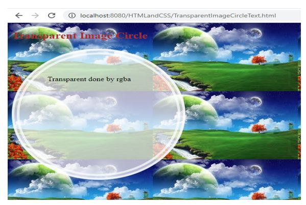
Explanation:
As you can see from the above output, if we are taking a border with transparent(rgba)background, the image is visible from the top of the circle shape.
Example #3
Transparent by rgba property with the image.
HTML Code: TransparentImageSquare.html
<!DOCTYPE html>
<html>
<head>
<meta charset="ISO-8859-1">
<link rel="stylesheet" href="TransparentImageSquare.css">
<title>Transparent border</title>
</head>
<body>
<font color="brown"><h2>Transparent Image
Square</h2></font>
<div class="image">
Transparent done by rgba
</div>
</body>
</html>
CSS Code: TransparentImageSquare.css
.image
{
height: 400px;
width: 400px;
margin: 120px;
border: 15px double rgba(255,255,255,.7);
}
body
{
background: url("p4.jpg");
background-size: 100% 100%; /*makes image displayed in entire page*/
}
Output after applying transparent:

Explanation:
As you can see in the above output, if we are taking a border with transparent(rgba)background, the image is visible from the top of the square shape.
Example #4
Transparent by rgba property with an image.
HTML Code: TransparentImageEllips.html
<!DOCTYPE html>
<html>
<head>
<meta charset="ISO-8859-1">
<link rel="stylesheet" href="TransparentImageEllipse.css">
<title>Transparent border</title>
</head>
<body>
<font color="brown"><h2>Transparent Image
Square</h2></font>
<div class="image">
Transparent done by rgba
</div>
</body>
</html>
CSS Code: TransparentImageEllips.css
.image
{
width: 400px;
height: 200px;
border-radius: 200px/150px;
padding:50px;
margin: 120px;
border: 15px double rgba(255,255,255,.7);
}
body
{
background: url("p5.jpg");
background-size: 100% 100%; /*makes image displayed in entire page*/
}
Output after applying transparent:

Explanation:
As you can see from the above output, if we are taking a border with transparent(rgba)background, the image is visible from the top of the ellipse shape.
Example #5
Transparent by rgba property with an image.
HTML Code: TransparentImageParallogram.html
<!DOCTYPE html>
<html>
<head>
<meta charset="ISO-8859-1">
<link rel="stylesheet" href="TransparentImageParallogram.css">
<title>Transparent border</title>
</head>
<body>
<font color="brown"><h2>Transparent Image
Parallelogram</h2></font>
<div class="image">
Transparent done by rgba
</div>
</body>
</html>
CSS Code: TransparentImageParallogram.css
.image {
width: 250px;
height : 150px;
transform : skew( 30deg);
padding: 50px;
margin: 120px;
border: 15px double rgba(230, 230, 230, .7);
height: 150px;
transform: skew(30deg);
}
body {
background: url("p3.jpg");
background-size: 100% 100%; /*makes image displayed in entire page*/
}
Output After applying transparent(rgba):
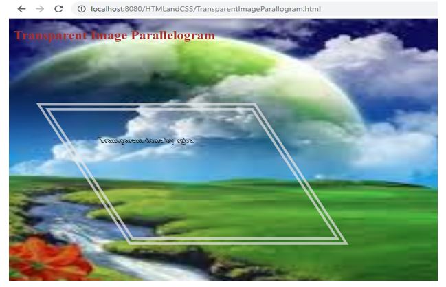
Explanation:
As you can see in the above output, if we are taking a border with transparent(rgba)background, the image is visible from the top of the parallelogram shape.
Conclusion
Border transparent property is used to show the background through the border. Border transparent can also be achieved by rgba property value.
Recommended Articles
We hope that this EDUCBA information on “CSS Transparent Border” was beneficial to you. You can view EDUCBA’s recommended articles for more information.

