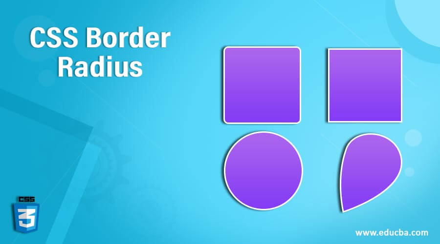
Introduction to CSS Border Radius
The border-radius property of the CSS describes the radius of the corners of an element. This property enables the addition of rounded corners to elements. For creating circular corners, you can set a single radius or two radii to produce an elliptical corner.
The CSS border-radius property can be defined as:
- One, two, three, or four values of < length > or < percentage >. It is used to align the corners to a single radius.
- Optionally preceded by the values “/” and one, two, three, or four < length > or < percentage >. It is used to create an additional radius to get elliptical corners
length: It represents the size of the circle radius, or the ellipse semi-major and semi-minor axes, using longitudinal values.
percentage: It represents the size of the circle radius, or the ellipse semi-major and semi-minor axes, using percentage values.
Syntax and Parameters
border-radius: length or percentage (can be specified up to 1 to 4 values)These four parameters can be specified with the below points:
- When you assign one value, it will determine the radius of all corners.
- In the case of three values, the top-left corner will use the first value, the top-right, and bottom-left corners will use the second value, and the bottom-right corner will use the third value.
- If four values are defined, each value is assigned to a specific corner in the following order: top-left, top-right, bottom-right, and bottom-left. This allows for individual control of the borders for each corner of the shape.
For instance,
border-radius: 15px;
border-radius: 15px 30%;
border-radius: 15% 25%;
border-radius: 10px 15px 10px 15px;
How Border Radius property work in CSS?
The CSS border property is a format to configure the radius with the four properties at the top left of the border, top right of the border, bottom right of the border, and bottom left of the border. By utilizing the border-radius shorthand property, it is possible to create rounded corners independently by utilizing the border-*-radius properties. Either of the border-*-radius properties will embrace either one or two values, represented as a length or percentage (percentage related to the associated border box dimensions).
Examples to Implement CSS Border Radius
Below are the examples mentioned :
Example #1
Code:
<!DOCTYPE html>
<html lang="en">
<head>
<meta charset="utf-8">
<title> CSS Border Radius Example </title>
<style>
.txt {
border-radius: 25px;
background: grey;
padding: 10px;
text-align: center;
width: 400px;
height: 150px;
}
</style>
</head>
<body>
<h2> Welcome to EDUCBA... </h2>
<div class= "txt">
EDUCBA (Corporate Bridge Consultancy Pvt Ltd) is a leading global provider of skill based education addressing the needs of 500,000+ members across 40+ Countries. Our unique step-by-step, online learning model along with amazing 2500+ courses prepared by top-notch professionals from the Industry help participants achieve their goals successfully.
</div>
</body>
</html>
Output:

Explanation: In the above example, we have set the border-radius to 25px, which sets the border radius with the same value at each corner of the div block.
Example #2
Code:
<!DOCTYPE html>
<html lang="en">
<head>
<meta charset="utf-8">
<title> CSS Border Radius Example </title>
<style>
.txt {
border-radius: 25px 50px;
background: grey;
padding: 10px;
text-align: center;
width: 400px;
height: 150px;
}
</style>
</head>
<body>
<h2> Welcome to EDUCBA... </h2>
<div class= "txt">
EDUCBA (Corporate Bridge Consultancy Pvt Ltd) is a leading global provider of skill based education addressing the needs of 500,000+ members across 40+ Countries. Our unique step-by-step, online learning model along with amazing 2500+ courses prepared by top-notch professionals from the Industry help participants achieve their goals successfully.
</div>
</body>
</html>
Output:

Explanation: In the above example, we have set the border-radius to 25px and 50px, in which 25px sets the border radius at the top left side and bottom right side of the div block and 50px sets the border-radius at the top right side and bottom left side of the div block.
Example #3
Code:
<!DOCTYPE html>
<html lang="en">
<head>
<meta charset="utf-8">
<title> CSS Border Radius Example </title>
<style>
.txt {
border-radius: 25px 50px 75px;
background: grey;
padding: 10px;
text-align: center;
width: 400px;
height: 150px;
}
</style>
</head>
<body>
<h2> Welcome to EDUCBA... </h2>
<div class= "txt">
EDUCBA (Corporate Bridge Consultancy Pvt Ltd) is a leading global provider of skill based education addressing the needs of 500,000+ members across 40+ Countries. Our unique step-by-step, online learning model along with amazing 2500+ courses prepared by top-notch professionals from the Industry help participants achieve their goals successfully.
</div>
</body>
</html>
Output:

Explanation: In the above example, we have set the border radius to 25px, 50px, and 75px, in which 25px sets the border-radius at the top left side of the div block, 50px sets the border-radius at the top right side and bottom left side of the div block and 75px sets the border-radius at the bottom right side of the div block.
Example #4
Code:
<!DOCTYPE html>
<html lang="en">
<head>
<meta charset="utf-8">
<title> CSS Border Radius Example </title>
<style>
.txt {
border-radius: 25px 50px 75px 100px;
background: grey;
padding: 10px;
text-align: center;
width: 400px;
height: 150px;
}
</style>
</head>
<body>
<h2> Welcome to EDUCBA... </h2>
<div class= "txt">
EDUCBA (Corporate Bridge Consultancy Pvt Ltd) is a leading global provider of skill based education addressing the needs of 500,000+ members across 40+ Countries. Our unique step-by-step, online learning model along with amazing 2500+ courses prepared by top-notch professionals from the Industry help participants achieve their goals successfully.
</div>
</body>
</html>
Output:

Explanation: In the above example, we have set the border-radius to 25px, 50px, 75px, and 100px, in which 25px sets the border-radius at the top left side, 50px sets the border radius at the top right side, 75px sets the border-radius at the bottom right side, and 100px sets the border-radius at the bottom left side of the div block.
Conclusion
So far, we have studied CSS border-radius property that enables web developers to conveniently use rounder corners in their design features without needing corner objects or several div tags. It is one of the most talked about perspectives of CSS3. In order to create designs with rounded corners, web designers would no longer have to revert to complicated table structures using personalized corner graphics or using arcane JavaScript files.
Recommended Articles
This is a guide to CSS Border Radius. Here we discuss an introduction to CSS Border Radius, syntax, and how it works with programming examples. You can also go through our other related articles to learn more –

