Updated June 17, 2023
Overview of CSS Shape Generator
CSS Shape generator is usually used for generating or forming differently shaped objects. Generally, we will investigate the below shapes in this “Shape Generator” concept
- Circle
- Ellipse
- Square
- Rectangle
- Polygon
- Trapezoid
- Parallelogram
- Moon
Usually, these shaped objects are used to beautify the view of images. For example, WhatsApp initially had a square shape around the profile picture, but now it is round or circular. The future may be oval or some other shape.
How does Shape Generator work in CSS?
We can use the clip-path property for Circle, Ellipse, Square, Rectangle, and Polygon shapes. Based on this clip-path property, these will work. But clip-path property cannot work on HTML elements but can work on Scalable Vector Graphics. So, we will use normal CSS properties to achieve all 8 shapes.
We will change border-radius, box-shadow, and transform properties as per the required shape for the other shapes, like Trapezoid, Parallelogram, and Moon shapes. Anyway, we will use normal CSS properties to get all the shapes.
To make functioning these shapes, we must work on the below properties parallelly.
- Height and width
- Padding
- Rotation
- Skew
- Positioning
- Colors
- Border
We will deal with the above eight shapes in the below eight examples.
Examples of CSS Shape Generator with Code
The examples of CSS shape generators are given below:
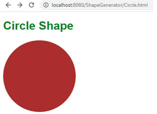
1. Circle
We will get a circle shape by assigning border-radius:50%.
Syntax:
.class
{
width: 200px;
height: 200px;
border-radius: 50%
}
HTML Code: Circle.html
<!DOCTYPE html>
<html>
<head>
<meta charset="ISO-8859-1">
<link rel="stylesheet"  type="text/css" href="Circle.css">
<title>Circle</title>
</head>
<body>
<h1>Circle Shape</h1>
<div class="circle"></div>
</body>
</html>
CSS Code: Circle.css
h1{
font-family: sans-serif;;
color: green;
}
.circle{
width: 200px;
height: 200px;
background: Brown;
border-radius: 50%
}
Output:
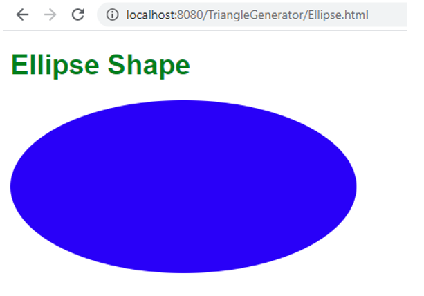
2. Ellipse
We will get the ellipse shape by assigning border-radius exactly half of the width and height respectively, for example, width=400px, height=200px, then border-radius:200px/100px.
Syntax:
.class
{
width: 400px;
height: 200px;
border-radius: 200px/100px;
}
HTML Code: Eclipse.html
<!DOCTYPE html>
<html>
<head>
<meta charset="ISO-8859-1">
<link rel="stylesheet"  type="text/css" href="Ellipse.css">
<title>Circle</title>
</head>
<body>
<h1>Ellipse Shape</h1>
<div class="ellipse"></div>
</body>
</html>
CSS Code: Ellipse.css
.ellipse {
width: 400px;
height: 200px;
background: blue;
border-radius: 200px/100px;
}
h1 {
font-family: sans-serif;;
color: green;
}
Output:
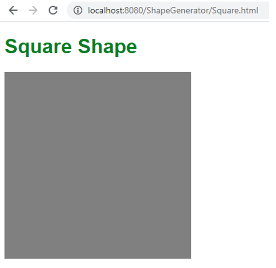
3. Square
We will get a square by assigning width; height should be the same, like width=100px, height=100px.
Syntax:
.class
{
width:100px;
height:100px;
}
HTML Code: Square.html
<!DOCTYPE html>
<html>
<head>
<meta charset="ISO-8859-1">
<link rel="stylesheet"  type="text/css" href="Square.css">
<title>Square</title>
</head>
<body>
<h1>Square Shape</h1>
<div class="square"></div>
</body>
</html>
CSS Code: Square.css
.square {
width: 300px;
height: 300px;
background: gray;
}
h1 {
font-family: sans-serif;;
color: green;
}
Output:
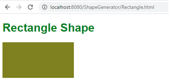
4. Rectangle
We will get a square by assigning width, and height should be different, like width=200px, height=100px or width=100px, height=200px vice-versa.
Syntax:
.class
{
width:200px;
height:100px;
}
HTML Code: Rectangle.html
<!DOCTYPE html>
<html>
<head>
<meta charset="ISO-8859-1">
<link rel="stylesheet"  type="text/css" href="Rectangle.css">
<title>Rectangle</title>
</head>
<body>
<h1>Rectangle Shape</h1>
<div class="rectangle"></div>
</body>
</html>
CSS Code: Rectangle.css
.rectangle {
width: 200px;
height: 100px;
background: olive;
}
h1 {
font-family: sans-serif;;
color: green;
}
Output:
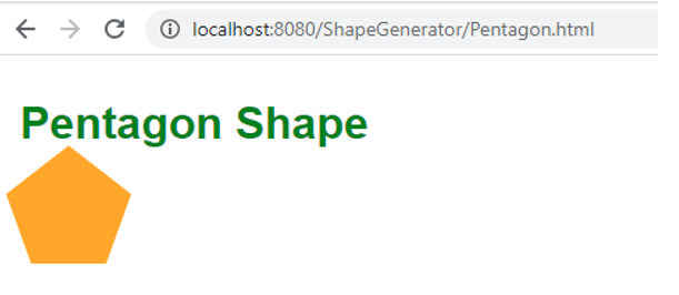
5. Polygon
Sides 5 more is said to be Polygon. Example Pentagon
Pentagon: We will get Pentagon by assigning values below
In class property:
width: 54px;
box-sizing: content-box;
border-width: 50px 18px 0;
In before-class property:
top: -85px;
left: -18px;
border-width: 0 45px 35px;
Syntax:
.class{
width: 54px;
box-sizing: content-box; //default box sizing behavior in CSS
border-width: 50px 18px 0;
position: relative;//position is relative to normal position
border-color: silver transparent;
}
.class:before
{
top: -85px;//this negative margin values pulls element in top direction
left: -18px; //this negative margin values pulls element in left direction
border-width: 0 45px 35px;
content: "";
position: absolute;
border-color: transparent transparent silver;
}HTML Code: Pentgon.html
<!DOCTYPE html>
<html>
<head>
<meta charset="ISO-8859-1">
<link rel="stylesheet"  type="text/css" href="Pentagon.css">
<title>Pentagon</title>
</head>
<body>
<h1>Pentagon Shape</h1>
<div class="pentagon"></div>
</body>
</html>
CSS Code: Pentagon.css
.pentagon {
border-style: solid;
position: relative;
width: 54px;
box-sizing: content-box;
border-width: 50px 18px 0;
border-color: orange transparent;
box-sizing: content-box;
border-width: 50px 18px 0;
}
.pentagon:before {
border-width: 0 45px 35px;
border-style: solid;
content: ""; position : absolute; height : 0; width : 0; top : -85px;
left : -18px;
border-color: transparent transparent orange;
position: absolute;
height: 0;
width: 0;
top: -85px;
left: -18px;
}
h1 {
font-family: sans-serif;;
color: green;
padding: 10px;
}Output:
6. Trapezoid
Just remove the top part from Pentagon (means class before CSS code, no need), and we will get
Syntax:
.class{
width: 54px;
box-sizing: content-box; //default box sizing behavior in CSS
border-width: 50px 18px 0;
position: relative;//position is relative to normal position
border-color: silver transparent;
}
HTML Code: Trapezoid.html
<!DOCTYPE html>
<html>
<head>
<meta charset="ISO-8859-1">
<link rel="stylesheet"  type="text/css" href="Trapezoid.css">
<title>Trapezoid</title>
</head>
<body>
<h1>Trapezoid Shape</h1>
<div class="trapezoid"></div>
</body>
</html>
CSS Code: Trapezoid.css
.trapezoid {
border-style: solid;
position: relative;
width: 54px;
box-sizing: content-box;
border-width: 50px 18px 0;
border-color: orange transparent;
box-sizing: content-box;
border-width: 50px 18px 0;
}
h1 {
font-family: sans-serif;;
color: green;
padding: 10px;
}
Output:
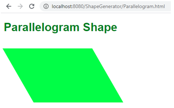
7. Parallelogram
It is just like a rectangle but tilted some angles on a vertical and horizontal plane. We will get it by assigning width: 250px, height: 150px, and transform: skew(30deg). Skew will give you a 2D angle in CSS.
Syntax:
.class{
width: 250px,
height: 150px,
transform: skew(30deg)
}
HTML Code: Parallelogram.html
<!DOCTYPE html>
<html>
<head>
<meta charset="ISO-8859-1">
<link rel="stylesheet"  type="text/css" href="Parallelogram.css">
<title>Parallelogram</title>
</head>
<body>
<h1>Parallelogram Shape</h1>
<div class="parlgrm"></div>
</body>
</html>
CSS Code: Parallelogram.css
.parlgrm {
width: 250px;
height: 150px;
transform: skew(30deg);
background: lime;
margin:40px;
}
h1 {
font-family: sans-serif;;
color: green;
}
Output:
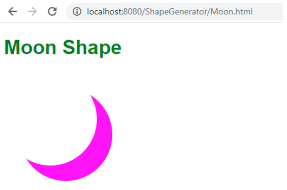
8. Moon
If we observe, we will only get it from the circle by covering 80 of the portion with shadow. Here we will do the same thing covering the circle with some shadow. Get it by assigning box-shadow: 15px 15px 0 0 red to the circle.
Syntax:
.class{
border-radius: 50%;
box-shadow: 15px 15px 0 0 red; //it will cover the top portion of the circle
}
HTML Code: Moon.htm
<!DOCTYPE html>
<html>
<head>
<meta charset="ISO-8859-1">
<link rel="stylesheet"  type="text/css" href="Moon.css">
<title>Moon</title>
</head>
<body>
<h1>Moon Shape</h1>
<div class="moon"></div>
</body>
</html>
CSS Code: Moon.css
h1 {
font-family: sans-serif;;
color: green;
}
.moon {
width: 150px;
height: 150px;
border-radius: 50%;
box-shadow: 25px 25px 0 0 fuchsia;
}
Output:
Conclusion
We will get all shapes without using the clip-path property by changing the height, width, transform, border-radius, position, box-sizing, etc.
Recommended Articles
We hope that this EDUCBA information on “CSS Shape Generator” was beneficial to you. You can view EDUCBA’s recommended articles for more information.

