Introduction to CSS Radio Button
You can use Radio Buttons when the user needs to make a single selection from a group of items. They are a common choice for forms that require multiple options but restrict the user to making only one selection. However, when you try to select several options, clicking a radio button that has not been selected would unselect the other option which was previously selected.
Radio buttons are just like checkboxes. The main difference is that they only require one selection of multiple items from a list. Gender selection (Male, Female) is a clear example of where radio buttons will be a suitable input item.
Syntax
You can write the syntax for the radio button as shown below:
<input type="radio" name="myradio" value="radio_value"  id="radio_demo" class="form-radio" checked>
<label for="radio_demo">Radio</label>
The following are the attributes of the radio button:
- type: The input type control is defined and set to the radio.
- name: It controls a name sent to the server for recognition and retrieval of the value.
- value: This value can be used when the user selects the radio box.
- checked: You will use this attribute when choosing the radio button by default.
How does Radio Button work in CSS?
Radio buttons will be used when two or more options are identified which are mutually exclusive, and the user has to choose exactly one choice. In other words, clicking a non-selected radio button would erase any previously selected button on the list. Radio buttons include lower cognitive load, as they permanently keep all options visible so users can easily analyze them. Radio buttons are also simpler for users with difficulty making effective mouse movements.
Examples to Implement CSS Radio Button
Now, some examples as described below:
Example #1
Code:
<!DOCTYPE html>
<html>
<head>
<meta charset="utf-8">
<title> CSS Radio Button Example </title>
<style>
.container {
display: block;
position: relative;
padding-left: 30px;
margin-bottom: 10px;
cursor: pointer;
font-size: 20px;
}
.container input {
position: absolute;
opacity: 0;
}
.radio_class {
position: absolute;
top: 0;
left: 0;
height: 20px;
width: 20px;
background-color: #eee;
border-radius: 25%;
}
.container:hover input ~ .radio_class {
background-color: #4863A0;
}
.container input:checked ~ .radio_class {
background-color: #728C00;
}
.container .radio_class:after {
top: 10px;
left: 10px;
width: 10px;
height: 10px;
border-radius: 80%;
background: white;
}
</style>
</head>
<body>
<h2> Basic Radio Buttons </h2>
<label class="container">One
<input type="radio" checked="checked" name="radio">
<span class="radio_class"></span>
</label>
<label class="container">Two
<input type="radio" name="radio">
<span class="radio_class"></span>
</label>
</body>
</html>
Output: Open the file in a browser, and it will produce the following result.
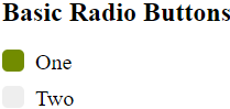
Explanation: In the above example, we have created custom radio buttons. The code adds a background color when a radio button is checked and a different color when the user hovers over the radio button. We have defined a class called .radio_class to apply CSS styles to the radio buttons. The check attribute specifies the default radio button. A container creates the radio buttons, and we add CSS styles, which we can define after each selected element’s content.
Example #2
Code:
<!DOCTYPE html>
<html>
<head>
<meta charset="utf-8">
<title> CSS Radio Button Example </title>
<style>
body{
background: #222222;
}
.container{
display: block;
position: relative;
margin: 20px auto;
height: auto;
width: 400px;
padding: 10px;
}
h2{
color: #ffffff;
}
ul li{
color: #00FA9A;
display: block;
position: relative;
border-bottom: 1px dotted #DAA520;
}
ul li input[type=radio]{
position: absolute;
visibility: hidden;
}
ul li label{
display: block;
position: relative;
font-weight: 200;
font-size: 1.15em;
padding: 25px 25px 25px 80px;
margin: 8px auto;
height: 20px;
z-index: 9;
cursor: pointer;
}
ul li:hover label{
color: #FAEBD7;
}
ul li .radio_demo{
display: block;
position: absolute;
border: 3px solid #AAAAAA;
border-radius: 100%;
height: 30px;
width: 30px;
top: 25px;
left: 30px;
z-index: 5;
}
ul li .radio_demo::before {
position: absolute;
content: '';
border-radius: 80%;
height: 20px;
width: 20px;
top: 5px;
left: 5px;
margin: auto;
transition: background 0.25s linear;
}
input[type=radio]:checked ~ .radio_demo {
border: 3px solid #0DFF92;
}
input[type=radio]:checked ~ .radio_demo::before{
background: #0DFF92;
}
</style>
</head>
<body>
<div class="container">
<h2> Indian Cricket Team Members: </h2>
<ul>
<li>
<input type="radio" id="option_one" name="selector">
<label for="option_one"> M S Dhoni</label>
<div class="radio_demo"></div>
</li>
<li>
<input type="radio" id="option_two" name="selector">
<label for="option_two"> Virat Kohli</label>
<div class="radio_demo">
<div class="inside"></div>
</div>
</li>
<li>
<input type="radio" id="option_three" name="selector">
<label for="option_three"> Rohit Sharma </label>
<div class="radio_demo">
<div class="inside"></div>
</div>
</li>
</ul>
</div>
</body>
</html>
Output:
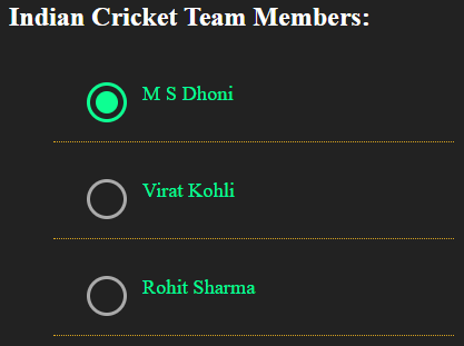
Explanation: In the above example, radio buttons are created using different CSS styles. We have defined radio buttons as list items using ul and li tags. These are specified in the parent element and container and contain respective CSS styles for the radio buttons. We have utilized the label for options and applied various CSS styles to them. Additionally, we have defined the color when the user hovers the mouse over the radio button labels. The code also displays respective colors before hovering and after hovering the mouse on the radio buttons.
Example #3
Code:
<!DOCTYPE html>
<html lang="en">
<head>
<meta charset="utf-8">
<title> CSS Radio Button Example </title>
<style>
body{
background:grey;
color:#fff;
}
#myradio{
position:relative;
width:40%;
margin:0 auto;
}
input[type="radio"]{
position:absolute;
right:2000%;
}
label{
float:left;
width:15%;
padding-bottom:15%;
margin:0 2%;
background:#A0522D;
border-radius:60%;
cursor:pointer;
}
#slider{
position:absolute;
left:0%;
top:0;
width:10%;
padding-bottom:9%;
margin:2% 0 0 6%;
background:#fff;
transition:transform 2s;
border-radius:60%;
animation-timing-function: ease-in-out;
transition: 0.3s left .06s ease-in-out;
}
#radio1:checked  ~ #slider{ animation-name: one; left:0; }
#radio2:checked  ~ #slider{ animation-name: two; left:15%; }
#radio3:checked  ~ #slider{ animation-name: three; left:35%; }
#radio4:checked  ~ #slider{ animation-name: four; left:65%; }
#radio5:checked  ~ #slider{ animation-name: five; left:85%; }
@keyframes one{ 20%, 80% { transform:scale(0.6); } }
@keyframes two{ 20%, 80% { transform:scale(0.6); } }
@keyframes three{ 20%, 80% { transform:scale(0.6); } }
@keyframes four{ 20%, 80% { transform:scale(0.6); } }
@keyframes five{ 20%, 80% { transform:scale(0.6); } }
</style>
</head>
<body>
<h2> Radio Select - with Animated Slide </h2>
<div id="myradio">
<label for="radio1"></label>
<input  id="radio1" name="radio" type="radio" />
<label for="radio2"></label>
<input  id="radio2" name="radio" type="radio" />
<label for="radio3"></label>
<input  id="radio3" name="radio" type="radio" />
<label for="radio4"></label>
<input  id="radio4" name="radio" type="radio" />
<label for="radio5"></label>
<input  id="radio5" name="radio" type="radio" />
<span id="slider"></span>
</div>
</body>
</html>
Output:
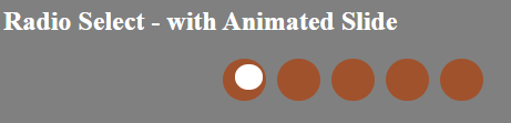
Explanation: In the above example, we have created the animated slide with the radio buttons. We apply transition effects to the radio buttons to create a smooth transition when moving to the next button. The code uses at-rule @keyframes to manage the steps required in a CSS animation process by specifying keyframe styles. The @keyframes rule stipulates the code for the animation. The id ‘slider’ uses to define transition and animation effects.
Advantages
Some of the advantages of the radio button are:
- When you need to allow only one selection, you design radio buttons to display lists of multiple items.
- The information is generally more accurate with radio buttons than with open-ended inputs like text boxes.
- The user checks the option with ease and speed.
Conclusion
So far, we have observed that the radio button is a crucial input control that can be used interchangeably when the user requires input. To improve the user experience of the form, it is very essential to have proper controls for taking input from the user. By definition, radio buttons always have precisely one preference, and you should not view them without a default choice. They use radio buttons to alter settings only, not action buttons to make something occur. The changed settings will not occur until the user clicks the command button.
Recommended Articles
We hope that this EDUCBA information on the “CSS Radio Button” was beneficial to you. You can view EDUCBA’s recommended articles for more information.

