Updated June 27, 2023
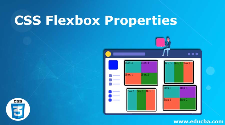
Introduction to CSS Flexbox Properties
The Flexbox structure intends to provide a more effective way of organizing, aligning, and distributing space between elements in a container, even though their size is unspecified or dynamic. The flexbox module typically called the flexbox, has been developed as a one-dimensional layout model and a method to provide space distribution between elements in an application and efficient alignment functionality. In this topic, we are going to learn about CSS Flexbox Properties.
The fundamental idea behind the flex layout is to offer the container the capacity to change the width/height of its items to fill the space best available (often to accommodate display devices and screen sizes of all kinds). If the normal layout is centered on the block and the inline flow directions, then the flex layout will be centered on flex-flow directions.
CSS Flexbox Properties with examples
We will discuss how to use Flexbox properties with the help of examples.
Examples #1 – flex Property
The CSS flex property defines the flexible-length components. i.e., it measures the flexible length of flexible items.
Syntax
flex: [ flex-grow flex-shrink flex-basis] | auto | initial | inherit;Code:
<!DOCTYPE html>
<html>
<head>
<meta http-equiv="Content-Type" content="text/html; charset=windows-1252">
<title> CSS Flexbox Property Example </title>
<style>
.flex-container {
width: 50px;
height: 150px;
font-size: 20px;
display: flex; /* It defines the flex container */
}
.flex-container div {
-webkit-flex: 1; /* This is for safari */
-ms-flex: 1; /* This is for IE 10 */
flex: 1; /* This is standard syntax setting flex to 1*/
}
.class1 {
background: #FF6347;
}
.class2 {
background: #228B22;
}
.class3 {
background: #20B2AA;
}
</style>
</head>
<body><br>
<div class="flex-container">
<div class="class1">EDUCBA</div>
<div class="class2">EDUCBA</div>
<div class="class3">EDUCBA</div>
</div>
</body>
</html>
Output:

In the following examples, use the above steps to display the result of an html page.
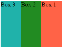
Examples #2 – flex-direction Property
The CSS flex-direction property defines how flex items are positioned in the flex container by specifying the direction of the flex container’s main axis.
Syntax
flex-direction: row | row-reverse | column | column-reverse | initial | inheritCode:
<!DOCTYPE html>
<html>
<head>
<meta http-equiv="Content-Type" content="text/html; charset=windows-1252">
<title> CSS Flexbox Property Example </title>
<style>
.flex-container {
width: 200px;
height: 150px;
font-size: 20px;
display: flex; /* It defines the flex container */
flex-direction: row-reverse; /* CSS property */
}
.flex-container div {
-webkit-flex: 1; /* This is for safari */
-ms-flex: 1; /* This is for IE 10 */
flex: 1; /* This is standard syntax setting flex to 1*/
}
.class1 {
background: #FF6347;
}
.class2 {
background: #228B22;
}
.class3 {
background: #20B2AA;
}
</style>
</head>
<body><br>
<div class="flex-container">
<div class="class1">Box 1</div>
<div class="class2">Box 2</div>
<div class="class3">Box 3</div>
</div>
</body>
</html>
Output:
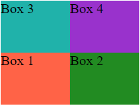
Examples #3 – flex-wrap Property
The CSS flex-wrap property determines whether the flex objects are pushed into a single line or wrapped in several lines or columns depending on the flex container’s available space.
Syntax
flex-wrap: nowrap | wrap | wrap-reverse | initial | inheritCode:
<!DOCTYPE html>
<html>
<head>
<meta http-equiv="Content-Type" content="text/html; charset=windows-1252">
<title> CSS Flexbox Property Example </title>
<style>
.flex-container {
width: 200px;
height: 150px;
font-size: 20px;
display: flex; /* It defines the flex container */
flex-wrap: wrap-reverse; /* CSS property */
}
.flex-container div {
width: 100px;
}
.class1 {
background: #FF6347;
}
.class2 {
background: #228B22;
}
.class3 {
background: #20B2AA;
}
.class4 {
background: #9932CC;
}
</style>
</head>
<body><br>
<div class="flex-container">
<div class="class1">Box 1</div>
<div class="class2">Box 2</div>
<div class="class3">Box 3</div>
<div class="class4">Box 4</div>
</div>
</body>
</html>
Output:
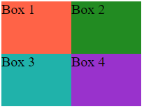
Examples #4 – flex-flow Property
The flex-flow CSS property is simplified for setting individual properties simultaneously as the flex-direction and flex-wrap.
Syntax
flex-flow: [ flex-direction flex-wrap ] | initial | inheritCode:
<!DOCTYPE html>
<html>
<head>
<meta http-equiv="Content-Type" content="text/html; charset=windows-1252">
<title> CSS Flexbox Property Example </title>
<style>
.flex-container {
width: 200px;
height: 150px;
font-size: 20px;
display: flex; /* It defines the flex container */
flex-flow: row wrap; /* CSS property */
}
.flex-container div {
width: 100px;
}
.class1 {
background: #FF6347;
}
.class2 {
background: #228B22;
}
.class3 {
background: #20B2AA;
}
.class4 {
background: #9932CC;
}
</style>
</head>
<body><br>
<div class="flex-container">
<div class="class1">Box 1</div>
<div class="class2">Box 2</div>
<div class="class3">Box 3</div>
<div class="class4">Box 4</div>
</div>
</body>
</html>
Output:
Examples #5 – flex-grow Property
The flex-grow CSS property determines how the flex element in the flex container should expand relative to the other items inside.
Syntax
flex-grow: number | initial | inheritCode:
<!DOCTYPE html>
<html>
<head>
<meta http-equiv="Content-Type" content="text/html; charset=windows-1252">
<title> CSS Flexbox Property Example </title>
<style>
.flex-container {
width: 350px;
height: 150px;
font-size: 20px;
display: flex; /* It defines the flex container */
}
.class1 {
background: #FF6347;
width: 100px;
flex-grow: 4; /* CSS property */
}
.class2 {
background: #228B22;
width: 100px;
flex-grow: 2; /* CSS property */
}
.class3 {
background: #20B2AA;
width: 100px;
flex-grow: 3; /* CSS property */
}
</style>
</head>
<body><br>
<div class="flex-container">
<div class="class1">EDUCBA</div>
<div class="class2">EDUCBA</div>
<div class="class3">EDUCBA</div>
</div>
</body>
</html>
Output:

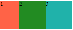
Examples #6 – flex-shrink Property
The flex-shrink CSS property determines how the flex element within the flex container should shrink according to some other elements inside.
Syntax
flex-shrink: number | initial | inheritCode:
<!DOCTYPE html>
<html>
<head>
<meta http-equiv="Content-Type" content="text/html; charset=windows-1252">
<title> CSS Flexbox Property Example </title>
<style>
.flex-container {
width: 250px;
height: 100px;
font-size: 20px;
display: flex; /* It defines the flex container */
}
.class1 {
background: #FF6347;
width: 100px;
flex-shrink: 4; /* CSS property */
}
.class2 {
background: #228B22;
width: 100px;
flex-shrink: 1; /* CSS property */
}
.class3 {
background: #20B2AA;
width: 100px;
flex-shrink: 1; /* CSS property */
}
</style>
</head>
<body><br>
<div class="flex-container">
<div class="class1">1</div>
<div class="class2">2</div>
<div class="class3">3</div>
</div>
</body>
</html>
Output:
Conclusion
In the article, we have discussed flexbox properties in extensive detail to understand better how they function. The Flexbox model best suits an application’s elements and small designs. The flex property is very responsive and comfortable for mobile use. It offers an easy and powerful property to allocate space and coordinate content in ways often needed by web applications and complex web pages.
Recommended Articles
We hope that this EDUCBA information on “CSS Flexbox Properties” was beneficial to you. You can view EDUCBA’s recommended articles for more information.

