Updated June 8, 2023
Overview of CSS Arrow
The arrows that can be created by using CSS are very simple. You can use the CSS Arrow to create a tooltip set. It makes the tooltip a bubble of speech. Arrows can specify how you manipulate them on a website or application by executing specific actions such as “go to next page,” “top or bottom, left or right,” and several others. Using CSS pseudo-elements and borders, it will be easy to build various styles of arrows that look amazing on both desktop and mobile.
You can use the CSS arrows in the following ways:
- Top arrow
- Bottom arrow
- Left arrow
- Right arrow
- Animated arrow
Types of CSS Arrows
We will explain the five types of arrows in CSS below:
1. Top Arrow
When you hover your mouse cursor over the element, you can use the top arrow to apply an arrow-like shape at the top of the tooltip, which will be displayed at the bottom.
Code:
<!DOCTYPE html>
<html>
<head>
<title>Top Arrow</title>
</head>
<style>
.tooltip {
position: relative;
display: inline-block;
border-bottom: 1px dashed grey;
}
.tooltip .tltp_text {
visibility: hidden;
background-color: brown;
color: #fff;
border-radius: 5px;
padding: 6px 0;
position: absolute;
top: 150%;
left: 50%;
margin-left: -70px;
}
.tooltip .tltp_text::after {
content: "";
position: absolute;
bottom: 100%;
left: 50%;
margin-left: -6px;
border-width: 6px;
border-style: solid;
border-color: transparent transparent grey transparent;
}
.tooltip:hover .tltp_text {
visibility: visible;
}
</style>
<body style="text-align:center;">
<h2>Example for Top Arrow</h2>
<p>Move the mouse cursor over the Heading</p>
<div class="tooltip"><strong>Welcome to EDUCBA...</strong>
<span class="tltp_text">EDUCBA is a leading global provider of skill based education addressing the needs 500,000+ members across 40+ Countries.</span>
</div>
</body>
</html>
Output:
- Save the above code on the HTML page and name it according to your choice.
- Open the file in a browser, and it will display the output as shown in the below image.
2. Bottom Arrow
When you hover your mouse cursor over the element, you can use the bottom arrow to apply an arrow-like shape at the bottom of the tooltip, displayed at the top of the element.
Code:
<!DOCTYPE html>
<html>
<head>
<title>Bottom Arrow</title>
</head>
<style>
.tooltip {
position: relative;
display: inline-block;
border-bottom: 1px dashed grey;
}
.tooltip .tltp_text {
visibility: hidden;
background-color: brown;
color: #fff;
border-radius: 5px;
padding: 6px 0;
position: absolute;
bottom: 150%;
left: 50%;
margin-left: -70px;
}
.tooltip .tltp_text::after {
content: "";
position: absolute;
top: 100%;
left: 50%;
margin-left: -6px;
border-width: 6px;
border-style: solid;
border-color: transparent transparent grey transparent;
}
.tooltip:hover .tltp_text {
visibility: visible;
}
</style>
<body style="text-align:center;"><br><br>
<h2>Example for Bottom Arrow</h2>
<p>Move the mouse cursor over the Heading</p>
<div class="tooltip"><strong>Welcome to EDUCBA...</strong>
<span class="tltp_text">EDUCBA is a leading global provider of skill based education addressing the needs 500,000+ members across 40+ Countries.</span>
</div>
</body>
</html>
Output:
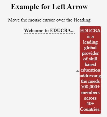
3. Left Arrow
If you push your mouse cursor over the element, the left arrow can apply an arrow-like shape to the left of the tooltip. The tooltip will be shown at the right of the element.
Code:
<!DOCTYPE html>
<html>
<head>
<title>Left Arrow</title>
</head>
<style>
.tooltip {
position: relative;
display: inline-block;
border-bottom: 1px dashed grey;
}
.tooltip .tltp_text {
visibility: hidden;
background-color: brown;
color: #fff;
border-radius: 5px;
padding: 6px 0;
position: absolute;
top: -5px;
left: 110%;
}
.tooltip .tltp_text::after {
content: "";
position: absolute;
top: 50%;
right: 100%;
margin-top: -6px;
border-width: 6px;
border-style: solid;
border-color: transparent transparent grey transparent;
}
.tooltip:hover .tltp_text {
visibility: visible;
}
</style>
<body style="text-align:center;"><br><br>
<h2>Example for Left Arrow</h2>
<p>Move the mouse cursor over the Heading</p>
<div class="tooltip"><strong>Welcome to EDUCBA...</strong>
<span class="tltp_text">EDUCBA is a leading global provider of skill based education addressing the needs 500,000+ members across 40+ Countries.</span>
</div>
</body>
</html>
Output:
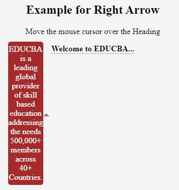
4. Right Arrow
If you push your mouse cursor over the element, the right arrow can apply an arrow-like shape to the right of the tooltip. The tooltip will be shown at the left of the element.
Code:
<!DOCTYPE html>
<html>
<head>
<title>Right Arrow</title>
</head>
<style>
.tooltip {
position: relative;
display: inline-block;
border-bottom: 1px dashed grey;
}
.tooltip .tltp_text {
visibility: hidden;
background-color: brown;
color: #fff;
border-radius: 5px;
padding: 6px 0;
position: absolute;
top: -5px;
right: 110%;
}
.tooltip .tltp_text::after {
content: "";
position: absolute;
top: 50%;
left: 100%;
margin-top: -6px;
border-width: 6px;
border-style: solid;
border-color: transparent transparent grey transparent;
}
.tooltip:hover .tltp_text {
visibility: visible;
}
</style>
<body style="text-align:center;"><br><br>
<h2>Example for Right Arrow</h2>
<p>Move the mouse cursor over the Heading</p>
<div class="tooltip"><strong>Welcome to EDUCBA...</strong>
<span class="tltp_text">EDUCBA is a leading global provider of skill based education addressing the needs 500,000+ members across 40+ Countries.</span>
</div>
</body>
</html>
Output:
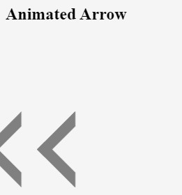
5. Animated Arrow
Code:
<!DOCTYPE html>
<html>
<head>
<title>Animated Arrow</title>
</head>
<style>
#animation_arrow {
width: 75vh;
height: 75vh;
display: flex;
align-items: center;
}
.myarrow {
width: 6vw;
height: 6vw;
border: 2vw solid;
border-color: grey transparent transparent grey;
transform: rotate(-45deg);
}
.sliding_arrow {
position: absolute;
-webkit-animation: slide 3s linear infinite;
animation: slide 3s linear infinite;
}
.animation1 {
-webkit-animation-delay: 1s;
animation-delay: 1s;
}
.animation2 {
-webkit-animation-delay: 2s;
animation-delay: 2s;
}
.animation3 {
-webkit-animation-delay: 3s;
animation-delay: 3s;
}
@-webkit-keyframes slide {
0% { opacity:0; transform: translateX(15vw); }
20% { opacity:1; transform: translateX(9vw); }
80% { opacity:1; transform: translateX(-9vw); }
100% { opacity:0; transform: translateX(-15vw); }
}
@keyframes slide {
0% { opacity:0; transform: translateX(15vw); }
20% { opacity:1; transform: translateX(9vw); }
80% { opacity:1; transform: translateX(-9vw); }
100% { opacity:0; transform: translateX(-15vw); }
}
</style>
<body style="text-align:left;">
<h2>Animated Arrow</h2>
<div id="animation_arrow">
<div class="sliding_arrow">
<div class="myarrow"></div>
</div>
<div class="sliding_arrow animation1">
<div class="myarrow"></div>
</div>
<div class="sliding_arrow animation2">
<div class="myarrow"></div>
</div>
<div class="sliding_arrow animation3">
<div class="myarrow"></div>
</div>
</div>
</body>
</html>
Output:
Conclusion – CSS Arrow
So far, we have studied various CSS arrows that can easily fit inside a website or an application. Using the CSS pseudo-elements and borders, we can quickly create arrows that look great on desktops and mobiles. Try creating with the above code snippets; you will have better insights into these arrows.
Recommended Articles
We hope that this EDUCBA information on “CSS Arrow” was beneficial to you. You can view EDUCBA’s recommended articles for more information.

