Excel Combination Charts (Tables of Contents)
Combination Chart in Excel
In Excel, we have the Combo Chart option, which can club two chart types, Column Clusters Chart and Line Chart, to get valuable output, but for this, we must have 2 data set values that we can plot on. First, create a Combo Chart, select the data we want to plot, and then choose Combo chart type from the Insert menu section. There we can find a Combo chart of Column – Line, Column Cluster – Line, and with Area Chart type. Under the Recommended Chart option, we can even change the type axis for any of the data we have selected, and also we can change the type of Chart type.
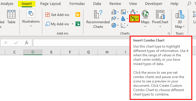
Combination charts are not inbuilt into Excel 2007 and earlier versions. Combo Charts is an in-built tool from Excel 2013 onwards. You can see the combination chart under the INSERT tab.
Observe the icon of the chart carefully. It has two different charts on it. One is a column chart, and the other is a line chart. So a combination of two different charts is called combination charts in Excel. These charts are very helpful to compare two things at a time.
How to Create a Combination of Charts in Excel?
Excel Combination Charts are very simple and easy to create. Let us now see how to create Combination Charts in Excel with the help of some examples.
Excel Combo Chart – Example #1
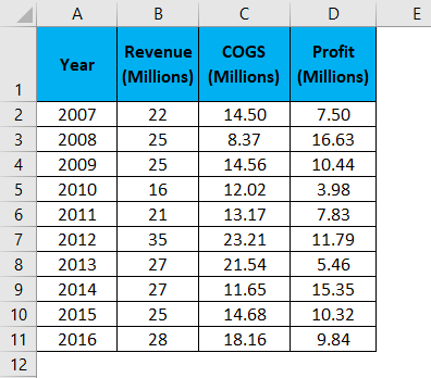
To create an Excel combination chart, I have a few years’ sales, cost, and profit data in an Excel sheet.
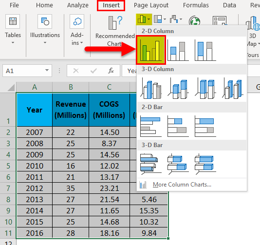
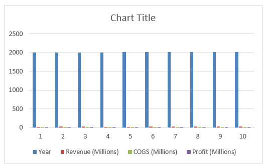
Step 1: Select the entire data range and insert a simple column chart.
Step 2: Now, your chart should look like this.
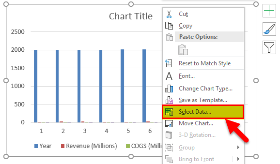
Step 3: Right-click on the chart and select Select Data.
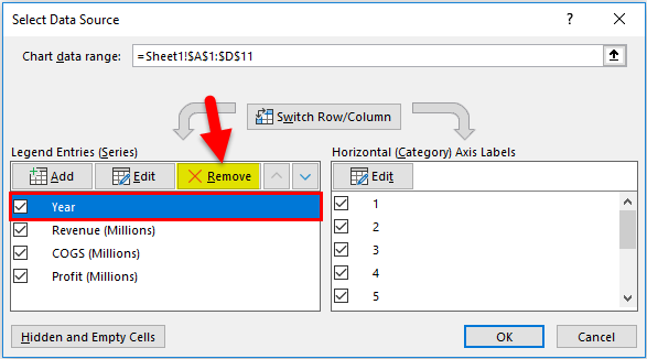
Step 4: First, remove the Year from the below window.
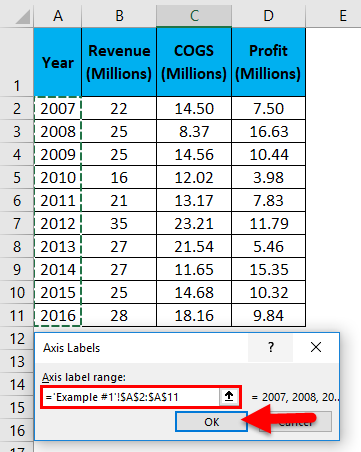
Step 5: Now click on EDIT on the right-hand side, i.e., horizontal axis labels.
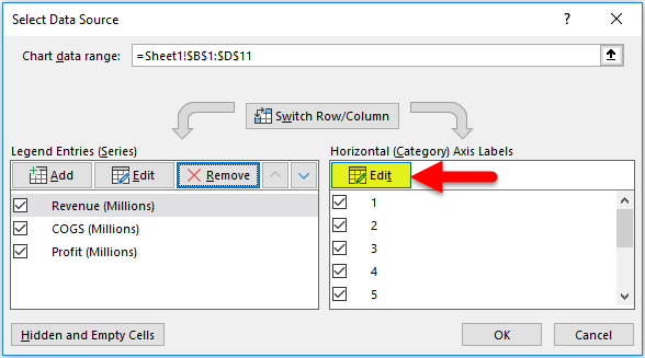
Step 6: Select the Year list here. Click on OK to complete the process.
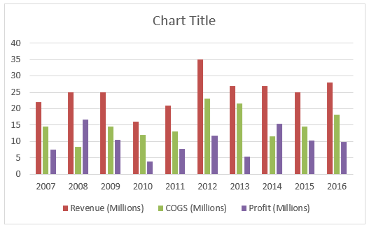
Step 7: Now, your chart should look like this.
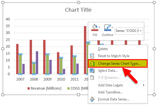
Step 8: Select the bar of COGS. Right-click and select Change Series Chart Type.
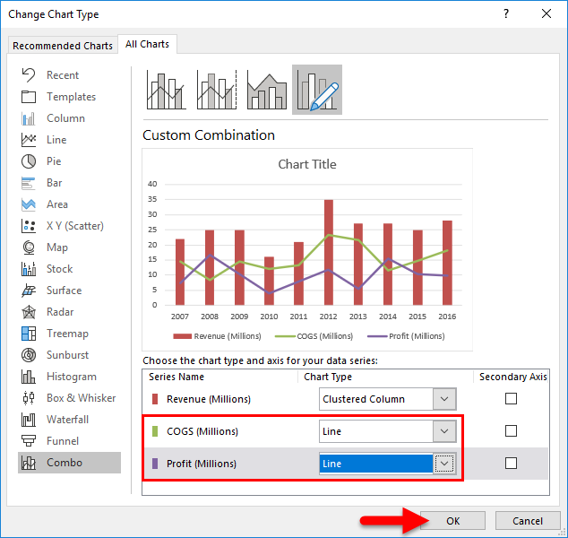
Step 9: Now, you will see the Change Chart Type dialogue box. Here select the option COMBO. (Excel must have selected this option by default).
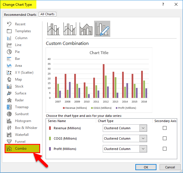
Step 10: In the same window, change the chart type of both COGS & Profit to Line chart as shown in the below image. Click on OK.
Step 11: It will give us the below combination chart.
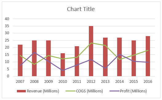
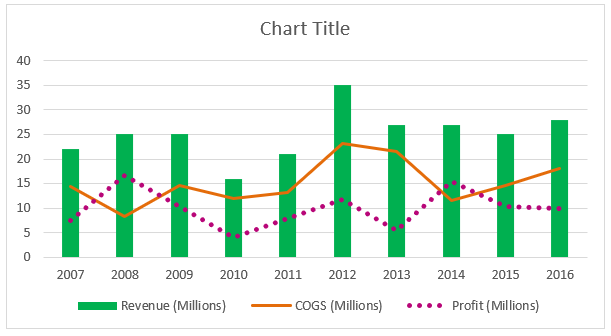
You can change the line and column bar colors according to your wish. I have changed it according to my preferences; combo charts look like this in Excel.
Interpretation of the Chart
Now you must be thinking about the use of the combination chart. Below are some of the important observations of the above chart.
- Sales have fluctuated throughout the last 10 years.
- It reached its peak sale in 2012, i.e., 35 million.
- In terms of profit margin, 2008 had a percentage of 66.50%, which is the highest in terms of percentage.
- From 2013 to 2016, revenue was constant, but profit fluctuated due to variance in COGS. In 2013, COGS is more, and profit came down drastically.
Excel Combo Charts – Example #2
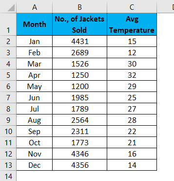
In the previous example, we have seen the combination of sales, COGS, and profit margin. In this example, I will show you the sale of leather jackets in the last 12 months with the temperate data.
Data includes the sales of leather jackets against the average temperature data for the last 12 months. We need to plot a graph, see when the highest sales happened and find the reasons.
Step 1: The dataset should look like this.
Step 2: Select the data and insert a new column chart.
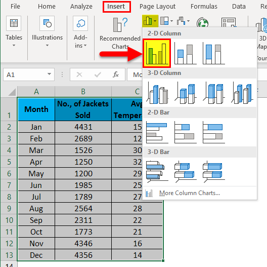
Step 3: Now, your chart should be like this.
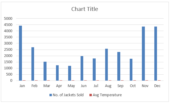
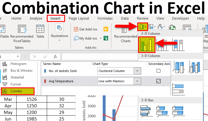
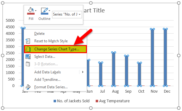
Step 4: Both No. of Jackets sold and the Average Temperature are data plotted as a clustered chart only. Now don’t know where the temperature bar is. To select the column bar, right-click and select Change Series Chart Type.
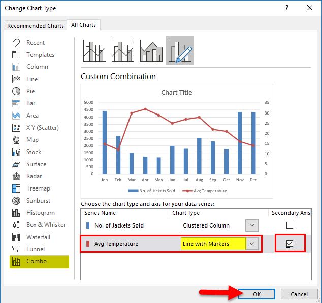
Step 5: Under Combo, change the Avg Temperature chart type to the Line chart, make this a secondary axis, and then Click on Ok to complete the process.
Step 6: We have our combination chart ready.
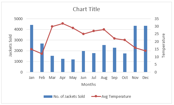
If you notice, we have Vertical axis labels here. Once is representing No. Of Jackets Sold, and the other one is Temperature data. Since we have selected the Temperature chart type as a secondary axis, it has created a new vertical axis.
Interpretation of the Chart
It is clear that as the temperature decreases, the sales of jackets increase. Especially in the months Nov, Dec, Jan, and Feb, the sales of Jackets increased at a good rate. This is because, in those four months, the temperature is 16, 14, 15, and 12, respectively.
You must be thinking of Feb month. Even though the temperature is low compared to the other 3 months, the jacket sale is very low. The reason behind this is that most people are already ready with the jackets by the time temperature reduces to the lowest.
Things to Remember
- A combination chart can interpret two different datasets in Excel.
- The combo Chart shows how one data set impacts the other data set in Excel.
- In case of huge number differentiation, always select any one of the data sets as a secondary axis. Otherwise, it isn’t seeing the differences.
Recommended Articles
This has been a guide to Combination Charts in Excel. Here we discuss how to create Combination Charts in Excel, with examples and a downloadable Excel template. You may also look at these useful charts in Excel –
