Updated June 27, 2023
Introduction to Checkbox CSS
The CSS checkbox selects multiple choices from a list of options at a time. Generally, the checkbox is square with space inside the box. When the user clicks on the box space, it is said to choose is selected. The checkbox is the best choice when someone selects multiple options from the given list. Then this will be the best choice, but in the case of a radio button, Only one radio button can be selected at once.
Real-Time Example: Suppose the particular question has four options in an examination. In that, more questions if more than two options are correct. If we take the general radio button, we can select at a time only one option, but that is not the case. We must select more than two options at a time and use the checkbox to achieve this requirement.
Advantages
More than one option can be selected by using the checkbox.
Types of Checkboxes
There are two types of Checkboxes in CSS
- Default checkboxes
- Custom checkboxes
1. Default checkboxes
The default checkbox is not required to add any additional styles. CSS libraries, by default, provided some styles for this checkbox.
Syntax:
<label>//Write some content here
<input type="checkbox" checked="checked">//checked="checked" will make checkbox checked
</label>
2. Custom checkboxes
This Custom checkbox must require adding additional styles because this is a user-required checkbox, so they have to provide CSS styles based on their requirement.
Syntax:
<style>
CSS Styles
/* topClass class styles*/
.topClass {
display: block;
cursor: pointer;
font-size: 22px;
-webkit-user-select: none;
-moz-user-select: none;
-ms-user-select: none;
user-select: none;
position: relative;
padding-left: 35px;
margin-bottom: 12px;
}
/* Hidden the default check box*/
.topClass input {
position: absolute;
cursor: pointer;
height: 0;
width: 0;
opacity: 0;
}
/* creating user custom contentMark */
.contentMark {
position: absolute;
height: 25px;
width: 25px;
background-color: #eee;
top: 0;
left: 0;
}
/* when hover the mouse green color will be added */
.topClass:hover input ~ . contentMark {
background-color: green;
}
/* When the checkbox is checked, add a blue background */
.toClass input:checked ~ . contentMark {
background-color: blue;
}
/* create checkmark, initially hidden if we not check*/
.contentMark:after {
position: absolute;
display: none;
content: "";
}
/* checked and showed if we check the box */
.topClass input:checked ~ . contentMark:after {
display: block;
}
/*It styles the contentMark class indicator */
.topClass. contentMark:after {
left: 9px;
top: 5px;
width: 5px;
-ms-transform: rotate(45deg);
border-width: 0 3px 3px 0;
-webkit-transform: rotate(45deg);
transform: rotate(45deg);
height: 10px;
border: solid white;
}
</style>
HTML Code:
<label class="topClass">First Question
<input type="checkbox" checked="checked">
<span class="contentMark"></span>
</label>
Examples of Checkbox CSS
Here are the following examples:
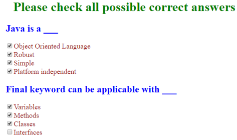
Example #1
Default checkbox with Question and Answer
Code:
<!DOCTYPE html>
<html>
<title>CSS checkbox</title>
<head>
<style>
h1
{
color: green;
text-align: center;
}
h2
{
color:blue;
}
label
{
color: brown;
font-size: 18px;
}
</style>
</head>
<body>
<h1>Please check all possible correct answers</h1>
<h2>Java is a ___</h2>
<label>
<input type="checkbox">Object Oriented Language
</label>
<br>
<label>
<input type="checkbox">Robust
</label>
<br>
<label>
<input type="checkbox">Simple
</label>
<br>
<label>
<input type="checkbox">Platform independent
</label>
<br>
<h2>Final keyword can be applicable with ___</h2>
<label>
<input type="checkbox">Variables
</label>
<br>
<label>
<input type="checkbox">Methods
</label>
<br>
<label>
<input type="checkbox">Classes
</label>
<br>
<label>
<input type="checkbox">Interfaces
</label>
</body>
</html>
Output:
Example #2
Custom checkbox with Question and Answer:
Code:
<!DOCTYPE html>
<html>
<style>
h1 {
color: green;
text-align: center;
}
h2 {
color: blue;
}
label {
color: brown;
font-size: 18px;
}
/* The labelClass */
.labelClass {
display: block;
position: relative;
padding-left: 36px;
margin-bottom: 13px;
-webkit-user-select: none;
-moz-user-select: none;
-ms-user-select: none;
user-select: none;
cursor: pointer;
-moz-user-select: none;
-ms-user-select: none;
user-select: none;
cursor: pointer;
font-size: 23px;
}
/* Hide the browser's default checkbox */
.labelClass input {
position: absolute;
height: 0;
width: 0;
opacity: 0;
cursor: pointer;
width: 0;
}
/* Create a custom checkbox */
.checkmark {
position: absolute;
top: 0;
height: 24px; width : 24px; background-color : pink;
left: 0;
width: 24px;
background-color: pink;
}
/* On mouse-over, add a grey background color */
.labelClass:hover input ~ .checkmark {
background-color: gray;
}
/* When the checkbox is checked, add a blue background */
.labelClass input:checked ~ .checkmark {
background-color: brown;
}
/* Create the checkmark/indicator (hidden when not checked) */
.checkmark:after {
content: "";
position: absolute;
display: none;
}
/* Show the checkmark when checked */
.labelClass input:checked ~ .checkmark:after {
display: block;
}
/* Style the checkmark/indicator */
.labelClass .checkmark:after {
left: 10px;
top: 6px;
-webkit-transform: rotate(46deg);
-ms-transform : rotate( 46deg);
transform : rotate( 46deg);
width: 6px;
height: 11px;
border: solid white;
border-width: 0 2px 2px 0;
-ms-transform: rotate(46deg);
transform: rotate(46deg);
}
</style>
<body>
<h1>Please check all possible correct answers</h1>
<h2>Java is a ___</h2>
<label class="labelClass"> <input type="checkbox">Object
Oriented Language <span class="checkmark"></span>
</label>
<br>
<label class="labelClass"> <input type="checkbox">Robust
<span class="checkmark"></span>
</label>
<br>
<label class="labelClass"> <input type="checkbox">Simple
<span class="checkmark"></span>
</label>
<br>
<label class="labelClass"> <input type="checkbox">Platform
independent <span class="checkmark"></span>
</label>
<br>
<h2>Final keyword can be applicable with ___</h2>
<label class="labelClass"> <input type="checkbox">Variables
<span class="checkmark"></span>
</label>
<br>
<label class="labelClass"> <input type="checkbox">Methods
<span class="checkmark"></span>
</label>
<br>
<label class="labelClass"> <input type="checkbox">Classes
<span class="checkmark"></span>
</label>
<br>
<label class="labelClass"> <input type="checkbox">Interfaces
<span class="checkmark"></span>
</label>
</body>
</html>
Output:
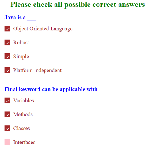
Explanation: Example 1 has no styles, whereas in Example 2, we have a Custom checkbox with styles that make the font and checkbox beautiful.
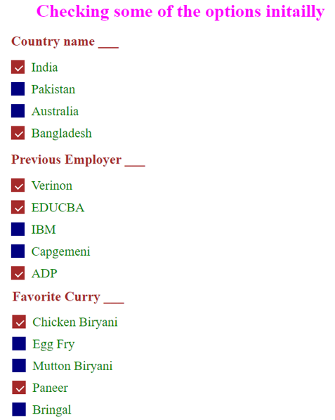
Example #3
Auto Select Items
Code:
<!DOCTYPE html>
<html>
<style>
h1 {
color: fuchsia;
text-align: center;
}
h2 {
color: brown;
}
label {
color: green;
font-size: 18px;
}
/* The labelClass */
.labelClass {
display: block;
position: relative;
padding-left: 36px;
margin-bottom: 13px;
-webkit-user-select: none;
-moz-user-select: none;
-ms-user-select: none;
user-select: none;
cursor: pointer;
-moz-user-select: none;
-ms-user-select: none;
user-select: none;
cursor: pointer;
font-size: 23px;
}
/* Hide the browser's default checkbox */
.labelClass input {
position: absolute;
height: 0;
width: 0;
opacity: 0;
cursor: pointer;
width: 0;
}
/* Create a custom checkbox */
.checkmark {
position: absolute;
top: 0;
height: 24px; width : 24px; background-color : orange;
left: 0;
width: 24px;
background-color: navy;
}
/* On mouse-over, add a grey background color */
.labelClass:hover input ~ .checkmark {
background-color: gray;
}
/* When the checkbox is checked, add a blue background */
.labelClass input:checked ~ .checkmark {
background-color: brown;
}
/* Create the checkmark/indicator (hidden when not checked) */
.checkmark:after {
content: "";
position: absolute;
display: none;
}
/* Show the checkmark when checked */
.labelClass input:checked ~ .checkmark:after {
display: block;
}
/* Style the checkmark/indicator */
.labelClass .checkmark:after {
left: 10px;
top: 6px;
-webkit-transform: rotate(46deg);
-ms-transform : rotate( 46deg);
transform : rotate( 46deg);
width: 6px;
height: 11px;
border: solid white;
border-width: 0 2px 2px 0;
-ms-transform: rotate(46deg);
transform: rotate(46deg);
}
</style>
<body>
<h1>Checking some of the options initailly </h1>
<h2>Country name ___</h2>
<label class="labelClass"> <input type="checkbox" checked="checked">India
<span class="checkmark"></span>
</label>
<br>
<label class="labelClass"> <input type="checkbox">Pakistan
<span class="checkmark"></span>
</label>
<br>
<label class="labelClass"> <input type="checkbox">Australia
<span class="checkmark"></span>
</label>
<br>
<label class="labelClass"> <input type="checkbox" checked="checked">Bangladesh
<span class="checkmark"></span>
</label>
<br>
<h2>Previous Employer ___</h2>
<label class="labelClass"> <input type="checkbox" checked="checked">Verinon
<span class="checkmark"></span>
</label>
<br>
<label class="labelClass"> <input type="checkbox" checked="checked">EDUCBA
<span class="checkmark"></span>
</label>
<br>
<label class="labelClass"> <input type="checkbox">IBM
<span class="checkmark"></span>
</label>
<br>
<label class="labelClass"> <input type="checkbox">Capgemeni
<span class="checkmark"></span>
</label>
<label class="labelClass"> <input type="checkbox" checked="checked">ADP
<span class="checkmark"></span>
</label>
<h2>Favorite Curry ___</h2>
<label class="labelClass"> <input type="checkbox" checked="checked">Chicken Biryani
<span class="checkmark"></span>
</label>
<br>
<label class="labelClass"> <input type="checkbox">Egg Fry
<span class="checkmark"></span>
</label>
<br>
<label class="labelClass"> <input type="checkbox">Mutton Biryani
<span class="checkmark"></span>
</label>
<br>
<label class="labelClass"> <input type="checkbox" checked="checked">Paneer
<span class="checkmark"></span>
</label>
<label class="labelClass"> <input type="checkbox">Bringal
<span class="checkmark"></span>
</label>
</body>
</html>
Output:
Conclusion
CSS checkbox can be created by using default styles and custom styles. The default checkbox does not have a rich GUI, whereas the custom checkbox has a rich GUI. You can select multiple items at a time in the checkbox. Initially, we can also auto-check any choice number of checkboxes.
Recommended Articles
We hope that this EDUCBA information on “Checkbox CSS” was beneficial to you. You can view EDUCBA’s recommended articles for more information.

