Introduction to Bootstrap List Group
We all know the struggle. You’ve meticulously crafted a website or app brimming with valuable information. But then, it hits you – a content avalanche! Lists sprawl endlessly, drowning your visitors in a sea of text. Fear not, intrepid developer, for there’s a hero in your midst: the Bootstrap List Group. This powerful tool is here to rescue you, empowering you to regain control over your content and present it in a more organized and visually appealing manner.
This isn’t your average, run-of-the-mill list. The Bootstrap List Group is a UI (User Interface) component specifically designed to corral information into neat, digestible chunks. It is a versatile component of the Bootstrap framework that allows web developers to create organized and visually appealing lists. It provides an efficient way to display content in a structured manner, making it convenient for users to navigate and comprehend information on a webpage. It boasts a clean aesthetic, responsive design, and a surprising amount of flexibility, making it a developer’s dream come true.
But wait, there’s more! This article will explain what a Bootstrap List Group is and how it works and equip you with the knowledge to unleash its full potential. So, grab your metaphorical lasso because we’re about to wrangle that information beast into submission!
Table of Contents:
Why is Bootstrap List Group Important for Web Development?
Bootstrap List Group is essential for web development because it simplifies the creation of well-designed and responsive lists. With Bootstrap List Group, developers can save time and effort in implementing complex styling and functionality, as it comes with predefined classes and features. It allows developers to focus on the user experience and content organization rather than spending excessive time on the technical aspects of list creation.
Benefits of Utilizing Bootstrap List Group in Web Design
There are several benefits of utilizing Bootstrap List Group in web design:
- Efficiency: Bootstrap List Group provides a streamlined way to create lists, reducing development time and effort. The pre-built classes and components make implementing and customizing lists according to specific requirements easy.
- Consistency: Using Bootstrap List Group, web developers can guarantee consistency in the design and layout of lists throughout a website or web application. It promotes a unified and professional appearance, enhancing the overall user experience.
- Responsiveness: Mobile-first Bootstrap List Group is optimized for different screen sizes and devices and is designed for practical use on various mobiles. It ensures that lists created with Bootstrap List Group will look and function well on desktop computers, tablets, and smartphones.
- Customizability: Despite its ease of use, Bootstrap List Group offers a high level of customization. Web developers can modify the appearance and behavior of lists by applying their own CSS styles or leveraging the various classes and options provided by Bootstrap List Group.
Step-by-step Instructions on Including Bootstrap List Group in Your Project
Download Bootstrap:
- Visit the official Bootstrap website at https://getbootstrap.com/.
- On the page, click the “Download” button.
- Download the compiled CSS and JavaScript files or utilize the Bootstrap CDN (Content Delivery Network).
Link Bootstrap CSS and JavaScript Files:
- Extract the downloaded Bootstrap package if you opted for the compiled files.
- Make a folder named “css” in your project directory and move the “bootstrap.min.css” file into it.
- Similarly, create a folder named “js” and move the “bootstrap.bundle.min.js” file into it.
- In the <head> section of your HTML file, add the following line to link the Bootstrap CSS file:
<link rel="stylesheet" href="css/bootstrap.min.css">- Place the following line before the closing </body> tag to link the Bootstrap JavaScript file:
<script src="js/bootstrap.bundle.min.js"></script>CDN for Bootstrap CSS:
- The Bootstrap CSS file is linked using a CDN URL within the <head> section of the HTML document.
- In the example,
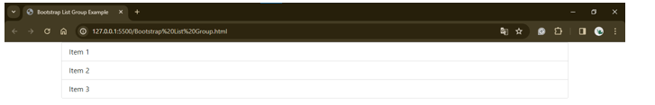
<link href="https://cdn.jsdelivr.net/npm/[email protected]/dist/css/bootstrap.min.css" rel="stylesheet">Example 1: Basic HTML structure for creating a List Group using Bootstrap
Code:
<!DOCTYPE html>
<html lang="en">
<head>
<meta charset="UTF-8">
<meta name="viewport" content="width=device-width, initial-scale=1.0">
<title>Bootstrap List Group Example</title>
<link href="https://cdn.jsdelivr.net/npm/[email protected]/dist/css/bootstrap.min.css" rel="stylesheet">
</head>
<body>
<div class="container">
<ul class="list-group">
<li class="list-group-item">Item 1</li>
<li class="list-group-item">Item 2</li>
<li class="list-group-item">Item 3</li>
</ul>
</div>
<script src="https://cdn.jsdelivr.net/npm/[email protected]/dist/js/bootstrap.bundle.min.js"></script>
</body>
</html>
Output:
Explanation:
<ul> Element:
- The <ul> element creates an unordered list, which serves as the container for the list group items.
class=”list-group”:
- This class is a Bootstrap-specific class that styles the <ul> element as a list group.
List Group Items (<li> Elements):
- Inside the <ul> element, each list item (<li>) represents an item in the list group.
- Each <li> element has the class list-group-item, which applies Bootstrap’s default styling to the list item.
Bootstrap CSS and JS:
- In the <head> section of the HTML document, you include the Bootstrap CSS file from a CDN (Content Delivery Network) to apply Bootstrap’s styling to your list group.
- Optionally, you can include the Bootstrap JavaScript file before the closing </body> tag to enable advanced functionality (e.g., collapsible list groups, modals).
Container (<div class=”container”>):
- The .container class from Bootstrap centers the content horizontally within the browser window. It is optional but recommended for better layout control.
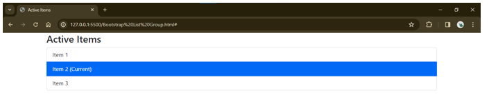
Example 2: Active Item in a List
Code:
<!DOCTYPE html>
<html lang="en">
<head>
<meta charset="UTF-8">
<meta name="viewport" content="width=device-width, initial-scale=1.0">
<title>Active Items</title>
<link href="https://cdn.jsdelivr.net/npm/[email protected]/dist/css/bootstrap.min.css" rel="stylesheet">
</head>
<body>
<div class="container">
<h3>Active Items</h3>
<ul class="list-group">
<li class="list-group-item">Item 1</li>
<li class="list-group-item active">Item 2 (Current)</li>
<li class="list-group-item">Item 3</li>
</ul>
<script src="https://cdn.jsdelivr.net/npm/[email protected]/dist/js/bootstrap.bundle.min.js"></script>
</body>
</html>
Output:
Explanation:
Highlights the currently selected item using the active class
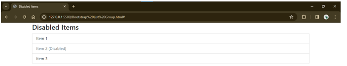
Example 3: Disabled Item in a List
Code:
<!DOCTYPE html>
<html lang="en">
<head>
<meta charset="UTF-8">
<meta name="viewport" content="width=device-width, initial-scale=1.0">
<title>Disabled Items</title>
<link href="https://cdn.jsdelivr.net/npm/[email protected]/dist/css/bootstrap.min.css" rel="stylesheet">
</head>
<body>
<div class="container">
<h3>Disabled Items</h3>
<ul class="list-group">
<li class="list-group-item">Item 1</li>
<li class="list-group-item disabled">Item 2 (Disabled)</li>
<li class="list-group-item">Item 3</li>
</ul>
<script src="https://cdn.jsdelivr.net/npm/[email protected]/dist/js/bootstrap.bundle.min.js"></script>
</body>
</html>
Output:
Explanation:
Indicate unavailable options with the disabled class.
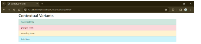
Example 4: Contextual Variants
Code:
<!DOCTYPE html>
<html lang="en">
<head>
<meta charset="UTF-8">
<meta name="viewport" content="width=device-width, initial-scale=1.0">
<title>Contextual Variants</title>
<link href="https://cdn.jsdelivr.net/npm/[email protected]/dist/css/bootstrap.min.css" rel="stylesheet">
</head>
<body>
<div class="container">
<h3>Contextual Variants</h3>
<ul class="list-group">
<li class="list-group-item list-group-item-success">Success Item</li>
<li class="list-group-item list-group-item-danger">Danger Item</li>
<li class="list-group-item list-group-item-warning">Warning Item</li>
<li class="list-group-item list-group-item-info">Info Item</li>
</ul>
<script src="https://cdn.jsdelivr.net/npm/[email protected]/dist/js/bootstrap.bundle.min.js"></script>
</body>
</html>
Output:
Explanation:
Add color and meaning with contextual classes like Success, Danger, Warning, etc.
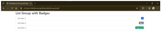
Example 5: Using Badges
Code:
<!DOCTYPE html>
<html lang="en">
<head>
<meta charset="UTF-8">
<meta name="viewport" content="width=device-width, initial-scale=1.0">
<title>Bootstrap List Group with Badges</title>
<link href="https://cdn.jsdelivr.net/npm/[email protected]/dist/css/bootstrap.min.css" rel="stylesheet">
</head>
<body>
<div class="container">
<h3>List Group with Badges</h3>
<ul class="list-group">
<li class="list-group-item d-flex justify-content-between align-items-center">
List item 1
<span class="badge bg-primary">5</span>
</li>
<li class="list-group-item d-flex justify-content-between align-items-center">
List item 2
<span class="badge bg-secondary">New</span>
</li>
<li class="list-group-item d-flex justify-content-between align-items-center">
List item 3
<span class="badge bg-success">Approved</span>
</li>
</ul>
</div>
<script src="https://cdn.jsdelivr.net/npm/[email protected]/dist/js/bootstrap.bundle.min.js"></script>
</body>
</html>
Output:
Explanation:
Showing additional information or counting using badge elements
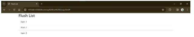
Example 6: Flush List
Code:
<!DOCTYPE html>
<html lang="en">
<head>
<meta charset="UTF-8">
<meta name="viewport" content="width=device-width, initial-scale=1.0">
<title>Flush List</title>
<link href="https://cdn.jsdelivr.net/npm/[email protected]/dist/css/bootstrap.min.css" rel="stylesheet">
</head>
<body>
<div class="container">
<h3>Flush List</h3>
<ul class="list-group list-group-flush">
<li class="list-group-item">Item 1</li>
<li class="list-group-item">Item 2</li>
<li class="list-group-item">Item 3</li>
</ul>
<script src="https://cdn.jsdelivr.net/npm/[email protected]/dist/js/bootstrap.bundle.min.js"></script>
</body>
</html>
Output:
Explanation:
Remove borders and padding for a cleaner look
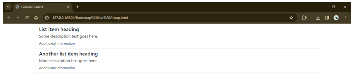
Example 7: Custom Content
Code:
<!DOCTYPE html>
<html lang="en">
<head>
<meta charset="UTF-8">
<meta name="viewport" content="width=device-width, initial-scale=1.0">
<title>Custom Content</title>
<link href="https://cdn.jsdelivr.net/npm/[email protected]/dist/css/bootstrap.min.css" rel="stylesheet">
</head>
<body>
<div class="container">
<ul class="list-group">
<ul class="list-group">
<li class="list-group-item">
<h5 class="mb-1">List item heading</h5>
<p class="mb-1">Some description text goes here.</p>
<small>Additional information</small>
</li>
<li class="list-group-item">
<h5 class="mb-1">Another list item heading</h5>
<p class="mb-1">More description text goes here.</p>
<small>Additional information</small>
</li>
</ul>
</div>
<script src="https://cdn.jsdelivr.net/npm/[email protected]/dist/js/bootstrap.bundle.min.js"></script>
</body>
</html>
Output:
Explanation:
Each list group item contains custom content, including headings (<h5>), descriptions (<p>), and additional information (<small>).
Custom content provides more context and detail about each list item, enhancing the usability and informativeness of the list group.
How do List Groups Adapt to Different Screen Sizes?
Bootstrap’s grid system ensures that list groups effectively adapt to different screen sizes, providing a responsive design. The grid system in Bootstrap allows organizing content into rows and columns. It automatically adjusts the layout, which is based on the screen size, making it ideal for creating responsive web designs.
Responsive Grid Classes
- Bootstrap provides responsive grid classes that define content layout across different screen sizes. These classes include .col, .col-sm, .col-md, .col-lg, and .col-xl, which specify the column width for various breakpoints (small, extra small, medium, large, and extra large screens).
List Group within Grid Columns
- List groups can be placed within grid columns to control their layout and positioning on the page. By wrapping list groups in grid column classes, you can specify how they should behave on different screen sizes.
Grid Breakpoints
- Bootstrap’s grid system defines predefined breakpoints (e.g., small, medium, large) at which it adjusts the content layout. List groups within grid columns can dynamically respond to these breakpoints, ensuring smooth adaptation as the screen size changes.
Example to Demonstrate Grid Size in Bootstrap:
Code:
<!DOCTYPE html>
<html lang="en">
<head>
<meta charset="UTF-8">
<meta name="viewport" content="width=device-width, initial-scale=1.0">
<title>Responsive List Group Example</title>
<link href="https://cdn.jsdelivr.net/npm/[email protected]/dist/css/bootstrap.min.css" rel="stylesheet">
<style>
.list-group-item {
/* Additional custom styling */
background-color: #f8f9fa;
}
</style>
</head>
<body>
<div class="container">
<h3>Responsive List Group Example</h3>
<div class="row">
<div class="col-sm-6">
<ul class="list-group">
<li class="list-group-item">Item 1</li>
<li class="list-group-item">Item 2</li>
<li class="list-group-item">Item 3</li>
</ul>
</div>
<div class="col-sm-6">
<ul class="list-group">
<li class="list-group-item">Item 4</li>
<li class="list-group-item">Item 5</li>
<li class="list-group-item">Item 6</li>
</ul>
</div>
</div>
</div>
<script src="https://cdn.jsdelivr.net/npm/[email protected]/dist/js/bootstrap.bundle.min.js"></script>
</body>
</html>Output:
Explanation:
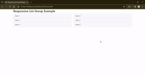
The list groups are placed within grid columns (col-sm-6), ensuring that they occupy half of the container width on small screens and above.
As the screen size increases beyond the small breakpoint (sm), the grid columns adjust their width accordingly, allowing the list groups to resize dynamically.
Best Practices for Using Bootstrap List Groups Effectively
Accessibility:
-
- Keyboard Navigation: Ensure that list group items are keyboard accessible by adding appropriate tabindex attributes and ensuring focus management.
- Contrast and Readability: Maintain enough color contrast between text and background colors to improve readability, especially for visually impaired users.
Responsiveness:
-
- Mobile-first Approach: Design list groups with a mobile-first approach, ensuring they look and function well on smaller screens before scaling to larger screens.
- Responsive Classes: Utilize Bootstrap’s responsive utility classes to control the layout and visibility of list groups across different screen sizes.
- Flexbox Alignment: Use Flexbox utilities (d-flex, justify-content, align-items) to control the alignment and spacing of list group items, especially in horizontal layouts.
Design Principles:
-
- Consistency: Maintain consistent design elements such as typography, spacing, and colors across list group items to provide a cohesive user experience.
- Visual Hierarchy: Use typography, color, and spacing to establish a clear visual hierarchy within list groups, highlighting essential items and distinguishing different sections.
- Whitespace: Use whitespace to improve readability and visual separation between list group items, especially in dense or long lists.
- Feedback and Interactivity: Provide visual feedback (e.g., hover effects, active states) to indicate interactive elements within list groups, improving usability and user engagement
Performance:
-
- Optimize Load Times: Minimize the number of list group items and optimize images and content to improve page load times, especially on mobile devices with a slower internet connections.
- Lazy Loading: Consider lazy loading techniques for dynamically loading list group content as needed, reducing initial page load times and improving performance.
- Code Optimization: Keep the HTML, CSS, and JavaScript code lean and well-structured to reduce unnecessary bloat and improve rendering performance.
Common Pitfalls to Avoid and Suggest Solutions
- Overusing List Groups:
- Pitfall: Including too many items in a list group can overwhelm users, leading to information overload and reduced usability.
- Solution: Break down large lists into smaller, more manageable chunks. Consider implementing pagination, lazy loading, or filtering options to improve navigation and reduce cognitive load.
- Lack of Visual Hierarchy:
- Pitfall: Failing to establish a clear visual hierarchy within list groups can make it difficult for users to prioritize and scan through the content.
- Solution: Use typography, color, and spacing to create a hierarchy of importance within list groups. Emphasize essential items with larger font sizes, bold text, or distinctive colors while de-emphasizing less critical items.
- Non-responsive Design:
- Pitfall: Failing to design list groups with responsiveness can result in poor user experience on various devices and screen sizes.
- Solution: Design list groups with a mobile-first approach, ensuring they look and function well on smaller screens before scaling to larger screens. Use Bootstrap’s responsive utility classes and Flexbox layout to create fluid and adaptable list groups that work across various devices.
Conclusion
Bootstrap List Group is a versatile and indispensable tool in modern web development, offering a wealth of features and customization options to streamline the creation of intuitive and visually appealing user interfaces. Bootstrap List Group empowers developers to structure and present content clearly and engagingly across various website sections, from organizing navigation menus to presenting product lists and blog archives.
FAQs
Q1. What other components can be combined with Bootstrap List Group?
Answer: You can combine various other components and features, such as buttons, dropdowns, forms, and navigation bars, with a Bootstrap List Group of the Bootstrap framework. It enables developers to create interactive and rich interfaces seamlessly integrating different elements.
Q2. Can I change the appearance of the List Group component?
Answer: Yes, Bootstrap List Group provides extensive customization options. By applying custom CSS styles or utilizing the classes and options provided by Bootstrap, developers can modify the appearance, colors, spacing, and other visual aspects of the List Group component to match their design requirements.
Q3. Are there any alternatives to Bootstrap List Group?
Answer: Yes, there are alternatives to Bootstrap List Group, such as using custom CSS or other UI libraries/frameworks like Materialize CSS, Semantic UI, or Foundation. However, Bootstrap List Group offers a convenient and standardized way to create organized lists with built-in styling and functionality. Choose the best option for your project’s requirements and development preferences.
Q4. Are there any JavaScript events available for Bootstrap List Groups?
Answer: Yes, Bootstrap List Groups support various JavaScript events, such as click events for clickable list items (list-group-item-action class) and other interaction events like hover or focus. You can add event handlers to these events to perform actions or trigger functionality in your web application.
Recommended Articles
We hope this EDUCBA information on “Bootstrap List Group” benefited you. You can view EDUCBA’s recommended articles for more information,

