Create a Clean Website Layout in Photoshop – Designing a website layout is more than arranging colorful images and filling some text in the text frames. It is an approach that speaks volumes about your client’s business. The website’s colors and graphics define the nature of the company. In contrast, the website’s design quality and easy navigation flow should tie the user with the organization and turn him into a potential customer.
Designing a good looking and easily accessible website layout is mandatory for every wannabe web designer. This tutorial aims to guide you through the process of creating a simple and clean website layout from scratch. During the process, you will learn important points that will help you gain more knowledge of web design.
Write Down your Requirements Before Designing a Website Layout
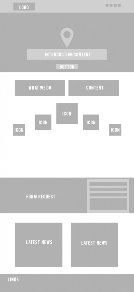
Before you start designing a website layout, you should know how your website will look and what topics you should include in the website. Listing website layout elements your client needs on his website is crucial. Along with that, the quality of a good designer is to prepare a mock of the entire website before he starts working on the final template.
Various designing companies adapt different levels of pre-designing strategies, which may contain wireframing, prototyping, mockup, beta versions, and much more. In this tutorial, we will create a mock-up version before kick-starting the original template design. I am using grey shades, which allow identifying the mockup block.
Canvas
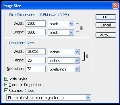
Years ago, when there were limited devices to access websites and few operating systems available, website pages were fixed to one or two sizes in dimensions. Today the scenario is entirely different. End Users access desktop sites of various sizes, mobile phones, iPads, and Tablets. In this diverse situation, you cannot fix your web page to a particular extent. Industry standards dictate specific sizes for every device. You will slowly find your favorite size, or your Client may refer you to a website to mimic the dimensions.
In this case, we are working on the following dimensions. Stay calm about the height, as it will change over time. The more content you add to your website, the more the height will be.
Remember, it is common to scroll down the page vertically, so you may only fix to a particular height for your web page if you want the user to scroll on your homepage as Google does. But, it is necessary not to scroll horizontally. So, limit your width as per the Industry standards, and don’t get creative with the horizontal scrolling.
For the web, the resolution is limited to 72. Higher resolution images and pages have recently been found on iPads and a few tablets. But it is rare, and it is better to stick with 72 considering the internet speed globally.
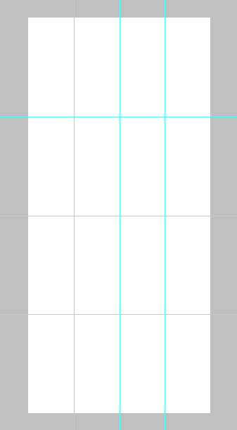
A website should be neatly organized, with every element arranged coherently to each other. And website layout guidelines help you to obtain it easily. Select the files using the Ctrl+A command and draw guides throughout the template.
Get your Mockup Ready
Placing your mockup file on your original template helps you to save ample time. Designing your website becomes so easy that you will complete the framework within a few minutes. However, the mockup will only help you to create the frames. Adding finishing touches to your website’s design, such as type arrangement and alignment, may take longer than creating the layout, but using software to build your website can speed up the process.
Color Scheme and Other Choices
After getting your framework ready, the next thing to do is choose a color scheme. But preparing your colors before you start working on the design is better.
The whole thing boils down to the message that gets your guns ready before you start the design. Everything, including icons, images, and color choices, should be ready before you start working. Organizing and planning your work will save more time and focuses on design without obstruction in between.
Choosing colors can be a designer’s choice if the company is new and has no corporate identity. Clients give an idea of what shades they want the logo or background should be in some cases. Regarding existing companies where you may need to redesign an entire website, you may have to choose the same colors per the client’s needs.
Numerous websites can help you to choose millions of color schemes from the archives. Try out the following websites to enjoy a wide choice of color combinations.
The whole website will be planned with the following color scheme. Here I chose a few shades of blue to use for the website. Remember to choose three or four color combinations, as we don’t know which color the client prefers. Once the client finalizes a color scheme, save the shade values and ensure the colors play a vital role in every vertical of the organization, especially in the corporate identity.
Designing Process
There are many ways to carry on your designers. There are no hard and fast website layout rules to define or follow in the process of designing; it is mostly a process the designer will choose at his convenience.
Some designers want to build the entire blocks and frames and start to work on details in the second stage, followed by the type and, finally, alignments and adjustments. Some like to finish one part of the page at one time and take it to the next part. We are following the second style.
We will finish the website in the following steps
- Header & Footer
- What we do
- Services
- Form
- News
- Footer
Header & Footer
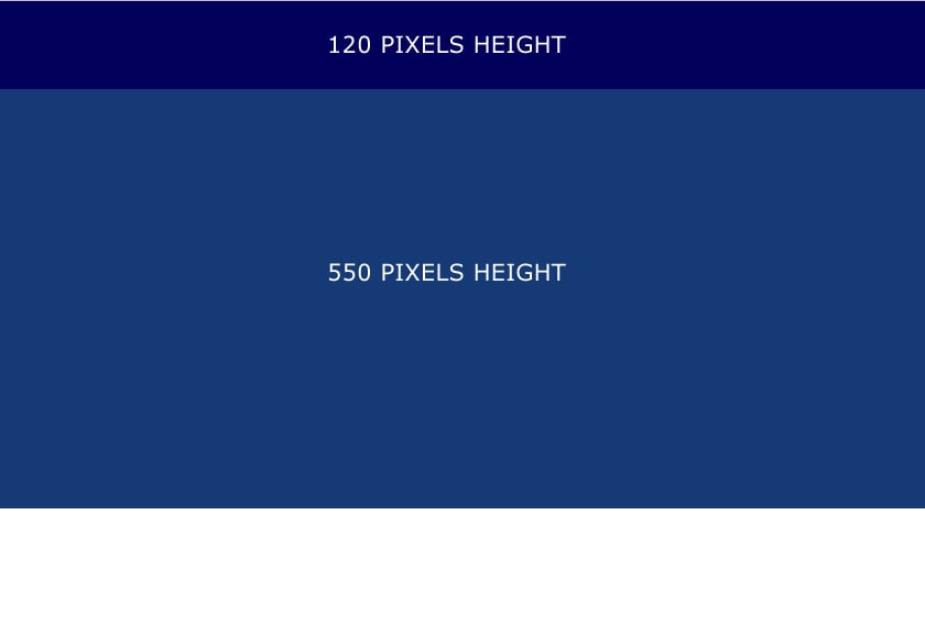
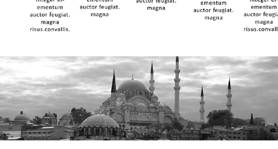
The rule of thumb to define the dimensions of your header or banner is left to your creativity. According to the latest trends, websites appear with a huge image covering your computer screen. The style is called Hero Image, which became quite popular recently.
In this case, we started with 120 pixels height header and a 550 pixels height banner. The width should match the document size.
Designs with solid colors have a flat look which doesn’t go well with larger frames or images. I applied a gradient overlay layer on top of the banner to avoid the matte look. It gives the flag a depth that slowly transforms from one shade to another.
Next, we started to import the Logo and place it on the top left corner of the header and another bigger logo at the center of the banner. You can also observe the website layout vector shapes at the top right corner, which are used to share social media links.
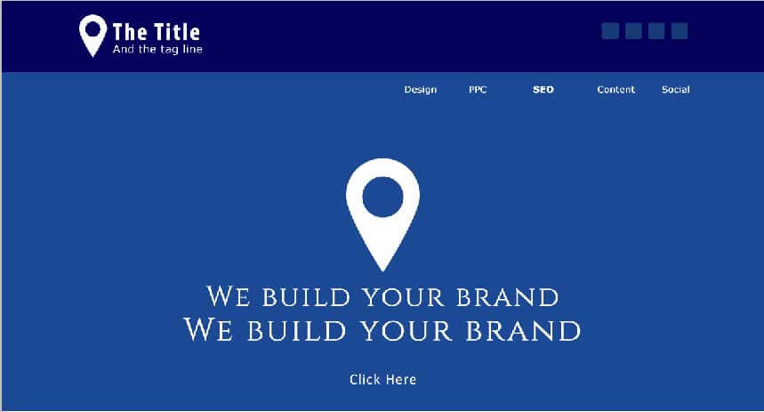
I finished adding the type in the Header & Banner part at this stage. Company name, and brand message, with links and services, are added in the text. You can also observe a transparent button on the Banner.
Check out the vector shape I added to the services links on the top right of the banner. The style is simple, yet it fills the void avoiding the mundane look. Plain text or too much type without special features will spoil the look and feel of your web page; the page will soon bore the user, which may let him leave your site quickly.
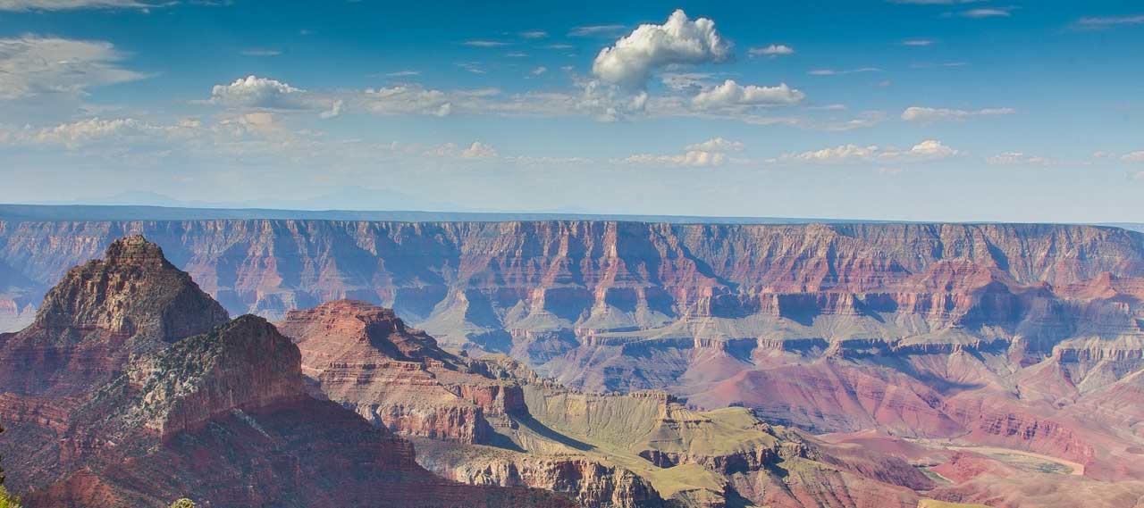
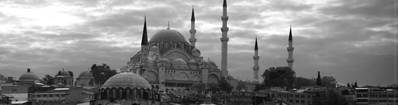
Choose an image appropriate to the business. Millions of stock images are available on the web, and it will take a little time to find an image that fits your requirement.
In my case, I found a high-quality image that will go well with my website. I don’t have a business theme for the website, so I am free to choose any picture that looks good on the banner post.
Try to download some HD images from the free stock image sites given below
www.pixabay.com.
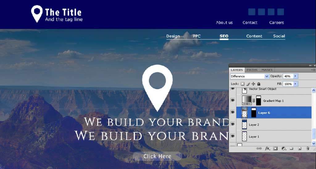
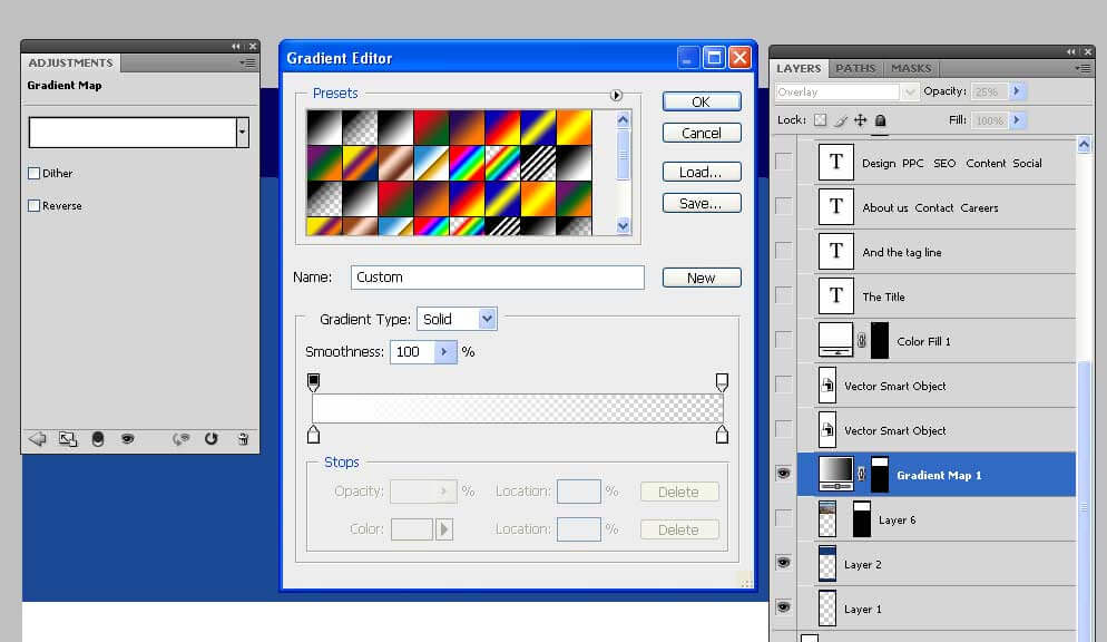
Blending is an art you should master to produce beautiful banners. Here I mixed three layers to achieve the effect shown in the above image. Here is what I did
- Place the image layer on top of the blue color banner
- Place the Gradient overlay above the image
- Change the opacity of the image 40 percent and change the blending mode to difference.
- To understand how the layers are stacked on each other, check the layers palette in the above image.
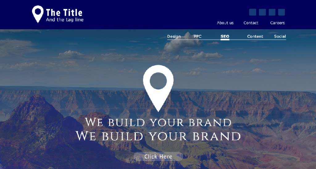
This is how your Header & Banner will look as we just finished working on it. We are working on one part at once, and it is time to move on to the next level.
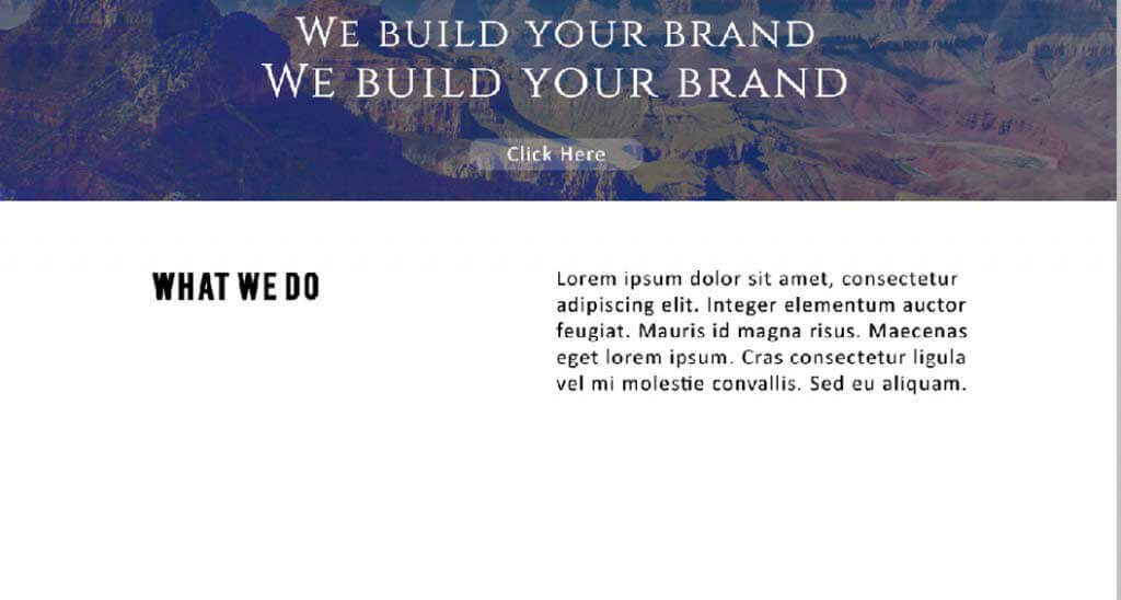
Alignment is crucial when it comes to type; have an idea of how your site should look, and text should be aligned before you start it. At this level, I used two text frames aligned to the left.
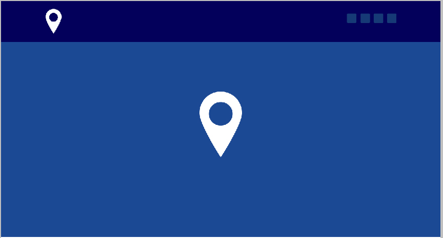
The next step is designing the services part of the web page. I created a metallic star in gray shades to showcase the company’s various services. The intention behind using the star symbol is 5 Star services.
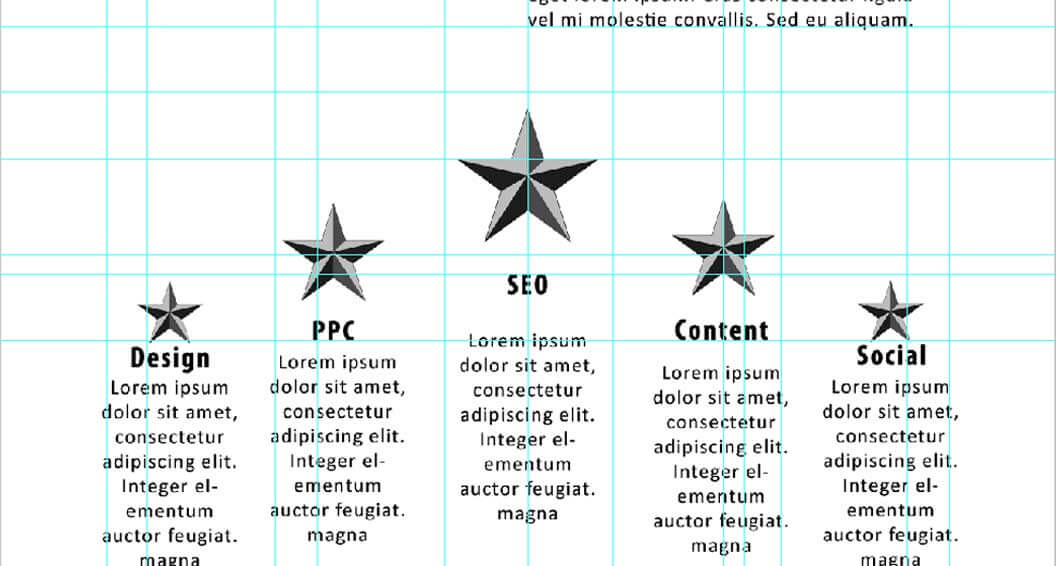
When it comes to aligning the text, Guides are your best friends. Coherency within the type and objects can be obtained using white space and equal gaps between the design elements. I used many website layout Guidelines to see that all things in the frame should maintain proper intervals and distances, which bring out a fair amount of white space.
The next step of our design is to create the Form field. In this case, I am working opposite the method we used to design the banner. We will place the image layer below the solid colored layer and apply a gradient layer on top of the two layers to achieve a better look. Playing with the blending modes is always essential while placing larger images.
The choice of images for this site has no specific theme. This image will help the site look better.
Place the image below the colored background layer. To fix the image exactly to the size of the colored layer, use layer masking options.
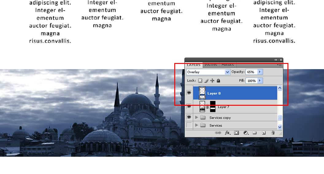
Take a look at the layers palette in the above image. Convert the blending mode to overlay and decrease the opacity to 65 percent of the solid blue-colored layer, which is on top of the image.
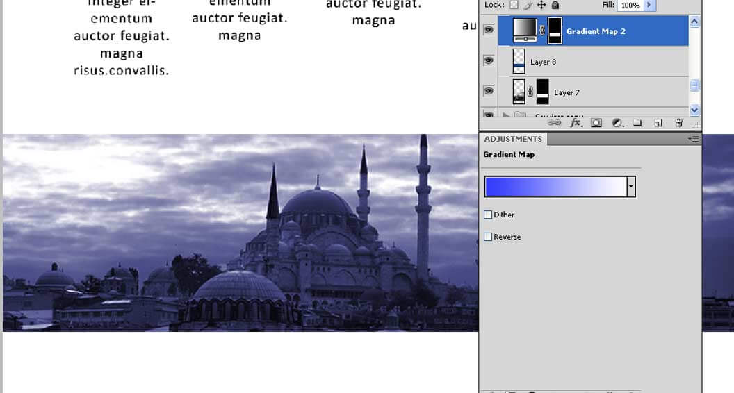
I used the gradient map on top of the two layers. Change the blending mode to hue while keeping the opacity constant.
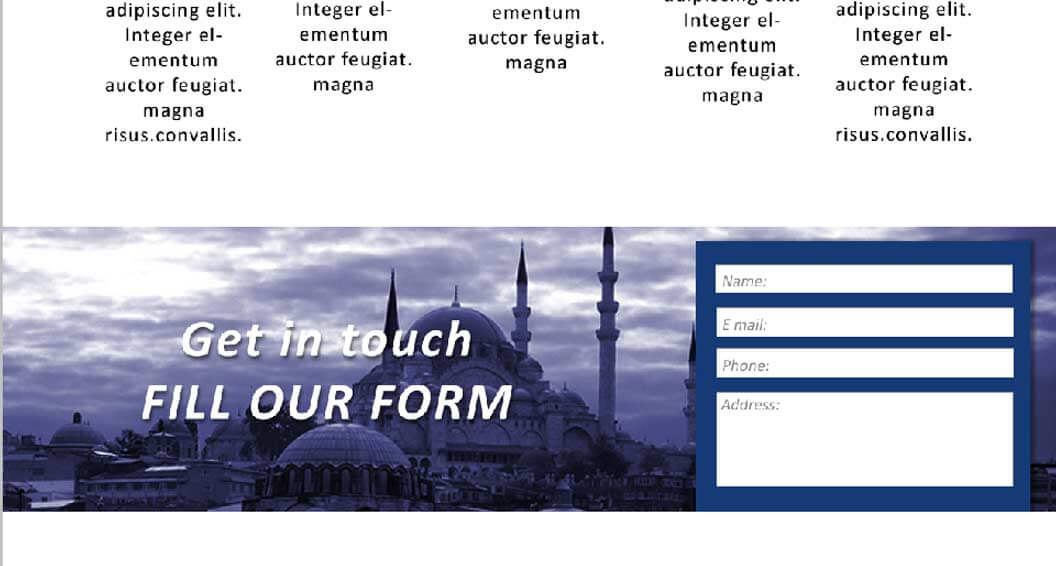
The form box is ready, which brings us to the end of the fourth level in our website design.
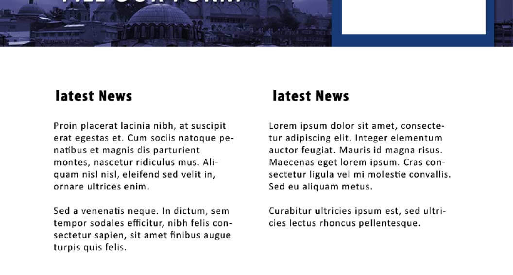
Our next level consists of two simple text frames. It resembles level two of the web page, and I aligned the two boxes similarly to the top. Maintaining coherency in alignment is a good way of using white space.
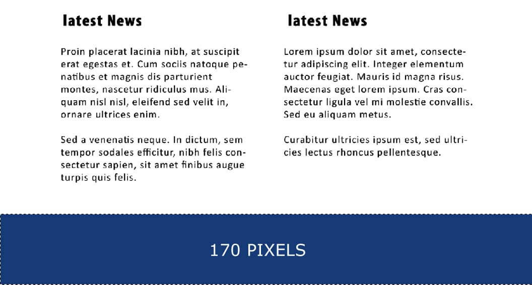
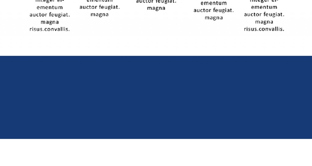
As we reached the final part of the page, it was time to look at the dimensions of the footer again. The width remains the same as the website. The designer has to plan the footer’s height based on the links he should use there. In this case, I gave my footer a size of 170 Pixels.
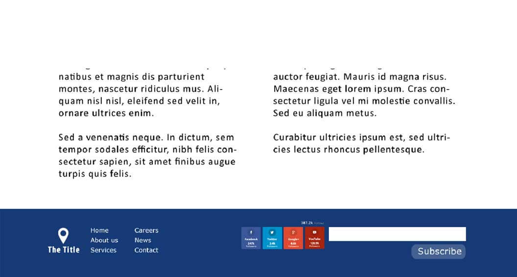
Place the links and images as per your requirement.
With this, we concluded the designing part of our website. The color combinations we used are minimum; we made use of a lot of white space in our design and added simple text with minimum fonts. Our intention is to fulfill the design of a clean web page.
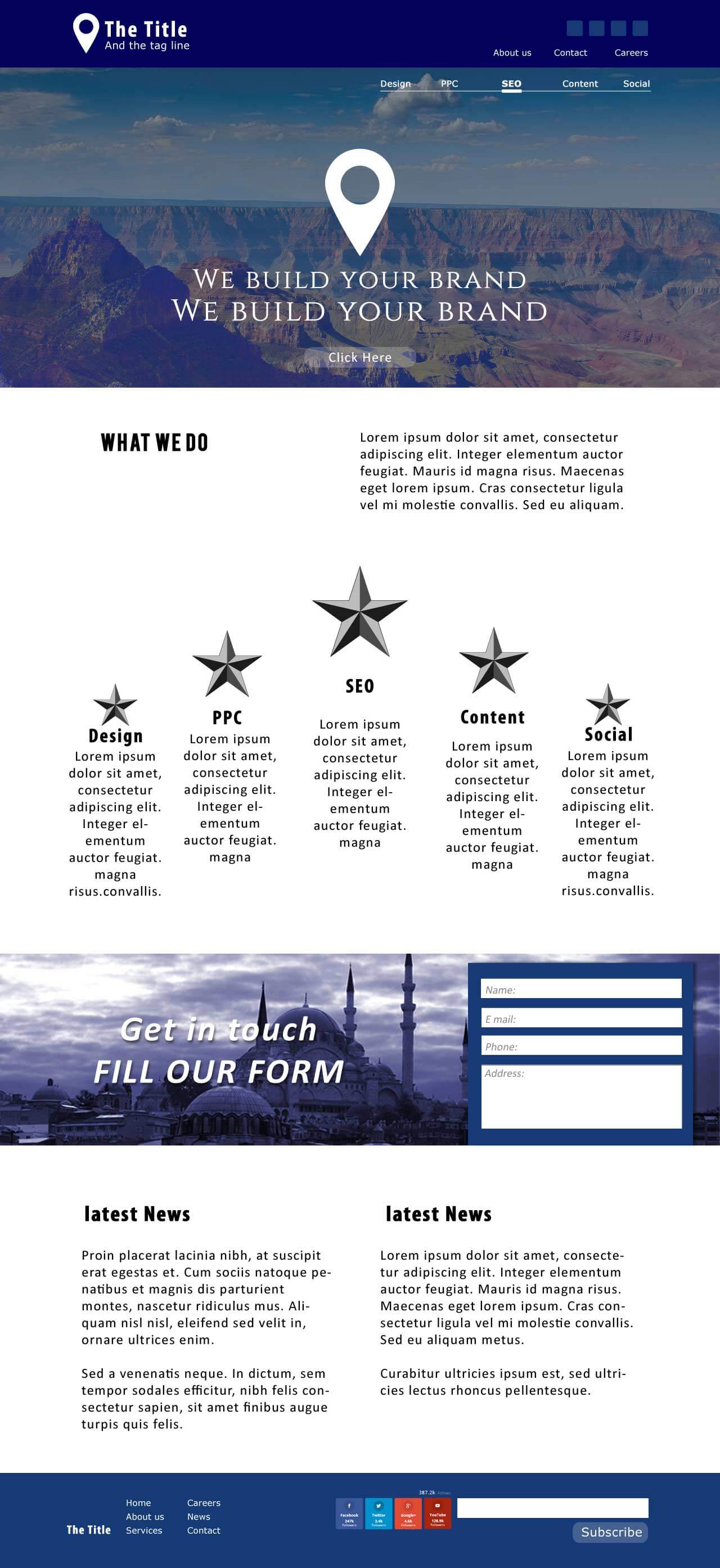
Please look again at the design of the entire page below.

