What is Typography?
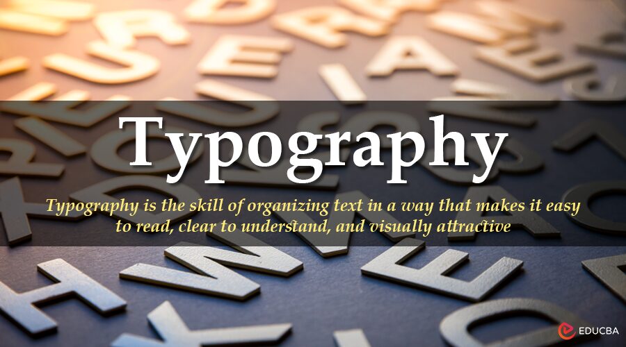
Typography is the skill of organizing text in a way that makes it easy to read, clear to understand, and visually attractive. It includes choosing the right typefaces, setting font sizes and spacing, and arranging the text layout to communicate messages effectively.
When you see a magazine cover, the bold headline uses a large, stylish font to grab attention, while the smaller body text inside is chosen for easy reading. Every type choice, from size to spacing, is an intentional part of typography.
Table of Contents
- Meaning
- History
- Core Elements
- Types
- Functions & Impact
- Role in Design
- Modern Trends
- Best Practices
- Examples
- Design Disciplines
Key Takeaways
- Typography enhances readability and shapes how content is visually perceived.
- A typeface is the overall design; a font is a specific style, weight, and size within it.
- Core elements, such as kerning, leading, tracking, and alignment, impact the text structure.
- Different typography styles (serif, sans-serif, script, etc.) set different tones.
- Typography plays a crucial role in branding, UI/UX design, storytelling, and accessibility.
- Modern trends include variable fonts, animated text, and minimalist designs.
- Effective typography uses clear hierarchy, consistent styles, and accessible spacing.
History of Typography
Typography has a long and transformative journey, evolving in tandem with culture, technology, and the growing need for clear communication. Its development reflects the changing ways humans share knowledge, tell stories, and express identity.
Before 1450: The Manuscript Era
Before the invention of printing, scribes meticulously hand-lettered texts using calligraphy. Religious texts, royal decrees, and scholarly manuscripts were crafted with precision and artistry, often illuminated with decorative flourishes. This era laid the artistic foundations for typography, treating each letter as a work of visual art.
1455: Gutenberg and the Movable Type Revolution
In 1455, Johannes Gutenberg introduced movable type in Europe with the printing of the Gutenberg Bible. This innovation marked the dawn of mass communication. Gutenberg’s blackletter typeface, which imitated the handwriting of scribes, allowed books to be reproduced quickly and consistently, sparking the printing revolution across Europe.
1500s–1700s: The Rise of Old-Style Serifs
As printing matured, type designers like Claude Garamond and William Caslon introduced old-style serif typefaces. These fonts featured bracketed serifs and a slanted axis, improving readability in long-form texts. During this period, typography became crucial for scholarly publishing, political discourse, and the dissemination of religious ideas.
1800s: The Industrial Display Boom
The Industrial Revolution brought technological advancements and urban expansion, creating a need for eye-catching advertising. Typefaces grew bolder and more decorative, giving rise to display type, which is used in posters, signage, and newspapers. Designers like Vincent Figgins developed slab serifs, while letterpress techniques scaled up production.
1900s: The Modernist Shift
In the 20th century, modernist movements, including the Bauhaus and Swiss Design, revolutionized typography. Designers emphasized functionality, clarity, and the use of grid systems. Sans-serif fonts like Helvetica (1957) and Univers (1957) rejected ornamentation in favor of a minimalist approach. Typography has evolved not only into a visual tool but also a core component of modern design philosophy.
2000s–Today: The Digital Typography Era
With the rise of computers, smartphones, and responsive web design, typography entered the digital age. Designers now prioritize readability on screens, web-safe fonts, and dynamic scaling. Variable fonts, responsive grids, and kinetic typography enable interactive and animated type. Today, typography adapts seamlessly across mobile apps, websites, social media, and motion graphics.
Core Elements of Typography
Good typography is not just about picking a nice font — it’s about using key design rules that affect how people read and understand text. Designers utilize a few basic elements to ensure the text appears visually appealing and functions effectively.
1. Typeface vs. Font
Learning typography begins with understanding the distinction between a typeface and a font.
- A typeface refers to the overall look and style of a group of letters, such as Roboto.
- A font is a particular version of a typeface, including details such as weight, style, and size, for example, Roboto Bold Italic at 14pt.
Designers select fonts from a typeface family based on the design’s purpose, the desired tone, and the readability of the text.
2. Kerning
Kerning adjusts the space between individual letters. Proper kerning improves the visual harmony of text, especially in headlines or logos. Without it, words can look awkward or imbalanced.
3. Leading
Leading (pronounced ledding) controls the vertical space between lines of text. Designers use leading to improve legibility and guide the reader’s eye through paragraphs.
4. Tracking
Tracking sets the overall spacing between characters across a word, sentence, or paragraph. While kerning adjusts space between specific pairs, tracking applies to groups of characters.
5. Alignment
Text alignment determines how text aligns within a layout:
- Left-aligned: Common for body text; easy to read.
- Right-aligned: Used for visual effect; harder to read in long form.
- Center-aligned: Common for titles or formal content.
- Justified: Aligns both left and right edges; often seen in newspapers or books.
Choosing the right alignment impacts the tone and readability of the text block.
6. Hierarchy
A typographic hierarchy organizes content by importance, helping readers scan and understand information more efficiently. Designers create hierarchy using size, weight, color, spacing, and positioning.
7. Contrast
Contrast helps differentiate elements and create visual interest. Designers use contrast through:
- Font size (e.g., big vs. small)
- Font weight (e.g., bold vs. regular)
- Color (e.g., black text on white background)
- Typeface pairings (e.g., a serif heading with a sans-serif body)
Strong contrast improves clarity and makes key content stand out, particularly in headlines or calls to action.
Types of Typography
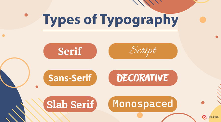
Typography encompasses a range of styles, each with its distinct visual characteristics and emotional connotations. Designers select typography based on the message, medium, and audience. Here are the six major types:
1. Serif Typography
- Traits: Serif fonts feature small decorative strokes, also known as “feet,” at the ends of each letterform. These details help guide the reader’s eye in print and create a formal tone.
- Tone: Traditional, authoritative, trustworthy
- Best Use: Books, newspapers, academic publications, legal documents
- Examples:
- Times New Roman – often used in formal writing and academia.
- Garamond – elegant and historic; excellent for editorial work
- Georgia – designed for readability on screens
2. Sans-Serif Typography
- Traits: These fonts lack serifs, giving them a clean, modern appearance. Sans serifs are highly legible on digital screens and widely used in contemporary design.
- Tone: Modern, minimal, approachable
- Best Use: Websites, user interfaces, mobile apps, branding
- Examples:
- Helvetica – a design classic known for neutrality and clarity
- Arial – widely used as a system default font
- Open Sans – optimized for digital readability
- Roboto – Google’s system font for Android and Material Design
3. Slab Serif Typography
- Traits: Slab serifs have thick, block-like serifs, making them bold and attention-grabbing. They blend the authority of serif fonts with modern impact.
- Tone: Strong, confident, impactful
- Best Use: Posters, headlines, branding with a bold personality
- Examples:
- Rockwell – geometric and strong
- Courier – typewriter style; commonly used in scripts and coding
- Roboto Slab – combines slab strength with digital clarity.
4. Script Typography
- Traits: Script fonts mimic handwritten or calligraphic writing, with flowing, connected strokes. They add a personal and artistic feel to the design.
- Tone: Elegant, romantic, expressive
- Best Use: Invitations, greeting cards, boutique branding, logos
- Examples:
- Pacifico – casual and friendly handwritten style
- Great Vibes – elegant and formal
- Allura – stylish with high legibility for a script
5. Display / Decorative Typography
- Traits: Display fonts are highly stylized and designed for short, impactful text, especially when used in large sizes. These fonts often feature unique shapes, textures, or artistic embellishments.
- Tone: Creative, dramatic, unconventional
- Best Use: Posters, headlines, album covers, event promotions
- Examples:
- Bangers – comic-inspired and bold
- Chiller – horror-themed with jagged strokes
- Jokerman – playful and eccentric, often used for children’s media or parties
6. Monospaced Typography
- Traits: In monospaced fonts, each character takes up the same horizontal space. This creates a rigid, grid-like look often associated with code or technical documents.
- Tone: Functional, neutral, mechanical
- Best Use: Coding interfaces, scripts, tabular data, minimalist layouts
- Examples:
- Courier New – classic typewriter font
- Source Code Pro – designed specifically for developers
- Consolas – clean and easy to read in coding environments
Functions and Impact of Typography
Typography plays multiple functional roles:
1. Enhances Readability
Typography improves Readability by using clear font choices, consistent line spacing, proper kerning, and logical layout structure. When readers encounter well-set text, they absorb information more comfortably and with less fatigue.
2. Creates Visual Rhythm and Flow
Designers use typography to create a visual rhythm, a flow that guides the reader’s eyes smoothly through content. Consistent headings, subheadings, paragraph breaks, and whitespace help users scan and process information efficiently.
3. Influences Mood and Emotion
Typography sets the emotional tone of a design. Typefaces carry personality, whether bold and loud or soft and elegant. These stylistic choices impact how readers perceive the content or brand.
4. Establishes Brand Personality
Typography is a crucial element in defining a brand’s visual identity. By using consistent fonts, brands express their personality and values. The chosen typeface helps communicate the brand’s tone, whether it is reliable, fun, high-end, or forward-thinking.
5. Guides User Flow and Experience
Typography is a key part of UI and UX design. It helps users navigate apps, websites, or digital tools by creating a clear structure and highlighting key elements, such as buttons, links, and instructions.
The Role of Typography in Design
Typography serves as a design language:
1. Branding
Typography helps brands express personality, values, and positioning. The right font choice can convey a brand’s image as luxurious, innovative, casual, or corporate. Designers use consistent typefaces across logos, websites, packaging, and advertising to strengthen recognition.
2. UI/UX Design
Typography plays a central role in user interface (UI) and user experience (UX) design. It directly affects how users navigate digital products, read content, and complete tasks. Good typography improves usability through legibility, hierarchy, and visual structure.
3. Storytelling
Typography amplifies narrative tone and mood. The shape, weight, and movement of text evoke emotion and help align the visual voice with the content’s intention, whether dramatic, lighthearted, mysterious, or professional.
4. Accessibility
Designers utilize typography to make content more readable for all users, including those with visual impairments or reading difficulties. By selecting readable fonts and using proper contrast, spacing, and font sizes, they help ensure the information is accessible to everyone.
Modern Typography Trends
Typography continues to evolve in partnership with technology, culture, and user behavior. Today’s designers incorporate a diverse range of innovative, expressive, and functional trends to keep their designs engaging, readable, and relevant across various platforms.
1. Embracing Variable Fonts
Designers utilize variable fonts to create responsive typography that adapts seamlessly to various screens and design requirements. A single font file can include multiple weights, widths, and slants, giving greater creative control and improving performance.
- Benefits: Reduces file size, improves loading speed, and offers a flexible design that adapts across breakpoints.
- Example: Google’s Roboto Flex allows smooth transitions in weight and stretch across devices.
2. Animating with Kinetic Typography
Kinetic typography introduces motion to letterforms, enhancing storytelling and drawing attention in video content, apps, and websites. Designers animate text to reflect tone, emotion, or pacing, turning static words into dynamic visuals.
- Use Cases: Explainer videos, lyric animations, hero headers, interactive onboarding screens.
- Example: Apple’s product launches often feature subtle text animations to emphasize sleekness and precision.
3. Reviving Retro Fonts
Designers often draw inspiration from the past, utilizing retro-style typefaces from the 1970s, 1980s, and 1990s to evoke nostalgia, personality, and a sense of cultural flair. These fonts are playful and expressive, often combining bold shapes with vintage aesthetics.
- Popular Retro Fonts: Cooper Black, Balloon, ITC Benguiat (used in Stranger Things).
- Use Cases: Posters, apparel, brand identities targeting Gen Z or nostalgic millennials.
4. Elevating with Minimalist Typography
Minimalist typography embraces clarity, simplicity, and structure. Designers use clean, sans-serif fonts, ample white space, and strict alignment to create calm and elegant layouts.
- Traits: Low contrast, neutral tones, geometric fonts, grid-based design.
- Example: Luxury fashion websites and modern tech brands, such as Apple and Tesla, favor minimalist typography for a premium, future-focused look.
5. Adding Personality with Handwritten Fonts
Handwritten or custom script fonts add authenticity, warmth, and a human touch to a design. These fonts feel personal and expressive, making them ideal for creative branding, artisanal products, or storytelling.
- Example: A café might use a handwritten font, such as Pacifico or Fredericka the Great, on menus or packaging to evoke charm and individuality.
- Trend Tip: Combine handwritten fonts with clean sans-serifs for a balanced, approachable aesthetic.
Typography trends are continually evolving. By blending creativity with functionality, modern designers craft type that not only looks great but also responds, moves, and connects in new and exciting ways.
Best Practices for Great Typography
To use typography effectively:
- Limit font usage to 2–3 per project for consistency.
- Establish a clear hierarchy using size, weight, and style.
- Keep the text and background different to make reading easier.
- Avoid decorative fonts in body text to enhance legibility.
- Test readability across different screen sizes and devices.
- Align text consistently and use ample white space to create a visually appealing layout.
- Ensure accessibility with proper sizing, spacing, and font choices.
Real-World Examples of Typography in Use
Brands carefully choose typefaces that reflect their identity, tone, and audience. Below are iconic examples of how typography reinforces branding:
| Brand | Font/Style | Typography Message |
| Apple | San Francisco (custom) | Sleek, modern, and tech-forward |
| Netflix | Netflix Sans | Bold, cinematic, and instantly recognizable |
| Vogue | Didot | Elegant, refined, and high-fashion |
| Product Sans | Simple, friendly, and innovative | |
| Tiffany & Co. | Garamond | Sophisticated, timeless, and classic |
| Spotify | Circular | Fresh, fun, and digitally native |
Typography in Different Design Disciplines
Typography adapts to the unique needs of various design fields, striking a balance between functionality, aesthetics, and audience expectations.
1. Print Design
Focuses on timeless readability and structured layouts.
- Prioritizes legibility and type rhythm.
- Uses serif fonts and justified text for a formal tone.
2. Web Design
Optimizes for screens and responsive environments.
- Prefers scalable, web-safe fonts.
- Sans-serif fonts enhance on-screen clarity.
3. Mobile App Design
Adapts typography for usability on small screens.
- Requires responsive font sizing and spacing.
- Emphasizes tap-friendly, legible typefaces.
4. Advertising Design
Grabs attention and conveys messages instantly.
- Uses bold, display fonts and minimal wording.
- Typography supports visual hierarchy and call-to-action.
5. Packaging Design
Communicates product identity and brand value at a glance.
- Uses distinct fonts to signal quality or style.
- Example: Script fonts for artisan goods; bold sans-serifs for energy brands.
6. Motion Design
Brings type to life through movement and timing.
- Animates text to support video storytelling.
- Common in lyric videos, title cards, and explainer animations.
Final Thoughts
Typography is more than just choosing fonts; it is a powerful design tool that shapes how people read, feel, and interact with content. From brand identity to user experience, great typography improves communication, adds personality, and brings ideas to life. By mastering the basics and staying updated on trends, designers can use typography to create clear, meaningful, and memorable designs across any platform.
Frequently Asked Questions (FAQ’s)
Q1. What is the difference between typography and calligraphy?
Answer: Typography involves arranging pre-designed type (fonts and typefaces), while calligraphy is the art of hand-drawn lettering.
Q2. What does ‘x-height’ mean in typography?
Answer: X-height refers to the height of lowercase letters (excluding ascenders and descenders), usually measured from the baseline to the top of the lowercase “x”.
Q3. What is a baseline in typography?
Answer: The baseline is the invisible line on which most letters sit. It is the foundation for aligning text elements across a design.
Q4. What is the role of white space in typography?
Answer: White space (or negative space) gives breathing room around text, improving clarity, focus, and visual balance in a layout.
Q5. Are free fonts safe to use for commercial projects?
Answer: Not always. It is important to check the license of a free font, as some may be restricted to personal use only.
Recommended Article
We hope this complete guide to typography helps you understand its power in design and communication. For further reading, explore these articles for more insights into visual design, branding strategies, and user experience:
