Updated March 27, 2023

Introduction to Tkinter Checkbutton
The Tkinter Checkbutton (GUI – Graphical User Interface), which contains the images or the text, is helpful in order to track the options/choices which are provided to the application, and it also helps in order to implement the off/on selections by providing many/multiple choices to the user/users in order to choose one choice/option among all of them.
Syntax:
W = checkbutton ( master, option/options = value/values, …. )Attributes:
- Master: This master term will represent the parent window.
- Option/Options: This option/options terms will list the most commonly used options for the widget. All the options which are used as the value/key-value pairs which are separated by the commas.
List of Options with Description
Given below are list of options with description.
1. activebackground: This will help with the background color when the cursor is on the checkbutton.
2. activeforeground: This will help to get the foreground color when the cursor is on the checkbutton.
3. bg: This option of the Tkinter checkbutton will help get the normal background color displayed behind the indicator and the label.
4. bitmap: This option will help in order to display the monochrome image on the checkbutton.
5. bd: The bd option of the Tkinter checkbutton will help to get the size of the border, which is around the indicator, which is by default of 2 pixels size.
6. command: The “command” option of the Tkinter checkbutton will help with the procedure used to be called each and every time the user wills to change the checkbutton state.
7. cursor: The “cursor” option will help you to place a name to the cursor ( for the dot/arrow etc..). After this, you can get a different pattern like name/other when the mouse cursor is on the checkbutton.
8. disabledforeground: The “disabledforeground” option will help us get the foreground color used to render the disabled checkbutton text. By default, the default foreground color is the stippled version.
9. font: The “font” option helps us to get the text using the option.
10. fg: The “fg” option is the color used to render the text.
11. height: The “height” option of the Tkinter checkbutton will help to get many text lines on the checkbutton, and by default, it will be the value as “1”.
12. highlightcolor: The “highlightcolor” option of the Tkinter option will help get the color for the highlight focus when the check button focuses on it.
13. image: The “image” option helps to get a graphic image display on the button.
14. justify: The “justify” option of the Tkinter checkbutton will help us only if the text contains many/multiple lines; this is the option that only controls how the text will be justified like left, right or the center.
15. offvalue: The “Offvalue” option will help make the control variable associated with the checkbutton value as 0 normally. You can also set it to an alternative value to the off state with the setting value’s help.
16. onvalue: The “onvalue” option of the Tkinter checkbutton will set the control variable value, which is associated with the checkbutton as 1 by default. Like the Offvalue option, here also you can set the value to the alternate value as you wish by passing the value to the onvalue.
17. padx: The “padx” option will help us to know how much space is needed to the right and the left of the checkbutton. By default, the size of the space will be only 1 pixel.
18. pady: The “pady” option will help know how much space is needed above and below the checkbutton and text. By default, the size of the space value will be only 1 pixel.
19. relief: The “relief” option is with the default value relief=FLAT , checkbutton couldn’t stand out from its background. You can set this option to all of the other styles.
20. selectcolor: The “selectcolor” option will help to set the color of the checkbutton, but by default, it will be red (selectcolor = “red” ).
21. selectimage: The “selectimage” option of the Tkinter checkbutton will help to set an image to the checkbutton. The image will appear on the checkbutton if it is set by using the “selectimage” option.
22 state: The “state” option is by default state = normal, but one can use it as state = disabled to grey out of control and make it unresponsive. If the cursor is over to the checkbutton, then the state is active.
23. text: The “text” option will help get the label displayed next to the checkbutton. You can display many/multiple lines of text using the “\n” term.
24 underline: The “underline” option is with the default value as -1, but most of all, the characters will not be underlined. By setting the option of the index of the character in text (from the value 0 as starting) to that character’s underline.
25. variable: This option helps to track the checkbutton’s current state. Usually, the variable will be an IntVar, 0 is for the cleared, and 1 means set, but you can see the onvalue and the off value options above.
26. width: This option, by default, the checkbutton width is determined by the displayed image/text size. You can also have an option to set the numbers of characters & then the checkbutton will have a lot of space for many characters possible.
27. wraplength: The “wraplength” option has lines that are wrapped. One can easily set this option to many character numbers, and all the lines will be broken into many pieces which are no longer a number.
Methods
There are only a few methods that are called with the checkbuttons of Tkinter. Check out those below:
- Deselect(): It is used to turn off the Tkinter checkbutton in the program.
- Flash(): It is used to flash the checkbutton, which is between the normal and the active colors.
- Invoke(): It is used for method invoking which is associated with the Tkinter checkbutton
- Select(): It helps to turn on the Tkinter checkbutton implementation in the program.
- Toggle(): It is helpful to toggle between different types of checkbuttons.
Examples of Tkinter Checkbutton
Given below are the examples of Tkinter Checkbutton:
Example #1
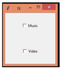
The below program will display two checkbuttons using some of the options mentioned below in the options section. C11 and C21 are the checkbuttons with their options (function to create checkbutton, text, variable type, on and off values, height and width options) to create the checkbuttons. Import option will import the Tkinter checkbutton from the python library, and by using from function, Tkinter will import all the functions of the Tkinter library.
Code:
from tkinter import *
import tkinter
top1 = tkinter.Tk()
CheckVar11 = IntVar()
CheckVar21 = IntVar()
C11 = Checkbutton(top1, text = "Music", variable = CheckVar11, \
                 onvalue = 1, offvalue = 0, height=5, \
                 width = 20)
C21 = Checkbutton(top1, text = "Video", variable = CheckVar21, \
                 onvalue = 1, offvalue = 0, height=5, \
                 width = 20)
C11.pack()
C21.pack()
top1.mainloop()
Output:
Example #2
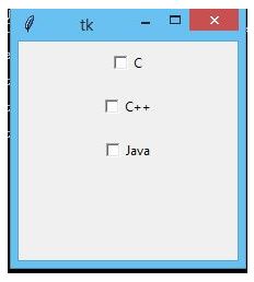
The below example will perform just like the above example of Tkinter checkbutton implementation with different names and functions, mostly the same but a little bit different. The below example will print 3 text names like c, c++, java. The whole dimension is set to “200X200” using the geometry function of Tkinter. After that, assigning variable as intvar and then implementing the check buttons with options and then displaying using the pack() function.
Code:
from tkinter import *
top1 = Tk()
top1.geometry("200x200")
checkvar11 = IntVar()
checkvar21 = IntVar()
checkvar31 = IntVar()
chkbtn11 = Checkbutton(top1, text = "C", variable = checkvar11, onvalue = 1, offvalue = 0, height = 2, width = 10)
chkbtn21 = Checkbutton(top1, text = "C++", variable = checkvar21, onvalue = 1, offvalue = 0, height = 2, width = 10)
chkbtn31 = Checkbutton(top1, text = "Java", variable = checkvar31, onvalue = 1, offvalue = 0, height = 2, width = 10)
chkbtn11.pack()
chkbtn21.pack()
chkbtn31.pack()
top1.mainloop()
Output:
Recommended Articles
This is a guide to Tkinter Checkbutton. Here we discuss the basic concept, list of options with description, methods, and examples of the Tkinter Checkbutton. You may also have a look at the following articles to learn more –
