EDUCBA

EDUCBA

MENUMENU
  • Free Tutorials
  • Free Courses
  • Certification Courses
  • 360+ Courses All in One Bundle
  • Login
Home Data Science Data Science Tutorials Tableau Tutorial Tableau Zen Master
Secondary Sidebar
Tableau Tutorial
  • Advanced
    • Tableau Bins
    • Tableau 3D
    • Tableau Export to Excel
    • Tableau Reporting
    • Tableau Reader
    • Tableau Map
    • Tableau Viewer
    • Tableau Prep Builder
    • Tableau Bridge
    • Tableau Tooltip
    • Tableau Hyper
    • Tableau Zen Master
    • Tableau Union
    • Tableau Templates
    • Tableau Alerts
    • Tableau Reporting Tool
    • Conditional Formatting in Tableau
    • Tableau Web Data Connector
    • Tableau BI Tool
    • Data Blending in Tableau
    • Parameters in Tableau
    • Tableau Data Sets
    • Creating Set in Tableau
    • Tableau Drill Down
    • Tableau Dynamic Parameters
    • Tableau Table Calculation
    • Tableau Visualization
    • Tableau Joins
    • Pivot in Tableau
    • Data Visualization With Tableau
    • Forecast in Tableau
    • Map Layers in Tableau
    • Group in Tableau
    • Tableau Group by
    • Hierarchy in Tableau
    • Sets in Tableau
    • How to create a Set in Tableau
    • Tableau Order of Operations
    • Tableau User Group
    • Tableau Calculated Field
    • Custom SQL in Tableau
  • Basic
    • What is Tableau
    • What is Tableau Dashboard
    • What is Tableau Server
    • Uses of Tableau
    • Tableau Versions
    • Tableau Architecture
    • Is Tableau Free
    • Tableau New Features
    • How To Install Tableau
    • How to Use Tableau?
    • Install Tableau Server
    • Tableau Commands
  • Charts
    • Tableau Charts
    • Tableau Bar Chart
    • Tableau Chart Types
    • Donut Chart in Tableau
    • Tableau Gauge Chart
    • Funnel Chart in Tableau
    • Gantt Chart in Tableau
    • Bubble Chart in Tableau
    • Pareto Chart in Tableau
    • Sankey Chart In Tableau
    • Stacked Bar Chart in Tableau
    • Tableau Bullet Chart
    • Waterfall Chart in Tableau
    • Line Chart in Tableau
    • Heat Map in Tableau
    • Histogram in Tableau
    • CrossTab in Tableau
    • Treemap in Tableau
    • Trend Lines in Tableau
    • Tableau Reference Lines
    • Tableau Dual Axis
    • Legend in Tableau
    • Pie Chart in Tableau
    • Tableau Storyline
  • Statement
    • Tableau IF Statement
    • Case Statement in Tableau
  • Functions
    • Tableau Functions
    • Tableau String Functions
    • Concatenate in Tableau
    • Rank Function in Tableau
    • Tableau Aggregate Functions
    • Window Sum Tableau
    • LOD Expressions in Tableau
    • LOOKUP Function in Tableau
    • Tableau Fixed Function
    • Tableau Count Distinct
    • Tableau Window Functions
  • Sort/Filters
    • Sorting in Tableau
    • Filters in Tableau
    • Types of Filters in Tableau
    • Tableau Action Filter
    • Context Filter in Tableau
    • Tableau Parameter Filter
    • Adding Filters in Tableau Dashboard
    • Tableau Context Filter
  • Tableau Dashboard
    • Dashboard in Tableau
    • Tableau Dashboard Examples
    • Tableau Dashboard Creation
    • Tableau Dashboard Design
    • Tableau Workbook
  • Interview Questions
    • Tableau Interview Questions

Related Courses

Tableau Certification Course

Business Intelligence Courses

Data Visualization Courses

Tableau Zen Master

Tableau Zen Master

Introduction to Tableau Zen Master

The following article provides an outline for Tableau Zen Master. Tableau is a prominent and advanced data visualization tool that enables all types of users to play, brand, and visualize their data. A tableau is a group of active BI communities. They recognize people who come up with innovative ideas, and those are nominated as tableau zen masters by the tableau community. The zen masters have to complete the mission within the date. Every year the community announces the new zen master based on the works from the previous year. Once you become a zen master, you’re offered to attend different conferences, get a unique badge, and be honored on the tableau’s website.

What is Tableau Zen Master?

Tableau zen masters are the people nominated by the tableau community every year. It is selected based on their innovative ideas, smart work, and achievements in the previous year. Tableau zen masters are offered a great salary, powerful recognition on the website, and access to some special sites.

How to Use Tableau Zen Master Chart?

Tableau charts can map three different types of spatial data like polygons, lines, and points. To project this, tableau uses coordinates like longitude and latitude values and converts them to the appropriate location using web Mercator which is a map project on the tableau website.

If the data is comprised of geographic terms like cities, airport codes, country names, zip codes, or others, tableau automatically triggers the relevant polygons using the longitude and latitude values, and it is fetched from the in-built geodatabase in tableau.

Start Your Free Data Science Course

Hadoop, Data Science, Statistics & others

Tableau Zen Master 1

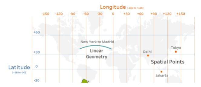
The user can connect spatial files like KML, GeoJSON, and shape files with spatial objects which can be displayed on a map.

To create a map with these geographic fields, double-click on the field value in the data pane and it creates a map using longitude and latitude fields. Encode the geographic areas or points to view the place that you want to be mapped in the data.

Tableau Zen Master 2

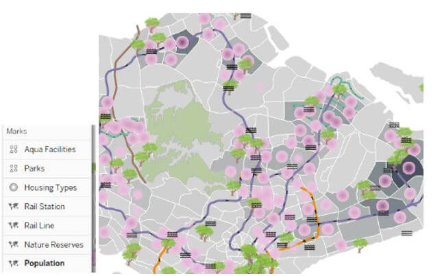
Map layers are introduced to enable multiple layer sources of spatial information to appear on maps to design more inclusive geographical views. The interactive version is opened on the tableau main pane.

Tableau Zen Master 3

Spatial functions can be integrated into multiple methods using make point, buffer, make line, area, distance, and spatial intersection joins.

All in One Data Science Bundle(360+ Courses, 50+ projects)
Python TutorialMachine LearningAWSArtificial Intelligence
TableauR ProgrammingPowerBIDeep Learning
Price
View Courses
360+ Online Courses | 50+ projects | 1500+ Hours | Verifiable Certificates | Lifetime Access
4.7 (86,354 ratings)

Make point is used to create a spatial point from projected coordinates, longitude, and latitude values with the help of SRID. Buffer is used to design a spatial buffer object which is specified by the user values and creates a radius around the concerned spatial point. Make a line is an option to design a line connecting two spatial points. It is created as an elliptical art about the earth’s curvature. Distance is used to give the value of distance in great elliptical art that connects two spatial points. The area gives the value of the total surface area in the spatial polygon. The joining of files is based on the spatial intersection joints. So all the measures are combined to explore the spatial data in multiple innovative methods. The calculation of area is done using square area, miles, feet, meters, and kilometers in the connected spatial file.

Tableau Zen Master 4

Tableau Zen Master Tips and Tricks

To design an attractive dashboard, fix and design the goals in a clear format. The goals should be based on the end-user and framed using the amount of consumption, use, and data flow. The bell and whistle are embellished only when there is a positive use instead it is mandatory not to use them.

The user must find a suitable mix to enhance the chances and productivity measures. The company which looks for advertisement should work on attractive posters and statistical measures to cover the audience. Such formatting and designs and data visualization tools, Qlik, and Spotfire are provided in Tableau.

Advanced Tableau Zen Master

Tableau has vast features with different visualization types like maps, charts, and graphs. It is possible to build from advanced stacked bar charts to gauge charts.

Below are advanced charts in tableau, which are used to represent multiple datasets with categorical measurements:

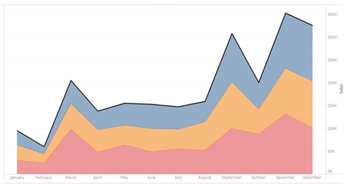
1. Tableau Area Chart

This type of chart establishes the relationship among varied data variables. It inhibits the covered area by every segment and compares it to the total sum and percentage. This area chart can be either discrete or continuous based on the given values.

Tableau Zen Master 5

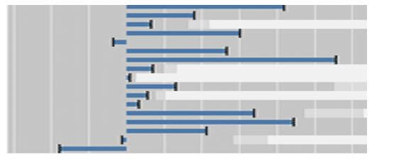
2. Tableau Bullet Chart

It is the advanced version of the ancient bar chart in Tableau and helps to compare multiple data fields on a unit bar. This bullet chart is applicable for the dataset where the user can compare the obtained output with the expected result.

Tableau Zen Master 7

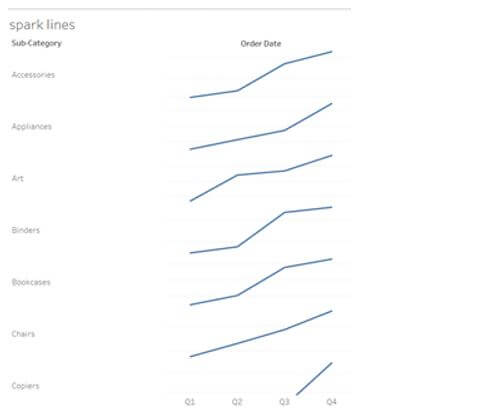
3. Tableau Sparklines

They are the condensed graph used to display the trend across different measures. It is implied in different corporate dashboards to show the trends instantly across the KPIs.

Tableau Zen Master 8

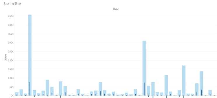
4. Tableau bar-in-bar Chart

It is the advanced version used by data scientists to measure one on other bar charts. It is comprised of two bar graphs interlocked with one another based on the values of rows and column area.
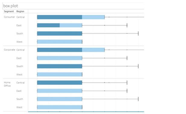
bar-in-bar Chart

5. Tableau Box Plot

It is also called the Box and the whisker plot which displays the sharing of different data measures along the axis. This distribution is denoted by the granular form with the dimension values of row shelf and column shelf.

Box Plot

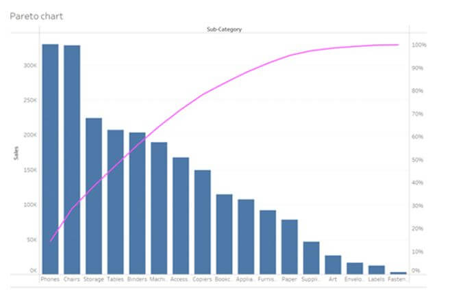
6. Tableau Pareto Chart

It is a type of chart with the values of both bar graph and line chart. The cumulative is signified by the other data values and line graph with the bar graph in the descendent order.

Pareto Chart

Conclusion

Not only is the quality and quantity important for a company to reach the audience, but it is also mandatory to make the audience listen and view it. So be precise and push the data to a bar chart to give a clear view that helps for comparison. Hence the advanced version of tableau charts is briefly discussed.

Recommended Articles

This is a guide to Tableau Zen Master. Here we discuss the introduction, and how to use the tableau zen master chart? tips and tricks, respectively. You may also have a look at the following articles to learn more –

  1. Tableau BI Tool
  2. Tableau Reporting
  3. Tableau Dashboard
  4. Tableau Gauge Chart
Popular Course in this category
Tableau Training (8 Courses, 8+ Projects)
  8 Online Courses |  8 Hands-on Projects |  55+ Hours |  Verifiable Certificate of Completion
4.5
Price

View Course

Related Courses

Business Intelligence Training (12 Courses, 6+ Projects)4.9
Data Visualization Training (15 Courses, 5+ Projects)4.8
0 Shares
Share
Tweet
Share
Primary Sidebar
Footer
About Us
  • Blog
  • Who is EDUCBA?
  • Sign Up
  • Live Classes
  • Corporate Training
  • Certificate from Top Institutions
  • Contact Us
  • Verifiable Certificate
  • Reviews
  • Terms and Conditions
  • Privacy Policy
  •  
Apps
  • iPhone & iPad
  • Android
Resources
  • Free Courses
  • Database Management
  • Machine Learning
  • All Tutorials
Certification Courses
  • All Courses
  • Data Science Course - All in One Bundle
  • Machine Learning Course
  • Hadoop Certification Training
  • Cloud Computing Training Course
  • R Programming Course
  • AWS Training Course
  • SAS Training Course

ISO 10004:2018 & ISO 9001:2015 Certified

© 2022 - EDUCBA. ALL RIGHTS RESERVED. THE CERTIFICATION NAMES ARE THE TRADEMARKS OF THEIR RESPECTIVE OWNERS.

EDUCBA
Free Data Science Course

SPSS, Data visualization with Python, Matplotlib Library, Seaborn Package

*Please provide your correct email id. Login details for this Free course will be emailed to you

By signing up, you agree to our Terms of Use and Privacy Policy.

EDUCBA Login

Forgot Password?

By signing up, you agree to our Terms of Use and Privacy Policy.

EDUCBA
Free Data Science Course

Hadoop, Data Science, Statistics & others

*Please provide your correct email id. Login details for this Free course will be emailed to you

By signing up, you agree to our Terms of Use and Privacy Policy.

EDUCBA

*Please provide your correct email id. Login details for this Free course will be emailed to you

By signing up, you agree to our Terms of Use and Privacy Policy.

Let’s Get Started

By signing up, you agree to our Terms of Use and Privacy Policy.

This website or its third-party tools use cookies, which are necessary to its functioning and required to achieve the purposes illustrated in the cookie policy. By closing this banner, scrolling this page, clicking a link or continuing to browse otherwise, you agree to our Privacy Policy

Loading . . .
Quiz
Question:

Answer:

Quiz Result
Total QuestionsCorrect AnswersWrong AnswersPercentage

Explore 1000+ varieties of Mock tests View more