Updated March 17, 2023
Introduction to Seaborn Kdeplot
Seaborn kdeplot is nothing but the kernel density estimate plot, which allows us to estimate the function of the probability density of non-parametric and continuous data sets. We can set the curve by using it in single or more dimensions, which means we create a plot in one graph for more samples, which helps visualize data. It is essential and valuable in python for probability.

Key Takeaways
- The KDE plot is the method used to visualize the distribution of the dataset. KDE will represent the data by using the density of continuous probability.
- KDE produces a less cluttered plot, which is more interpretable when drawing multiple distributions.
What is Seaborn Kdeplot?
It is the plots which were depicting the function of density probability. We are building the kdeplot with various functionality using the python seaborn module. To use it, we need to install the seaborn in our system. After installing the same, we need to import the same in our code using the import keyword. It is beneficial and essential in python to estimate the function of probability density. The function used to plot the data of a single variable will represent the probability distribution of data values under the curve plotted.
How to Create Seaborn Kdeplot?
When creating, we need to install the seaborn in our system. We are installing the same using the pip command.
Code:
pip install seabornOutput:
It accepts the data in the input.
Syntax:
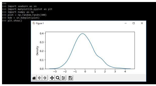
seaborn.kdeplot(data)It is used in a univariate variable. In the below example, we are using the random function for creating the seaborn kdeplot as follows. We are generating random values by using a random function.
Code:
import seaborn as sn
import matplotlib.pyplot as plt
import numpy as np
plot = np.random.randn(300)
kde = sn.kdeplot(plot)
plt.show()
Output:
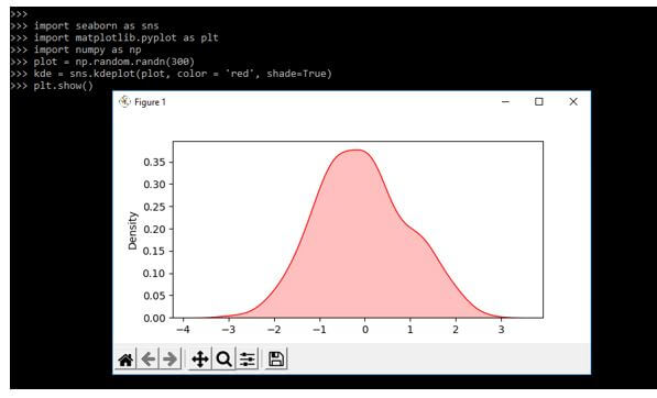
In the below example, we are highlighting the plot using the shade parameter. Also, we are setting different colors by using a color parameter.
Code:
import seaborn as sns
import matplotlib.pyplot as plt
import numpy as np
plot = np.random.randn(300)
kde = sns.kdeplot (plot, color = 'red', shade=True)
plt.show()
Output:
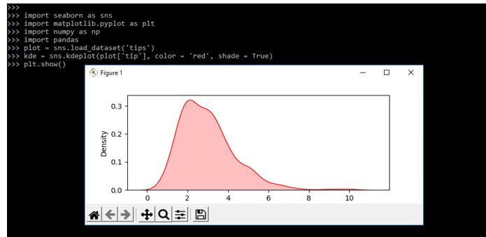
It is used to plot the data against the bivariate variable for depicting the probability distribution of a single with other values. The below example shows the creation of the bivariate as follows.
Code:
import seaborn as sns
import matplotlib.pyplot as plt
import numpy as np
import pandas
plot = sns.load_dataset('tips')
kde = sns.kdeplot(plot['tip'], color = 'red', shade = True)
plt.show()
Output:
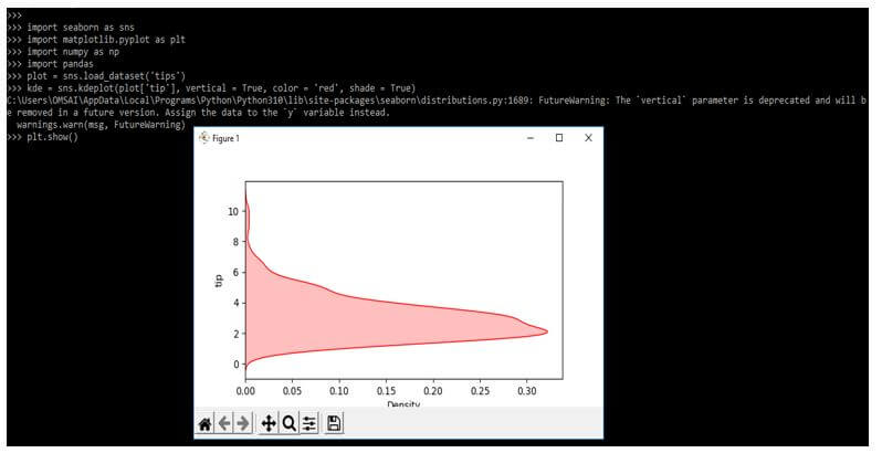
We can also plot the kdeplot by using the y-axis. We can plot the distribution using the y-axis by setting the vertical parameter as accurate.
Code:
import seaborn as sns
import matplotlib.pyplot as plt
import numpy as np
import pandas
plot = sns.load_dataset('tips')
kde = sns.kdeplot(plot['tip'], vertical = True, color = 'red', shade = True)
plt.show()
Output:
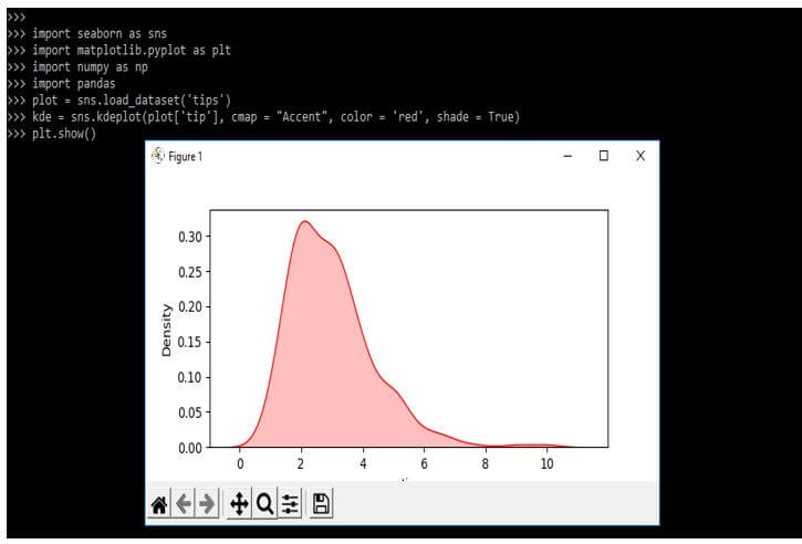
We can use the different palettes and the seaborn plot to visualize the data using parameters such as cmap.
Code:
import seaborn as sns
import matplotlib.pyplot as plt
import numpy as np
import pandas
plot = sns.load_dataset('tips')
kde = sns.kdeplot(plot['tip'], cmap = "Accent", color = 'red', shade = True)
plt.show()
Output:
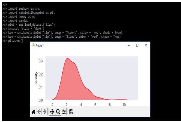
Seaborn Kdeplot Visualisation
A data scientist uses this library for creating statistical graphs. We plot the univariate and bivariate plots by using the kde function. The two-shaded bivariate plot helps to understand the variation of the data.
Below example shows seaborn kdeplot visualization as follows:
Code:
import seaborn as sns
import matplotlib.pyplot as plt
import numpy as np
import pandas
plot = sns.load_dataset('tips')
sns.set (style = 'dark')
kde = sns.kdeplot(plot['tip'], cmap = "Accent", color = 'red', shade = True)
kde = sns.kdeplot(plot['tip'], cmap = "Blues", color = 'red', shade = True)
plt.show()
Output:
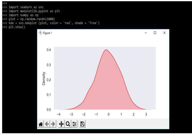
We can plot and visualize the data using the kdeplot function and the seaborn library. In the example below, we are creating 100 samples using the random function.
Code:
import seaborn as sns
import matplotlib.pyplot as plt
import numpy as np
plot = np.random.randn(1000)
kde = sns.kdeplot (plot, color = 'red', shade = 'True')
plt.show()
Output:
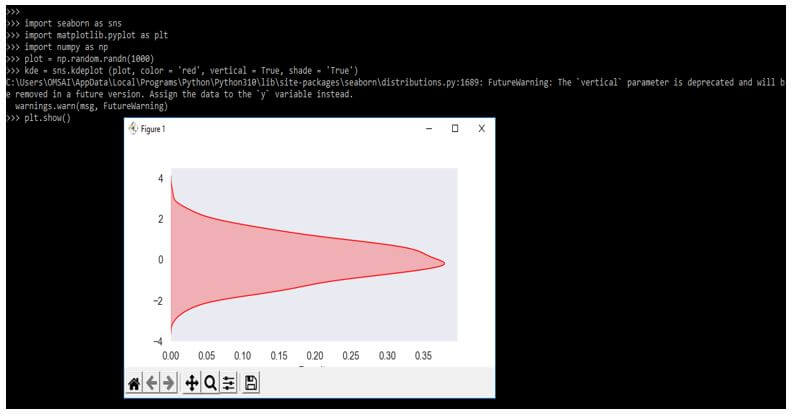
We can visualize the data sample vertically or revert the plot using the KDE library. We are using a vertical parameter for Visualization.
Code:
import seaborn as sns
import matplotlib.pyplot as plt
import numpy as np
plot = np.random.randn(1000)
kde = sns.kdeplot (plot, color = 'red', vertical = True, shade = 'True')
plt.show()
Output:
Examples of Seaborn Kdeplot
Different examples are mentioned below:
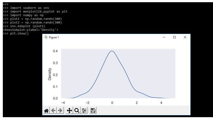
Example #1
In the below example, we are using random methods.
Code:
import seaborn as sns
import matplotlib.pyplot as plt
import numpy as np
plot1 = np.random.randn(300)
plot2 = np.random.randn(300)
sns.kdeplot (plot1)
plt.show()
Output:
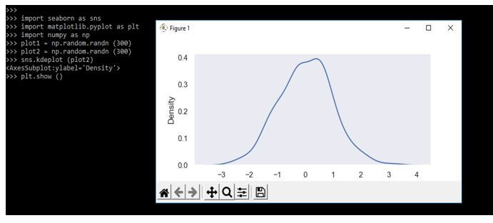
Example #2
In the below example, we are using random methods. We are passing the y-axis values. We are giving the random values as 300.
Code:
import seaborn as sns
import matplotlib.pyplot as plt
import numpy as np
plot1 = np.random.randn (300)
plot2 = np.random.randn (300)
sns.kdeplot (plot2)
plt.show ()
Output:
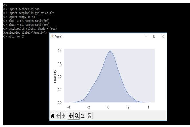
Example #3
We can highlight the plot using the shaded area covered by the curve.
Code:
import seaborn as sns
import matplotlib.pyplot as plt
import numpy as np
plot1 = np.random.randn(300)
plot2 = np.random.randn(300)
sns.kdeplot (plot1, shade = True)
plt.show ()
Output:
FAQ
Other FAQs are mentioned below:
Q1. What is the use of seaborn kdeplot in python?
Answer:
It is used to visualize the distribution of the dataset. KDE will represent the data as per probability.
Q2. Which libraries are used at the time of using seaborn kdeplot?
Answer:
We need to use seaborn, numpy, pandas, and matplotlib when using seaborn kdeplot in python.
Q3. How can we visualize the seaborn kdeplot?
Answer:
We can visualize the kdeplot by using different types of parameters. We can imagine the data using other parameters.
Conclusion
The function is used to plot the data of a single variable; it will represent the probability distribution of data values under the curve plotted. It is nothing but a kernel density estimate plot that allows us to estimate the function of probability density and continuous data set.
Recommended Articles
This is a guide to Seaborn Kdeplot. Here we discuss the introduction, Visualization, examples, and how to create a seaborn kdeplot. You may also have a look at the following articles to learn more –
