Updated April 3, 2023
Excel Regression Analysis (Table of Contents)
- Regression Analysis in Excel
- Explanation of Regression Mathematically
- How to Perform Linear Regression in Excel?
What is Regression Analysis in Excel
Linear regression is a statistical technique that examines the linear relationship between a dependent variable and one or more independent variables.
- Dependent Variable (aka response/outcome variable): This is the variable of your interest and wanted to predict based on the Independent variable(s).
- Independent Variable (aka explanatory/predictor variable): Is/are the variable(s) on which response variable is depend. This means these are the variables using which response variables can be predicted.
Linear relationship means the change in an independent variable(s) causes a change in the dependent variable.
There are basically two types of linear relationships as well.
- Positive Linear Relationship: When the independent variable increases, the dependent variable increases too.
- Negative Linear Relationship: When the independent variable increases, the dependent variable decreases.
These were some of the pre-requisites before you actually proceed towards regression analysis in excel.
There are two basic ways to perform linear regression in excel using:
- Regression tool through Analysis ToolPak
- Scatter chart with a trendline
There is actually one more method which is using manual formula’s to calculate linear regression. But why should you go for it when excel does calculations for you?
Therefore, we are going to talk about the two methods discussed above only.
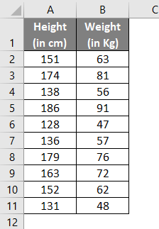
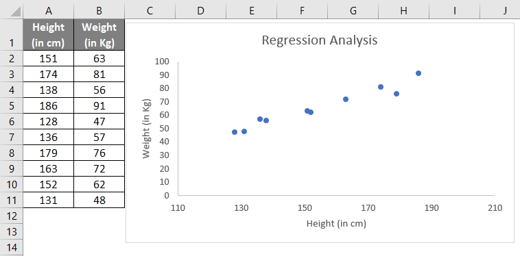
Suppose you have data on the height and weight of 10 individuals. If you plot this information through a chart, let’s see what it gives.
As the above screenshot shows, the linear relationship can be found in Height and Weight through the graph. Don’t get much involved in graphs now; we are anyhow going to dig it deep in the second portion of this article.
Explanation of Regression Mathematically
We have a mathematical expression for linear regression as below:
Where,
- Y is a dependent variable or response variable.
- X is an independent variable or predictor.
- a is the slope of the regression line. This represents that when X changes, there is a change in Y by “a” units.
- b is intercepting. It is the value Y takes when the value of X is zero.
- ε is the random error term. It occurs because Y’s predicted value will never be exactly the same as the actual value for a given X. We don’t need to worry about this error term as some software do the calculation of this error term in the backend for you. Excel is one of that software.
In that case, the equation becomes,
Which can be represented as:
We’ll try to find out the values of this a and b using the methods we have discussed above.
How to Perform Linear Regression in Excel?
The further article explains the basics of regression analysis in excel and shows a few different ways to do linear regression in Excel.
#1 – Regression Tool Using Analysis ToolPak in Excel
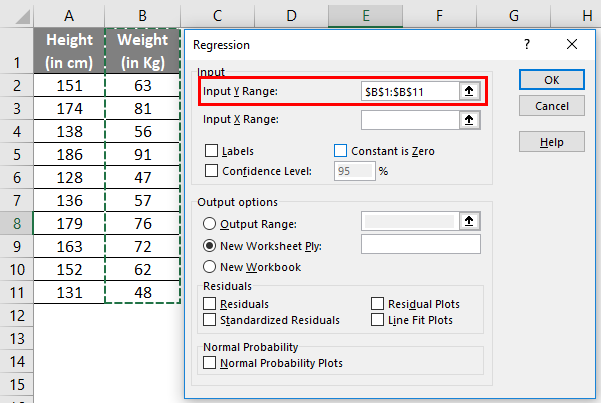
For our example, we’ll try to fit regression for Weight values (which is a dependent variable) with the help of Height values (which is an independent variable).
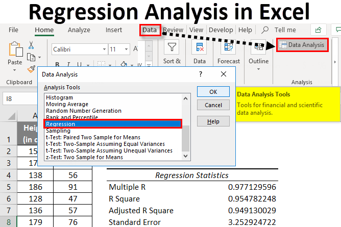
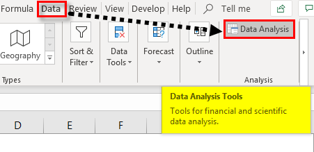
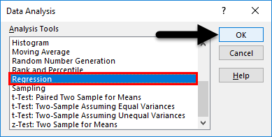
- In the excel spreadsheet, click on Data Analysis (present under Analysis Group) under Data.
- Search out for Regression. Could you select it and press, ok?
- Use the following inputs under the Regression pane, which opens up.
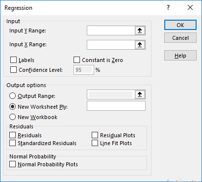
- Input Y Range: Select the cells which contain your dependent variable (in this example, B1:B11)
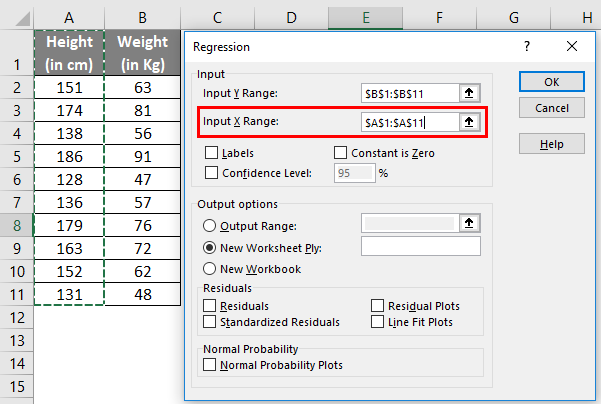
- Input X Range: Select the cells which contain your independent variable (in this example, A1:A11).
- Check the box named Labels if your data have column names (in this example, we have column names).
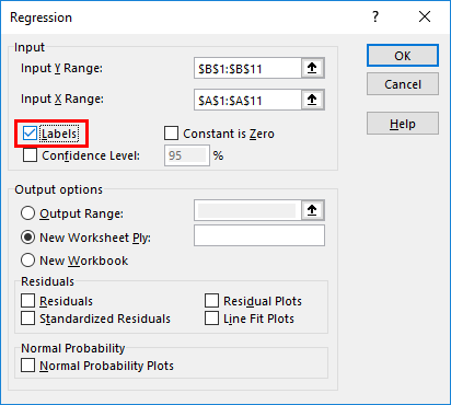
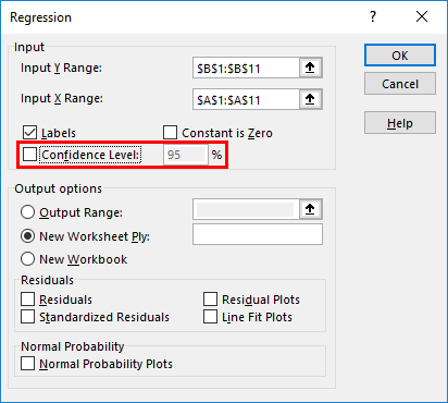
- The confidence level is set to 95% by default, which can be changed as per user’s requirements.
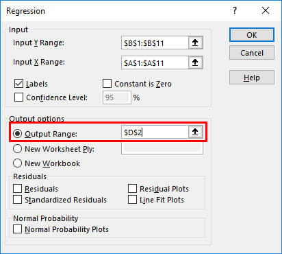
- Under Output options, you can customize where you want to see the regression analysis output in Excel. In this case, we want to see the output on the same sheet. Therefore, the given range is accordingly.
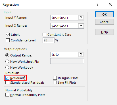
- Under the Residuals option, you have optional inputs like Residuals, Residual Plots, Standardized Residuals, and Line Fit Plots, which you can select as per your need. In this case, check the Residuals checkbox so that we can see the dispersion between predicted and actual values.
- Under the Normal Probability option, you can select Normal Probability Plots, which can help you check the normality of predictors. Click on OK.
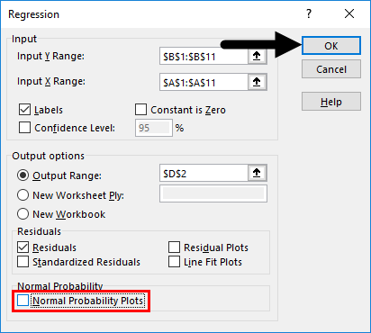
- Excel will compute Regression analysis for you in a fraction of second.
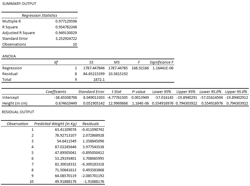
Till here, it was easy and not that logical. However, interpreting this output and make valuable insights from it is a tricky task.
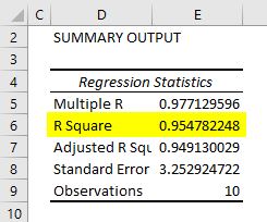
One important part of this entire output is R Square/ Adjusted R Square under the SUMMARY OUTPUT table, which provides information on how well our model is fit. In this case, the R Square value is 0.9547, which interprets that the model has a 95.47% accuracy (good fit). Or in another language, information about the Y variable is explained 95.47% by the X variable.
The other important part of the entire output is a table of coefficients. It gives values of coefficients that can be used to build the model for future predictions.
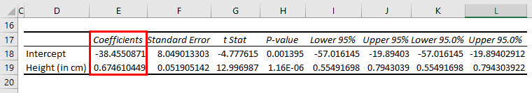
Now our regression equation for prediction becomes:
Weight = 0.6746*Height – 38.45508 (Slope value for Height is 0.6746… and Intercept is -38.45508…)
Did you get what you have defined? You have defined a function in which you now just have to put the value of Height, and you’ll get the Weight value.
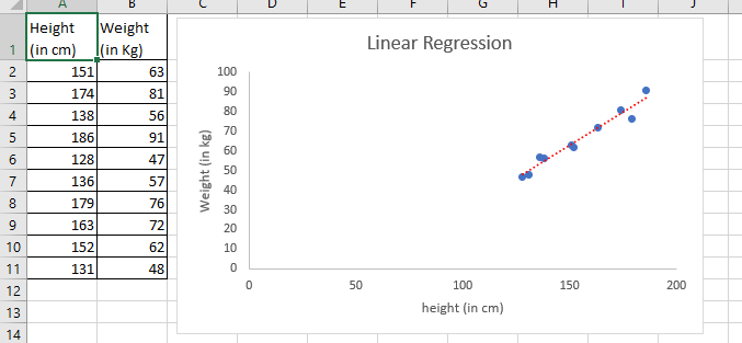
#2 – Regression Analysis Using Scatterplot with Trendline in Excel
Now, we’ll see how in excel, we can fit a regression equation on a scatterplot itself.
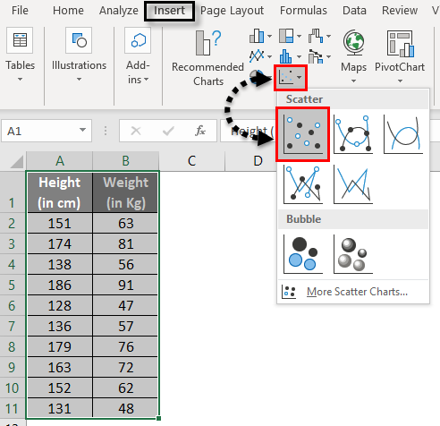
- Select your entire two-columned data (including headers).
- Click on Insert and select Scatter Plot under the graphs section, as shown in the image below.
- See the output graph.
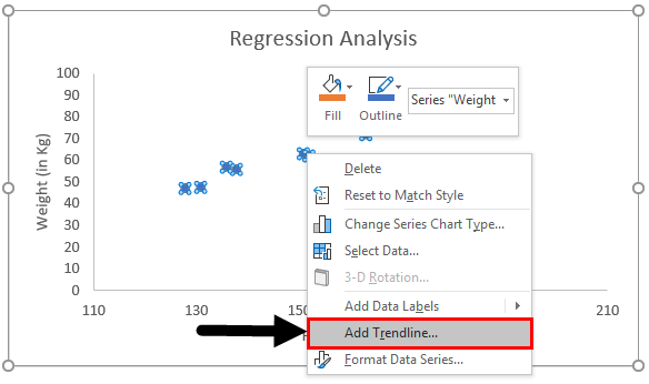
- Now, we need to have the least squared regression line on this graph. To add this line, right-click on any of the graph’s data points and select Add Trendline option.
- It will enable you to have a trendline of the least square of regression like below.
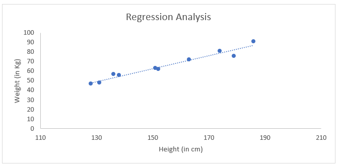
- Under the Format Trendline option, check the box for Display Equation on Chart.
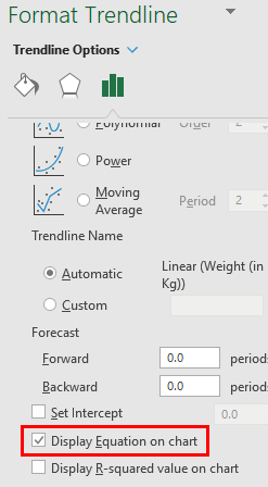
- It enables you to see the equation of the least squared regression line on the graph.
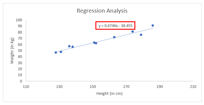
This is the equation using which we can predict the weight values for any given set of Height values.
Things to Remember About Regression Analysis in Excel
- You can change the layout of the trendline under the Format Trendline option in the scatter plot.
- It is always recommended to have a look at residual plots while you are doing regression analysis using Data Analysis ToolPak in Excel. It gives you a better understanding of the spread of the actual Y values and estimated X values.
- Simple Linear Regression in excel does not need ANOVA and Adjusted R Square to check. These features can be considered for Multiple Linear Regression, which is beyond the scope of this article.
Recommended Articles
This has been a guide to Regression Analysis in Excel. Here we discuss how to do Regression Analysis in Excel, along with excel examples and a downloadable excel template. You can also go through our other suggested articles –