Updated June 9, 2023
Linear Regression in Excel (Table of Contents)
Introduction to Linear Regression in Excel
Linear regression is a statistical technique/method used to study the relationship between two continuous quantitative variables. In linear regression, we use independent variables to predict the value of a dependent variable. If there is only one independent variable, then it is a simple linear regression; if some independent variables are more than one, then it is multiple linear regression. Linear Regression models have a relationship between dependent and independent variables by fitting a linear equation to the observed data. Linear refers to the fact that we use a line to fit our data. In regression analysis, we refer to the dependent variables as the response or predicted variables, and we also call the independent variables the explanatory variables or predictors.
A linear regression line has an equation of the kind: Y= a + bX;
Where:
- X is the explanatory variable,
- Y is the dependent variable,
- b is the slope of the line,
- a is the y-intercept (i.e., the value of y when x=0).
The least-squares method minimizes the sum of squares of deviation of data points from the line to calculate the best fit line for observed data in linear regression.
Methods for Using Linear Regression in Excel
This example teaches you the methods to perform Linear Regression Analysis in Excel. Let’s look at a few methods.
Method #1 – Scatter Chart with a Trendline
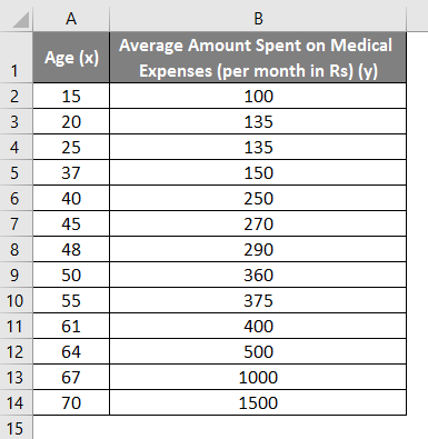
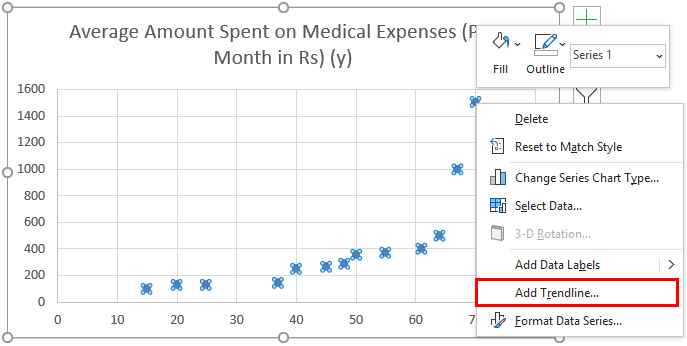
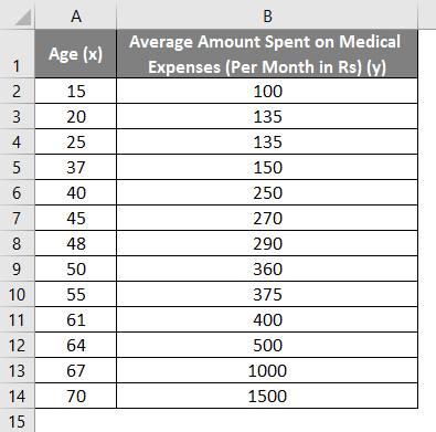
Let us say we have a dataset of some individuals with their age, bio-mass index (BMI), and the amount they spend on medical expenses in a month. Now with an insight into the individuals’ characteristics like age and BMI, we wish to find how these variables affect the medical expenses and hence use these to carry out regression and estimate/predict the average medical expenses for some specific individuals. Let us first see how only age affects medical expenses. Let us see the dataset:
Amount on medical expenses= b*age + a
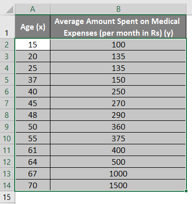
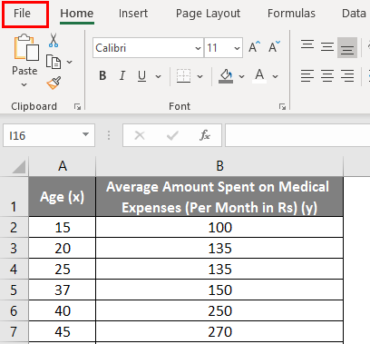
- Select the two dataset columns (x and y), including headers.
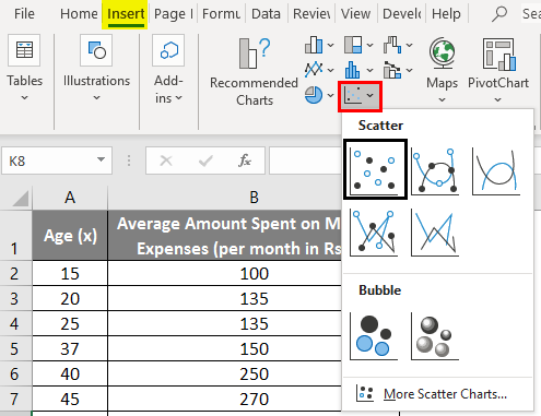
- Click on ‘Insert’ and expand the dropdown for ‘Scatter Chart’ and select the ‘Scatter’ thumbnail (first one)
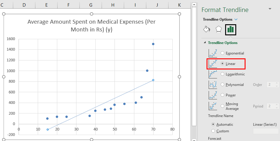
- Now a scatter plot will appear, and we will draw the regression line. To do this, right-click on any data point and select ‘Add Trendline.’
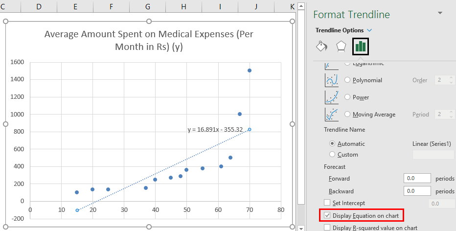
- Select ‘Linear Trendline’ and ‘Display Equation on Chart’ in the’ Format Trendline’ pane on the right.
- Select ‘Display Equation on Chart’.
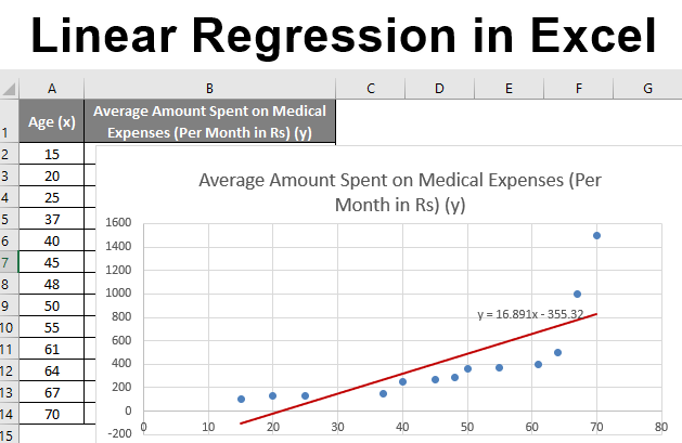
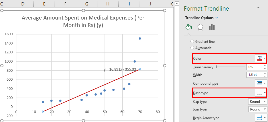
We can improvise the chart per our requirements, like adding axes titles and changing the scale, color, and line type.
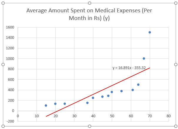
After Improvising the chart, this is the output we get.
Method #2 – Analysis ToolPak Add-In Method
Analysis ToolPak is sometimes not enabled by default, and we must do it manually. To do so:
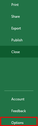
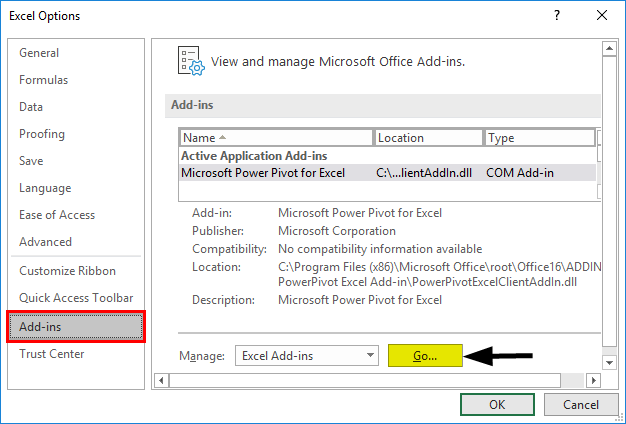
- Click on the ‘File’ menu.
After that, click on ‘Options’.
- Select ‘Excel Add-Ins’ in the ‘Manage’ box, and click on ‘Go.’
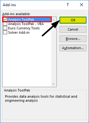
- Select ‘Analysis ToolPak’ -> ‘OK.’
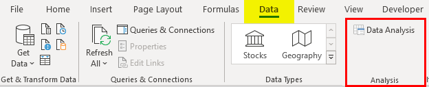
This will add ‘Data Analysis’ tools to the ‘Data’ tab. Now we run the regression analysis:
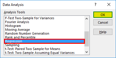
- Click on ‘Data Analysis in the ‘Data’ tab
- Select ‘Regression’ -> ‘OK.’
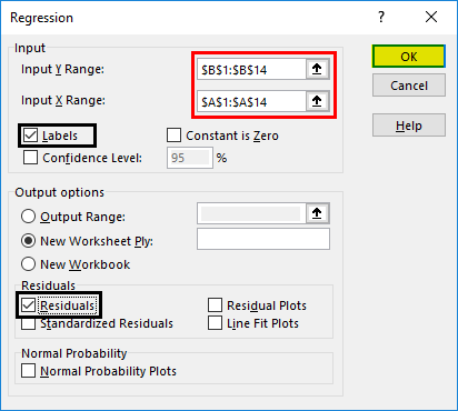
- A regression dialog box will appear. Select the Input Y and X ranges (medical expenses and age, respectively). In the case of multiple linear regression, we can select more columns of independent variables (like if we wish to see the impact of BMI on medical expenses).
- Check the ‘Labels’ box to include headers.
- Choose the desired ‘output’ option.
- Select the ‘residuals’ checkbox and click ‘OK.
Now our regression analysis output will create in a new worksheet, stating the Regression Statistics, ANOVA, residuals, and coefficients.
Output Interpretation:
- Regression Statistics tells how well the regression equation fits the data:
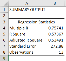
- Multiple R is the correlation coefficient that measures the strength of a linear relationship between two variables. It lies between -1 and 1, and its absolute value depicts the relationship strength with a large value indicating a stronger relationship, a low value indicating negative, and a zero value indicating no relationship.
- R Square is the Coefficient of Determination used to indicate the goodness of fit. It lies between 0 and 1, with a value close to 1 indicating that the model fits well. In this case, 0.57=57% of y-values are explaining in the x-values.
- Adjusted R Square is adjusted for some predictors in the case of multiple linear regression.
- Standard Error depicts the precision of regression analysis.
- Observations depict the number of model observations.
- Anova tells the level of variability within the regression model.

This is generally not used for simple linear regression. However, the ‘Significance F values’ indicate our results’ reliability, with a value greater than 0.05 suggesting choosing another predictor.
- Coefficients are the most important part used to build regression equations.

So, our regression equation would be: y= 16.891 x – 355.32. This is the same as that done by method 1 (scatter chart with a trendline).
Now, if we wish to predict average medical expenses when the age is 72:
So y= 16.891 * 72 -355.32 = 860.832
So this way, we can predict y values for any other x values.
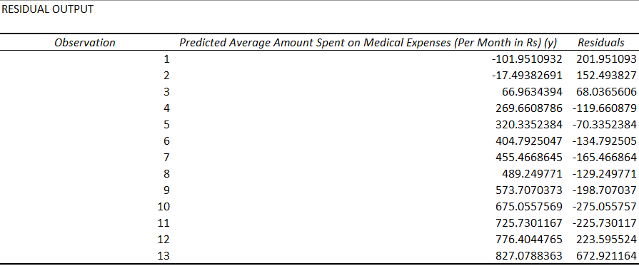
- Residuals indicate the difference between actual and predicted values.
The last method for regression is not commonly used and requires statistical functions like slope (), intercept (), correl (), etc., to carry out regression analysis.
Things to Remember About Linear Regression in Excel
- We generally use regression analysis to see if there is a statistically significant relationship between two sets of variables.
- It uses to predict the value of the dependent variable based on the values of one or more independent variables.
- Whenever we wish to fit a linear regression model to a group of data, then the range of data should be carefully observed. Using a regression equation to predict any value outside this range (extrapolation) may lead to wrong results.
Recommended Articles
This is a guide to Linear Regression in Excel. Here we discuss how to do Linear Regression in Excel, practical examples, and a downloadable Excel template. You can also go through our other suggested articles –
