Updated June 12, 2023
Introduction to Pure CSS tabs
Pure CSS tabs are defined as navigators and are preferably used in sole page websites to view the multiple information in limited space and help to switch tabs quickly. This program is well-built in JavaScript, but now Pure CSS makes it a responsive design without JavaScript. We use this tab as a graphical control object to have multiple documents on a single page and within the content box.
Syntax
The General Syntax is declared as
<div class =" demo_tabs">
<input name="demo_tabs" type=" radio" id= "name"/>
</div>
<section>. </section>
// Next Is the CSS part
.tabs
{
// Style properties and animation
}
How to create tabs in Pure CSS?
Creating a tab in CSS is very simple. Here in this article, we shall see a responsive tab with HTML and CSS combined. Therefore, we are supposed to create two files to follow the steps. Each tab has its content when clicked, provided the tabs have a click event. The code created here is a pure CSS solution in its entirety.
First, we shall start with HTML code for a Tabbed area.
<div class =" demo_area">
<input name="demo_area" type=" radio" id= "one"/>
<ul>… </ul> </div>
<div id = " tab_one">
// content
</div>
Next, create a .CSS file to give style to the program code
.tabs .slider .indicator {
Position : 20px;
width: 10px;
background: #EB3349;
border-radius: 2px;
}
And here, we provide basic presentation styling by letting a font family and background color. Next is creating a container for tabs with a flexbox. The style label names a tab, and we wrap these labels inside an unordered list. Lastly, we use panels; a higher-order value is given for the desktop view.
Examples
Let’s see the Program source code of Pure CSS Tabs with the input type.
Example #1
Using Responsive Tabs for Pure CSS
tab.html
<html>
<head>
<meta charset="UTF-8">
<title>Pure CSS Tab From EDUCBA</title>
<link rel="stylesheet" href="style.css">
</head>
<body>
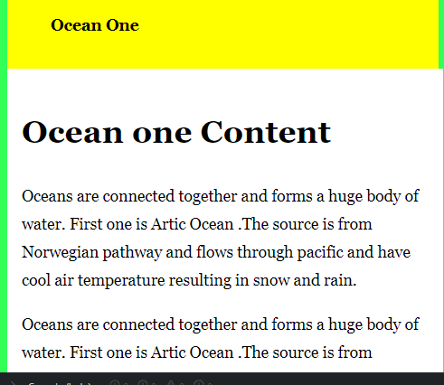
<div class="demotab">
<input type="radio" name="demotab" id="Ocean1" checked="checked">
<label for="Ocean1">Ocean One</label>
<div class="dtab">
<h1>Ocean one Content</h1>
<p>Oceans are connected together and forms a huge body of water. First one is Artic Ocean. The source is from Norwegian pathway and flows through pacific and have cool air temperature resulting in snow and rain. </p>
<p>Oceans are connected together and forms a huge body of water. First one is Artic Ocean. The source is from Norwegian pathway and flows through pacific and have cool air temperature resulting in snow and rain..</p>
</div>
<input type="radio" name="demotab" id="Ocean2">
<label for="Ocean2">Ocean two</label>
<div class="dtab">
<h1>Ocean Two Content</h1>
<p> Second Largest Ocean a Atlantic Ocean which includes gulf of mexico.</p>
</div>
<input type="radio" name="demotab" id="Ocean3">
<label for="Ocean3">Ocean three</label>
<div class="dtab">
<h1>Ocean third Content</h1>
<p>Indian Ocean Third largest ocean in the world Underneath is the convergence of Africa. Also has a glacier water. </p>
</div>
</div>
</body>
</html>tab.css
.demotab {
display: flex;
flex-wrap: wrap;
}
.demotab label {
order: 1;
display: block;
padding: 2rem 3rem;
margin-right: 0.3rem;
cursor: pointer;
background: blue;
font-weight: bold;
transition: background ease 0.4s;
}
.demotab .dtab {
order: 98;
flex-grow: 1;
width: 100%;
display: none;
padding: 1rem;
background: #fff;
}
.demotab input[type="radio"] {
display: none;
}
.demotab input[type="radio"]:checked + label {
background: yellow;
}
.demotab input[type="radio"]:checked + label + .dtab {
display: block;
}
@media (max-width: 43em) {
.demotab .dtab,
.demotab label {
order: initial;
}
.demotab label {
width: 95%;
margin-right: 0.1;
margin-top: 0.4rem;
}
}
body {
background: #33FF57;
min-height: 100vh;
box-sizing: border-box;
padding-top: 11vh;
font-family: "fangsong", "Arial", "Georgia", Helvetica, Arial, "Algerian", sans-serif;
font-weight: 250;
line-height: 1.8;
max-width: 50rem;
margin: 0.5 auto;
font-size: 110%;
}
Explanation
So, in the first file, we have created an input-based radio type and the tab panel with the class. In the second file, we have created an animated component with the core CSS Styles.
Output:
Example #2
ffe.html
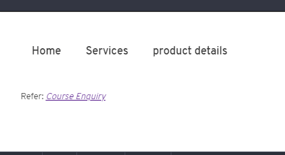
<div class="tabc">
<input type="radio" name="tabc" id="tabA" aria-controls="Home" checked>
<label for="tabA">Home</label>
<input type="radio" name="tabB" id="tabB" aria-controls="Services">
<label for="tabB">Services</label>
<input type="radio" name="tabnext" id="tabnext" aria-controls="product">
<label for="tabnext">product details</label>
<div class="panelpart">
<section id="Home" class="panelpart">
<h2>Description</h2>
<p><strong>Overall Concept:</strong> The best Online Course helps in career steps and the course comes with 30days trial pack.It gives free acces to self-paid courses. It covers updated technologies and programming</p>
<p><strong>Services:</strong> The most demanded courses in the market. They provide world-wide courses from various countries across a globe also provide up-to date courses at affordable price</p>
</section>
<section id="Services" class="panelpart">
<h2>Services</h2>
<p><strong>Overall Service description</strong> The most demanded courses in the market.They provide world-wide courses from various countries across a globe also provide up-to date courses at affordable price.</p>
<p><strong>History:</strong> The most demanded courses in the market. They provide world-wide courses from various countries across a globe also provide up-to date courses at affordable price.</p>
</section>
<section id="Products" class="panelpart">
<h2>Product Details</h2>
<p><strong>List Products or courses:</strong> PHP, Artificial Intelligence, Machine Learning, Python, R language, JavaScript, AJAXB, Java</p>
<p><strong>Free Course too:</strong> The most demanded courses in the market. They provide world-wide courses from various countries across a globe also provide up-to date courses at affordable price.</p>
</section>
</div>
</div>
<p><small>Refer: <cite><a href="https://www.educba.com">Course Enquiry</a></cite></small></p>
twoex.css
.tabc > input[type="radio"] {
position: absolute;
left: -210vw;
}
.tabc .panelpart {
display: none;
}
.tabc > input:first-child:checked ~ .panelpart > .panelpart:first-child,
.tabc > input:nth-child(3):checked ~ .panelpart > .panelpart:nth-child(2),
.tabc > input:nth-child(5):checked ~ .panelpart > .panelpart:nth-child(3),
.tabc > input:nth-child(7):checked ~ .panelpart > .panelpart:nth-child(4),
.tabc > input:nth-child(9):checked ~ .panelpart > .panelpart:nth-child(5),
.tabc > input:nth-child(11):checked ~ .panelpart > .panelpart:nth-child(6) {
display: block;
}
body {
font: 14px/1.8em "Overpass", "Calibri", Georgia, sans-serif;
color: #blue;
font-weight: 280;
}
.tabc > label {
position: relative;
display: inline-block;
padding: 13px 13px 22px;
border: 2px solid transparent;
border-bottom: 1;
cursor: pointer;
font-weight: 550;
}
.tabc > label::after {
content: "";
position: absolute;
left: 14px;
bottom: 12px;
width: 24px;
height: 6px;
background: Yellow;
}
.tabc > label:hover,
.tabc > input:focus + label {
color: pink;
}
.tabc > label:hover::after,
.tabc > input:focus + label::after,
.tabc > input:checked + label::after {
background: red;
}
.tabc > input:checked + label {
border-color: #green;
border-bottom: 2px solid brown;
margin-bottom: -2px;
}
.panelpart {
padding: 25px 0;
border-top: 2px solid #fff;
}
*,
*:before,
*:after {
box-sizing: border-box;
}
body {
padding: 25px;
}
.tabc {
max-width: 60em;
}
Explanation
That’s the code here. The above code adds a tab to the website with the section and div class as a responsive part. Below, you can see the demo.
Output:
Conclusion
Therefore, we have learned how to create a tab using pure CSS, which also works when a user makes an action. The activated tab performs well in navigating the tabs. Therefore, this CSS Tb enriches the user interface on the website.
Recommended Articles
We hope that this EDUCBA information on “Pure CSS Tabs” was beneficial to you. You can view EDUCBA’s recommended articles for more information.

