Updated June 14, 2023

Introduction to CSS Pseudo Classes
While designing pages in HTML, you might want to change the state of all or some of the page’s elements according to the user’s action example; when the page is loaded, one element, a link, will be in one state, say, it has a blue color. But once we click the link or hover the mouse, it changes to a different, say, pink. To define this special state of an HTML element, we use pseudo-class. In this article, we will see how we can change the state of different elements in an HTML page by using pseudo-classes by some examples.
Syntax:
selector:pseudo-class {
property: value;
}
Now the question is, what are the different values available? Those are different types of states. For this, you can refer to the below table of values where various state types are described.
| Value | Description |
| link | This value adds style to a link that is not visited. |
| visited | This value is used to add style to a link that is visited. |
| hover | This value adds style to an element when hovering the mouse on it. |
| active | This value is used to add style to an active element. |
| focus | This value is used to add style to a focused element. |
| first-child | This value adds style to the first child of a parent element. |
| lang | This value sets a language to use in the desired element. |
How are Pseudo Classes done in CSS?
You need to mention the required value of the state as per the syntax in your HTML code to get that state in the output. That is it!! You can refer to the example section with code to see how you can implement a relative state of one or multiple elements (s) in your HTML code by using different pseudo-class values of CSS.
Examples
Lets us discuss examples of CSS Pseudo Classes.
Example #1
In the first example, we will see a default link which we generally see in a typical HTML page with no special style associated with the link.
Code:
<html>
<head>
<style type = "text/css">
a:link {color:#000000}
</style>
</head>
<body>
<a href = "">Default Link</a>
</body>
</html>
Output:
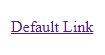
If you run the above code, you will see the below output as a default HTML link
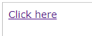
Example #2
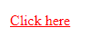
In the second example, we will see how a default HTML link’s color will change on the user’s action. Here the user clicks on the link, which means the user visits the link. Once the link is clicked, the color of the link will change, as per the mention in the HTML code.
Code:
<html>
<head>
<style type = "text/css">
a:visited {color: red}
</style>
</head>
<body>
<a href = "">Click here</a>
</body>
</html>
Output:
This will generate a default HTML link. Once you click this link, it will change its color to red.
Example #3
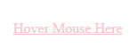
This example shows how a default HTML link will change its color once the user hovers the pointer onto the link. The HTML code will explicitly mention the change of color upon hovering the mouse pointer. Practically it helps the user be cautious that the mouse pointer is onto an HTML link by changing its color.
Code:
<html>
<head>
<style type = "text/css">
a:hover {color: pink}
</style>
</head>
<body>
<a href = "">Hover Mouse Here</a>
</body>
</html>
Output:
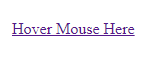
The above code will generate the following output.
After you hover the mouse on the link, it will change color to pink. This will make you aware of the fact that your mouse pointer is onto a link.
Example #4
In the fourth example, we will see how a default HTML link will change color once the user clicks the link. The HTML code will explicitly mention the change of color upon clicking the mouse pointer. Practically, it helps the user be aware that they have clicked an HTML link by changing its color.
Code:
<html>
<head>
<style type = "text/css">
a:active {color: red}
</style>
</head>
<body>
<a href = "">Click here</a>
</body>
</html>
Output:
The above code will generate the following output.
When a user clicks it, the color of the HTML link changes to red. In practical scenarios, this will help to find the already clicked links by a user in case they are visiting multiple links so that rework can be avoided.
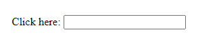
Example #5
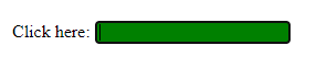
In this example, we will see how a default HTML element changes color once the user clicks on the element. Here we have shown an example of a text box. By default, when you run the HTML code, you will see a text box generated with a white background color. But whenever you click the mouse pointer inside the textbox, the background color of the text box changes. The HTML code will include a mention of the change of color upon clicking the mouse pointer. Practically, it helps the user be aware that they clicked an HTML element by changing its color. Remember to declare the doctype when using the focused pseudo-class value.
Code:
<!DOCTYPE html>
<html>
<head>
<style type = "text/css">
input:focus {background-color: green}
</style>
</head>
<body>
<form>
Click here: <input type="text" ><br>
</form>
</body>
</html>
Output:
The above code will generate the following output.
When the textbox receives focus, it changes its color to green. In a practical scenario, this will help the user quickly identify which HTML element they click or focus on.
Conclusion
This concludes our learning of the topic “CSS Pseudo Classes.” As you can see how we had used different states of pseudo-classes in our HTML code examples. This article will help those who are associated with HTML design. These pseudo-classes make end-users aware of visited/unvisited elements in a webpage.
Recommended Articles
We hope that this EDUCBA information on “CSS Pseudo Classes” was beneficial to you. You can view EDUCBA’s recommended articles for more information.

