Updated May 29, 2023
What are Pivot Table Examples?
In this article, we will check some of the best examples and tricks of pivot tables. The pivot table is such a powerful and important tool for Excel, which can work hours in minutes for analysts. In this article, I will cover some of the best features of the Excel pivot table through some examples.
Examples of Pivot Table
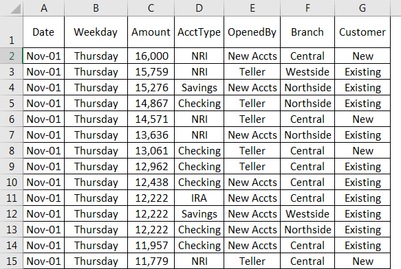
The data which I am going to use throughout this article is shown below:
Example #1 – Automatically Creating a Pivot Table
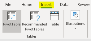
How good it would have been if you didn’t need to worry about the questions like – “Which columns should be ideal for my pivot table?”, “Which columns should go under rows, columns, values, etc.?”. Do you feel it’s a fantasy? Let me take a moment to inform you that this fantasy has become a reality in Excel. If you have Excel 2013 or above installed in your system, it has an option called Recommended PivotTables. Let’s see how it works.
Step 1 – Select any cell in your data and click insert >Recommended PivotTables (You can see this option beside the PivotTable tab).
Step 2 – Click > Recommended PivotTable.
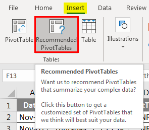
Step 3 – Excel will quickly analyze your data and develop some recommended pivot table layouts.
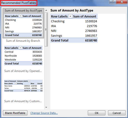
The recommended pivot table option uses the actual data from your worksheet. Hence, there is a good chance you’ll get the layout you were looking for or at least close to one of your interests.
Step 4 – Select any layout of interest and click Excel created a pivot table on a new worksheet.
In the above example, we have seen the example of How we automatically create a table. Let us see another example in the Pivot Table.
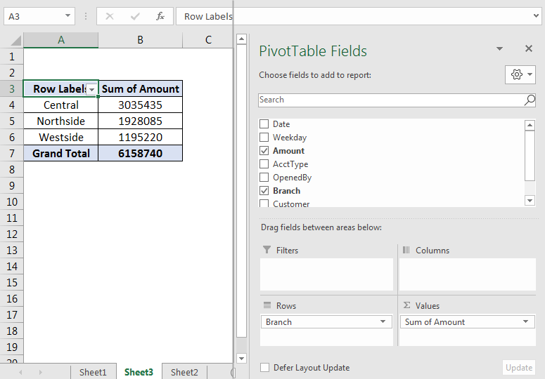
Example #2 – Modifying Pivot Table
Once you create the pivot table, it is easy to modify the same. You can add some more fields in the layout to display more summary using the PivotTable Fields pane, which can be found on the right-hand side of your worksheet in which the pivot is.
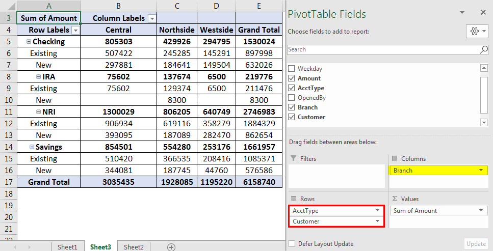
Here, the column named Customer is added under Rows, and Branch is added under Columns. You can add the columns under the Rows or Columns pane by dragging them down to the respective field area.
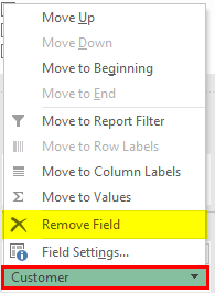
Similarly, you can also remove the field from the pivot table. Click on the column you want to remove, and there, a pane will open, under which you need to click on Remove Field, and the field will be removed from the pivot table. Or you can simply drag the field out of the pivot table pane, which yields the same result.
If you add any field under the Filters section, it will appear at the top of the pivot table as a drop-down list, allowing you to filter the displayed data by one or more than one items.
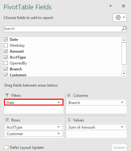
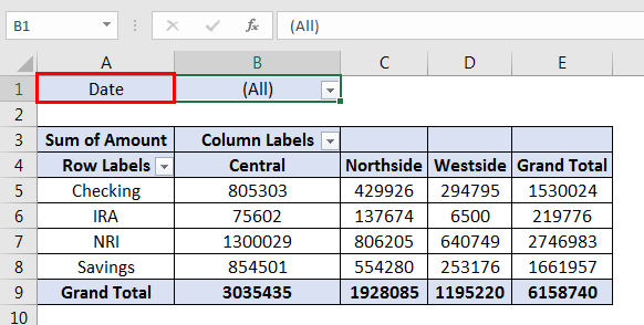
The above figure shows an example of the Filter fields. I have added the Date under the filter field and can use this column to filter my pivot data. For instance, I have filtered the data for 27-Nov-2018. It means that my pivot table will now only show the data for 27-Nov-2018.
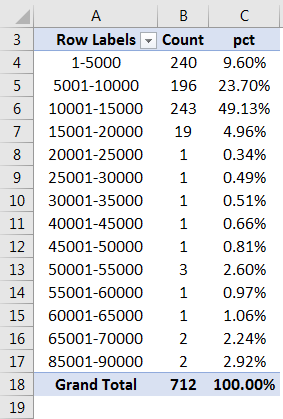
Example #3 – Customize Columns Under Pivot Table
Suppose we want to check the amount-wise distribution of accounts. We want to check what % of accounts are under what amount range. We can do this under a pivot table. So first, create a pivot table and then the columns as below.
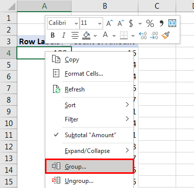
Under the Rows Field, select Amount (as a range). Select any cell from Pivot Table and right-click to add it as a range. Click on the Group section,
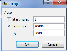
After that, make a grouping as shown in the second image. Starting from 0 to 90000 with a difference of 5000.
- Under Values Field, select Amount (as a count). Add column Amount two times under Values; it will automatically select it as a count. Also, add Amount under the Values field as a % of the column.
- For storing Amount as % of Amount in each group, click on the second Amount and select Value Field Settings.
- Under the Value Field Settings pane, click on Show values As inside, selecting the option % of Colum Total. It will change the field as % of the Amount for each Amount group. Moreover, you can also use a custom name for the column displayed in a pivot. Please see the name give Pct (Which makes sense for the Percentage column) and Count, which makes sense for the count of Amount.
The final output should look like below:
Let us see another example in the Pivot Table.
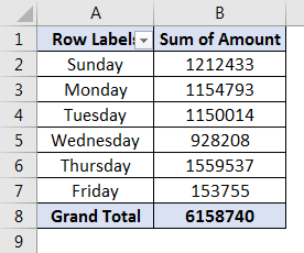
Example #4 – Data Analysis
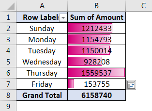
Suppose we want to check which day of the week gets more deposits in the account. Let’s see how we can go towards an answer to this question through pivot tables.
- Create a pivot table with Weekday under the Rows field and Sum of Amount under Values.
- If the Values field by default does not give Sum of Amount, change it through Summarize Values By under Value Field Settings (Change the type from Count to Sum, which will give the sum of Amount instead of count).
Your pivot should look like the below:
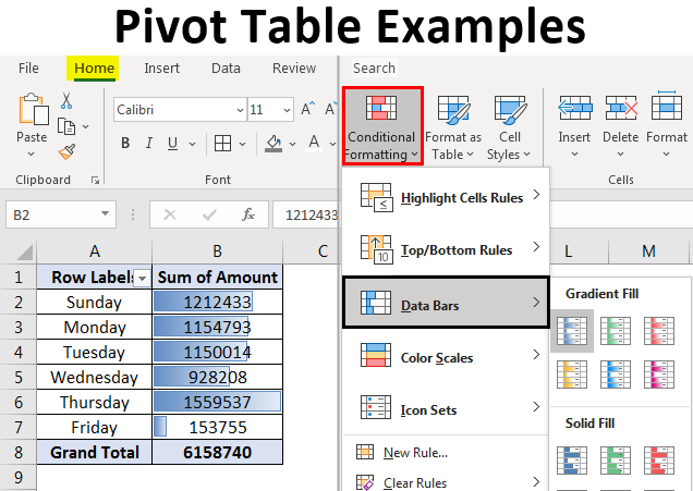
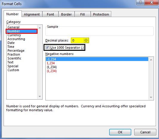
Please note that I have updated the visual settings of the column Sum of Amount using Cell Formatting. Please see the image below for the cell formatting reference.
For better visualization, we will use conditional formatting to add the data bars in this pivot.
Though this pivot shows you that Thursday is the day more account deposits happen, the data bar will give you a clearer and more graphical representation.
- Select all fields except Grand total from your pivot
- Click on Home
- Go to Conditional Formatting dropdown > Data Bars. Under which, select a bar with a color of your choice and fill (either gradient or solid).
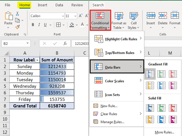
You should get the below output:
I hope this article is helpful. It gives a better idea in a single look, Right!. In this way, we can use some graphical analysis techniques under our pivot table with the help of Conditional Formatting. Let’s wrap things up with some of the points to be remembered.
Things to Remember
- Though it is very flexible, Pivot Table has its limitations. You can’t make a change in the pivot table fields. You can’t add columns or rows under it and can’t add formulas within the pivot table. If you want to make changes in a pivot table in a way not allowed normally, copy your pivot table to some other sheet and then do. Select your Pivot table and hit Ctrl + C. or go to Home and select Copy under Clipboard.
- If you update your source data, refresh the pivot table to capture the latest updates made in your data. This is because pivot prevents automatic up-gradation once the source data has been updated.
Recommended Articles
This is a guide to the Pivot Table examples in Excel. Here we discuss some of the Different Types of Examples in Pivot Table with the Excel template. You can also go through our other suggested articles to learn more –
