Updated June 9, 2023
Pareto Analysis – Ever so often, we find that a single rotten apple can lay to spoil an entire bunch in the basket. Similarly, we often find that a disproportionate majority of quality issues and business defects cause a small set of problems. Project management scholars have for many years debated and analyzed this aspect affecting our business strategies and how we function as a unit.
With issues and irregularities cropping up in our product quality, it became necessary for teams to analyze what was going wrong and develop different tools for analyses. One of them was Pareto Analysis, which stemmed from the basic principle called the Pareto Principle, which depends on the same fact that many problems arise from limited sources. In this article, we will dive deeper into understanding Pareto Analysis and how to conduct these analyses to place our business quality and functioning better.
Analyzing Pareto Analysis
Pareto Analysis states that 80% of the defects and issues in the quality of the end product delivered to Customers and consumers are the result of and contribute to just a mere 20% of the problems and process deformities encountered during the production process. This could be reinstated if we look out for that 20% of the issues, and we will be able to resolve about 80% of the quality issues reported by customers on the product.
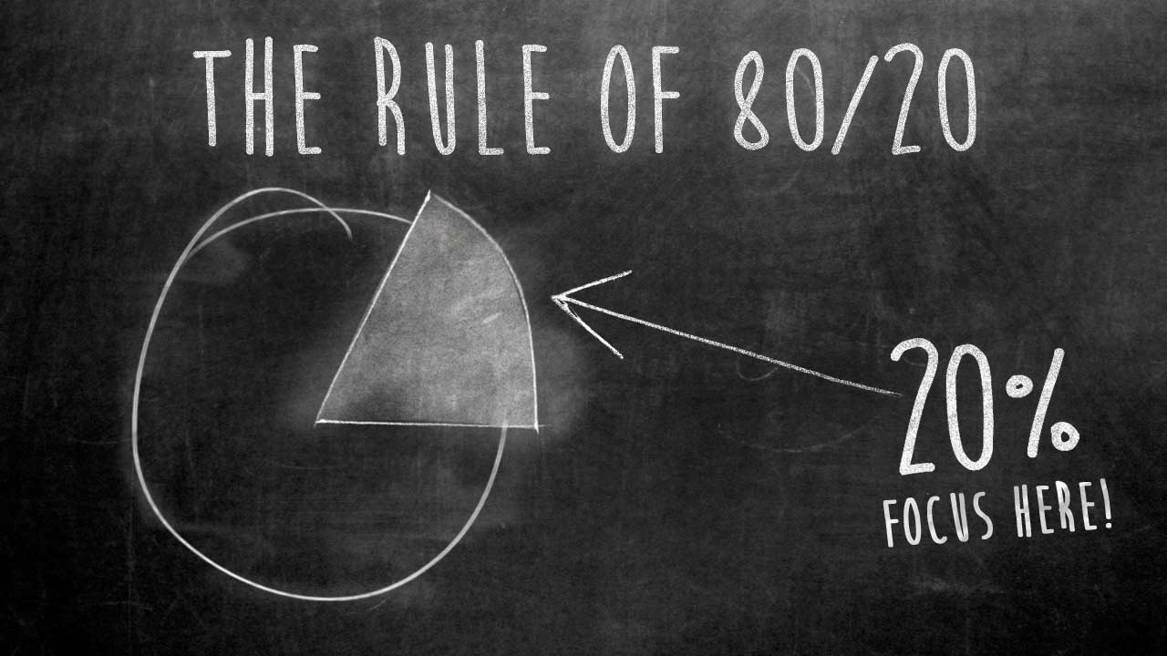
Being able to resolve 80% of the problems related to quality right in the production stage is recommended for every business that faces problems with its product quality. The entire concept then pits us against this 20%. It allows us to dedicate our time and resources to finding, eradicating, and setting up preventive measures for these quality-oriented issues. Achieving 100% quality on your product can be quite a daunting job, and maintaining it can still be daunting. You will require all the help you can find. Interestingly enough, if you obtain a tool such as Pareto Analysis, you will mark improvements almost instantly and say farewell to the idea that 20% of criminals are responsible for 80% of problems.
History of Pareto Analysis
Knowing the basis for Pareto Analysis can be quite some knowledge for you, and I will introduce just that to you. Taking you back to the 19th century and the dawn of the 20th century, we have Vilfredo Pareto, a noted economist, who would always have a go at studying the economies across regions and how each person in society would contribute to it.
According to Pareto’s findings, based on his tremendous research, he deduced that 80% of the region’s wealth in Italy came from only 20% of the population residing in the area. His theory was groundbreaking. He formalized the 80-20 count after carefully studying the distribution of wealth in his hometown and subsequent towns across Italy. Over the years, this principle and theory came to be recognized not only in the economic space but also in quality and project management. It was Joseph Juran, a noted American engineer and management consultant who, many years later, in the 1940s, applied this principle to quality control and thus resurfaced the process of Pareto Analysis.
He put into practice an analysis technique that showed 80% of the qualitative defects or errors stemming from 20% of the problems. Thus, focusing on that 20% could put to rest 80% of your product errors, giving your product a high level of quality.
Why Pareto Analysis?
Take into consideration that you’re running your restaurant. You want to check for the high points in your menu—items that sell the most, and the weak points—items that sell the least.
Using Pareto Analysis, you will be able to figure out that 20% of your menu gathers for you 80% of the profit. You will then ask your chefs to improve those hotcakes to attract more crowds to your restaurant, perhaps even make their signature dishes. And on the flip side, you will even look at the 80% of your menu that contribute to just 20% of the profits made and remove some items that feature the least and make up for the rest. This way, you will have a fixed aim at things and greater control over what goes out of that kitchen.
As stated, this will be just one of the ways Pareto Analysis helps you narrow down on central issues and peak points in your business and even helps you keep a constant roving eye on them.
Another example that I would like to share is from my own experience as a Project Manager. Errata on product text received seven separate categories created from user feedback. Categories. Having applied Pareto Analysis to this data set made me realize that 2 types constituted 80% of the errata we were receiving. In contrast, the remaining 20% were distributed among the remaining 5 categories. With this realization on paper and backed with data and figures, my team and I could concentrate heavily on eradicating the errors marked in those categories right in the production stage.
With a combination of root cause analysis, we resolved that chuck of 80% errors by 10% each month. Giving us a boost in quality control, we found lesser errata coming in from customers and more satisfaction and belief in the product and brand.
Given below is the list of what Pareto Analysis can do for you once you bring it into a corporate environment:
- It helps you to find the start line for your problem-solving spree
- It helps categorize the errors, defects, customer complaints, and quality parameters that need attention
- Through a Pareto Chart or Pareto Diagram, it allows you to see the 80-20 rule in action.
This is the power of Pareto Analysis and the answer to why we need it.
Pareto Chart/Diagram – How to Use It?
Putting into effect the Pareto Chart can be summarized as part of 4 phases. These phases of Pareto Analysis look directly into steps that will lead you to construct a Pareto Chart for your use. We’ll go through these phases individually and have them associated with achieving a conducive and perfect Pareto Chart for all your problems analyses.
1. Phase 1 – Identification
In this phase, you will look at the following steps:
- Classify all your problems that result in inferior product quality. At some point, customers/distributors may have rejected these products. You can find the reasons for this quality by gaining feedback from these sides and reviewing your processes and workflow.
- Create a rough list of problem and issue categories on them. Restrict yourself to 5-6 problem categories, and note that this list can be modified during the analysis.
A list can be identified and created through brainstorming sessions, focus group meetings, customer feedback, and employee/executive surveys within your team or the affected department. Through these activities, it will become easier for you to narrow down to categories that, on a wide scale, affect and degrade the quality of the products belted out.
2. Phase 2 – Time and Assessment
In this phase, you will look at the following steps:
- Fix a time frame for the list that you’re considering. Time frames ensure that work is currently organized and in time for implementation. In this time frame, please complete the entire analysis, gather data, and prepare the Pareto Chart for every item on that list.
- Issue tally marks for the number of occurrences that each problem categorizes into. As a contingency, ensure you have an “Others” category to tally problems that don’t fit into the existing categories.
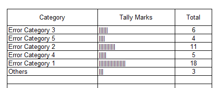
- Get a number to the total occurrences in each category and produce a total of affairs.
- Obtain the percentage by dividing the number in each category by the total number of occurrences obtained.
This phase intends to gather enough statistical data and information to assess the problems effectively and efficiently. The period over which you will collect this data and sit across the table to analyze them will help you gain an overview of the possibilities of where these problems may lead you. The frequency will also enable you to put into place quality control measures to grab the quality at every step of the allotted process and gauge the different levels of issues and causes for those issues.
3. Phase 3 – Summarization and Graphical Representation
In this phase, we will look at the following steps:
- Rearrange the categories in the order of those with the highest percentage and gradually drop through till the least harmful or not-so-frequently occurring problem on the list. Draw out the “Others” category at the end, irrespective of its tally percentage.
- Construct a graph with a horizontal axis and two vertical axes on either side of your screen. Plot the left vertical axis with increments starting from zero and ending with the total occurrences calculated while striking the tally marks. While on the other hand, plot the right vertical axis with increments beginning with zero and ending with 100%.
- Plot the first vertical bar with the highest percentage, start from the left, slowly progress to the lowest rate, and finally conclude with the “Others” vertical bar. The height of these bars will be marked against the values mentioned on the left axis (number of occurrences) and the percentage of the total on the right axis. Maintain no space between these bars and keep the width consistent through all the bars representing the categories. It should look something like this:
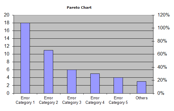
- Provide labels to the bars right under the horizontal axis.
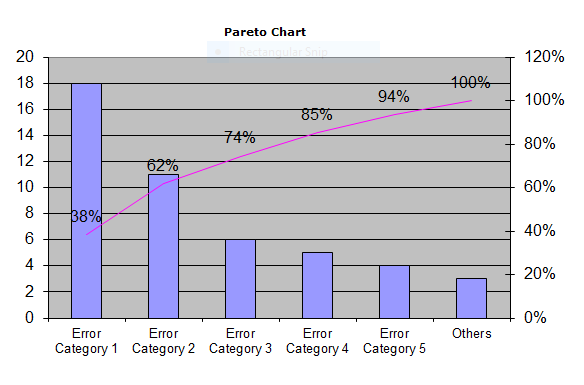
- Start at the left zero point and plot a line depicting the cumulative percentage total reached by adding each category as they progress. This line will end at 100% on the right vertical axis. It will look something like this:
You can conduct these steps by repetitively preparing the Pareto Chart to break down the categories further. This solely depends on the intensity of the problem categories you have created.
4. Phase 4 – Interpretation
This final phase involved in Pareto Analysis is the interpretation of the Pareto Chart you have laid out before yourself. You can see the line you plotted starting at the zero point on the left vertical axis to the 100% mark on the right vertical axis; this serves as a gauge to understand and watch the Pareto Principle come to life. If we span the chart from left to right, we will see the categories contributing to maximum occurrences of the problem, and this graph gradually lowers down as you traverse right.

We can see the 80-20 breakup that the Pareto Principle dictates. 80% of issues/defects/errors are caused by only 20% of the categories you narrowed down to. With this interpretation, you must target the left-most types and proceed to the right. The left classes are the problem areas and need attention most urgently for you to increase your product quality and ensure customer satisfaction.
You can have Pareto Analysis conducted once again on 20% of categories and break them down further. This will surely be effective.
Benefits of Pareto Analysis and Pareto Chart
A Pareto Chart is a great tool for project managers and business executives when they find themselves in situations where the process investigated using the Pareto Analysis framework results in the categorization of errors, defects, or abnormalities. Putting a number to these categories can help you plot them graphically, thus, bringing you to a visual treat of what you need to focus on and its magnitude. The Pareto Chart also enables you to rank in the hierarchy and descend to low-key problems and issues.
By the sound of it, many benefits can be reaped from Pareto Analysis and the Pareto Chart, helping you identify and gradually rectify these errors and defects. Summarizing the benefits, we have the following list:
- Using identification and categorization based on hierarchy, Pareto Analysis and the Pareto Chart can highlight the main 20% causes to 80% of the problems.
- It allows many practical applications such as process improvement trials, checking for customer needs and demand, investment and deal opportunities, and many more to set priorities.
- It allows us to concentrate our efforts on improving a set category, thus, helping to save time and resources.
- As it allows better utilization of resources and time on a larger scale
