Updated August 24, 2023
Excel Line Chart (Tables of Contents)
Line Chart in Excel
Line Chart is a graph that shows a series of point trends connected by the straight line in excel. Line Chart is the graphical presentation format in excel. By Line Chart, we can plot the graph to see the trend, growth of any product, etc.
Line Chart can be accessed from the Insert menu under the Chart section in excel.
How to Create a Line Chart in Excel?
It is very simple and easy to create. Let us now see how to create a Line Chart in Excel with the help of some examples.
Example #1
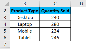
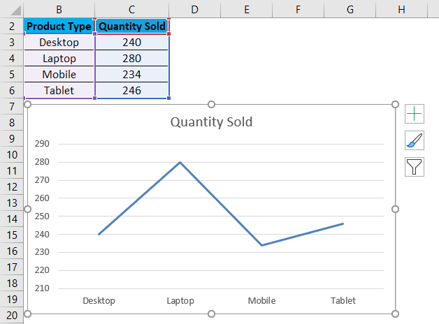
Here we have sales data of some products sold in a random month. Product Type is mentioned in column B, and their sales data are shown in subsequent column C, as shown in the below screenshot.
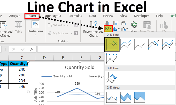
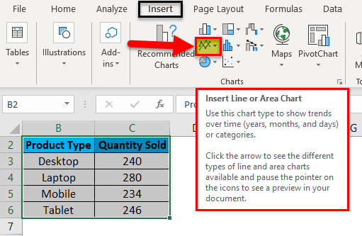
Let’s create a line chart in the above-shown data. For this, first, select the data table and then go to the Insert menu; under Charts, select Insert Line Chart as shown below.
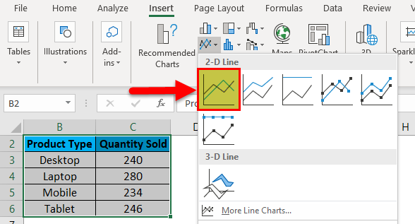
Once we click on the Insert Line Chart icon as shown in the above screenshot, we will get the drop-down menu of different line chart menu available under it. As we can see below, it has 2D, 3D and more line charts. For learning, choose the first basic line chart as shown in the below screenshot.
Once we click on the basic Line chart as shown in the above screenshot, we will get the line chart of Quantity sold, drawn as below.
As we can see, there are some more options available at the right top corner of the Excel Line Chart, by which we can do some more modifications. Let’s see all the available options one by one.
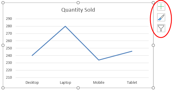
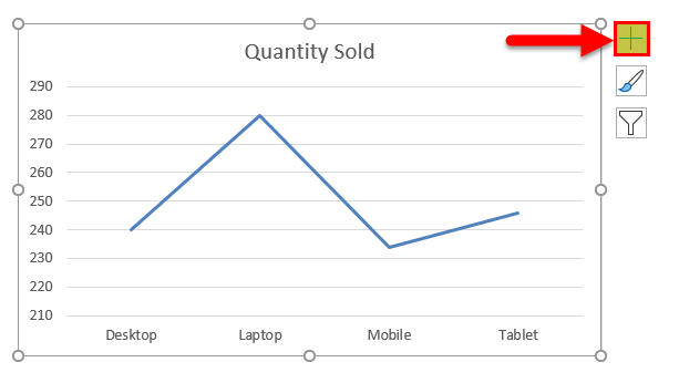
First, click on a cross sign to see more options.
Once we do that, we will get Chart Elements, as shown below. Here, we have already checked some of the elements for an explanation.
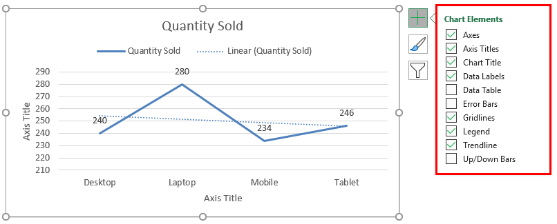
- Axes: These are numbers shown in Y-axis. It represents the range under which data may fall in.
- Axis Title: Axis Title as it is mentioned beside Axes and bottom of product types in the line chart. We can choose/write any text in this title box. It represents the data type.
- Chart Title: Chart title is the heading of the whole Chart. Here, it is mentioned as “Quantity Sold.”
- Data Labels: These are the datum points in the graph, where the line chart points are pointed. Connecting data labels creates line charts in excel. Here, these are 240, 280, 234, and 246.
- Data Table: Data Table is the table that has data used in creating a line chart.
- Error Bars: This shows the kind of error and amount of error the data has. These are Standard Error, Standard Deviation, and Percentage mainly.
- Gridlines: Horizontal thin lines shown in the above chart are Gridlines. Primary Minor Vertical/Horizontal, Primary Major Vertical/Horizontal is the types of gridlines.
- Legends: Different color lines, different types of the line present different data. These are call Legends.
- Trendline: This shows the data trend. Here it is shown by a dotted line.
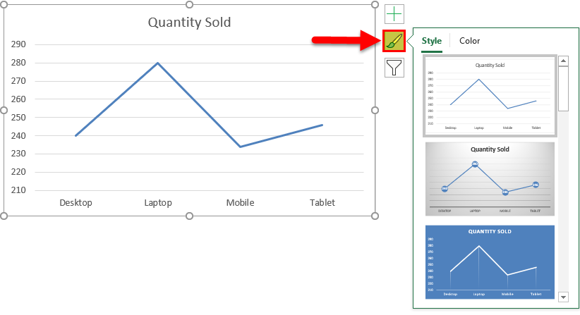
Now, let’s see the Chart Style, which has the icon as shown in the below screenshot. Once we click on it, we will get different styles listed and supported for that selected data and the Line Chart. These styles may change if we choose some other chart type.
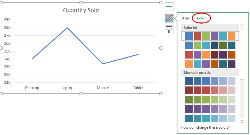
If we click on the Color tab circled in the below screenshot, we will see the different color patterns used to have more one-line data to show. This makes the chart more attractive.
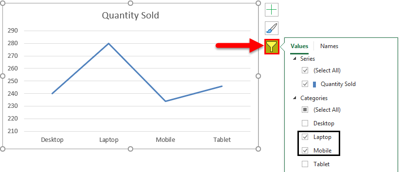
Then we have Chart Filters. This is used to filter the data in the chart itself. We can choose one or more categories to get the data trend. As we can select in below, we have chosen laptops and Mobile in the product to get the data trend.
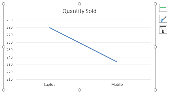
And the same is getting reflected in Line Chart as well.
Example #2
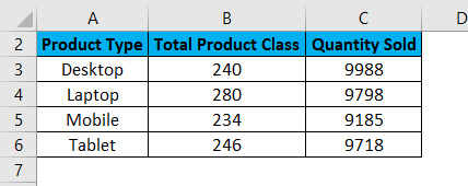
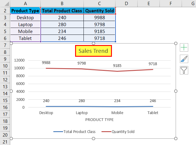
Let’s see one more example of the Line Charts. Now consider the two data sets of a table as shown below.
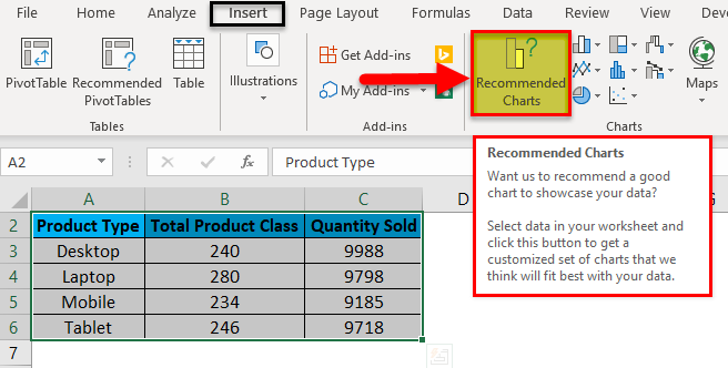
First, select the data table and go to the Insert menu and click on Recommended Charts as shown below. This is another method of creating Line Charts in excel.
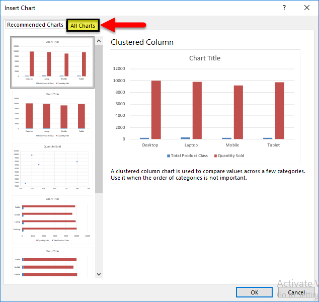
Once we click on it, we will get the possible charts that the present selected data can make. If the recommended chart does not have the Line Chart, click the All Charts tab below.
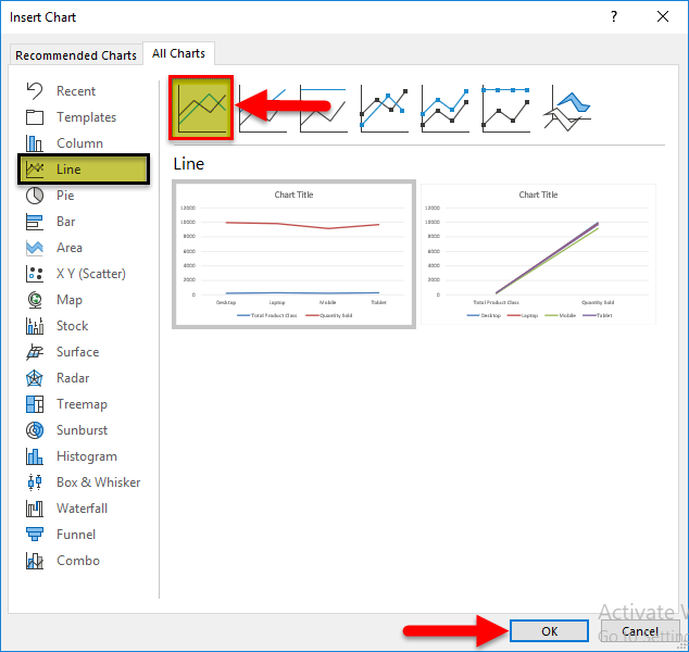
Now, from the All Chart tab, select Line Chart. Here also, we will get the possible type of line chart that may be created by the current data set in excel. Select one type and click on OK, as shown below.
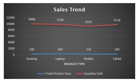
After that, we will get the Line Chart as shown below, which we name as Sales Trend.
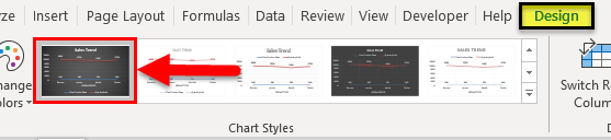
We can decorate the data as discussed in the first example. Also, there is more way of selecting different designs and styles. For this, select the chart first. After selection, Design and Format menu tab becomes active, as shown below. From those, select the Design menu and select under that select and suitable style of chart. Here, we have selected a black color slide to have a classier look.
Pros of Line Chart in Excel
- It gives a great trend projection.
- We can see the error percentage as well, by which the accuracy of data can be determined.
Cons of Line Chart in Excel
- It can be used only for trend projection, pulse data projections only.
Things to Remember About Line Chart in Excel
- Line Chart with a combination of Column Chart gives the best view in excel.
- Always enable the data labels so that the counts can be seen easily. This helps in the presentation a lot.
Recommended Articles
This has been a guide to Line Chart in Excel. Here we discuss how to create a Line Chart in Excel along with excel examples and a downloadable excel template. You may also look at these suggested articles –
