Updated May 10, 2023

Error Bars in Excel
Error bars are one of the graphical representations of data that is used to denote errors. Also, error bars can have plus, minus, or both types of direction with Cap and No Cap style of bars. First, to insert error bars, create an Excel chart using any Bars or Columns charts, mainly from the Insert menu tab. Then click the Plug button at the top right corner of the chart and select Error Bars from there. To customize the error bars further, choose More Options from the same menu list.
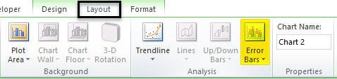
In Error Bar, we have three options which are listed as follows:
- Errors Bars with Standard Error.
- Error Bars with Percentage.
- Error Bars with Standard Deviation.
How to Add Error Bars in Excel?
Adding error bars in Excel is very simple and easy. Let’s understand how to add error bars in Excel with a few different examples.
Example #1
The standard error is a statistical term that measures the accuracy of the specific data. In statistics, a sample deviates from the actual mean of the population; therefore, this deviation is called the standard error. In Microsoft Excel standard error bar is the exact standard deviation.
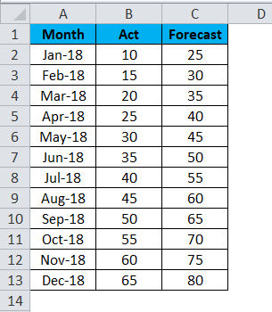
In this example, we will learn how to add error bars to the chart. Let’s consider the example below, which shows the sales actual figure and forecasting figure.
Now we will apply Excel error bars by following the below steps.
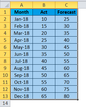
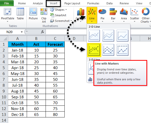
- First, select the Actual and Forecast figure and the month to get the graph below.
- Go to the Insert menu and choose the Line chart.
- We will get the below line chart with an actual and forecasting figure.
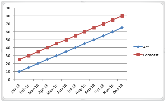
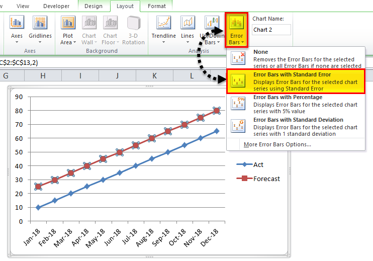
- Now click on the forecast bar to select the actual line with a dotted line, as shown below.
- Once we can click on the forecast, we can see the layout menu. Click on the Layout menu to see the Error bar option.
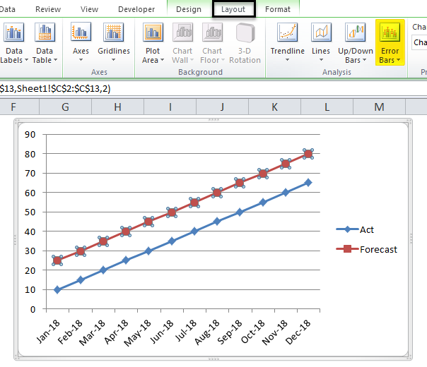
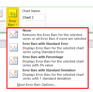
- Click on the Error Bars option so that we will get the below option as shown below.
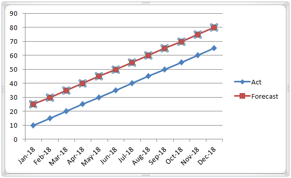
- In the error bar, click on the second option, “Error Bar with Standard Error“.
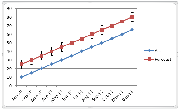
- Once we click on the standard error bar, the graph will get changed, as shown below. The screenshot below shows the standard error bar, which shows the fluctuation statistic measurement of Actual and forecast reports.
Example #2
This example will teach adding an Excel Error bar with a percentage in the graphical chart.
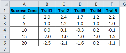
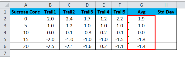
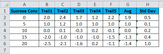
Let’s consider the example below, which shows a chemistry lab trial test as follows.
Now calculate the Average and standard deviation to apply for the error bar by following the below steps.
- Create two new columns as Average and Standard Deviation.
- Insert Average formula =AVERAGE(B2:F2) by selecting B2: F2.
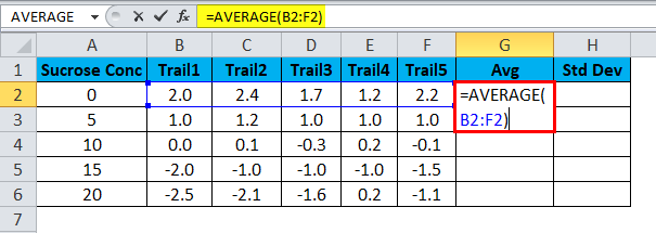
- We will get the average output as follows.
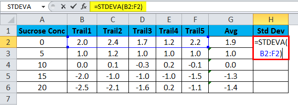
- Now calculate the Standard Deviation by using the formula =STDEVA(B2:F2)
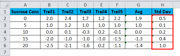
- We will get the standard deviation as follows.
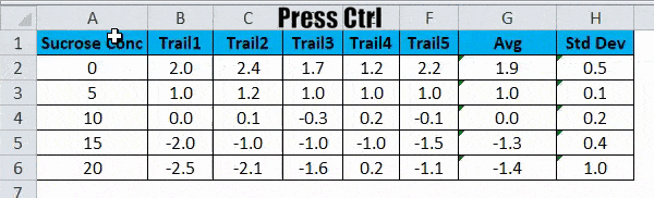
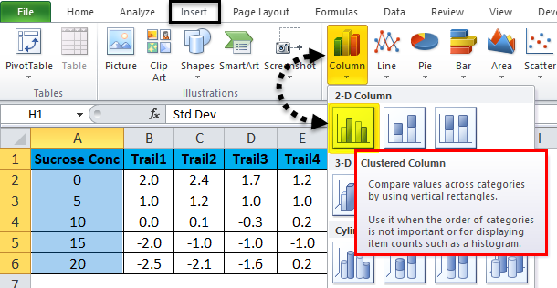
- Now select the Sucrose Concentration Column and AVG column by holding the CTRL-key.
- Go to the Insert menu. Select the Scatter Chart that needs to be displayed. Click on the scatter chart.
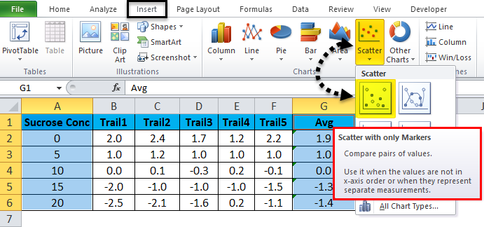
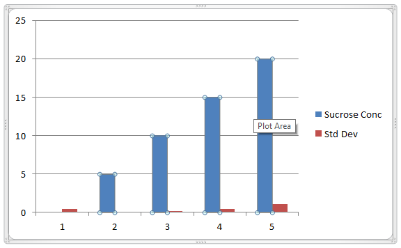
- We will get the result as follows.
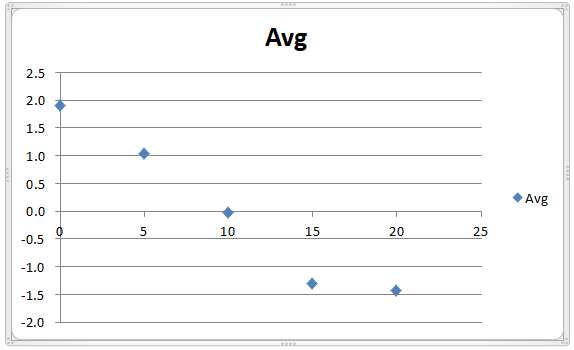
- The dotted lines show the average trail figure.
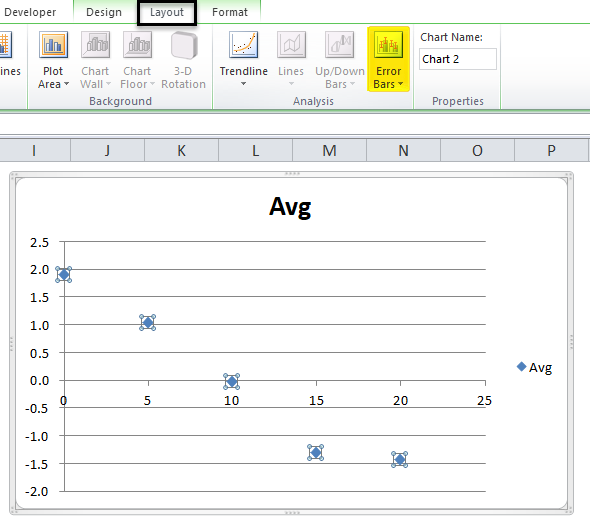
- Now click on the blue dots to get the layout menu.
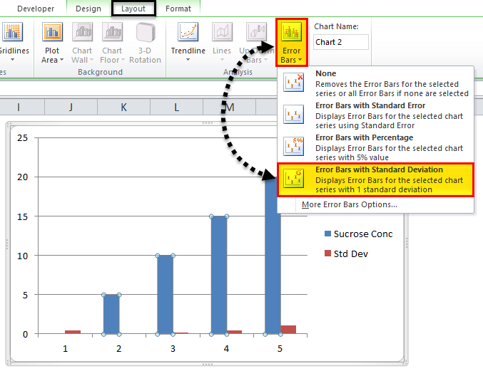
- Click on the Layout Menu to find the error bar option, as displayed in the screenshot below.
- Click on the Error Bar to get the error bar options. Click on the third option called “Error Bar with Percentage”.
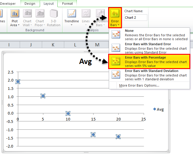
- Once we click on the Error Bar with the percentage, the above graph will change, as shown below.
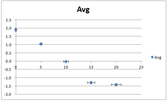
- In the above screenshot, we can see that Error Bar with 5 Percentage measurement.
- By default, the Error Bar with Percentage takes as 5 Percentage. We can change the Error Bar Percentage by applying custom values in Excel, as shown below.
- Click on the Error Bar to see the More Error Bar Option, as shown below.
- Click on the “More Error Bar option”.
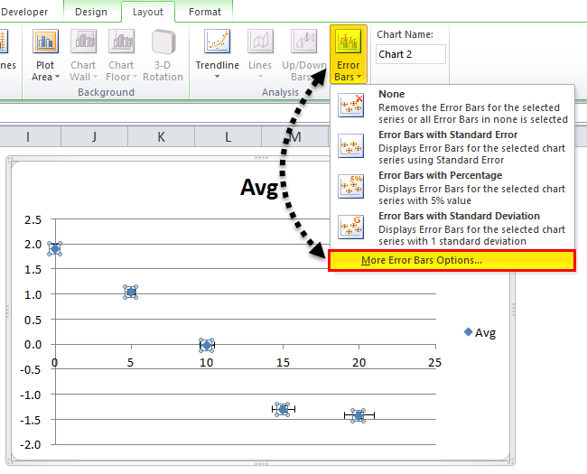
- So that we will get the below dialogue box, we can see in the percentage column by default, excel will take as 5 Percent.
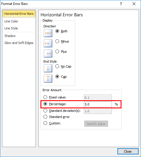
- In this example, we will increase the Error Bar Percentage by 15 %, as shown below.

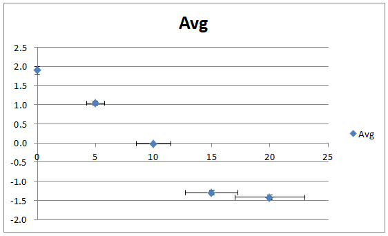
- Close the dialogue box so that the above Error bar with the percentage will increase by 15 percent.
- In the below screenshot, the Error Bar with Percentage shows 15 percentage Error Bar measurements of 1.0, 1.0, 0.0, -1.3, and at last with value -1.4 in blue color dots as shown in the below screenshot.
Example #3
In this example, we will see how to add an Error Bar with Standard Deviation in Excel.
Consider the same example where we have already calculated the Standard deviation as shown in the screenshot below showing chemistry labs test trails with average and standard deviation.
We can apply an Error Bar with a Standard Deviation by following the below steps.
- First, select the Sucrose Concentration column and Standard deviation Column.
- Go to the Insert menu to choose the chart type and select the Column chart as shown below.
- We will get the below chart as follows.

- Now click on the Blue Colour bar to get the dotted lines as shown below.
- Once we click on the selected dots, we will get the chart layout with the Error Bar option. Choose the fourth option, “Error Bars with Standard Deviation”.
- So that we will get the below standard deviation measurement chart as shown in the below screenshot.
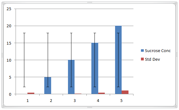
- Follow the same process illustrated above to show the Error bar in Red Bar.
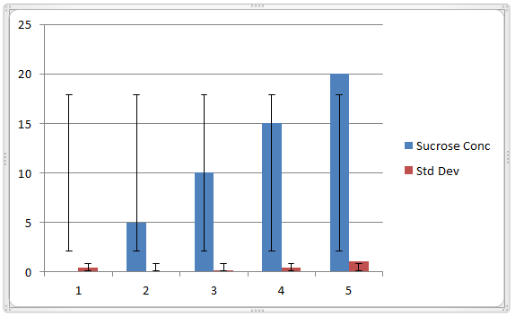
As we can notice, the error bars show a standard deviation of 0.5, 0.1, 0.2, 0.4 and 1.0
Things to Remember
- Error Bars in Excel can be applied only for chart formats.
- In Microsoft Excel, error bars are mostly used in chemistry labs and biology to describe the data set.
- While using Error bars in Excel, ensure you use the full axis, i.e., numerical values must start at zero.
Recommended Articles
This has been a guide to Error Bars in Excel. Here we discuss how to add Error Bars in Excel, along with Excel examples and a downloadable Excel template. You can also go through our other suggested articles –
