Updated March 8, 2023
Introduction to Flexbox and Bootstrap
The need for responsive design is rapidly growing as everyone is looking for a device-friendly user interface. To achieve this responsive design, we either choose Flex or Bootstrap.
One of my favourite CSS concepts is Flexbox because its layout allows responsive elements within a container to be automatically arranged depending upon the device’s screen size. This flex technique stays flexible to the item’s size and stays flexible towards its contents. To put it in simple word, I will say Flexbox is normally checked for the tallest div in the container and sticks to its height. Also, in flexbox, we put more class per elements which eventually increase the HTML page. All this result in a speed of retrieves the HTML page. Undoubtedly Flexbox is one of the standard ways of deploying. So it is a must for everyone who wants to be a frontend developer.
On the other hand, we have the world’s favourite UI library for Responsive Design called Bootstrap. It is a framework that uses floats to make the grid system. It is also CSS, so the performance is very little, except for the downloading file. It creates one class or maybe two per elements. While using Bootstrap, to avoid misaligned divs of different height, we must use clearfix after each row. Bootstrap is good for creating consistency across projects & teams. Also, the last version of Bootstrap, i.e. Bootstrap 4, uses the flexbox model, which makes it more powerful.
Head To Head Comparison Between Flexbox and Bootstrap (Infographics)
Below is the top 10 difference between Flexbox vs Bootstrap
Key Differences between Flexbox and Bootstrap
Both are popular choices in the market; let us discuss some of the major difference:
Bootstrap has a set of CSS used to design web pages with the support of responsive layouts using media queries which makes it different from FlexBox. In fact, Bootstrap 4 has support for FlexBox.
Unlike Bootstrap, FlexBox has inbuilt in CSS3 and made for better positioning elements. As FlexBox is one dimensional, it makes creating difficult layouts easier.
If we want to make all the child elements in a single row of the exact same width, then we have to make a flexbox by defining parent class as display flex. This way, we can make operations on a row or to an individual element. Eventually, we eliminate the use of float.
In Bootstrap, as styles are already defined, the developers would not have to code from scratch. It not only reduces the CSS coding but also saves time. We can also customize the Bootstrap file if needed. The responsive behaviour of Bootstrap is the best part of it. As everything is predefined, so we don’t need to write code separately for mobile devices of different size.
Most of the time, we use Grid on our web, which can be made using floats in Bootstrap. However, flexbox does the opposite by staying flexible to the items’ size and contents; which is similar to using pixels vs em/rem, or like controlling your divs only using margins and padding and never setting a pre-defined size.
As Bootstrap uses floats, it needs clearfix after each row; otherwise, we will get misaligned divs of different height. Flexbox doesn’t use floats; instead, it checks for the tallest div in the container and sticks to its height.
Flexbox layout is most appropriate to an application’s components and small-scale layouts, while Bootstrap is intended for smaller or larger scale layouts.
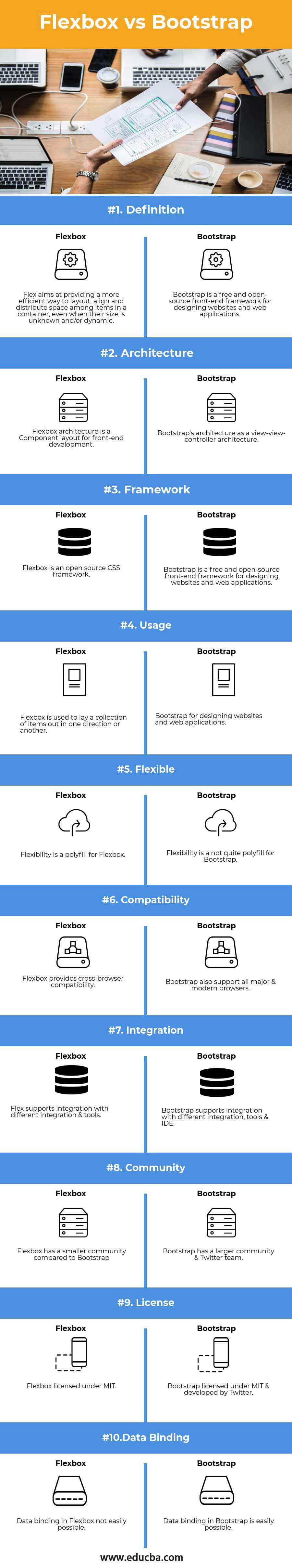
Flexbox vs Bootstrap Comparison Table
Below is the topmost comparison between Flexbox vs Bootstrap
| The basis of comparison |
Flexbox |
Bootstrap |
| Definition | Flex aims at providing a more efficient way to layout, align and distribute space among items in a container, even when their size is unknown and/or dynamic. | Bootstrap is a free and open-source front-end framework for designing websites and web applications. |
| Architecture | Flexbox architecture is a Component layout for front-end development. | Bootstrap’s architecture as a view-view-controller architecture. |
| Framework | Flexbox is an open-source CSS framework | Bootstrap is a free and open-source front-end framework for designing websites and web applications. |
| Usage | Flexbox is used to lay a collection of items out in one direction or another. | Bootstrap for designing websites and web applications. |
| Flexible | Flexibility is a polyfill for Flexbox | Flexibility is a not quite polyfill for Bootstrap |
| Compatibility | Flexbox provides cross-browser compatibility. | Bootstrap also support all major & modern browsers. |
| Integration | Flex supports integration with different integration & tools | Bootstrap supports integration with different integration, tools & IDE |
| Community | Flexbox has a smaller community compared to Bootstrap | Bootstrap has a larger community & Twitter team. |
| License | Flexbox licensed under MIT. | Bootstrap licensed under MIT & developed by Twitter. |
| Data Binding | Data binding in Flexbox not easily possible. | Data binding in Bootstrap is easily possible. |
Conclusion
If you’ve read the whole Flexbox vs Bootstrap article, the conclusion shouldn’t come as a surprise to you. Because the truth is, there isn’t a better system – both flexboxes vs Bootstrap are good at different things and should be used together, not as alternatives to one another.
Basically, Flexbox is not an alternative to Bootstrap. As a matter of fact, Bootstrap also uses flexbox for its layout in Bootstrap 4.
To resolve out cross-browser issues, we have to go for Bootstrap by including normalize CSS; it also has some extra CSS for elements in it (buttons, panels, jumbotron, etc.). There are three ways to handle the “responsive” part of Bootstrap, i.e. by floating elements introduced in Bootstrap 3 or using Flexbox, which has been used in Bootstrap 4.
Recommended Articles
This has been a guide to the top difference between Flexbox vs Bootstrap. Here we also discuss the key differences with infographics and comparison table. You may also have a look at the following articles to learn more –
