Updated August 24, 2023
Types of Graphs in Excel
We have seen multiple uses of Excel in our professional lives; it helps us analyze, sort, and extract insights from data. One feature of Excel helps us put insights gained from our data into a visual form. This feature helps us display data in an easy to understand pictorial format. We are talking about graphs in Excel. Excel supports most of the commonly used graphs in statistics.
Creating different types of graphs in Excel according to our data is very easy and convenient when it comes to analysis, comparing datasets, presentations, etc. In this article, we will discuss the six most commonly used types of graphs in Excel. We will also discuss selecting the correct graph type for some data.
Common Types of Graphs in Excel
The most common types of graphs used in Excel are:
- Pie Graph
- Column Graph
- Line Graph
- Area Graph
- Scatter Graph
Let’s understand Excel’s different types of graphs and how to create them. We will start with a few examples of types of graphs in Excel.
1. The Pie Graph
As the name suggests, the pie graph displays data as a pie or circle. This graph type is used for showing the proportions of a whole. For example, if we want to compare who did how much work in a team, we would use a pie graph to display it in an easy way to understand.
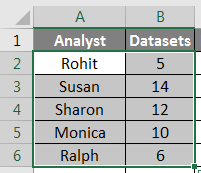
So our data looks like this:
It would now look like this:
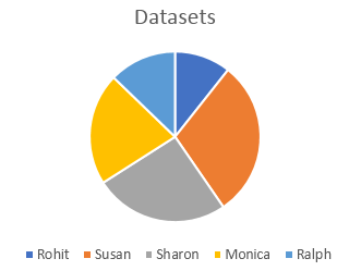
We can also use different types of pie graphs, such as a 3D pie graph, pie of pie, bar of pie, or doughnut graph, to represent the same data.
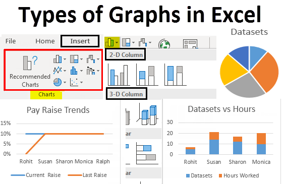
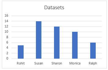
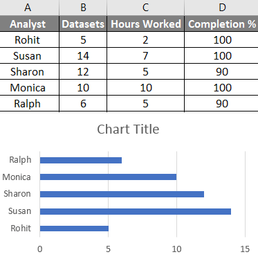
2. The Column or Bar Graph
The next one in the list is a column graph, also called a bar graph in statistics. We use these different types of graphs to see and compare values across a range. The same data that we used in the pie graph example would look like this:
Different bar graphs are available in Excel, such as stacked columns, 100% stacked column, 3D columns, etc. These types of graphs can be used for expanded datasets. For example, we have been working with only two columns in the last two examples, now; if we want to include the hours worked as a third column and compare the hours worked with the number of datasets visually, we can either use a stacked column or a 100% stacked column which would look like this:
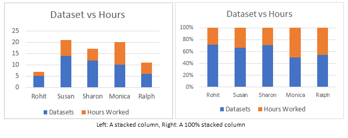
The difference between these is that while a stacked column represents actual values, a 100% stacked column represents the values as percentages. There are 3D version as well as horizontal versions of these graphs in Excel.
3. The Line Graph
The next type of graph we are going to discuss is called a line graph. This type of graph is used when we need to visualize data like an increasing or decreasing series over a period. This is an excellent Excel graph for representing trends and comparing performance. For example, if we wanted to see how the current rise compares to the last raise for different people in the earlier examples, we would get something like this:
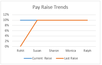
We can see that Rohit is the only one whose pay raise has increased, while other’s pay raise percentages have remained constant over the last year. We have different line graphs or line graphs available in excel, such as stacked and 100% stacked lines.
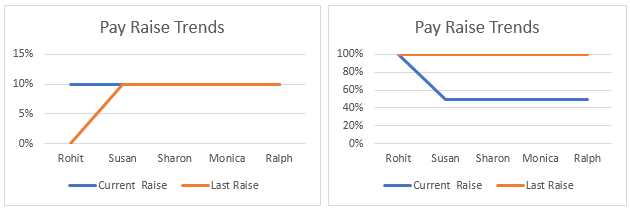
Stacked lines like stacked columns represent percentages instead of actual values.
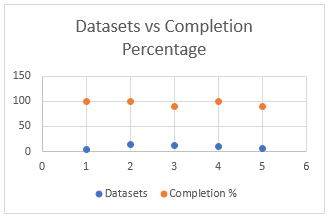
4. The Area Graph
The area graph is available within the line graph menu. This is used for the same purpose as the line graph, which visualizes trends and compares data. In this example, we represent the relationship between the number of datasets worked on by an analyst and the number of hours they worked.
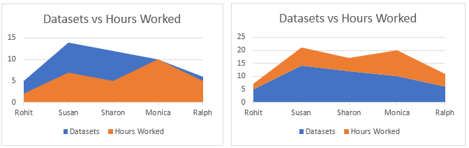
The stacked area graph on the right is used to draw attention to the difference in magnitude of the two categories and displays the values as percentages.
5. The Scatter Graph
The Scatter graph is a simple representation of data points in Excel. It is used when we need to compare at least two sets of data with a limited number of data points.
Many more types of graphs are available in Excel, such as Hierarchy graph, Radar graph, Waterfall graph, and Combo graphs which are combinations of two or more graphs. All these are used based on specific conditions fulfilled by the data, such as the type of data, the number of data points, etc.
How to Create Graphs in Excel?
Now that we have gone through a few examples of types of graphs in Excel, we will learn how to make these graphs. The same procedure is used to make all the graphs. They are enumerated sequentially below:
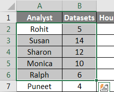
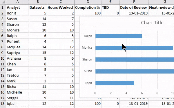
1. First, choose the data you want to represent in the graph. In this case, we will select Analyst and Datasets from the practice table:
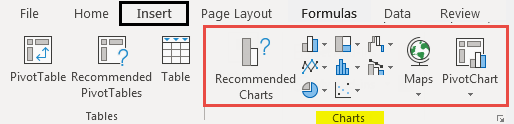
2. Click Insert on the toolbar and navigate to the Charts menu.
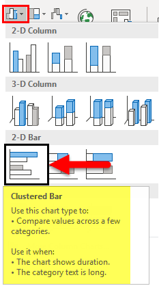
3. Select the required graph from the different types of graphs; in this case, we are making a bar graph which is a horizontal column graph, but you can select any graph that suits the data you are working on:
4. A graph would appear over your data, move the graph to the required position by clicking on it and dragging it across the screen, or cut/copy the graph and paste it elsewhere where you need it:
By following the above steps and varying the type of graph you select, you can make all graphs available in Excel. You can modify these different types of graphs, like modifying a table, by specifying the data which would go into the x-axis and y-axis by right-clicking on the graph and clicking on select data, then specifying the data in the pop up that appears:
Things to Remember
- Know your data before making a graph. A type of graph that may suit a time series may not be suitable for a set of unpatterned data.
- Sort the data before making graphs.
- Do not use unnecessary styling while making the graph.
Recommended Articles
This has been a guide to Types of Graphs in Excel. Here we discussed Different types of Graphs in Excel and how to create these different types of Graphs in Excel, along with practical examples and a downloadable Excel template. You can also go through our other suggested articles –