Updated August 24, 2023
Change Chart Style In Excel (Table of Contents)
How to Change Chart Style in Excel?
Charts are a better way to express data in an effective manner. Creating a chart is easy but giving the matching style to the chart is challenging. According to the data set, a proper style is more effective for the expressed data, and different charts will be used. The most preferred styles are simple and which gives more clarity to your data. A different type of charts are available to picture your data, and these more styles are available to make your charts more effective. You can either customize the chart styles or use the predefined layout styles. Once you select the chart type, the different styles will be listed right next to the chart type, as shown below.
Steps to Change Chart Style In Excel
Let’s understand how to Change Chart Style in Excel with a few steps.
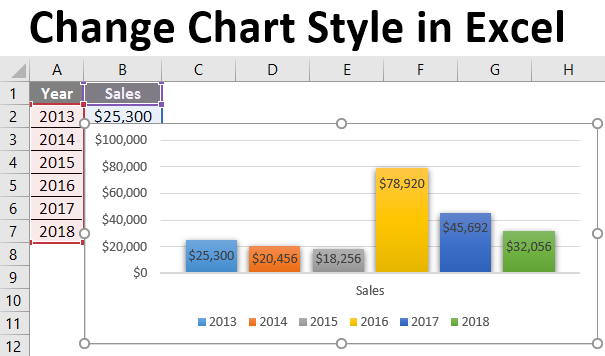
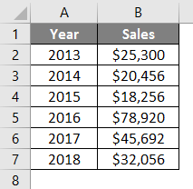
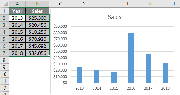
Let’s see how to change the chart styles in the way you want. First, we can create a chart using the table below, where the sales amount for different years is provided. If the data is more than 20 years, it feels difficult to analyze using a table. By creating this chart, people will better understand the data. This will help you capture the sales increase or decrease for different years. The difference in graph components can give a clear view of variations happening for different years. The detailed study of this chart can provide a business trend in sales.
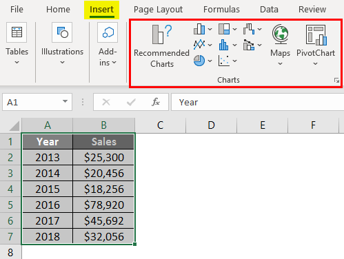
Step 1: Select the table and go to the insert menu. From the chart option, you can select a different chart style. A commonly used style is the column chart or bar chart. Since the data shows sales amount against different years column chart will be more suitable.
Step 2: A column chart is also known as a bar chart. Insert a bar chart from the list.
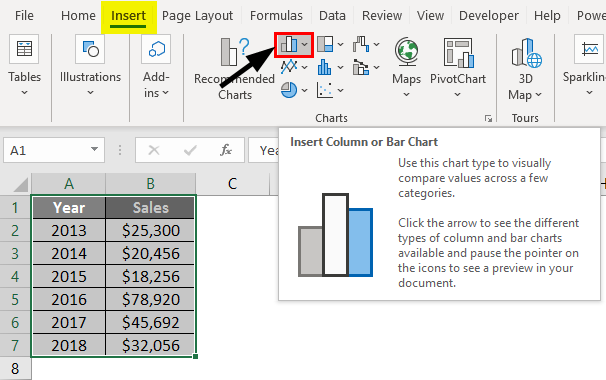
Bar charts look like different bars with both vertical and horizontal styles available.
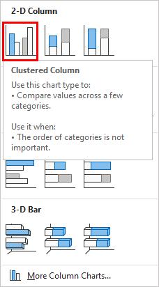
Step 3: Select a style from 2D charts. Now the chart will be inserted into the spreadsheet.
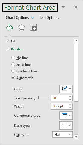
Step 4: Let’s see how to format the charts once inserted. We have different options to change the color and texture of the inserted bars. Select the inserted chart and then press Ctrl+1, a shortcut for formatting the chart. This will provide a sidebar next to the chart with different options to fill the bars will different colors, change the background texture, etc.
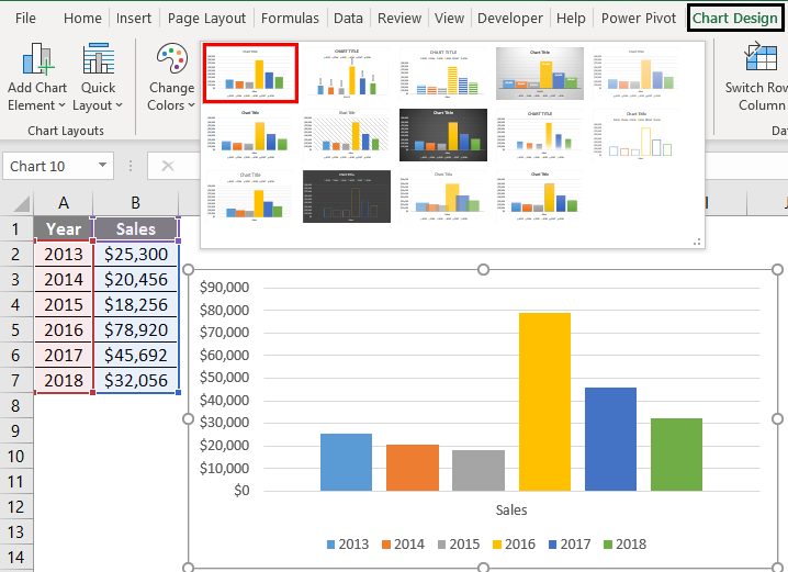
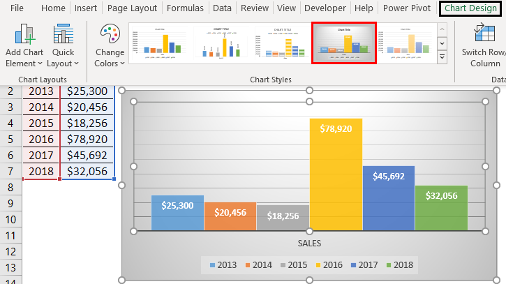
Step 5: It is available with some built-in theme or style that you can adopt for the inserted chart. Select the inserted chart, and you will get the design menu in the menu bar.
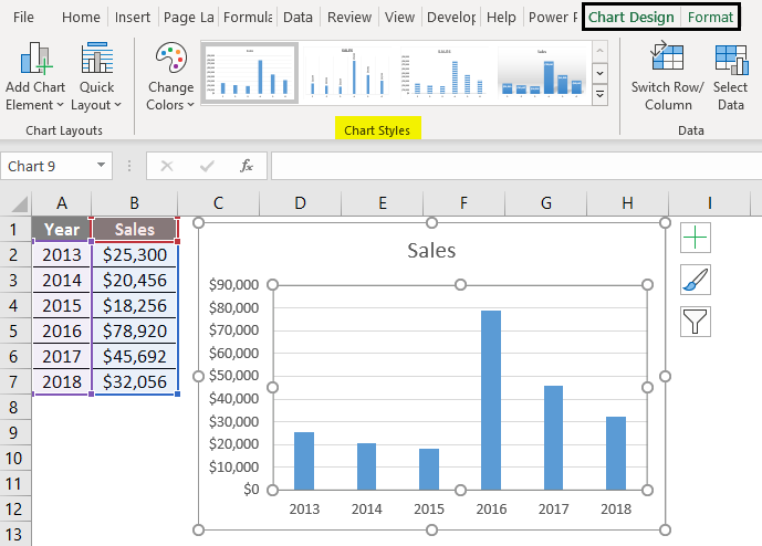
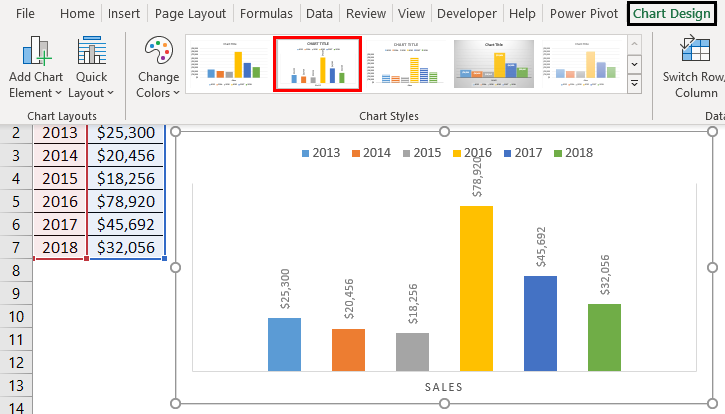
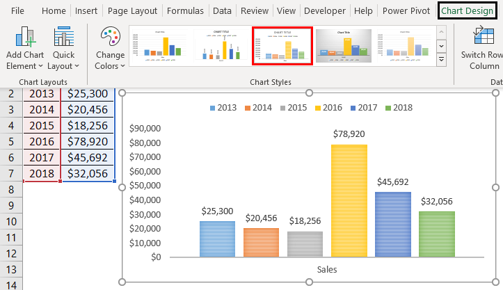
Step 6: Click on the design menu. It will provide a list of chart styles. The different chart styles available are:
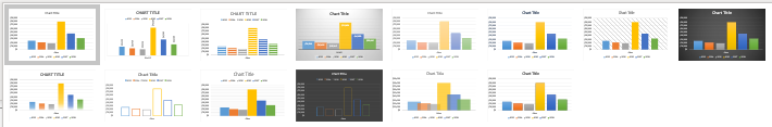
Different Chart Styles
Let’s look at the different Chart Styles available in Excel 2016.
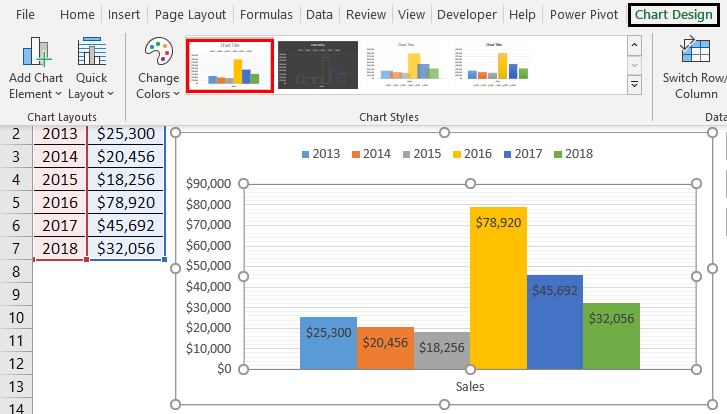
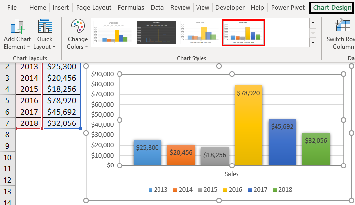
Style 1: With Gridlines
The bars are filled with different colors. From the normal bar chart size of the bars is increased to double size.
Style 2: Data Labels in a Vertical Way
The grid lines will be decreased in width, and the data labels will be shown in a vertical way. You can’t find any names for these styles apart from style 1, style 2, etc.
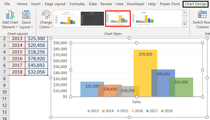
Style 3: Shaded Column
Instead of plane colors, shaded columns will appear. The columns are shaded with small lines, and the width of the bars is increased. When you have a minimum number of data labels to plot, this style will suit you.
Style 4: Gray Shade Background
The background is filled with shades. The bars appear very close, like connecting one with another.
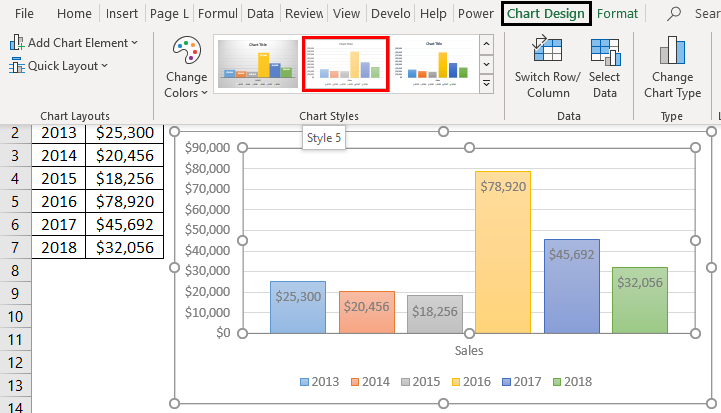
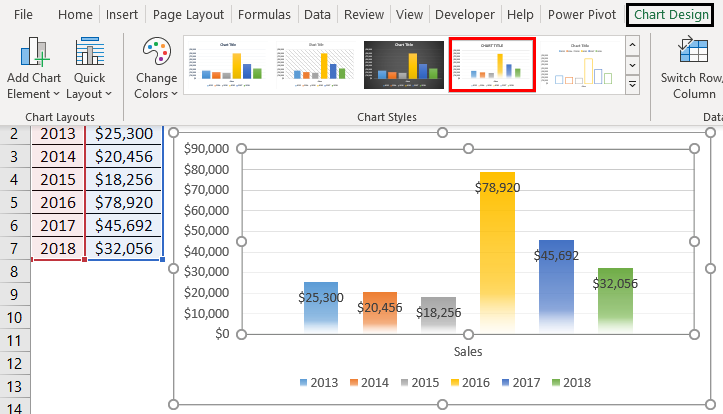
Style 5: Light Colors to the Column
In this style, you can make the columns with light colors, which appear independently with better width.
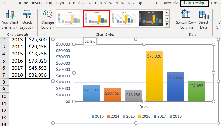
Style 6: Light Gridlines
In this predefined style, the gridlines are light in color, but the data bars are highlighted. For every style, you have the option to hide the gridlines, which will give you a plain background for the chart.
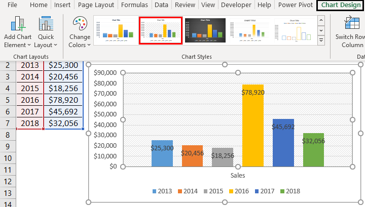
Style 7: With Rectangular Gridlines
The background is faded, whereas the gridlines are in a rectangular box shape and faded in color. Column bars are highlighted with colors.
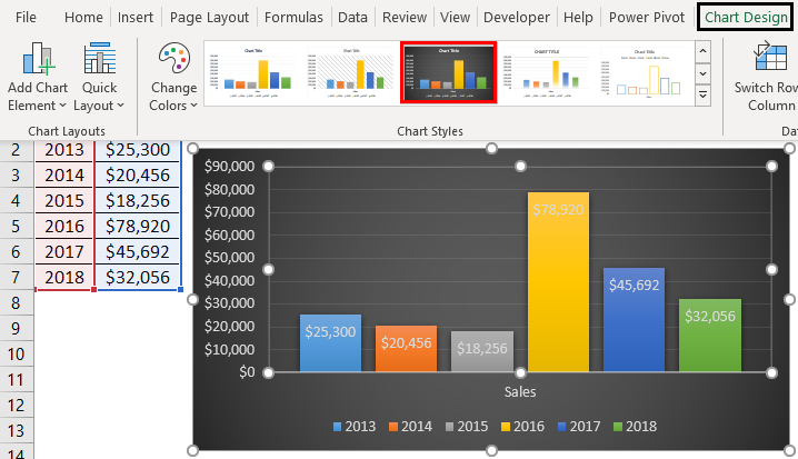
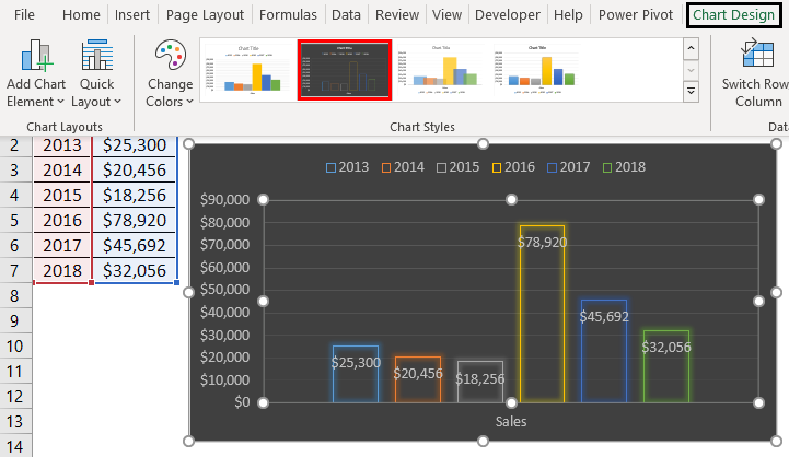
Style 8: Black Background
The background is completely black, and the data bars are indicated in different colors. The data bars are highlighted effectively by using a dark background color.
Style 9: Smoky Bottom
This looks like a normal column graph, but the bottom of the bar is not clear or looks like a smoke effect. The base is not attached to the axis.
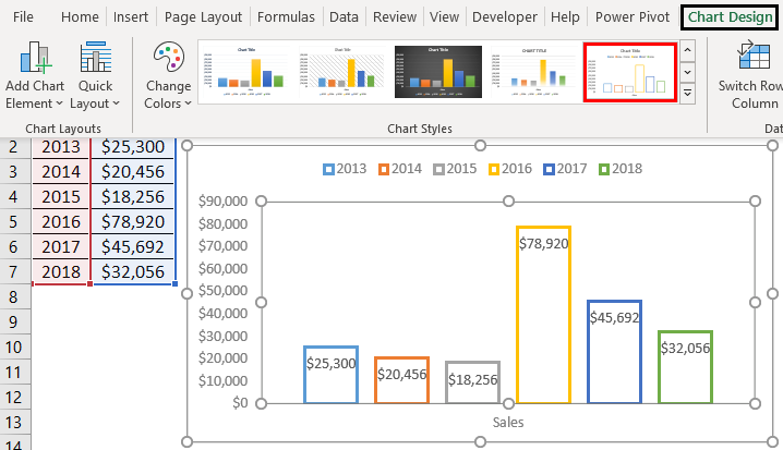
Style 10: Empty Bars with Outlined Bars
The data bars become empty, or only the outline is provided without filling any color.
Style 11: Similar to Style 1 but Connected Bars
This is similar to style 1, but the bars are arranged close together, one after the other.
Style 12: Empty Bars with Black Background
This style is a combination of empty bars with a dark black background. The data columns appear like a fluorescent effect on the dark background.
Style 13: Overlapping Bars
This style is overlapped one column with the other. Colors of the data bars are faded in color. Gridlines are also not in a bright appearance.
Style 14: Column Bar with Intense Effect
Each data stands individually and is well projected in its color. The data bars are quite projective than the common column style.
Things to Remember About Change Chart Style In Excel
- Select the chart style according to the data you want to showcase.
- Never choose a style with multiple colors and more fancy styles; this will be difficult to identify the data.
- Select simple styles to convey the data set easily.
- Go with other types of charts if your data recommends them. For example, use line charts instead of column charts to indicate trends over time.
- Once you create a chart style, you can reuse it by saving it as a chart template.
- You can easily change the chart style from one to another by selecting the chart and applying some other kind.
Recommended Articles
This is a guide to Change Chart Style in Excel. We discuss How to Change Chart Style In Excel, practical examples, and a downloadable Excel template. You can also go through our other suggested articles –
