Introduction to Data Formatting in Excel
Data Formatting in Excel is very useful, which allows us to format the data in any way we want. We can change the format of data to make it as per standards or our requirements. This brings uniformity in the same type of fonts, shapes, alignment, and font color. This is normally used in all types of work, such as official, report creation, and anything we want to print. This also allows others to read and understand the meaning properly if everything is in the standard format.
There are a lot of ways to format data in Excel. Follow the below guidelines while formatting the data/report in Excel:
- The column heading/row heading is an important part of the report. It describes the information about data. Thus, the heading should be in bold. The shortcut key is CTRL + B. It’s also available in the Font section in the toolbar.
- The header font size should be larger than the other content of the data.
- The header field background color should be other than white color so that it should be properly visible in the data.
- Make the outline border of the heading field. There are a lot of border styles. For border style, Go to the Font section and click on an icon as per the below screenshot:
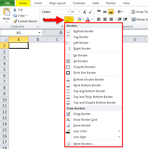
- Choose the appropriate border style. With this, we can add a border of the cells.
- The header font should be aligned in the center.
- To make the size of cells enough so that the data written within the cell should be properly read.
- For number formatting, there are a lot of styles available. For this, Go to the number section and click on the combo box like the below screenshot:
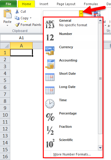
- Depending on the data, whether it should be in decimal, percentage, number, date, or formatting can be done.
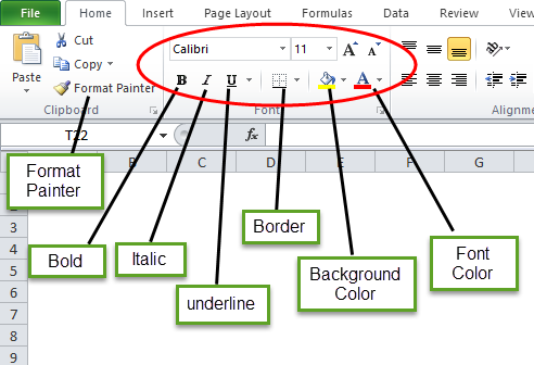
In the below image, we have shown different font styles:
“B” is to make the font bold, “I” is for italics, “U” is to make underline, etc.
How to Format Data in Excel?
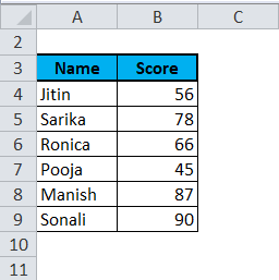
Let’s take the below data and will understand the data formatting in Excel one by one.
Formatting in Excel – Example #1
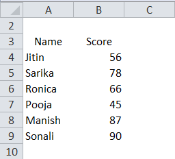
We have the above-unorganized data, which looks very simple. Now we will do data formatting in Excel and will make this data in a presentable format.
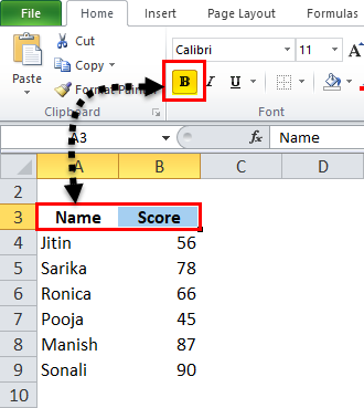
- First, select the header field and make it bold.
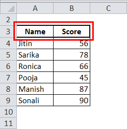
- Select the whole data and choose the “All Border option” under the border.
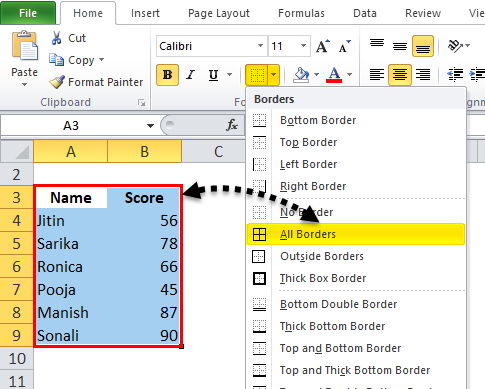
So the Data will look like this :
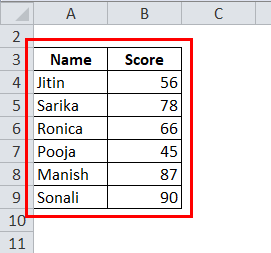
- Now select the header field and make the thick border by selecting the “Thick box border” under the border.
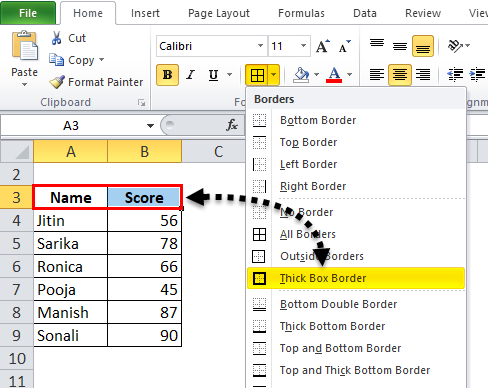
After that, the Data will look like this :
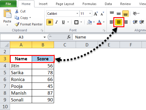
- Make the header field in the center.
- Also, choose a background color other than white. Here we will use a light blue color.
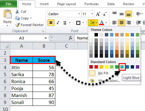
Now the data is looking more presentable.
Formatting in Excel – Example #2
In this example, we will learn more about the style of formatting the report or data.
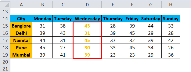
Let’s take an example of weather prediction of different cities day wise.
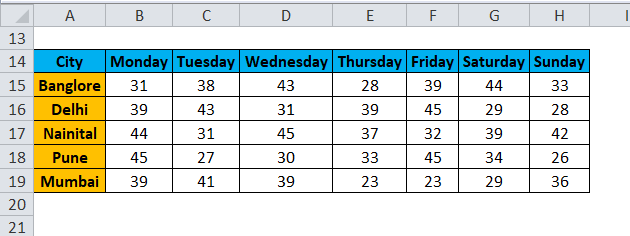
Now we want to highlight the Wednesday data.
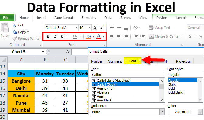
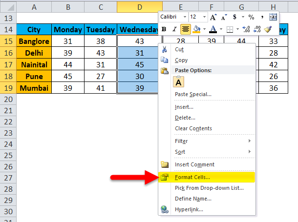
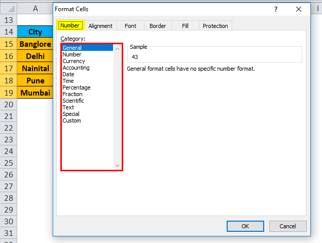
- Select the whole records of that data and right-click. A drop-down box will appear. Select the “Format Cells” option.
- This will open a Format Cells dialog box. As we can see, many options are available to change the font style in various styles as we want.
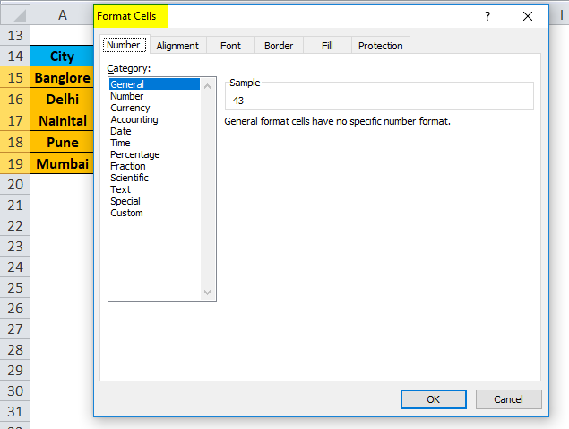
- The Number button can change the data type like decimal, percentage, etc.
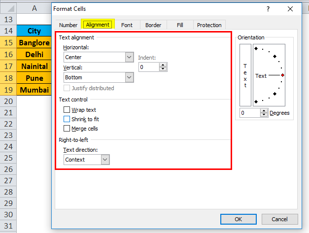
- We can align the font in a different style through the Alignment button.
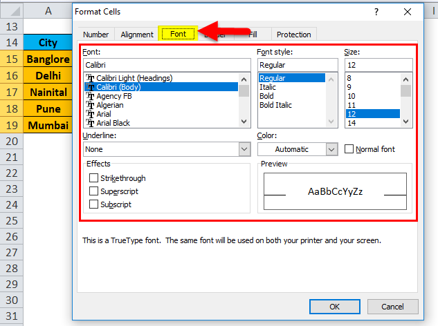
- Click on the Font button. This button has a lot of font styles available. We can change the font type, style, size, color, etc.
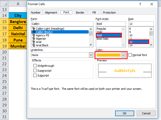
- In this example, we are choosing a bold font size of 12, the color of Orange. We also can make the border of this data look more visible by clicking on the Border button.
- Now our data looks like the below screenshot:
Formatting in Excel – Example #3
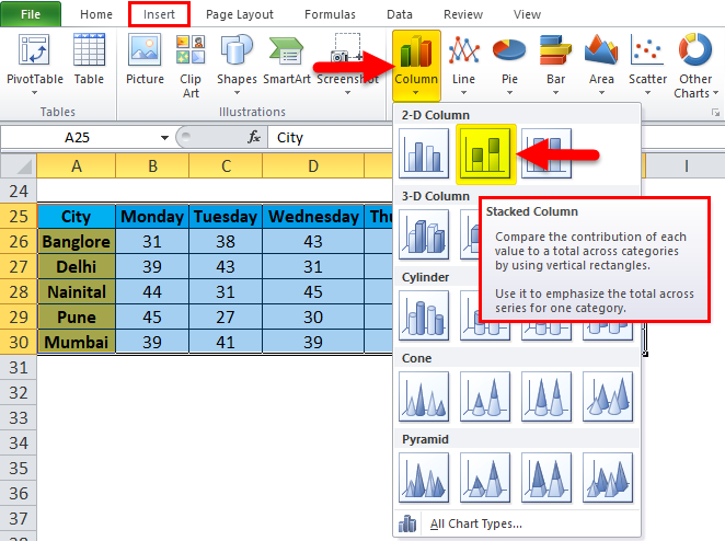
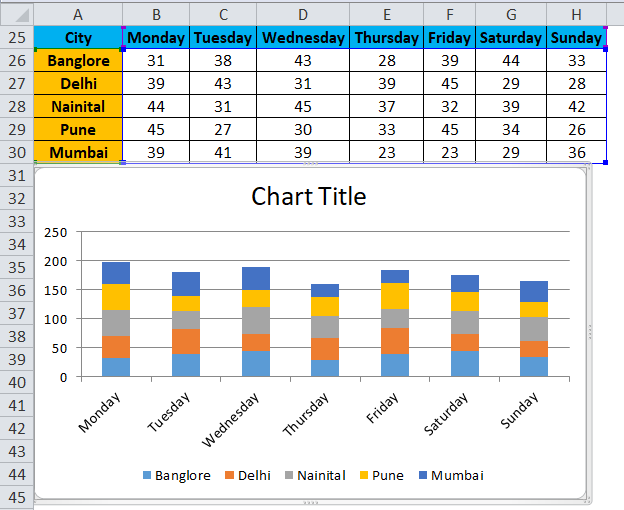
Again we are assuming the same data. Now we want to present this data in pictorial format.

- Select whole data and go to the Insert menu. Click on Column Chart, and Select Stacked Column under 2-D Column Chart.
Benefits of Data Formatting in Excel
- Data looks more presentable.
- We can highlight specific data like profit or loss in business through formatting. Our Data will look like as below:
- Through the chart, we can easily analyze the data.
- Data Formatting saves a lot of time and effort.
Things to Remember
- There are a lot of shortcut keys available for data formatting in Excel. Through this, we can save a lot of time and effort.
- CTRL+B – BOLD
- CTRL+I – ITALIC
- CTRL+U – UNDERLINE
- ALT+H+B – Border Style
- CTRL+C – Copy the data, CTRL+X – Cut the data, CTRL+V – Paste the data.
- ALT+H+V – It will open the paste dialog box. Here a lot of paste options are available.
- When we insert the chart for the data we created in Example 3, it will open the chart tools menu. Through this option, we can format the chart as per our requirements.
- Excel provides a very interesting feature through which we can quickly analyze our data, especially while creating and managing reports. For this, Select the data and right-click. It will open a list of items. Select the “Quick Analysis” option.
- It will open the conditional formatting toolbox.
We can add more conditions in the data through this option, like if data is less than 40 or greater than 60, how does the data look in this condition?
Recommended Articles
This has been a guide to Formatting in Excel. Here we discuss how to Format Data in Excel along with Excel examples and downloadable Excel templates. You may also look at these useful functions in Excel –
