Updated June 21, 2023
Difference Between CSS vs CSS3
Web applications play a vital role in today’s world. The Internet is taking over almost everything that needs designer web pages. The role of Cascading Style Sheets (CSS) is hence vital. CSS works together with HTML and provides a basic style and structure. It defines how the HTML elements will look on the web page. CSS3 is the latest version of CSS. It provides JavaScript-like capabilities. In addition to this, it also offers mobile development features. It also has additional features like images, gradients, transitions, etc. Let us have a look at the difference between CSS and CSS3.
Head to Head Comparison Between CSS vs CSS3 (Infographics)
Below is the top 5 difference between CSS vs CSS3.
Key Difference Between CSS and CSS3
Both CSS vs CSS3 are popular choices in the market; let us discuss some of the major differences between CSS and CSS3:
- The main difference between CSS and CSS3 is that CSS3 has modules.CSS is the basic version and does not support responsive design. CSS3, on the other hand, is the latest version and supports a responsive layout.
- CSS cannot be split into modules, but CSS3 can be divided into modules. Being an older version of CSS is slower than CSS3.
- In addition to these, CSS3 has many alignment features. CSS3 provides a box-sizing tool that allows the user to get the correct size of any element without changing the element’s dimensions or padding. CSS does not have any box-sizing device, and hence the user needs to use the standard procedures defined to align text.
- The animations and 3D transformations are better in CSS3. Traditionally, developers have used Flash and JavaScript to move elements on the screen and enable dynamic interactions like changing the size and color of elements.
CSS does not provide 3D animation and modifications. - CSS provides basic color schema and standard colors. CSS3 supports RGBA, HSLA, HSL, and gradient colors. It also promotes rounded image corners for text boxes.
- CSS only supports single text blocks.
CSS vs CSS3 Comparison Table
The primary Comparison between CSS vs CSS3 is discussed below:
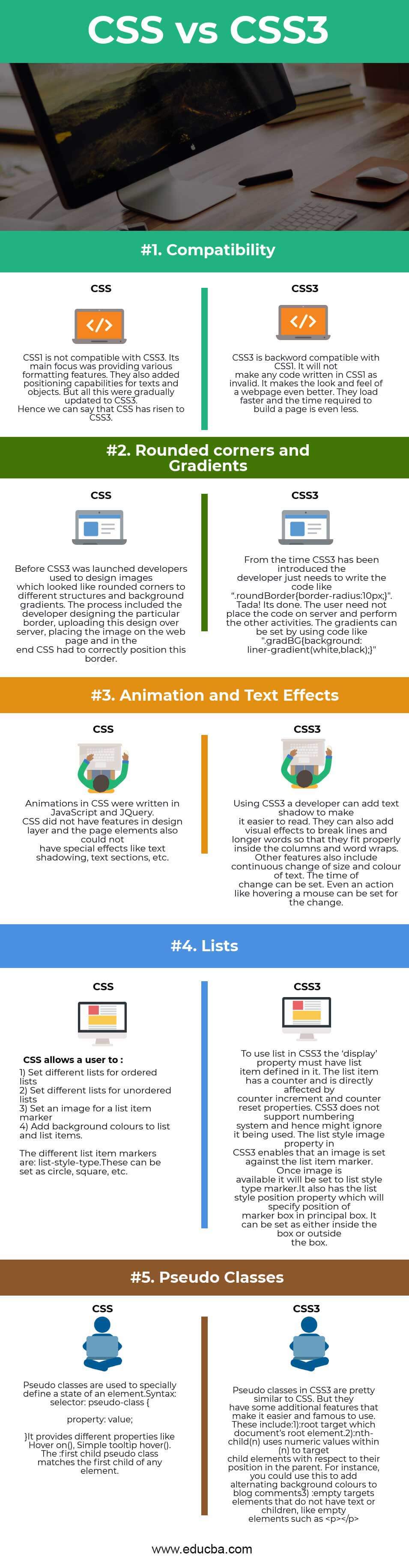
| The Basis Of Comparison Between CSS vs CSS3 | CSS | CSS3 |
| Compatibility | CSS1 is not compatible with CSS3. Its main focus was on providing various formatting features. They also added positioning capabilities for texts and objects. Gradual updates have been made to CSS, eventually leading to the introduction of CSS3. Hence we can say that CSS has risen to CSS3. | CSS3 is backward compatible with CSS1. It will not make any code written in CSS1 invalid. It makes the look and feels of a web page even better.CSS3-based designs offer faster loading times and reduce the time required to build a page. |
| Rounded corners and Gradients | Before the launch of CSS3, developers used to design images that resembled rounded corners and background gradients for various structures. The process included the developer designing the particular border, uploading this design over the server, and placing the image on the web page. In the end, CSS had to position this border correctly. | Since the advent of CSS3, developers only need to provide code along the lines of “.roundBorderborder-radius:10px;”. Tada! That is it. Users are not required to run any more tasks or upload the code to the server. Using code like “.gradBG background: linear-gradient(white, black);” makes it simple to set gradients. This allows users to define a gradient effect from white to black as the background of an element without any server-side actions. |
| Animation and Text Effects | Animations in CSS were written in JavaScript and JQuery. CSS did not have features in the design layer, and the page elements could not have special effects like text shadowing, text sections, etc. | Using CSS3, a developer can add text shadow to make it easier to read. They can also add visual effects to break lines and longer words to fit properly inside the columns and word wraps. Other features also include a continuous change in the size and color of the text. The time of change can be configured for the list-style-image property. Additionally, actions such as hovering a mouse can also be specified to trigger the change. |
| Lists | CSS allows a user to : 1) Set different lists for ordered lists2) Set different lists for unordered lists3) Set an image for a list item marker4) Add background colors to list and list items. The different list item markers are list-style-type. These can be set as circles, squares, etc. |
To use a list in CSS3, the ‘display’ property must-have a list item defined in it. The list item has a counter and is directly affected by counter increment and counter reset properties. CSS3 does not support the numbering system and hence might ignore it being used. The list-style-image property in CSS3 allows developers to set an image against the list item marker. Once the image becomes accessible, the marker for the list-style type will be assigned to it. It also has the list style position property, which will specify the position of the marker box in a principal box. It can be set as either inside the box or outside the box. |
| Pseudo-Classes |
Syntax:
selector: pseudo-class {
property: value; } It provides different properties like Hover on(), Simple tooltip hovers (). The: first-child pseudo-class matches the first child of any element. |
Pseudo-classes in CSS3 are pretty similar to CSS. But they have some additional features that make it easier and more famous to use. These include: 1): root target, which document’s root element.2):nth-child(n) uses numeric values within (n) to target child elements with respect to their position in the parent. For instance, you could use this to add alternating background colors to blog comments 3) :empty targets elements that do not have text or children, like empty elements such as <p></p> |
Conclusion
The above difference between CSS and css3 shows how CSS has gradually transformed into CSS3. The smooth transitions, clean design, and faster performance have brought CSS to today’s place. CSS can be used for all web application development. Until then, CSS3 is available for all users with small improvements in the present framework. Cascading Style Sheet will stay in the software industry and help users create interactively and the most stylish web applications and pages.
Recommended Articles
We hope that this EDUCBA information on “CSS vs CSS3” was beneficial to you. You can view EDUCBA’s recommended articles for more information.
