Updated June 21, 2023
Introduction to CSS Word Wrap
Word-wrap is a property that makes the content readable for the users. In other words, it is a feature that will break the words in such a manner that they do not cross the boundary of the container defined. The CSS Word Wrap property was adapted from the feature of the same name offered by Microsoft, wherein, instead of making the user scroll horizontally to read the entire sentence, the sentence is broken into parts to fit the window. The word-wrap property was later renamed to overflow-wrap but is still used as an alias.
Syntax:
overflow-wrap: normal| break-word;Examples of CSS Word Wrap
For the property overflow-wrap, if we use the parameter value as normal, it will cause the string of words to break at a normal point of separation, like a full stop or space or comma separator. If we use word break, otherwise, unbreakable words will break to fit the container. This property can be used if we have multiple containers on a page. Let’s look at some of the uses of the overflow-wrap property.
Example #1 – Demonstrating the Normal Feature of Overflow-Wrap
- When we use the normal parameter, the sentences or string breaks only at allowable intervals like comma separation, full stops, or space between words, it will not break long words even if it’s crossing the boundary.
- We will use external CSS for this example. Hence we will create a CSS file first.
- We will define styling for the <div> element, where we will define the overflow wrap along with width, margin, and other properties. The CSS element styling should look similar to this:
CSS Code:
div{
width: 100px;
margin: 20px;
background: palegoldenrod;
border: 5px dotted lightskyblue;
box-shadow: inset 10px 10px 15px 15px white;
font-style: italic;
overflow-wrap:normal;
}- Since the CSS is defined, we will create the HTML file next. This example uses external CSS, hence we will, first of all, call the respective file in our HTML code.
- Then we will code the body of the page such that we use the <div> element. This way, we can demonstrate all the properties we have used to style the element. The code should look like this:
HTML Code:
<html>
<head>
<title>Testing for overflow-wrap</title>
<link rel = "stylesheet" href = "wrap.css">
</head>
<body>
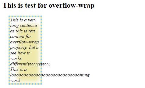
<h2>This is test for overflow-wrap</h2>
<div>This is a very long sentence as this is test content for overflow-wrap property. Let's see how it works differentlyyyyyyyyyy. This is a loooooooooooooooooooooooooooonnng word</div>
</body>
</html>The output can be observed by saving the HTML file and opening it through a browser. It should look as in the screenshot:
Output:
Example #2 – Demonstrating the Break-Word Feature of Overflow-Wrap
- Using the break-word parameter for the overflow-wrap property breaks long and otherwise unbreakable words to fit in the defined container.
- Like the previous example, we will be using external CSS. Hence, we will start by creating the CSS file first.
- We will retain the definition for <div> element and add a class with another overflow-wrap feature to use it for strings with long words. The final CSS code will look similar to the code snippet as follows:
CSS Code:
div{
width: 100px;
margin: 20px;
background: palegoldenrod;
border: 5px dotted lightskyblue;
box-shadow: inset 10px 10px 15px 15px white;
overflow-wrap:normal;
}
.class1{
font-style: italic;
overflow-wrap: break-word;
}
Next, we will call the CSS file while creating the HTML file. Then we will code the body so that both <div> element and class1 class are used. The final HTML code should be similar to this:
HTML Code:
<html>
<head>
<title>Testing for overflow-wrap</title>
<link rel = "stylesheet" href = "wrap.css">
</head>
<body>
<h2>This is test for overflow-wrap</h2>
<div>This is a very long sentence as this is test content for overflow-wrap property.
<em class="class1"> Let's see how it works differentlyyyyyyyyyy. This is a loooooooooooooooooooooooooooonnng word</em>
</div>
</body>
</html>
This code, when compiled and viewed through a browser, will give the following output:
Output:
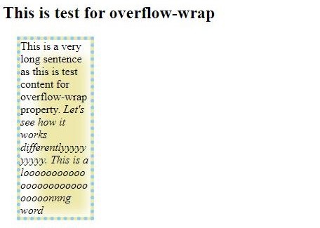
Here we can see that using a break-word parameter can fit long words by wrapping them in the container.
Example #3 – Overflow-Wrap Using Internal CSS
- We will use internal CSS for this example, i.e., we will use <style> tag while coding for our HTML page.
- We will start by opening the basic HTML tags like <html>,<head>,<body>, etc., so that we have the basic structure of the page.
- Within <head> tag, we will open a style tag and write the styling we need for the elements. The coding for style tags can be similar to this:
CSS Code:
<style>
p{
height: 100px;
width: 100px;
margin: 10px, 10px, 10px, 10px;
border: double blue;
}
.c1{
font-style: italic;
overflow-wrap: normal;
}
.c2{
font-style: oblique;
overflow-wrap: break-word;
}
</style>
We will define the body using paragraph elements and the classes defined in the style tag. The code can be referred from the below snippet:
HTML Code:
<html>
<head>
<title>Demo for Overflow-wrap</title>
<style>
p{
height: 100px;
width: 100px;
margin: 10px, 10px, 10px, 10px;
border: double blue;
}
.c1{
font-style: italic;
overflow-wrap: normal;
}
.c2{
font-style: oblique;
overflow-wrap: break-word;
}
</style>
</head>
<body>
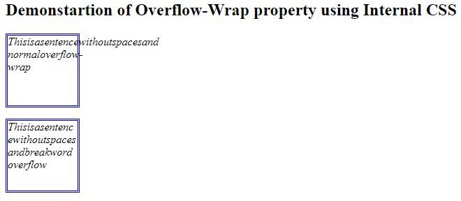
<h2>Demonstartion of Overflow-Wrap property using Internal CSS</h2>
<p class="c1">Thisisasentencewithoutspacesand normaloverflow-wrap</p>
<p class="c2">Thisisasentencewithoutspacesandbreakwordoverflow</p>
</body>
</html>When compiled and opened through a web browser, this code will give the desired output. It will give the following output:
Output:
Conclusion
We demonstrated the basic usage of overflow-wrap or word-wrap property with the above three examples. Since they are both aliases, we can use the property as word wrap or overflow wrap. Both syntaxes will satiate the code and give no run time issues. Also, the developers should try combining this property with other properties while structuring the page. Using the box structure, we can fit more content on the page than render. Each element’s container will occupy limited space, and word wrap will ensure that the text remains within the respective container’s boundary.
Recommended Articles
We hope that this EDUCBA information on “CSS Word Wrap” was beneficial to you. You can view EDUCBA’s recommended articles for more information.

