Updated June 7, 2023
Definition of CSS Transition Property
CSS Transition property is defined as one of the CSS Property to make transitions for a quiet period when a CSS property makes changes from one value to another without flash. It takes itself into two states, namely hover and active, and sometimes by pseudo-classes. With CSS3, the appearance and behavior of an element are changed by which animations can be made with multiple points of transitions upon various keyframes. Herewith the transitions only individual properties are animated. In this article, we shall learn how to implement CSS Transitions and how to do animations within this property.
Syntax
The Syntax is pretty straightforward. The general Syntax is given below, and it takes four values.
Transition: transition-property | duration |timing |delay;The transition takes almost four different values in total
How does Transition Property Work in CSS?
CSS Transition works on the principle of Transition values as it helps transition between two states of an element. The core objective is to change the value of a property, and CSS gives his hand to change the parameters towards the final state slowly. There are a few minimum numbers of properties that would do animate. Most importantly, we must specify two things to create a better transition.
- Emphasis on a CSS property
- Duration of the effect
1. Transition- Property
This specifies exactly what properties will be altered with changes. We can also add multiple transition properties separated by commas. Or, in another case, the keyword’ all are used to specify various transitions. But not all the properties could be transitioned as some values don’t have mid-points like color, font-sizes. Some transitional-property are clip, height, right, top, bottom, color, font weight, etc.
. demo
{
Transition-property: color , border; // value
}
So here, I have used two values separated by commas means transitioning is actioned on multiple properties. Let’s explain the sub-properties individually below.
2. Transition-Timing
This property determines the speed at which the element moves. With the help of the Duration property, the transition can do multiple rates within a single shot duration. This property includes keywords like linear, ease-in, ease-in-out, and ease-in. Linear shows the constant variation from one state to another. Ease-in determines the transition by taking it slow and speeding well. Ease-out is quite the opposite of ease-in. And finally, Ease-in-out is the mixture of both that starts slowly and speeds up in the mid and, in the end, eventually flows down again. This determines the accelerative curve for the present element transition.
3. Transition-Duration
It determines how long a transition takes time to finish the hover. The duration of the time units is specified in s or ms. The page shows no transitions if the value is 0s(default).
Ess
{
Transition-duration : 6 s;
}
4. Transition-Delay
We implement the delay property to determine the starting time of the animation movement. Same as duration, it too takes units in s or ms. It accepts both positive and negative values.
Note: To have a better curve with four points Bezier Curve can be used. Ease of time allows changing the rate of change of parameters to produce realism in the transitions.
Sample:
transition-property: margin-bottom;
transition-duration: 2s;
transition-timing-function: ease-in-out;
transition-delay: 0.8s;
The above transition property is done as shorthand property as:
transition: margin-bottom 2s ease-in-out 0.8s;Examples of CSS Transition Property
Let’s see the transition action by considering a few HTML codes over here. Here we will demonstrate how the transition affects their properties and timing functions with examples.
Example #1
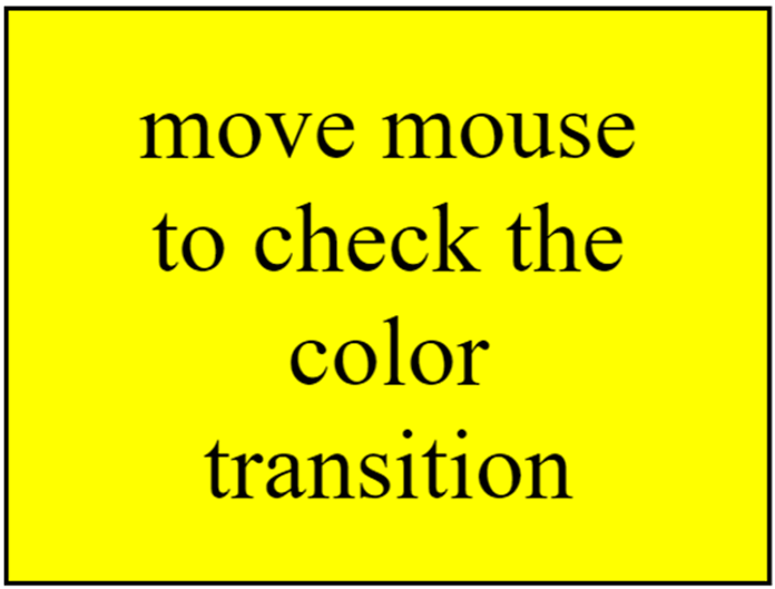
In the below example, the specified box would change its background color.
Code:
<html>
<head>
<title>Footer demo using HTML & CSS</title>
<style>
body {
display: flex;
min-height: 80vh;
justify-content: center;
align-items: center;
}
.boxmove {
font-size: 4em;
font-family: initial;
border: solid;
background-color: green;
padding: 0.6em 1em;
transition: background-color 0.7s ease-out;
}
.boxmove:hover {
background-color: yellow;
}
</style>
</head>
<body>
<button class="boxmove">move mouse to check the color transition</button>
</body>
</html>
Output:
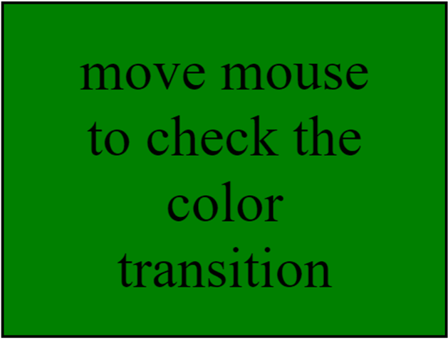
When Hovering .boxmove elements, there is a transition animation that eases the background color from green to yellow.
Example #2
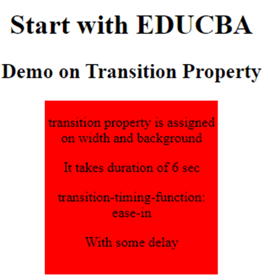
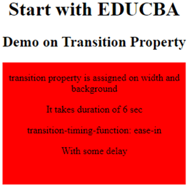
Let’s take an example where a transition effect is on the width property and given 6 secs. Here it animates the element <div > to change the background color.
Code:
<!DOCTYPE html>
<html>
<head>
<title>
CSS transition Property - Examples
</title>
<style>
div {
width: 200px;
height: 200px;
background: red;
transition: width background 6s ease-in .6s;
display: inline-block;
}
div:hover {
width: 300px;
}
</style>
</head>
<body style = "text-align:center;">
<h1>Start with EDUCBA</h1>
<h2> Demo on Transition Property</h2>
<div>
<p>transition property is assigned on width and background</p>
<p>It takes duration of 6 sec</p>
<p>transition-timing-function: ease-in</p>
<p>With some delay</p>
</div>
</body>
</html>
Output:
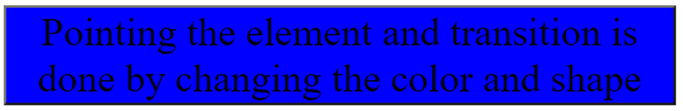
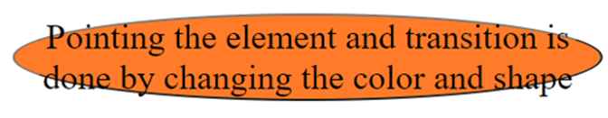
Example #3
Code:
<!DOCTYPE html>
<html>
<head>
<style>
body {
display: flex;
min-height: 80vh;
justify-content: center;
align-items: center;
}
.boxmove {
font-size: 2em;
font-family: initial;
border: semi-solid;
background-color: blue;
border-radius : 5px
padding: 0.3em 3em;
transition: background-color , border-radius 0.8s linear;
}
.boxmove:hover {
background-color: #ff7b29;
border-radius: 60%;
}
</style>
</head>
<body>
<button class="boxmove">Pointing the element and transition is done by changing the color and shape</button>
</body>
</html>
Output:
When you hoven, the box changes its shape.
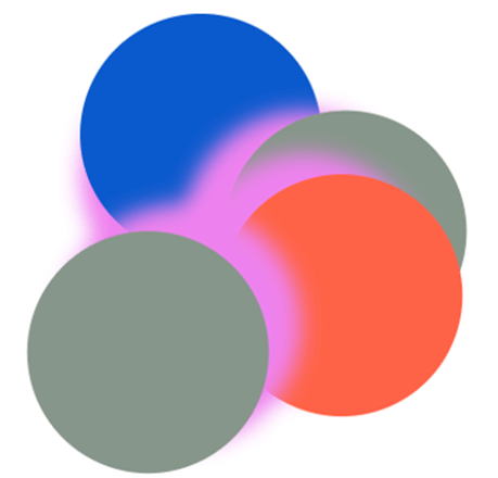
Example #4
Code:
<!DOCTYPE html>
<html>
<head>
<style>
.cir {
border-radius: 55%;
left: calc(55% - 7.25em);
top: calc(55% - 11.5em);
transform-origin: 60% 11.5em;
width: 11.5em;
height: 11.5em;
position: absolute;
box-shadow: 0 2em 1em rgb(238, 130, 238);
}
.one,
.three {
background: rgb(10, 90, 205);
transition: background 1s ease-in;
}
.two,
.four {
background: rgb(135, 150, 138);
}
.one {
transform: rotateZ(0);
}
.two {
transform: rotateZ(90deg);
}
.three {
transform: rotateZ(120deg);
}
.four {
transform: rotateZ(-130deg);
}
.cir:hover {
background: rgba(255, 99, 71, 1);
}
</style>
</head>
<body>
<div class="sealed">
<div class=" cir one"></div>
<div class="  cir two"></div>
<div class=" cir three"></div>
<div class=" cir four"></div>
</div>
</body>
</html>
Output:
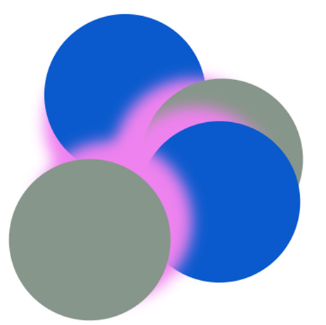
From the related CSS code, we would spot the transitions to do more sophisticated animations. When you hover over the circle the circle moves with the background colour change.
Conclusion
As we know, transitions play a crucial role in facilitating visual interactions between different states. Multiple states are utilized when there is a need for greater control and flexibility. And it’s the simplest way to do animations in CSS without using JavaScript, and it benefits web designers and front-end developers.
Recommended Articles
We hope that this EDUCBA information on “CSS Transition Property” was beneficial to you. You can view EDUCBA’s recommended articles for more information.

