Updated June 13, 2023
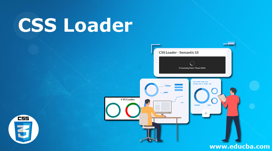
Introduction to CSS Loader
CSS Loader being a front-end component is defined as an npm Module that collects all the CSS files referenced in the working application to help webpack and consolidate into a string. This compiles an application of a particular resource as a JavaScript module (CSS to JS file). In simple terms, a CSS loader is an animation that indicates to the website that the page is loading and requests the user to wait momentarily. It is responsible for fetching styles from the corresponding CSS files. If no CSS loader is included in the browser, the page may appear unresponsive. Loader helps load the styles we require to the different sections of our application with added modular and easy-use benefits.
Syntax
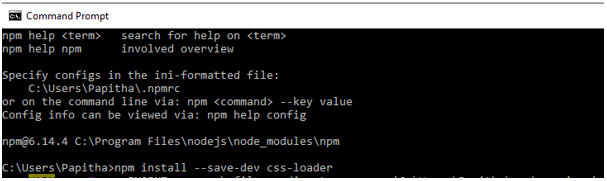
npm install –save-dev CSS-loaderWhere npm is the manager package node where we can do the CSS-loader, they are simply a module creator which can be installed with a single line comment. The loader is a feature of Webpack that seamlessly integrates with @import and URL() functions, allowing for the loading of external files using the ‘require’ component.
Working on CSS Loader
We can make it with a div that makes the entire screen with a white animated page loader with none set as a display property.
Here in our article, I have installed node.js to get npm installed.
We use the React Components to build a CSS module incorporating all style sheets. We need to load the loaders in the Web Pack to do so. CSS modules make it easy to name classes without global issues. Loading this CSS into the local component requires import. To work with the js module, these are the following step.
1. Getting started
It begins to install a css-loader. here comes the syntax path
npm install –save-dev css-loaderThe following snippets show the installation of the files
The following snipes offer CSS extraction from the Loader.
C:\Users\node_modules>npm install css-loader –save-dev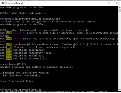
Testing the Package (CSS)
C:\Users\Papitha\node_modules>npx webpack –mode=developmentAnd for the production
<code
C:\Users\Papitha\node_modules>npx webpack –mode=production2. Defining a CSS file
.dd
{ color :violet;
}
3. Webpack config -Plugin – To interpret all the CSS files
import css from 'demo.css'4. javascript webpack
module.exports = {
module: {
rules: [
{
test: /\.css$/i,
use: ['style-loader', 'css-loader'],
},
],
},
};
5. String
module.exports = {
module: {
rules: [
{
test: /\.css$/i,
loader: 'css-loader',
options: {
modules: 'global', // delaration of global variables
},
},
],
},
};
Examples of CSS Loader
Here are the following examples mentioned below
Example #1
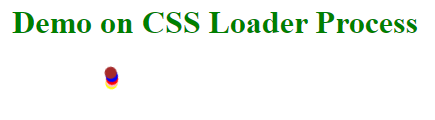
The html file shows how the CSS files enable a style by calling the respective class to load the process with animation.
load.html Code:
<!DOCTYPE html>
<html>
<head>
<title>Demo on CSS Loader Process</title>
<style>
h1{
color:green;
}
div{
display: block;
position: absolute;
width: 12px;
height: 12px;
right: calc(60% - 1em);
border-radius: 1.1em;
transform-origin: 1em 1em;
animation: rotate;
animation-iteration-count:infinite;
animation-duration: 2s;
}
@keyframes rotate {
0% { transform: rotate(0deg); }
100% { transform: rotate(180deg); }
}
.aa {
animation-delay: 0.2s;
background-color: yellow;
}
.bb {
animation-delay: 0.3s;
background-color: pink;
}
.cc {
animation-delay: 0.4s;
background-color: red;
}
.dd {
animation-delay: 0.5s;
background-color: blue;
}
.ee {
animation-delay: 0.6s;
background-color: brown;
}
</style>
</head>
<body>
<center>
<h1>Demo on CSS Loader Process</h1>
<div class='aa'></div>
<div class='bb'></div>
<div class='cc'></div>
<div class='dd'></div>
<div class='ee'></div>
</center>
</body>
</html>
Output:
We have seen simple preloading sequence animations using CSS loader, making an easy transition.
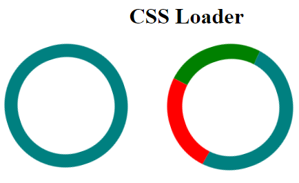
Example #2
With the same example – CSS is loaded with spinning. Even CSS Spinner could be used in the class, which makes a simple circle spinning with just an easy <div>.
Code:
<!DOCTYPE html>
<html>
<head>
<style>
h1{
text-align:center;
}
.load1 {
border: 19px solid #008080;
position:absolute;
border-radius: 49%;
border-top: 21px solid rose;
border-bottom: 21px solid rose;
width: 140px;
height: 140px;
animation: spin 3s linear infinite;
}
.load2 {
border: 20px solid #008080;
position:absolute;
left:45%;
border-radius: 49%;
border-top: 22px solid rose;
border-bottom: 22px solid green;
border-right: 22px solid red;
width: 140px;
height: 140px;
animation: spin 3s linear infinite;
}
.load3 {
border: 20px solid #FF6347;
position:absolute;
left:75%;
border-radius: 49%;
border-top: 21px solid rose;
border-bottom: 21px solid green;
border-right: 21px solid red;
border-left:21px solid blue;
width: 150px;
height: 150px;
animation: spin 3s linear infinite;
}
@keyframes spin {
0% { transform: rotate(0deg); }
100% { transform: rotate(360deg); }
}
</style>
</head>
<body>
<h1>CSS Loader</h1>
<div class="load"></div>
<div class="load1"></div>
<div class="load2"></div>
</body>
</html>
What we have done here is we have created an easy position type that has absolute. We make the circle by specifying the width and height dimensions and applying a radius value to achieve rounded edges. We are next assigning a different color for the border. And now, we implement Animation keyframes to have a rotation.
Output:
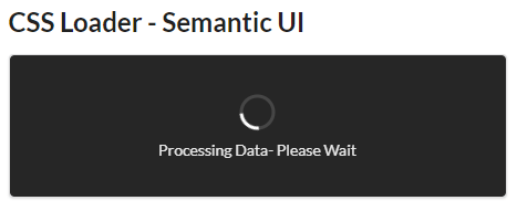
Example #3
Code:
<!DOCTYPE html>
<html>
<head>
<title>CSS Loader - Semantic UI</title>
<link href=
"https://cdnjs.cloudflare.com/ajax/libs/semantic-ui/2.4.1/semantic.min.css"
rel="stylesheet" />
</head>
<body>
<div class="ui container">
<h2>CSS Loader - Semantic UI</h2>
<div style="height: 130px; width: 450px;"
class="ui segment">
<div class="ui active dimmer">
<div class="ui indeterminate text loader">
Processing Data- Please Wait</div>
</div>
<p></p>
</div>
</div>
<script src=
"https://cdnjs.cloudflare.com/ajax/libs/semantic-ui/2.4.1/semantic.min.js">
</script>
</body>
</html>
Output:
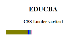
Example #4
With four different colors used for loading
Code:
<!DOCTYPE html>
<html>
<head>
<title>example on loader</title>
<style>
h1{
color:purple;
}
.loadd {
display: block;
position: absolute;
width: 95px;
height: 15px;
right: calc(55% - 2em);
transform-origin: 3px 13px;
animation: rotate;
animation-iteration-count: infinite;
animation-duration: 3.1s;
}
@keyframes rotate {
from {
transform: rotateY(45deg);
}
to {
transform: rotateY(360deg);
}
}
.a1 {
animation-delay: 0.2s;
background-color: #C71585;
}
.a2 {
animation-delay: 0.3s;
background-color: #20B2AA;
}
.a3 {
animation-delay: 0.4s;
background-color: #DC143;
}
.a4 {
animation-delay: 0.4s;
background-color: #0000FF ;
}
.a5 {
animation-delay: 0.5s;
background-color: #808000;
}
</style>
</head>
<body>
<center>
<h2>EDUCBA</h2>
<h4>CSS Loader vertical</h4>
<div class='loader'>
<div class='loadd a1'></div>
<div class='loadd a2'></div>
<div class='loadd a3'></div>
<div class='loadd a4'></div>
<div class='loadd a5'></div>
</div>
</center>
</body>
</html>
Output:
Conclusion
As we know that CSS is helpful in styling, and we can add animations or any other motion pictures on a particular web page. Therefore, when we emphasize a loader on a web page, we enable users to wait for a few seconds until the entire page is loaded. This loader enhances the user experience by providing a simple animation while the page is loading and adds necessary visual elements to the respective projects.
Recommended Articles
We hope that this EDUCBA information on “CSS Loader” was beneficial to you. You can view EDUCBA’s recommended articles for more information.

