Updated June 8, 2023
Introduction to CSS Pagination
Pagination separates the document into pages and assigns numbers. It facilitates easy navigation through a large amount of content by dividing multiple entries or web content into different pages, allowing convenient toggling of content. Web links for pagination enable visitors to browse through your content. CSS pagination is quite a good method for indexing on the homepage of various website pages. When you have loads of pages on your website, you must add some pagination for each page.
Types of Pagination in CSS
Below are the types of Pagination in CSS:
- Simple Pagination
- Active and Hoverable Pagination
- Rounded Active and Hoverable Buttons
- Bordered Pagination
- Rounded Border Pagination
- Centered Pagination
- Space between Pagination
- Pagination Size
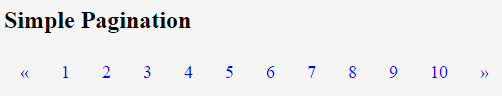
1. Simple Pagination
The below example depicts simple pagination. The “pagination” class can define pagination in HTML pages.
Code:
<!DOCTYPE html>
<html>
<head>
<style>
.pagination a {
font-size: 18px;
float: left;
padding: 8px 16px;
text-decoration: none;
}
</style>
</head>
<body>
<h2>Simple Pagination</h2>
<div class="pagination">
<a href="#">«</a>
<a href="#">1</a>
<a href="#">2</a>
<a href="#">3</a>
<a href="#">4</a>
<a href="#">5</a>
<a href="#">6</a>
<a href="#">7</a>
<a href="#">8</a>
<a href="#">9</a>
<a href="#">10</a>
<a href="#">»</a>
</div>
</body>
</html>
Save the above code on the HTML page and name it according to your choice. Then, open the file in a browser, displaying the output as shown in the image below.
Output:
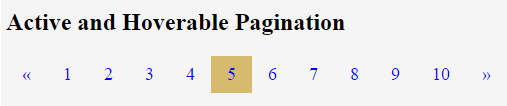
2. Active and Hoverable Pagination
The current page will be displayed using the active class. Hover will switch the page link color when the mouse passes over them.
Code:
<!DOCTYPE html>
<html>
<head>
<style>
.pagination a {
font-size: 18px;
float: left;
padding: 8px 16px;
text-decoration: none;
}
.pagination a.active {
background-color:#d7bb6c;
}
.pagination a:hover:not(.active) {
background-color: #d4d5d2;
}
</style>
</head>
<body>
<h2>Active and Hoverable Pagination</h2>
<div class="pagination">
<a href="#">«</a>
<a href="#">1</a>
<a href="#">2</a>
<a href="#">3</a>
<a href="#">4</a>
<a class = "active" href="#">5</a>
<a href="#">6</a>
<a href="#">7</a>
<a href="#">8</a>
<a href="#">9</a>
<a href="#">10</a>
<a href="#">»</a>
</div>
</body>
</html>
Output:
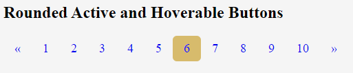
3. Rounded Active and Hoverable Buttons
The border-radius property can be used for rounded active and hoverable buttons in this pagination type.
Code:
<!DOCTYPE html>
<html>
<head>
<title>
Rounded Active and Hoverable Buttons
</title>
<style>
.pagination a {
font-size: 18px;
float: left;
padding: 8px 16px;
text-decoration: none;
}
.pagination a.active {
background-color:#d7bb6c;
border-radius:6px;
}
.pagination a:hover:not(.active) {
background-color: #d4d5d2;
border-radius:6px;
}
</style>
</head>
<body>
<h2>Rounded Active and Hoverable Buttons</h2>
<div class="pagination">
<a href="#">«</a>
<a href="#">1</a>
<a href="#">2</a>
<a href="#">3</a>
<a href="#">4</a>
<a href="#">5</a>
<a class = "active" href="#">6</a>
<a href="#">7</a>
<a href="#">8</a>
<a href="#">9</a>
<a href="#">10</a>
<a href="#">»</a>
</div>
</body>
</html>
Output:
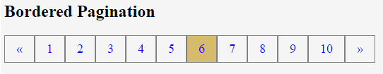
4. Bordered Pagination
This type can be used to add a border to the pagination.
Code:
<!DOCTYPE html>
<html>
<head>
<title>
Bordered Pagination
</title>
<style>
.pagination a {
font-size: 18px;
float: left;
padding: 8px 16px;
text-decoration: none;
border:1px solid grey;
}
.pagination a.active {
background-color:#d7bb6c;
}
.pagination a:hover:not(.active) {
background-color: #d4d5d2;
}
</style>
</head>
<body>
<h2>Bordered Pagination</h2>
<div class="pagination">
<a href="#">«</a>
<a href="#">1</a>
<a href="#">2</a>
<a href="#">3</a>
<a href="#">4</a>
<a href="#">5</a>
<a class = "active" href="#">6</a>
<a href="#">7</a>
<a href="#">8</a>
<a href="#">9</a>
<a href="#">10</a>
<a href="#">»</a>
</div>
</body>
</html>
Output:
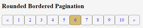
5. Rounded Border Pagination
Using the border-radius property, this type can add a rounded border to the pagination.
Code:
<!DOCTYPE html>
<html>
<head>
<title>
Rounded Bordered Pagination
</title>
<style>
.pagination a {
font-size: 18px;
float: left;
padding: 8px 16px;
text-decoration: none;
border-radius:6px;
border:1px solid grey;
}
.pagination a.active {
background-color:#d7bb6c;
}
.pagination a:hover:not(.active) {
background-color: #d4d5d2;
}
</style>
</head>
<body>
<h2>Rounded Bordered Pagination</h2>
<div class="pagination">
<a href="#">«</a>
<a href="#">1</a>
<a href="#">2</a>
<a href="#">3</a>
<a href="#">4</a>
<a href="#">5</a>
<a class = "active" href="#">6</a>
<a href="#">7</a>
<a href="#">8</a>
<a href="#">9</a>
<a href="#">10</a>
<a href="#">»</a>
</div>
</body>
</html>
Output:
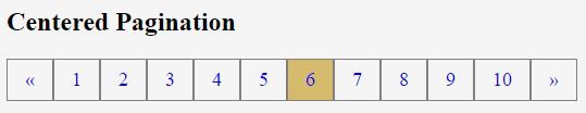
6. Centered Pagination
This type of pagination can be displayed centered with the help of the text-align property.
Code:
<!DOCTYPE html>
<html>
<head>
<title>
Centered Pagination
</title>
<style>
.center {
text-align:center;
}
.pagination a {
font-size: 18px;
float: left;
padding: 8px 16px;
text-decoration: none;
border:1px solid grey;
}
.pagination a.active {
background-color:#d7bb6c;
}
.pagination a:hover:not(.active) {
background-color: #d4d5d2;
}
</style>
</head>
<body>
<h2>Centered Pagination</h2>
<div class="center">
<div class="pagination">
<a href="#">«</a>
<a href="#">1</a>
<a href="#">2</a>
<a href="#">3</a>
<a href="#">4</a>
<a href="#">5</a>
<a class = "active" href="#">6</a>
<a href="#">7</a>
<a href="#">8</a>
<a href="#">9</a>
<a href="#">10</a>
<a href="#">»</a>
</div>
</div>
</body>
</html>
Output:
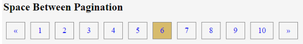
7. Space Between Pagination
Using the margin property, you can give space between page links in this type of pagination. Instead of grouping them closely, you can add space between the links by adjusting the margins.
Code:
<!DOCTYPE html>
<html>
<head>
<title>
Space Between Pagination
</title>
<style>
.center {
text-align:center;
}
.pagination a {
font-size: 18px;
float: left;
margin:0px 6px;
padding: 8px 16px;
text-decoration: none;
border:1px solid grey;
}
.pagination a.active {
background-color:#d7bb6c;
}
.pagination a:hover:not(.active) {
background-color: #d4d5d2;
}
</style>
</head>
<body>
<h2>Space Between Pagination</h2>
<div class="center">
<div class="pagination">
<a href="#">«</a>
<a href="#">1</a>
<a href="#">2</a>
<a href="#">3</a>
<a href="#">4</a>
<a href="#">5</a>
<a class = "active" href="#">6</a>
<a href="#">7</a>
<a href="#">8</a>
<a href="#">9</a>
<a href="#">10</a>
<a href="#">»</a>
</div>
</div>
</body>
</html>
Output:
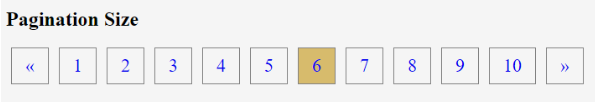
8. Pagination Size
You can change the size of this pagination by utilizing the font-size property.
Code:
<!DOCTYPE html>
<html>
<head>
<title>
Pagination Size
</title>
<style>
.center {
text-align:center;
}
.pagination a {
font-size: 22px;
float: left;
margin:0px 6px;
padding: 8px 16px;
text-decoration: none;
border:1px solid grey;
}
.pagination a.active {
background-color:#d7bb6c;
}
.pagination a:hover:not(.active) {
background-color: #d4d5d2;
}
</style>
</head>
<body>
<h2>Pagination Size</h2>
<div class="center">
<div class="pagination">
<a href="#">«</a>
<a href="#">1</a>
<a href="#">2</a>
<a href="#">3</a>
<a href="#">4</a>
<a href="#">5</a>
<a class = "active" href="#">6</a>
<a href="#">7</a>
<a href="#">8</a>
<a href="#">9</a>
<a href="#">10</a>
<a href="#">»</a>
</div>
</div>
</body>
</html>
Output:
Conclusion
So far, we have studied how pagination plays a role in breaking down a large amount of content into various HTML pages, providing users with convenient navigation and easy access to information. The pagination class could be used within the HTML elements to make content paganized. Therefore, CSS pagination is very helpful when a large amount of content of the HTML pages can be divided into discrete pages.
Recommended Articles
We hope that this EDUCBA information on “CSS Pagination” was beneficial to you. You can view EDUCBA’s recommended articles for more information.

