Updated June 14, 2023

Introduction to CSS object-fit
CSS object-fit is one of the CSS properties and will define how to specify the resizing property in an image or video that fits into a content box—an object-fit fixes an issue related to image resizing, like loss of aspect ratio and squished images. The object-fit property makes more sense when an image is part of the content with image tag <img> to achieve the desired result. And they are elements inserted directly into HTML code. When we need all of our images on a web page of small values (like profile pictures) in height and width, this object fit helps well.
Syntax and parameters:
Here is the syntax to use this property in CSS:
Object-fit: property values;The possible Property values are filled, cover, contain, initial, scale-down, inherit, and none.
How does object-fit Property work in CSS?
As we all know, videos and images have problems with website layout. When we have limited space, we need to alter an image’s height; therefore, resizing the browsers will not meet the aspect ratio, so these problems can be solved using CSS-object fit and positioning. Before that, we should know the difference between an image and an image content box. The image says that it’s an original image with height and width, and the content box has an element <img> inside the web page specifying their width and height values.
These properties are very similar to the background-color properties of CSS. This Object-fit works well with replaced elements, i.e., an image and background properties cannot be applied to the video part, but the object-fit goes well. And replaced element is said to be an element whose dimensions are defined out of the boundaries of CSS. The exact examples are <img> and <video>. In the case of embedded documents, it is <input> element.
The object-fit property has the following possible values, as shown below:
- fill: It is considered a default value and an initial value. This stretches an element container to make it fit inside the container box. Here the height and width of the box are the same.
- cover: This property covers an entire container with the picture means it enlarges itself to maintain its aspect ratio.
- contain: In this property value, the element content resizes to fit within the container box while maintaining its aspect ratio. The main benefit is that the image is available inside the content box. If it doesn’t fit inside the box, the specified background color fills the remaining space.
- scale-down: This compares the value of none and contains and chooses the smaller element (scales down the particular image).
- none: Makes an element content retain into original size by neglecting container size. This may lead the image out of the box or sometimes stretching out of the container. An intrinsic aspect ratio remains the same. Cropping may take place when the image overflows the box.
Examples of CSS object-fit
In this section, we shall see an example demonstrating changing an image’s width and height.
Example #1
So here is a short example of different attribute property values.
outfit.html
<!DOCTYPE html>
<html>
<head>
<title>
CSS Object-Fit Property Demo
</title>
<style>
img {
width: 230px;
height: 450px;
object-fit: Fill;
}
</style>
</head>
<body>
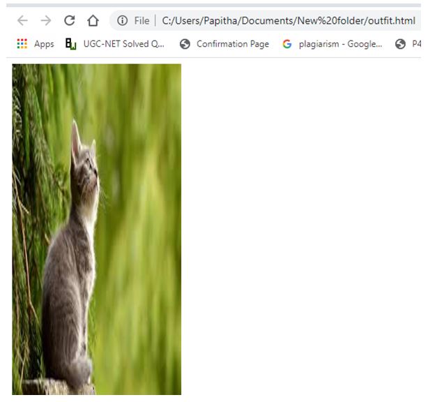
<h1>CSS Object-Fit Property Demo Using Fill </h1>
<img src="cat.jpeg"lt=" Cat Animal Pic" width="550" height="150">
</body>
</html>This fills property stretches an original image to fit the box, which we see in the demo below output:
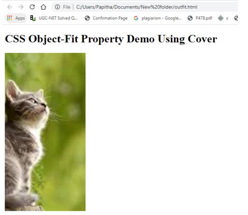
Using Cover:
We changed the above HTML code to this value to view the Cat Image’s different positions.
Code:
<style>
img {
width: 230px;
height: 450px;
object-fit: cover;
}
</style>
Here, we crop the image to fit within the box.
Output:
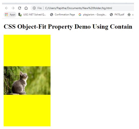
Using Contain:
We have applied a background color for the same HTML code to differentiate the image. The image fits the height and width of the box, displaying the remaining space as yellow.
bg.html
<!DOCTYPE html>
<html>
<head>
<title>
CSS Object-Fit Property Demo
</title>
<style>
img {
width: 230px;
height: 450px;
background: yellow;
color: red;
object-fit: contain;
}
</style>
</head>
<body>
<h1>CSS Object-Fit Property Demo Using Contain </h1>
<img src= "cat.jpeg"lt=" Cat Animal Pic" width="550" height="150">
</body>
</html>
Output:
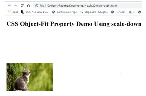
Using Scale-down:
<style>
img {
width: 230px;
height: 450px;
object-fit: scale-down;
}
</style>
Output:
Example #2
The implementation shows all the values together.
outfit.html
<html>
<head>
<title>My CSS </title>
<link rel="stylesheet" href="css/outfit.css">
</head>
<body>
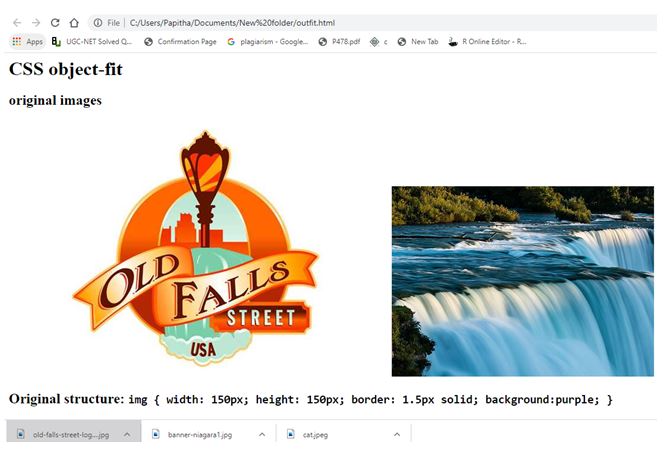
<h1>CSS object-fit</h1>
<section id="falls">
<h1>original images</h1>
<img src="old-falls-street-logo-spotlight.jpg" alt>
<img src="banner-niagara1.jpg" alt>
</section>
<section>
<h1>Original structure: <code>img { width: 150px; height: 150px; border: 1.5px solid; background:purple; }</code></h1>
<img src="old-falls-street-logo-spotlight.jpg" alt>
<img src="banner-niagara1.jpg.jpg" alt>
<h2>Squished Picture</h2>
</section>
<section class="contain">
<h1>Original Structure along with the image + <code>img { object-fit: contain }</code></h1>
<img src="old-falls-street-logo-spotlight.jpg" alt>
<img src="banner-niagara1.jpg" alt>
<h2>Images are appropriate with the Aspect ratio</h2>
</section>
<section class="cover">
<h1>Original Structure + <code>img { object-fit: cover; }</code></h1>
<img src="old-falls-street-logo-spotlight.jpg" alt>
<img src="banner-niagara1.jpg" alt>
<h2>Changes in image to cover the width and height</h2>
</section>
<section class="none">
<h1>Original Structure + <code>img { object-fit: none; }</code></h1>
<img src="old-falls-street-logo-spotlight.jpg" alt>
<img src="banner-niagara1.jpg" alt>
<h2>Images are cropped to maintain the original pic</h2>
</section>
</body>
</html>Here is the CSS file for the above HTML code:
outfit.css
body {
font-family: calibri, sans-serif;
margin: 1;
text-align: center; }
h1, h2 { font-weight: 80; }
section:nth-child(even) {
background: green;
}
#falls img {
width: 35%;
max-width: 250px;
height: auto;
margin: 1.5%;
}
section h1 {
font-weight: 400;
padding-top: 2.5rem;
}
code { font-family: inherit; font-weight: 80; }
section img {
width: 150px;
height: 150px;
border: 1.5px solid;
background: purple;
}
section.containimg {
object-fit: contain;
}
section.coverimg {
object-fit: cover;
}
section.noneimg {
object-fit: none;
}
Output:
Conclusion
Therefore, we have seen how these CSS Object-fits provide magic in manipulating the image. It helps web developers to give control access over the image content or media like video. Along with object-fit, object-position plays an important role.
Recommended Articles
We hope that this EDUCBA information on “CSS object-fit” was beneficial to you. You can view EDUCBA’s recommended articles for more information.

