Updated June 29, 2023

Introduction to CSS @keyframes
The @keyframes rule stipulates the code for the animation. The CSS at-rule @keyframes manages the steps required in a CSS animation process by specifying keyframe styles along the animation chain. It allows the animation sequence more control over the key steps than transitions.
The animation moves gradually from one set of CSS styles to the other. We can modify the set of CSS styles several times during the animation. Define whether the style transition will occur in percent or with the “from” and “to” keywords, which are the same as 0 % and 100 %. The 0 % is the start of the animation, and 100 % is the completion of the animation.
Syntax
The syntax for CSS @keyframes can be written as shown below:
@keyframes name_of_animation {keyframes-selector {CSS style here…}}
When a keyframe rule does not define the animation’s start or end state (i.e., 0% from and 100% to), browsers can use the existing styles of the element for the start/end state. It could be used to animate an element back and forth from its initial state.
For instance,
@keyframes background_color {
0% {
background-color: blue;
}
100% {
background-color: grey;
}
}
The 0% and 100% are keyframe selectors specifying each keyframe rule. The keyframe declaration block consists of properties and values for a keyframe rule.
How do @keyframes work in CSS?
To work with keyframes, build a @keyframes rule with a name that the animation-name property uses to fit an animation to its keyframe argument. Each @keyframes rule contains a keyframe selector style list that specifies percentages, animation when the keyframe takes place and a block that includes the keyframe styles.
We will discuss how to use the @keyframes module in CSS with the help of examples.
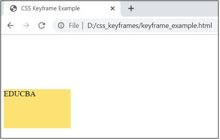
Example #1
Code:
<!DOCTYPE html>
<html>
<head>
<meta http-equiv="Content-Type" content="text/html; charset=windows-1252">
<title> CSS Keyframe Example </title>
<style>
div {
width: 80px;
height: 80px;
background: blue;
position: relative;
animation: animation_one 5s infinite;
}
@keyframes animation_one {
0%   {top: 0px; background: #ffd630; width: 80px;}
100% {top: 250px; background: #F5F5F5; width: 250px;}
}
</style>
</head>
<body><br>
<div>EDUCBA</div>
</body>
</html>
Output:
In the next examples, use the above steps to display the result of an html page.
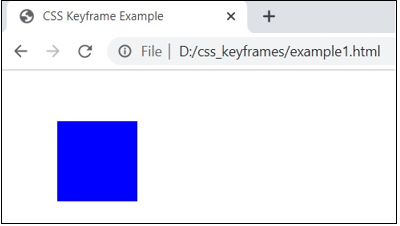
Example #2
Code:
<!DOCTYPE html>
<html lang="en">
<head>
<meta charset="utf-8">
<title>CSS Keyframe Example</title>
<style>
.box {
margin: 50px;
width: 80px;
height: 80px;
background: blue;
position: relative;
animation-name: animation_two;
animation-duration: 3s;
}
@-webkit-keyframes animation_two {
from {left: 0;}
to {left: 75%;}
}
</style>
</head>
<body>
<div class="box"></div>
</body>
</html>
Output:
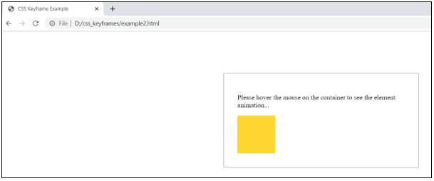
Example #3
Code:
<!DOCTYPE html>
<html lang="en">
<head>
<meta charset="utf-8">
<title>CSS Keyframe Example</title>
<style>
.container {
margin: 100px auto;
min-width: 200px;
max-width: 400px;
padding: 2em;
border: 1px solid grey;
}
.myelement {
padding: 20px;
width: 50px;
height: 50px;
background-color: #ffd630;
position: relative;
}
.container:hover .myelement1 {
animation: animation_three 3s linear both;
}
@keyframes animation_three {
0% {
left: 0;
top: 0;
}
50% {
left: 100px;
top: -100px;
}
100% {
left: 250px;
top: 0;
}
}
</style>
</head>
<body>
<div class="container">
<p>Please hover the mouse on the container to see the element animation...</p>
<div class="myelement myelement1">
</div>
</div>
</body>
</html>
Output:
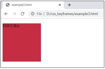
Example #4
Code:
<!DOCTYPE html>
<html>
<head>
<style>
div {
width: 150px;
height: 150px;
position: relative;
animation: animation_four 4s infinite;
}
@keyframes animation_four {
0%   {top: 0px; left: 0px; background: #BA55D3;}
25%  {top: 0px; left: 100px; background: #DB7093;}
50%  {top: 100px; left: 100px; background: #8B4513;}
75%  {top: 100px; left: 0px; background: #00FF7F;}
100% {top: 0px; left: 0px; background: #DC143C;}
}
</style>
</head>
<body>
<div>EDUCBA</div>
</body>
</html>
Output
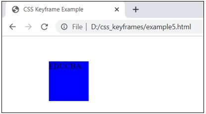
Example #5
Code:
<!DOCTYPE html>
<html lang="en">
<head>
<meta charset="utf-8">
<title>CSS Keyframe Example</title>
<style>
.mydiv {
margin: 50px;
width: 80px;
height: 80px;
background: blue;
position: relative;
animation: animation_five 3s linear 0s infinite alternate;
}
@keyframes animation_five {
from {left: 0;}
to {left: 30%;}
}
</style>
</head>
<body>
<div class="mydiv"> EDUCBA </div>
</body>
</html>
Output:
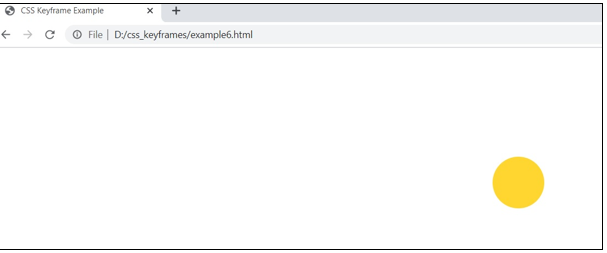
Example #6
Code:
<!DOCTYPE html>
<html lang="en">
<head>
<meta charset="utf-8">
<title>CSS Keyframe Example</title>
<style>
.container {
margin: 100px auto;
min-width: 200px;
max-width: 400px;
}
.myelement {
margin: 0 auto;
width: 75px;
height: 75px;
background-color: #ffd630;
border-radius: 50%;
position: relative;
top: 0;
animation: animation_six 2s infinite;
}
@keyframes animation_six {
from {
top: 50px;
animation-timing-function: ease-out;
}
25% {
top: 70px;
animation-timing-function: ease-in;
}
50% {
top: 100px;
animation-timing-function: ease-out;
}
75% {
top: 50px;
animation-timing-function: ease-in;
}
to {
top: 150px;
}
}
</style>
</head>
<body>
<div class="container">
<div class="myelement"></div>
</div>
</body>
</html>
Output:
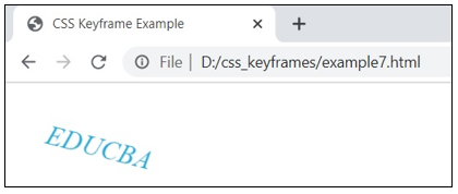
Example #7
Code:
<!DOCTYPE html>
<html lang="en">
<head>
<meta charset="utf-8">
<title>CSS Keyframe Example</title>
<style>
.mytxt {
font-size: 25px;
font-style: italic;
color: #0099cc;
-webkit-transform-origin: left center;
-ms-transform-origin: left center;
transform-origin: left center;
animation: animation_fall 5s infinite;
}
@keyframes animation_fall {
from {
-webkit-transform: rotate(0) translateX(0);
transform: rotate(0) translateX(0);
opacity: 1;
}
to {
-webkit-transform: rotate(90deg) translateX(200px);
transform: rotate(90deg) translateX(200px);
opacity: 0;
}
}
</style>
</head>
<body>
<div>
<p class="mytxt"> EDUCBA </p>
</div>
</body>
</html>
Output:
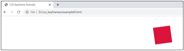
Example #8
Code:
<!DOCTYPE html>
<html lang="en">
<head>
<meta charset="utf-8">
<title>CSS Keyframe Example</title>
<style>
.container {
margin: 50px auto;
min-width: 350px;
}
.myelement {
margin: 0 auto;
width: 80px;
height: 80px;
background-color: #DB7093;
margin-bottom: 100px;
position: relative;
left: 0;
}
.myelement1 {
background-color: #DC143C;
-webkit-animation: animation_shake 6s infinite;
animation: animation_shake 6s infinite;
}
@keyframes animation_shake {
0%, 15%, 25%, 35%, 45%, 55% {
left: 80px;
transform: rotate(90deg);
}
5%,
10%,
20%,
30%,
40%,
50%{
left: -80px;
transform: rotate(-90deg);
}
}
</style>
</head>
<body>
<div class="container">
<div class="myelement myelement1"></div>
</div>
</body>
</html>
Output:
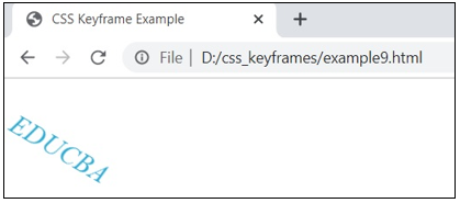
Example #9
Code:
<!DOCTYPE html>
<html lang="en">
<head>
<meta charset="utf-8">
<title>CSS Keyframe Example</title>
<style>
.mytxt {
font-size: 25px;
font-style: italic;
color: #0099cc;
transform-origin: left center;
animation: animation_fall 5s infinite;
}
@keyframes animation_fall {
from {
transform: rotate(0) translateX(0);
opacity: 0.5;
}
50%,
60% {
transform: rotate(45deg) translateX(0);
opacity: 1;
}
to {
transform: rotate(45deg) translateX(100px);
opacity: 0.5;
}
}
</style>
</head>
<body>
<div>
<p class="mytxt"> EDUCBA </p>
</div>
</body>
</html>
Output:
Conclusion
As shown, the @keyframe rule consists of the properties and values you want to animate in the keyframe declaration block. The keyframes have been used to define the animation properties’ values at various animation phases. The @keyframes at-rule consists of an encapsulated collection of CSS-style rules describing how the property values change with time.
Recommended Articles
We hope that this EDUCBA information on “CSS @keyframes” was beneficial to you. You can view EDUCBA’s recommended articles for more information.

