Updated June 8, 2023
What is CSS Text-Shadow?
Cascading style sheets are used for styling an html page. This counts all the elements that an HTML page can possibly contain. Text styling is a very prominent feature within CSS. There must be uniformity and synchronization in the styling of the text content on a page with other elements like images, links, buttons, etc. Using CSS, we can ensure that the text on the page is in sync. CSS offers many text features like color, letter spacing, size, line height, and direction. One such property is Text-shadow. Using this feature, we can project the text along with a shadow to highlight the text. This will give a desirable outline of the text we want to highlight. This article will discuss in detail this special feature. In this topic, we are going to learn about CSS for Text-Shadow.
Text-Shadow syntax and how it works in CSS?
Text shadow can be used in inline CSS, Internal CSS, or External CSS. The syntax for text-shadow is:
text-shadow: horizontal-shadow vertical-shadow blur-radius color/none/ inherit/initial;Here, horizontal shadow, vertical shadow, and blur radius are mandatory parameters, while color is optional.
- None, initial, and inherit are global values where none specifies that there is no text shadow; inherit instructs the element to take the parameters set for the parent element. Initial will make sure that the property is reverted to its default value.
- Horizontal and vertical shadows are numerical parameters that decide the distance of the shadow from the text.
- Horizontal shadow specifies the horizontal distance of the shadow from the text, i.e., left or right direction. If the value is positive, the shadow will be in the right direction; if negative, the shadow will be in the left direction.
- Vertical Shadow specifies the vertical distance, i.e., above or below. If the value is positive, the shadow will be below the text, while if it is negative, it will be placed above the text.
- Blur-radius is also a numerical parameter, which must be specified, or else, its default value is taken as 0. This parameter decides how blurry (light or wide) the shadow must be. The higher the value, the wider the shadow.
- As the name goes, color is the feature that decides the color of the shadow. This is an optional parameter.
Examples of CSS for Text-Shadow
Let’s discuss the feature through some examples for better clarity:
1. Basic Text-shadow Using Inline CSS
- Create an html page. Include the basic tags required to create the page, such as <html />, <head />, and <body>.
- Within the body tag, define any textual element and, using inline styling, defines its text-shadow parameters. For this example, we have styled <h1> as follows:
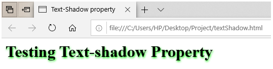
<h1 style="text-shadow: 1px 2px 4px #00EE00;">Testing Text-shadow Property</h1>- So the entire html code should be in somewhat the below-defined structure:
<html>
<head>
<title>Text-Shadow property</title>
</head>
<body>
<h1 style="text-shadow: 1px 2px 4px #00EE00;">Testing Text-shadow Property</h1>
</body>
</html>- Save the page, and open the saved .html file through a browser. The output text will have a green-colored shadow, as in the screenshot:
2. Text-shadow using External Style Sheet
- For this example, we are taking up the External CSS approach. We will create a CSS file and call its features in our html page. So, as the first step, we will create a css file, namely, textProp.css
- Next, we will style the paragraph tag, i.e., p, and define various properties for it, as below:
p{
text-align: center;
text-shadow: 2px 2px 4px blueviolet;
font-size: 20px;
font-family: 'Courier New', Courier, monospace;
background-color: rgb(230, 217, 217);
}- We will also define a class called “yellow-text”. We can call this class in various elements of our html page. The class must be coded as below:
.yellow-text{
text-align: center;
text-shadow: 4px -1px 4px green;
font-style: italic;
font-family: Arial, Helvetica, sans-serif;
color: yellow;
}- Combining these into pieces of code, the final CSS sheet should be:
p{
text-align: center;
text-shadow: 4px 2px 4px blueviolet;
font-size: 20px;
font-family: 'Courier New', Courier, monospace;
background-color: rgb(230, 217, 217);
}
.yellow-text{
text-align: center;
text-shadow: 4px -1px 4px green;
font-style: italic;
font-family: Arial, Helvetica, sans-serif;
color: yellow;
}- Now we will create an html page, call the style sheet and use the styles we have defined. To test all the properties that have been described, the html code can be similar to the one defined below:
<html>
<head>
<title>Text-Shadow property</title>
<link rel = "stylesheet" href = "textProp.css">
</head>
<body>
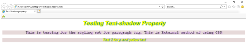
<h1 class="yellow-text">Testing Text-shadow Property</h1>
<p>This is testing for the styling set for paragraph tag. This is External method of using CSS </p>
<p class="yellow-text">Test 2 for p and yellow text</p>
</body>
</html>- There is a call for the text-yellow class within a p tag for experimentation purposes. There can be more combinations made and tested for research.
- The final page or output of the html code should be as below:
3. Creating Multiple Shadows
- There can be more than one shadow for a particular text. We need to add another set of the parameter in the same definition, separated by a comma, like this:
text-shadow: 4px 2px 4px blueviolet, -4px -2px 4px red;- Similar to the last example, we will create an external CSS file to define multiple shadows for all text with <p> tags. We can add some styling for the heading element <h1>. The CSS file should be similar to the example below:
p{
text-align: center;
text-shadow: 4px 2px 4px blueviolet, -4px -2px 4px red;
font-size: 20px;
font-family: 'Courier New', Courier, monospace;
background-color: rgb(230, 217, 217);
margin: 100px;
}
h1{
text-align: center;
font-family: 'Courier New', Courier, monospace;
color: purple;
text-shadow: 4px 4px 4px violet;
}- We will create an html page, call the style sheet and use the elements for which we have defined the style in the CSS file. The html code should look like this:
<html>
<head>
<title>Text-Shadow property</title>
<link rel = "stylesheet" href = "textProp.css">
</head>
<body>
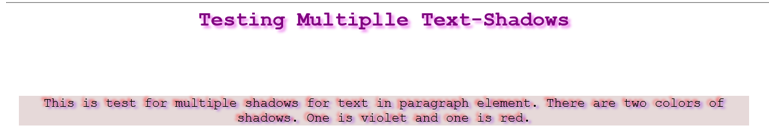
<h1>Testing Multiplle Text-Shadows</h1>
<p>This is test for multiple shadows for text in paragraph element. There are two colors of shadows. One is violet and one is red.</p>
</body>- The output of this file should look like this:
So, we discussed the uses of text-shadow property offered by CSS for styling texts in our html pages. There are many other ways where one can experiment with text shadow. It will be of prominent use for highlighting some important text.
Recommended Articles
We hope that this EDUCBA information on “CSS for Text-Shadow” was beneficial to you. You can view EDUCBA’s recommended articles for more information.

