Updated June 12, 2023

Introduction to CSS Fade-in Animation
As we know, CSS has many features to offer a developer. While some can be directly achieved, some are achievable by tinkering with existing features. For example, different animations can be put on various elements on a page. Fade-In animation is one such. In the case of fade-In animation, the object of the question appears to darken when hovered upon. Now, there are many ways to achieve this effect. This can be done to highlight a particular button or image. We can do so by playing around with the opacity of the element. In this topic, we are going to learn about CSS Fade-in Animation.
Methodology and Example of CSS Fade-in Animation
We will play around with the opacity, transition, and hover features to achieve the fade-in effect through CSS. We will specify the original opacity of the object/element. Within the pseudo-class created for the hover feature, we will specify the opacity it must transform to upon hover. We can follow the method of using external CSS, where we will create a style sheet file externally and call it on the HTML page. Or we can follow internal CSS and style the elements in the head section of the HTML code. First, look at the example to understand how the Fade-in effect works.
Fade In Animation for a Button, Using External CSS
1. This is external CSS, so that we will create the CSS file first. Then, we will define the styling for <div>. The code can be as follows:
div{
background-color: aquamarine;
height: 100px;
width: 100px;
padding: 10px;
margin: 10px;
}
2. Next, we will style a class, where we will define the property “opacity” and its transition time. We will initially keep the opacity at 50% such that it appears lighter than usual. In the pseudo hover class, we will make the opacity 100% such that it darkens as the end-user hovers over it. The code for the following is as follows:
.cl1 {
opacity: 50%;
transition:opacity 0.5s
}
.cl1:hover {
opacity:100%;
transition:opacity 0.5s
}
3. Combining the code, we will have the CSS file as follows:
div{
background-color: aquamarine;
height: 200px;
width: 200px;
padding: 10px;
margin: 10px;
}
.cl1 {
opacity: 50%;
transition:opacity 0.5s
}
.cl1:hover {
opacity:100%;
transition:opacity 0.5s
}
4. Next, we will code for the HTML page. Since this is an external CSS example, we will call for the externally created CSS file in the header section as follows:
<head>
<title>Fade In Animation Using CSS</title>
<link rel="stylesheet" type="text/css" href="fadeIn.css">
</head>
5. Once done, we will move to the body section. We have styled the >div> element and defined the class cl1 for the animation effect. Next, we will call the <div> element in the body section and call for the class cl1. Anything under the <div /> section will show the animation effect. The code for it is as follows:
<body>
<div class="cl1">
<center>
<h2>Fade In Using CSS</h2>
<button type="button">Click</button>
</center>
</div>
</body>
6. Combing the snippets, the final HTML code will look like this:
<html>
<head>
<title>Fade In Animation Using CSS</title>
<link rel="stylesheet" type="text/css" href="fadeIn.css">
</head>
<body>
<div class="cl1">
<center>
<h2>Fade In Using CSS</h2>
<button type="button">Click</button>
</center>
</div>
</body>
</html>
7. We can observe the output by saving the html file and opening it through a browser. We will get the following output:
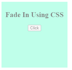
8. On hovering over the square patch, we will get the following output:
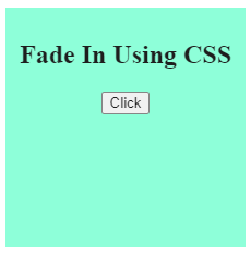
9. We can see how the fade-in effect works.
Fade in Animation for an Image, Using Internal CSS
1. Since this example uses internal CSS, we will define the styling within the HTML page.
2. We will use the <style> tag, defined in the header section of the HTML page.
3. Within the <style> tab, we will first style the <div> element, then define the class with opacity property. We will then determine the pseudo-class with the transformation in opacity on hover.
4. The code in the <style> tag will look like this:
<style>
div{
background-color: aquamarine;
height: 200px;
width: 200px;
padding: 10px;
margin: 10px;
}
.cl1{
opacity: 50%;
transition: opacity 0.5s;
}
.cl1:hover{
opacity: 100%;
transition: opacity 0.5s;
}
</style>
5. Once the styling is defined, we will move on to the body part. First, we will call the <div> element as we have styled that in the header section. Next, we will call the class cl1 along with <div>. Then, we will call the image within the <div> section. This way, the image will show the fade-in animation as expected.
6. The body section of the page can be coded as:
<div class="cl1">
<center>
<h2>Fade In Using CSS</h2>
<img src="first.jpg" height="100px" width="120px"></img>
</center>
</div>
7. Combining the body and head section, the final HTML code we get is as follows:
<html>
<head>
<title>Fade In Animation Using CSS</title>
<style>
div{
background-color: aquamarine;
height: 200px;
width: 200px;
padding: 10px;
margin: 10px;
}
.cl1{
opacity: 50%;
transition: opacity 0.5s;
}
.cl1:hover{
opacity: 100%;
transition: opacity 0.5s;
}
</style>
</head>
<body>
<div class="cl1">
<center>
<h2>Fade In Using CSS</h2>
<img src="first.jpg" height="100px" width="120px"></img>
</center>
</div>
</body>
</html>
8. Saving the above HTML code and opening it through the browser will give us the following result:
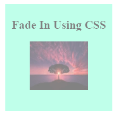
9. Hovering over the square patch will give the following result:

10. Hence, the fade-in effect is projected in the above two screenshots. This happens when the object in question is hovered upon.
In the above two examples, we learned how to achieve fade-in animation using internal or external CSS combined with HTML. Other options can be explored and utilized if the animation is needed elsewhere. To keep the code optimized, it is important to use External CSS. Many other features can be implemented following a similar means to customize the developed pages. It completely depends upon the choice of the developer and what way they want to proceed and achieve the desired results.
Recommended Articles
We hope that this EDUCBA information on “CSS Fade-in Animation” was beneficial to you. You can view EDUCBA’s recommended articles for more information.

