Updated June 17, 2023
Introduction to CSS Drop Shadow
CSS treats each element as a box. It provides various features to style each element. But as far as the rendering of the elements in a page and overall layout is concerned, the box model is the most important feature that CSS offers. In addition, CSS offers another feature where we can give the element a shadow effect while treating the element as a box. This feature is commonly called box-shadow but can also be addressed as drop-shadow.
How to Create Drop Shadow?
Syntax:
The syntax for a drop shadow or box shadow is as follows:
box-shadow: horizontal-offset vertical-offset blur-radius spread-radius(option) colorHere, horizontal offset refers to the shadow towards the left or right. If the value is positive, the shadow will be towards the right, and the shadow will be towards the left for a negative value. Vertical offset refers to the top or bottom shadow. If the value is positive, the shadow will be at the bottom or below the box; in the case of a negative value, the shadow will be on top or above the box. Blur decides the sharpness of the shadow. The higher the blur radius, the less sharp the shadow will appear. The Spread radius is an optional parameter that determines the size of the shadow. At the same time, a positive value means a larger size, negative means vice versa. Color is a parameter that decides the color of the shadow.
box-shadow: none|inset|initial|inheritBelow are some values that can be used with the box-shadow property. None will give no shadow for the box. Inset will provide an inner shadow instead of an outer shadow. This property is optional. Initial will set all the values of the box-shadow property to the initial state. And finally, the inheritance will take the property values of the parent element and use the same for styling the current element.
Examples of CSS Drop Shadow
Let us have a look at some of the examples to understand how drop-shadow property work in CSS:
Example #1
Demonstration of basic box-shadow property through external CSS.
- We will be implementing this example through external CSS. So first and foremost, we will create a CSS file.
- Since the box shadow can also be used as a part of the box model, we will create a box-model style for the heading element <h2>.
Code:
h2{
width: 500px;
font-size: 18px;
padding: 20px 50px;
border: 10px dotted pink;
margin: 10px 50px;
box-shadow: 5px 5px 10px purple;
background-color: lightcoral;
text-align: center;
}- Similarly, we will create another styling for the paragraph element <p>.
Code:
p{
height: 50px;
width: 300px;
padding: 10px;
border: 15px double lightskyblue;
margin: 10px 60px;
box-shadow: -10px 10px 15px 15px grey;
background-color: lightslategrey;
color: white;
font-family: Arial, Helvetica, sans-serif;
font-size: 20px;
}- The CSS file, after combining the above two snippets, should look like this.
Code:
h2{
width: 500px;
font-size: 18px;
padding: 20px 50px;
border: 10px dotted pink;
margin: 10px 50px;
box-shadow: 5px 5px 10px purple;
background-color: lightcoral;
text-align: center;
}
p{
height: 50px;
width: 300px;
padding: 10px;
border: 15px double lightskyblue;
margin: 10px 60px;
box-shadow: -10px 10px 15px 15px grey;
background-color: lightslategrey;
color: white;
font-family: Arial, Helvetica, sans-serif;
font-size: 20px;
}- Next, we will create an HTML page. Since this is an external CSS, we will call the CSS file in the head section.
- We will use elements <h2> and <p> to see the final results of the styling.
- The final HTML code should be similar to this.
Code:
<html>
<head>
<title>Testing Box Shadow</title>
<link rel = "stylesheet" href = "box.css">
</head>
<body>
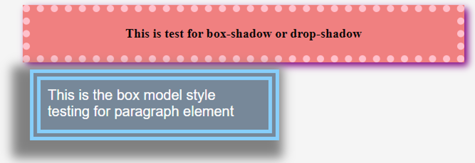
<h2>This is test for box-shadow or drop-shadow</h2>
<p>This is the box model style testing for paragraph element</p>
</body>
</html>- Once this file is saved, it can be opened through a browser.
- The final result should be similar to the below image:
Output:
Example #2
Demonstrating the ‘inset’ feature through External CSS.
- By default, box-shadow will produce an outer shadow for the element. However, if one wants to display an inner shadow, the optional feature inset can be used.
- Like the previous example, we will create a CSS file first.
- We will style the paragraph element and use the inset feature to display an inner border.
- The final CSS code should be similar to this snippet.
Code:
p{
height: 100px;
width: 400px;
padding: 15px;
border: 5px dotted lightskyblue;
margin: 20px 60px;
box-shadow: inset 10px 10px 15px 15px grey;
color: blue;
font-size: 20px;
font-family: fantasy;
}- Now that the CSS file is finalized, we will code the HTML page. We will use paragraph element <p> to see how the inset feature works for the box shadow.
Code:
<html>
<head>
<title>Testing Box Shadow</title>
<link rel = "stylesheet" href = "box.css">
</head>
<body>
<p>This is the box shadow inset style testing for paragraph element</p>
<p>This is second test for the inset box-shadow</p>
</body>
</html>- Saving this HTML file and opening it through any browser should give an output similar to this.
Output:

Example #3
Demonstrating drop-shadow through inline CSS.
- Since we use Inline CSS in this example, we can code the HTML page directly.
- We will add the styling using the style parameter for the paragraph element <p>.
Code:
<html>
<head>
<title>Testing Drop Shadow</title>
</head>
<body>
<p style="height: 100px; width: 400px; box-shadow: 10px 10px 5px grey; border: 2px dotted lightblue;">Testing drop-shadow through inline CSS</p>
</body>
</html>- Save this HTML page and open it through a browser to see the following output.
Output:

The above example demonstrated the use of drop shadow. This is a feature that can be used to give a three-dimensional impact to an element. It can be tried with various combinations in the box model or separately.
Recommended Articles
We hope that this EDUCBA information on “CSS Drop Shadow” was beneficial to you. You can view EDUCBA’s recommended articles for more information.

