Updated June 13, 2023
Introduction to CSS calc()
The calc() function contains a calculation that should be used as the property’s value. This function makes it easy to position an object with a set margin. The calc() function takes a specific expression as its argument, with the output of the expression being used as the value. The calc() is a native CSS method for doing basic maths correctly in CSS as a substitute for any longitudinal value or almost any number. This has four basic operators in math: add (+), subtract (-), multiply (*), and divide (/). Another case for the calc() function is to help ensure that form fields fit into the space available without extruding beyond the edge of the container while maintaining an acceptable margin.
Syntax:
property_name: calc(expression)The function uses the expression as a single parameter and uses operators such as add (+), subtract (-), multiply (*), and divide (/).
How does the calc() Function works in CSS?
The calc() function is better than the pre-processor, which can mix any unit. The calc() function makes simple calculations to specify the CSS property values. Users can multiply pixels by percentage.
To make the layout more versatile, it offers two key features such as:
- Mixing percentages and absolute values.
- Units of mixing sizes.
Examples of CSS calc()
Given below are the examples of CSS calc():
Example #1
Code:
<!DOCTYPE html>
<html>
<head>
<meta http-equiv="Content-Type" content="text/html; charset=windows-1252">
<title> CSS calc() Function Example </title>
<style>
.heading {
position: absolute;
left: 30px;
width: calc(50% - 20%);
height:calc(200px - 100px);
background-color: #5E9BC6;
padding-top:20px;
text-align: center;
}
h2 {
color:#F1DBED;
}
</style>
</head>
<body>
<br>
<div class="heading">
<h2> Welcome to EDUCBA... </h2>
</div>
</body>
</html>
Output:

We apply the calc() function to the height and width attributes, setting the width to 30% and the height to 100px. We are referring to the heading class for defining styles for the content.
Example #2
Code:
<!DOCTYPE html>
<html>
<head>
<meta http-equiv="Content-Type" content="text/html; charset=windows-1252">
<title> CSS calc() Function Example </title>
<style>
img {
width: 100%;
display: block;
}
.box {
float: left;
padding: 5px;
box-sizing: border-box;
width: calc(100% / 5);
}
@media (max-width: 900px) {
.box {
width: calc(100% / 4);
}
}
@media (max-width: 550px) {
.box {
width: calc(100% / 3);
}
}
@media (max-width: 400px) {
.box {
width: 100%;
}
}
</style>
</head>
<body>
<br>
<section>
<div class="box">
<img src="https://pluspng.com/img-png/png-certificate-borders-free-8-certificate-templates-free-itinerary-template-sample-intended-for-red-certificate-border-png-28044-1516.png">
</div>
<div class="box">
<img src="https://pluspng.com/img-png/png-certificate-borders-free-8-certificate-templates-free-itinerary-template-sample-intended-for-red-certificate-border-png-28044-1516.png">
</div>
<div class="box">
<img src="https://pluspng.com/img-png/png-certificate-borders-free-8-certificate-templates-free-itinerary-template-sample-intended-for-red-certificate-border-png-28044-1516.png">
</div>
<div class="box">
<img src="https://pluspng.com/img-png/png-certificate-borders-free-8-certificate-templates-free-itinerary-template-sample-intended-for-red-certificate-border-png-28044-1516.png">
</div>
</section>
</body>
</html>
Output:
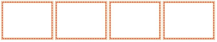
The program explains how the boxes will get displayed in different screen resolutions. We have taken maximum widths as 900px, 550px, and 400px. When the screen gets smaller than 900px, 550px, and 400px, each box will have a specified width, as provided in the example.
Example #3
Code:
<!DOCTYPE html>
<html>
<head>
<meta http-equiv="Content-Type" content="text/html; charset=windows-1252">
<title> CSS calc() Function Example </title>
<style>
.heading {
position: absolute;
left: 40px;
width: calc(300px - 50px);
border: 2px dotted red;
background-color: #5E9BC6;
padding: 3px;
text-align: center;
}
</style>
</head>
<body>
<br>
<div class="heading">
<h2> EDUCBA Education Center... </h2>
</div>
</body>
</html>
Output:

The calc() function is applied to the width attribute, where the width will be set to 250px. The heading class is referred to for defining the styles for the content display.
Example #4
Code:
<!DOCTYPE html>
<html>
<head>
<meta http-equiv="Content-Type" content="text/html; charset=windows-1252">
<title> CSS calc() Function Example </title>
<style>
.input_txt {
padding: 5px;
display: block;
width: calc(50% - 2em);
}
#box {
width: calc(200% / 8);
border: 1px dotted #5E9BC6;
padding: 5px;
}
</style>
</head>
<body>
<br>
<form>
<div id="box">
<label> Your text here: </label>
<input type="text" class="input_txt">
</div>
</form>
</body>
</html>
Output:
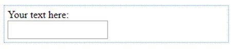
Here, we are using the input type element of the HTML form. We apply the calc() function to the div and input elements. The width of the input type will be decreased to 2 times the size of the current width.
Example #5
Code:
<!DOCTYPE html>
<html>
<head>
<meta http-equiv="Content-Type" content="text/html; charset=windows-1252">
<title> CSS calc() Function Example </title>
<style>
img {
display: block;
}
section {
width: 250px;
height: 150px;
position: relative;
background-color: #5E9BC6;
}
.box {
position: absolute;
}
.box-horizontal {
top: 15px;
left: calc(50% - 20px);
}
.box-vertical {
left: 15px;
top: calc(50% - 20px);
}
.box-middle {
left: calc(50% - 20px);
top: calc(50% - 20px);
}
</style>
</head>
<body>
<br>
<section>
<div class="box box-horizontal">
<img src="https://pluspng.com/img-png/png-certificate-borders-free-8-certificate-templates-free-itinerary-template-sample-intended-for-red-certificate-border-png-28044-1516.png" height="50" width="50">
</div>
</section>
<section>
<div class="box box-vertical">
<img src="https://pluspng.com/img-png/png-certificate-borders-free-8-certificate-templates-free-itinerary-template-sample-intended-for-red-certificate-border-png-28044-1516.png" height="50" width="50">
</div>
</section>
<section>
<div class="box box-middle">
<img src="https://pluspng.com/img-png/png-certificate-borders-free-8-certificate-templates-free-itinerary-template-sample-intended-for-red-certificate-border-png-28044-1516.png" height="50" width="50">
</div>
</section>
</body>
</html>
Output:
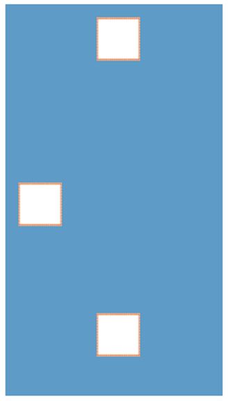
The output shows a horizontal box, a vertical box, and middlebox. The horizontal box will be displayed on the left side by decreasing 20px from 50% with the help of the calc() function. The same scenario will be applied to vertical and middle elements.
Example #6
Code:
<!DOCTYPE html>
<html>
<head>
<meta http-equiv="Content-Type" content="text/html; charset=windows-1252">
<title> CSS calc() Function Example </title>
<style>
*{
box-sizing: border-box;
}
html, body{
height: 100%;
padding: 50px;
background: #00174f;
}
body{
background: white url(https://pluspng.com/img-png/png-certificate-borders-free-8-certificate-templates-free-itinerary-template-sample-intended-for-red-certificate-border-png-28044-1516.png) calc(50% - 10px) calc(50% - 10px) no-repeat;
}
</style>
</head>
<body>
<br>
<h2> Hello World... </h2>
</body>
</html>
Output:

Here, we are using a background image for the HTML body page. We position the image on the left side with a 10px decrease from 50% and a 10px decrease from 50% on the top side.
Example #7
Code:
<!DOCTYPE html>
<html>
<head>
<meta http-equiv="Content-Type" content="text/html; charset=windows-1252">
<title> CSS calc() Function Example </title>
<style>
.heading {
margin: 0 auto;
outline: solid 1px;
width: 250px; height: 250px;
background:
linear-gradient(to left bottom,
transparent calc(75% - 1em), #000 0, #000 calc(75% + 1em), transparent 0);
}
</style>
</head>
<body>
<br>
<div class="heading">
<h2> EDUCBA... </h2>
</div>
</body>
</html>
Output:

The program creates a line with a gradient background for the HTML page on the left side of the bottom. It provides the inner background to the element and the opacity level for the element by using the calc() function.
Example #8
Code:
<!DOCTYPE html>
<html>
<head>
<meta http-equiv="Content-Type" content="text/html; charset=windows-1252">
<title> CSS calc() Function Example </title>
<style>
.heading {
width: calc(200% / 8);
border: 1px dotted #5E9BC6;
padding: 5px;
}
.demo{
background:grey;
font-size: 15px;
}
</style>
</head>
<body>
<br>
<div class="heading">
<div class="demo">
<h2> EDUCBA... It is an online learning model along with amazing 2500+ courses... </h2>
</div>
</div>
</body>
</html>
Output:

We define the div element with a heading class. This class will use 1/8 of the available window width and specified styles.
Conclusion
In this article, we have seen some helpful featufeaturesSS. The calc() function will operate as a value across all places where a number value with or without specific units works. It seems time to use our examples to learn more about the CSS calc() function.
Recommended Articles
We hope that this EDUCBA information on “CSS calc()” was beneficial to you. You can view EDUCBA’s recommended articles for more information.

