Updated March 18, 2023
Introduction to Bootstrap Form
The Form is the most common and essential component for every website and web application. The bootstrap form is a component of bootstrap used for the user’s input or information. It helps to control the styling and layout automatically. It has its classes for choosing style and layout for the Form. It has three layouts which are vertical layout, horizontal layout, and inline layout.
Syntax
The two classes are required for the bootstrap form.
- The class form group is placed in the main div tag. It is used for spacing in the Form.
- The class form-control is placed in the textual elements. It is used to control all the input elements.
There are three types of bootstrap forms, and their syntax is below.
1. Vertical layout form
<form>
<div class ="form-group">
<label for ="name"> Name: </label>
<input type ="text" class ="form-control" id="name" />
</div>
</form>
2. Horizontal layout form
<form class ="form-horizontal">
<div class ="form-group">
<label for ="name" class ="control-label" > Name: </label>
<input type ="text" class ="form-control" id="name" />
</div>
</form>
3. Inline layout form
<form class ="form-inline" >
<div class ="form-group" >
<label for ="name"> Name: </label>
<input type ="text" class ="form-control" id="name" />
</div>
</form>
How does the bootstrap Form work?
1. The vertical layout form.
- A vertical layout form is a default form in bootstrap.
- The class =”form-group” and class =”form-control” used for vertical layout form.
<form>
<div class="form-group">
<label for="uname">username:</label>
<input type="text" class="form-control" id="uname">
</div>
<div class="form-group">
<label for="paswrd"> User Password:</label>
<input type="password" class="form-control" id="paswrd" >
</div>
<button type="submit" class="btn btn-primary">Submit</button>
</form>
2. The horizontal layout form.
- The label and textual element next to each other is a format of horizontal layout form.
- The class =”form-horizontal” placed in the <form> tag.
- The class =”control-label” placed in the <label> tag.
<form class="form-horizontal">
<div class="form-group">
<label for="uname" class="control-label col-md-4">username:</label>
<div class="col-md-8">
<input type="text" class="form-control" id="uname">
</div>
</div>
<div class="form-group">
<label for="paswrd" class="control-label col-md-4"> User Password:</label>
<div class="col-md-8">
<input type="password" class="form-control" id="paswrd" >
</div>
</div>
<button type="submit" class="btn btn-primary col-md-offset-4">Submit</button>
</form>
3. The inline Form.
- All textual elements and text are in one row.
- The inline Form is displayed on large screen sizes. The screen size has to be at least 768px.
<form class ="form-inline">
<div class="form-group">
<label for="uname">username:</label>
<input type="text" class="form-control" id="uname">
</div>
<div class="form-group">
<label for="paswrd"> User Password:</label>
<input type="password" class="form-control" id="paswrd" >
</div>
<button class ="btn btn-primary" type="submit" > SUBMIT </button>
</form>- The inline Form is displayed on large screen sizes.
- The class=”sr-only” is used for hiding the label in the bootstrap inline Form.
<form class ="form-inline">
<div class ="form-group">
<label for ="uname" class="sr-only" > Name: </label>
<input type ="text" class="form-control" id="uname" />
</div>
<div class ="form-group">
<label for ="Paswrd" class="sr-only" > Password: </label>
<input type ="password" class="form-control" id="paswrd" />
</div>
<button class ="btn btn-primary" type="submit" > SUBMIT </button>
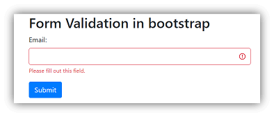
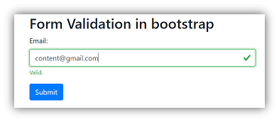
</form>- The form validation uses bootstrap classes of validation.
<form  class="was-validated" >
<div class="form-group">
<label for="eml"> Email: </label>
<input type="text" class="form-control" id="eml"  name="uname" required>
<div class="valid-feedback" > Valid. </div>
<div class="invalid-feedback" > Please fill out this field. </div>
</div>
</form>
Examples
Below are the different examples:
Example #1 – Vertical layout Form or Default Form
Code:
<!DOCTYPE html>
<html>
<head>
<title> Bootstrap form Example </title>
<meta charset ="utf-8">
<meta name ="viewport" content= "width=device-width, initial-scale=1">
<link rel = "stylesheet" href ="https://maxcdn.bootstrapcdn.com/bootstrap/3.4.1/css/bootstrap.min.css">
<script src= "https://ajax.googleapis.com/ajax/libs/jquery/3.5.1/jquery.min.js">
</script>
<script src= "https://maxcdn.bootstrapcdn.com/bootstrap/3.4.1/js/bootstrap.min.js">
</script>
</head>
<body>
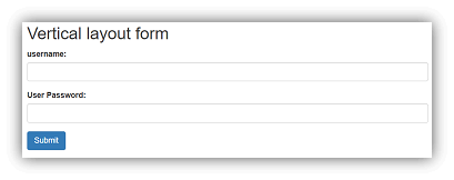
<div class= "container">
<h2> Vertical layout form </h2>
<form>
<div class="form-group">
<label for="uname"> username: </label>
<input type= "text" class= "form-control" id= "uname">
</div>
<div class="form-group">
<label for="paswrd"> User Password: </label>
<input type= "password" class= "form-control" id= "paswrd" >
</div>
<button type="submit" class="btn btn-primary"> Submit </button>
</form>
</div>
</body>
</html>Output:
Example #2 – Horizontal layout Form
Code:
<!DOCTYPE html>
<html>
<head>
<title> Bootstrap form Example </title>
<meta charset ="utf-8">
<meta name ="viewport" content="width=device-width, initial-scale=1">
<link rel ="stylesheet" href ="https://maxcdn.bootstrapcdn.com/bootstrap/3.4.1/css/bootstrap.min.css">
<script src= "https://ajax.googleapis.com/ajax/libs/jquery/3.5.1/jquery.min.js"></script>
<script src= "https://maxcdn.bootstrapcdn.com/bootstrap/3.4.1/js/bootstrap.min.js"></script>
</head>
<body>
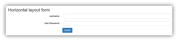
<div class= "container">
<h2> Horizontal layout form </h2>
<form class= "form-horizontal">
<div class= "form-group">
<label for= "uname" class= "control-label col-md-4"> username : </label>
<div class="col-md-8">
<input type= "text" class= "form-control" id= "uname">
</div>
</div>
<div class="form-group">
<label for= "paswrd" class= "control-label col-md-4"> User Password: </label>
<div class= "col-md-8">
<input type= "password" class= "form-control" id="paswrd" >
</div>
</div>
<button type= "submit" class= "btn btn-primary col-md-offset-4"> Submit </button>
</form>
</div>
</body>
</html>Output:
Example #3 – Inline Form
Code:
<!DOCTYPE html>
<html>
<head>
<title> Bootstrap form Example </title>
<meta charset ="utf-8">
<meta name ="viewport" content="width=device-width, initial-scale=1">
<link rel ="stylesheet" href ="https://maxcdn.bootstrapcdn.com/bootstrap/3.4.1/css/bootstrap.min.css">
<script src= "https://ajax.googleapis.com/ajax/libs/jquery/3.5.1/jquery.min.js"></script>
<script src= "https://maxcdn.bootstrapcdn.com/bootstrap/3.4.1/js/bootstrap.min.js"></script>
</head>
<body>
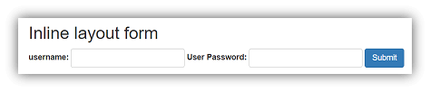
<div class= "container">
<h2> Inline layout form </ h2>
<form class= "form-inline">
<div class= "form-group">
<label for="uname" > username: </label>
<input type="text" class="form-control" id="uname">
</div>
<div class= "form-group">
<label for="paswrd" > User Password: </label>
<input type="password" class= "form-control" id="paswrd" >
</div>
<button type= "submit" class= "btn btn-primary "> Submit </button>
</form>
</div>
</body>
</html>Output:
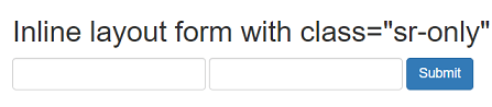
Example #4 – Inline Form using sr-only class
Code:
<!DOCTYPE html>
<html>
<head>
<title> Bootstrap form Example </title>
<meta charset ="utf-8">
<meta name ="viewport" content="width=device-width, initial-scale=1">
<link rel ="stylesheet" href ="https://maxcdn.bootstrapcdn.com/bootstrap/3.4.1/css/bootstrap.min.css">
<script src= "https://ajax.googleapis.com/ajax/libs/jquery/3.5.1/jquery.min.js">
</script>
<script src= "https://maxcdn.bootstrapcdn.com/bootstrap/3.4.1/js/bootstrap.min.js">
</script>
</head>
<body>
<div class= "container">
<h2> Inline layout form with class="sr-only" </h2>
<form class= "form-inline">
<div class= "form-group">
<label for="uname" class= "sr-only" >username:</label>
<input type="text" class= "form-control" id="uname">
</div>
<div class= "form-group">
<label for= "paswrd" class= "sr-only" > User Password: </label>
<input type= "password" class= "form-control" id= "paswrd" >
</div>
<button type ="submit" class ="btn btn-primary "> Submit </button>
</form>
</div>
</body>
</html>
Output:
Example #5 – Validation form
Code:
<!DOCTYPE html>
<html >
<head>
<title> Bootstrap form Example </title>
<meta charset= "utf-8">
<meta name= "viewport" content= "width=device-width, initial-scale=1">
<link rel= "stylesheet" href= "https://maxcdn.bootstrapcdn.com/bootstrap/4.5.0/css/bootstrap.min.css">
<script src= "https://ajax.googleapis.com/ajax/libs/jquery/3.5.1/jquery.min.js"></script>
<script src= "https://cdnjs.cloudflare.com/ajax/libs/popper.js/1.16.0/umd/popper.min.js"></script>
<script src= "https://maxcdn.bootstrapcdn.com/bootstrap/4.5.0/js/bootstrap.min.js"></script>
</head>
<body>
<div class= "container">
<h2> Form Validation in bootstrap </h2>
<form  class= "was-validated">
<div class= "form-group">
<label for= "eml"> Email: </label>
<input type= "text" class= "form-control" id= "eml"  required>
<div class= "valid-feedback"> Valid. </div>
<div class= "invalid-feedback"> Please fill out this field. </div>
</div>
<button type= "submit" class= "btn btn-primary"> Submit </button>
</form>
</div>
</body>
</html>
Output:
Conclusion
- It is a component used for user requests or connections.
- It reduces lengthy code using HTML and CSS. Only one class is enough for the required form layout.
- It helps for easy validation of the Form.
Recommended Article
This is a guide to bootstrap Form. Here we discuss the Introduction, syntax, and how it works, along with examples and Code Implementation. You can also go through our other suggested articles to learn more –

