Updated August 24, 2023
Area Chart in Excel
Area Chart is available in 3D and 2D types in excel under the insert menu tab. An area chart can be used in various situations where we need to show how much certain points cover an area or population. The area chart actually is formed by lines that show different parameters and their trend, and the area under these lines are shows the actual coverage of how much area is covered by the selective points. We may have simple parameter points, but Area Chart looks more attractive and meaningful using different colours if we have more than one parameter to show.
What is an Area Chart in Excel?
Simply put, the area chart displays graphically quantitative data. Let’s go deeper into the definition. It is an online-based chart where the area between the axis and line is bifurcated with different colors and textures. The representation of data through an area chart is more understandable and distinctive. This chart is useful for showing the part to whole relations. Also, it helps to analyze overall and individual trend relations.
How to Make an Area Chart in Excel?
Now we have understood, let’s dig deeper and see how to make an area chart in excel.
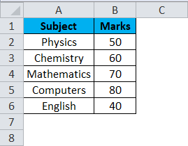
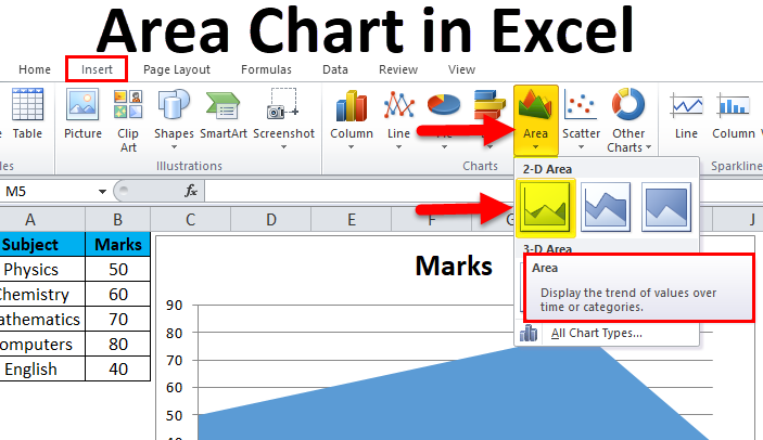
We have the above data of a student’s marks scored in his exams.
Steps to make an Area Chart in Excel:
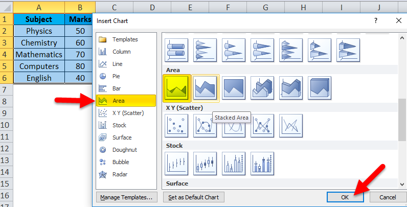
- Select the data in excel.
- Then go to the insert tab in your excel workbook; there is a chart section and click on all charts.
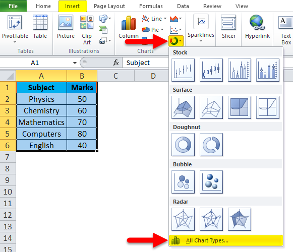
- After that, you can find the fifth type of chart as “AREA”. Select the first one and then click OK.
The chart will look like this:
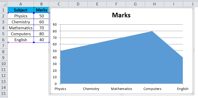
In the above-mentioned chart, Y-axis is the representation of marks, whereas the X-axis is the representation of subjects.
Let us practice a few more examples.
Example #1
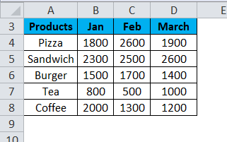
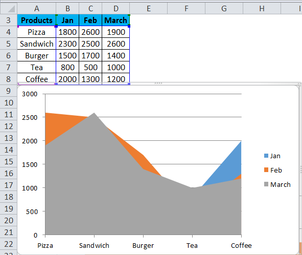
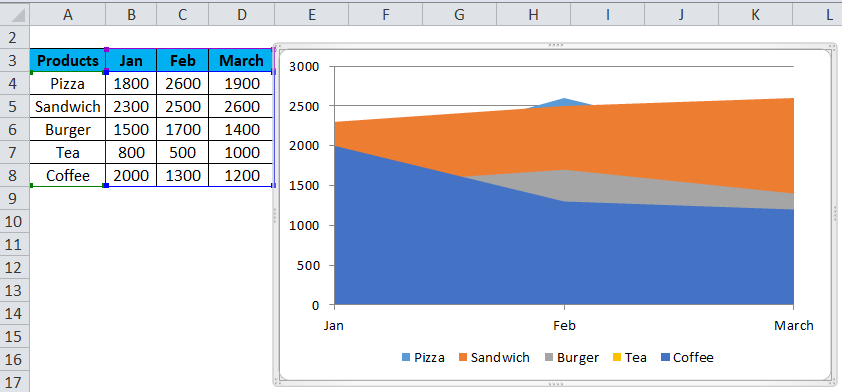
There is a canteen which sells the following products { Pizza, Sandwich, Tea, Coffee & Burger}, the vendor has data of his sales for the month of Jan, Feb & March. He wants to make an area chart so that the canteen owner can have quick visualization of the sales in the quarter.
Below is the representation of the raw data in Excel,
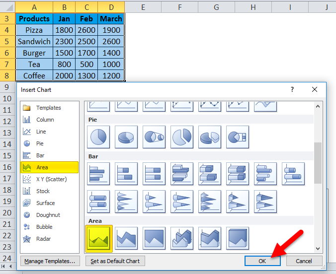
Let’s follow the same steps and go to the insert tab and then in the chart section, select all charts.
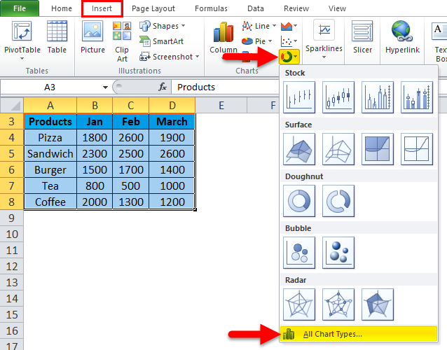
After that, you can find the fifth chart type as “AREA”. Select the first one and then click OK.
As soon as you insert the chart, it will look like this.
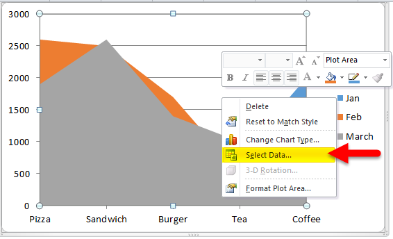
Right-click on the Plot chart and click on select data.
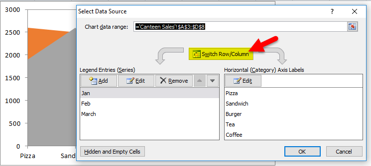
And then click on Switch Row/Column.
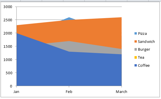
After switching, the chart will look like this.
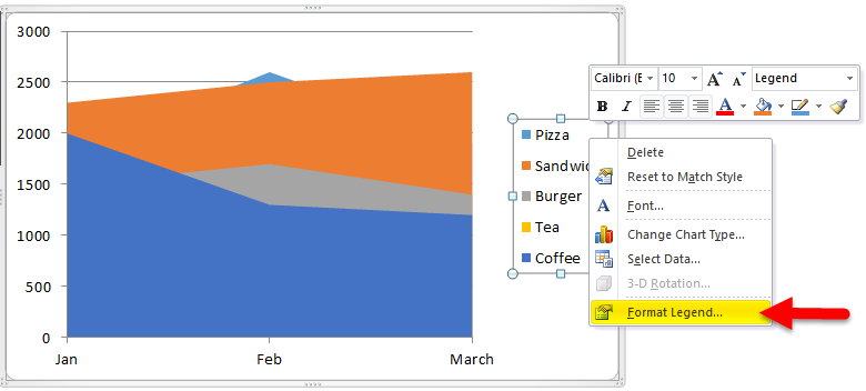
Right-click on Legend and select Format Legend.
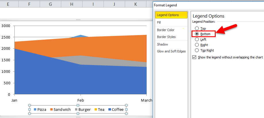
Go to Legend Options and select Bottom.
After that, our Chart looks like this.
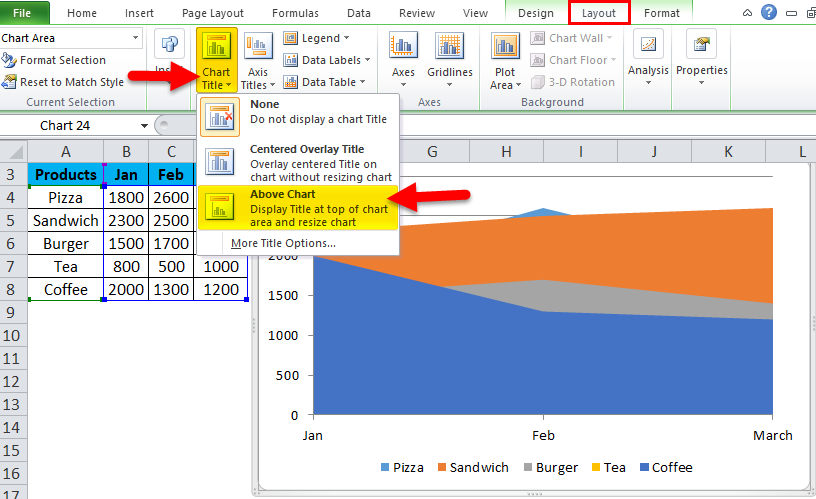
For Adding chart titles. We have to click on Layout > Chart Title > Above Chart.
Our Final Chart looks like this.
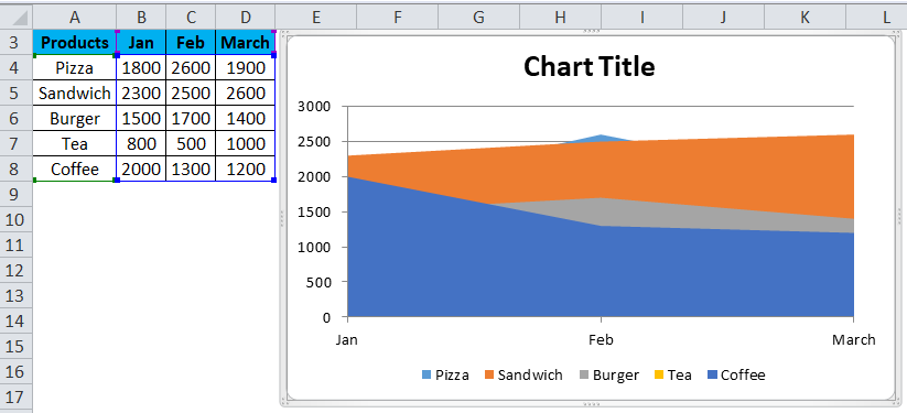
As the definition follows, the chart distinguishes data in colors and textures. All the products are in a different colour from one another, and the area occupied by them shows the number of sales done.
Example #2
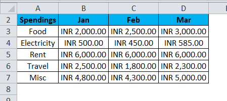
Anand is a bachelor, and he wants to see what his spending was for the past three months regarding Food, Rent, Electricity Bill, Travel Charges, and Miscellaneous Expenses.
Below is the representation of raw data in Excel,
Again, follow the same steps and go to the insert tab and then in the chart section, select all charts.
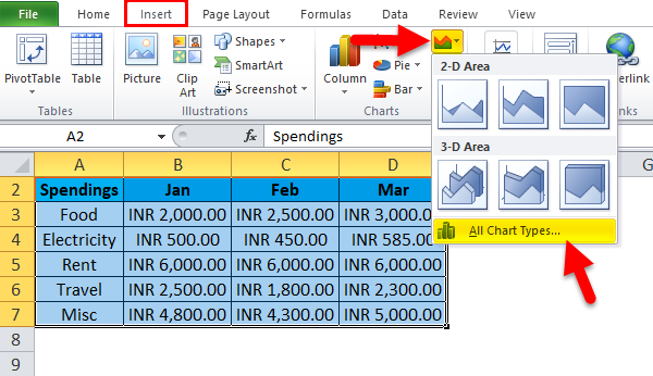
After that, you can find the fifth chart type as “AREA”. Select the first one and then click OK.
As soon as you insert the chart, it will look like this.
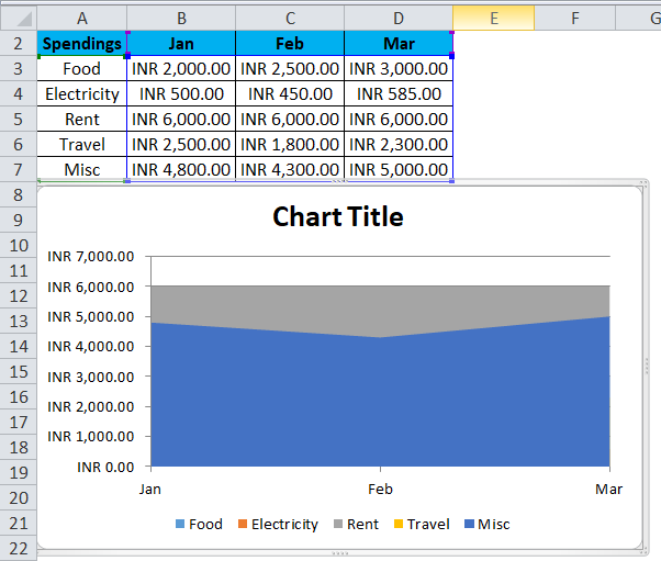
Uh-oh, from this area chart, we cannot judge Anand’s spending for the past three months. No worries, the above chart is a 2-D or two-dimensional chart.
In the Area chart, there is another choice for 3-D charts as well.
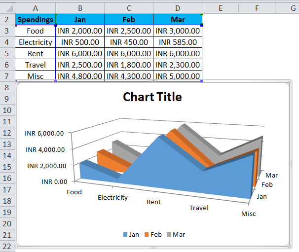
The above image shows a clear picture of the data. Therefore, it is easier to look at the spending which Anand did for the past three months from the 3-D Area chart.
Example #3
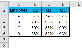
We also learned that this chart could show overall or individual trends. For example, in a Company A, B, C & D are working, and the boss wants to review their performance for the three quarters passed in this year.
Let us take a look at the raw data,
And we follow the same steps and go to the insert tab and then in the chart section select all charts,
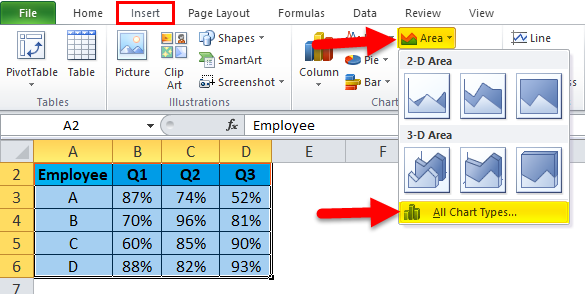
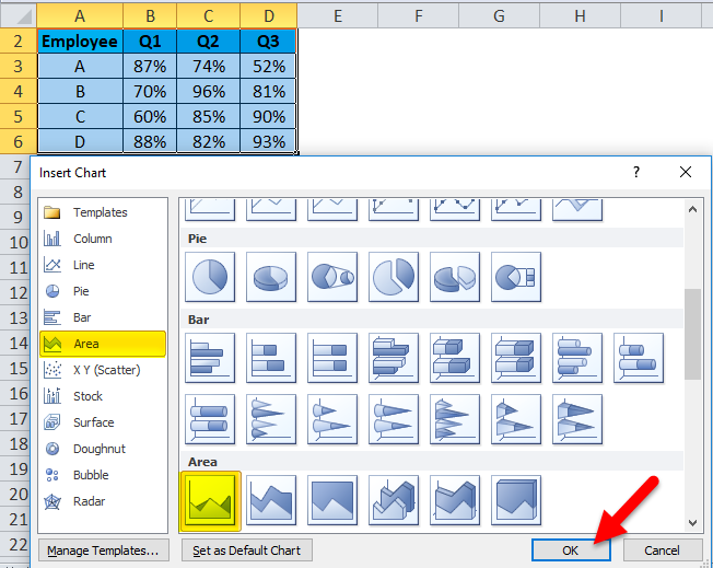
After that, you can find the fifth chart type as “AREA”. Select the first one and then click OK.
As soon as you insert the chart, it will look like this.
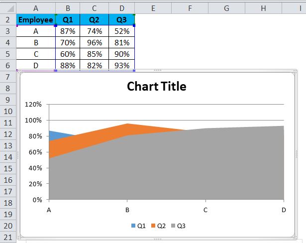
The above image is a pictorial representation of the overall analysis of the employees for their respective quarters.
Along with the various uses of the Area chart, there are some Pros and cons. Let’s discuss it one by one,
Pros
- It represents relatively simple data in a quantitative format.
- It compares only a small number of categories.
Cons
- It is difficult to read as compared to other charts.
- Reading the exact values from this chart is not feasible.
- It would not be feasible if I needed to cover multiple sections and know the exact data values.
Things to Remember About Area Charts in Excel
- Use transparent colors so that the information is not obscured in the background.
- Do not display excessive categories to avoid clutter.
- Organize highly variable data on the top of the chart to make it easy to read.
Recommended Articles
This has been a guide to Area Chart in Excel. Here we discuss how to make Area Chart in Excel, along with Excel examples and a downloadable Excel template. You may also look at these suggested articles:
