Updated June 28, 2023
Introduction to Tableau Map
The following article provides an outline for Tableau Map. Tableau Maps help geographical display data. Data users can quickly and readily gain insights and significance by visualizing spatial data. Tableau is a data visualization and mapping program becoming more widespread in academic and scientific staff’s analytic toolkits. Tableau employs a variety of charts, including line charts, bar charts, pie charts, maps, scatter plots, Gantt charts, and bubble charts, among others. Each Chart is distinct and best suited to a specific reason. Tableau’s maps are among the few widely used charts.
Overview of Tableau Map
Tableau could use the information to discover the world and communicate what people find in just a few clicks. This can import geospatial information from R or GIS and make it accessible, dynamic, and collaborative through Tableau Online, Tableau Public, and Tableau Server. They offer fine-grained geographic information. Over seconds, we can create map visualizations. Area codes, cities, and states are instances of geographic units.
Tableau makes extensive use of online maps. Even some of the most complicated graphs can’t uncover information about the data as maps can. They enable users to examine location data, identify patterns of repartition, and track how geographic data changes with time. If we mix map data with the data from other graphs, we get better responses to our data inquiries. Tableau offers two sources of data visualization maps: Symbol and Filled.
How to Create a Tableau Map?
We may create a variety of maps to analyze geographic places. The material used to create maps should include location information such as latitude, longitude, and site names.
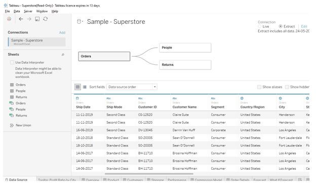
Step 1: Connecting to Tableau’s Samples – Superstore data sample in Tableau Desktop. Tableau will instantly construct a Map if we double on any Geographic field, like City, Postcode, Country, or State. We’ll almost double State Province Name dimension in this example. The Coordinates value was added to the Row shelf, the Longitude values to the Columnar shelf, and the State province Name to the Details field inside the Marks Shelf by Tableau.
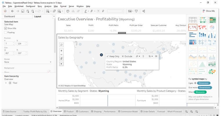
Step 2: Take the Amount of Records measure from the Measures window and place it on the Size button in the Marks pane. Measures, then drag Sales to size on the Marks Card. After completing the above activity, the map will display the number of sales in proportion to the image below.
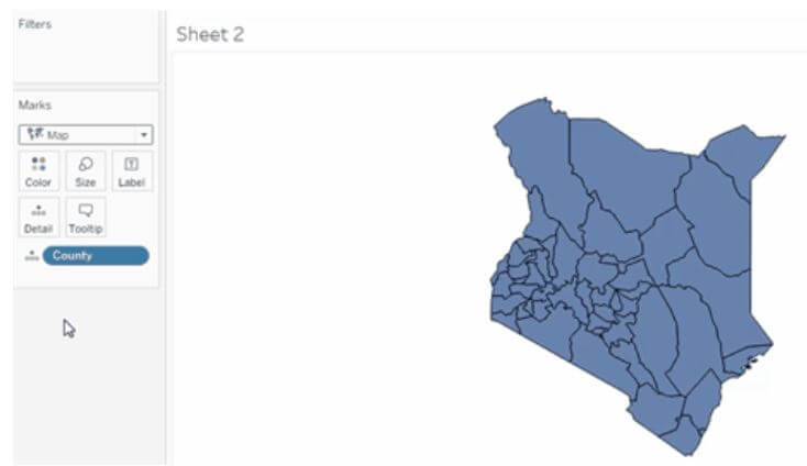
Step 3: Tableau automatically produces a Map when you drag and drop any Geographic information onto the Details field, such as City, Country, Postcode, or State. We’ll drag the State Province Name dimension to the Marks Shelf’s Details field.
Step 4: Modification of maps would aid us in distinguishing business reports and establishing a trademark for our maps. Tableau’s approach for customizing a map is as follows: We can customize maps in many forms by employing different colors and backgrounds in the tableau.
Tableau Map Concepts
MAKEPOINT() and MAKELINE() are both geographical functions. They make a geo field out of the computed field. That implies we could add this new field to a new update layer and begin fine-tuning the map. Describe a spot or a line, drag it in as a new layer, and tweak it to your liking:
We have numerous maps in the table; each one serves a distinct function in visualizing the data. Tableau charts answer complex geographical inquiries and help understand data trends.
If the dataset is a string instead of a Geographical field, we could make changes by right-clicking on a Geographic Role->none. There would be changes in the icon, which shows the field has geographical concepts. Including maps in the research allows us to assess the data and respond to questions that would be difficult to answer otherwise.
The customization process can be performed using the following:
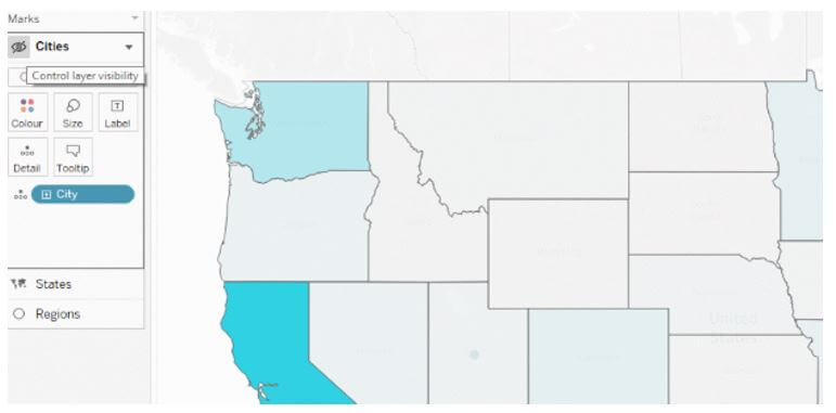
- Layers on the map can be shown or hidden.
- Change the size of your data points as necessary.
- Put labels on it.
- Add layers for demographic data from a country or region.
- Increase the amount of detail.
- Specify the type of mark.
- Toss in some color.
Filled Coloured Map
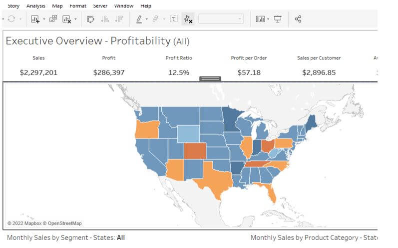
Modify the mark style from ‘Automatic’ to ‘Filled Map’ to convert the layout from a symbol map to a filled map. When we use Tableau’s special mark type, we will notice that every state’s circles have turned into gorgeous, smoother polygons that track the state’s full border.
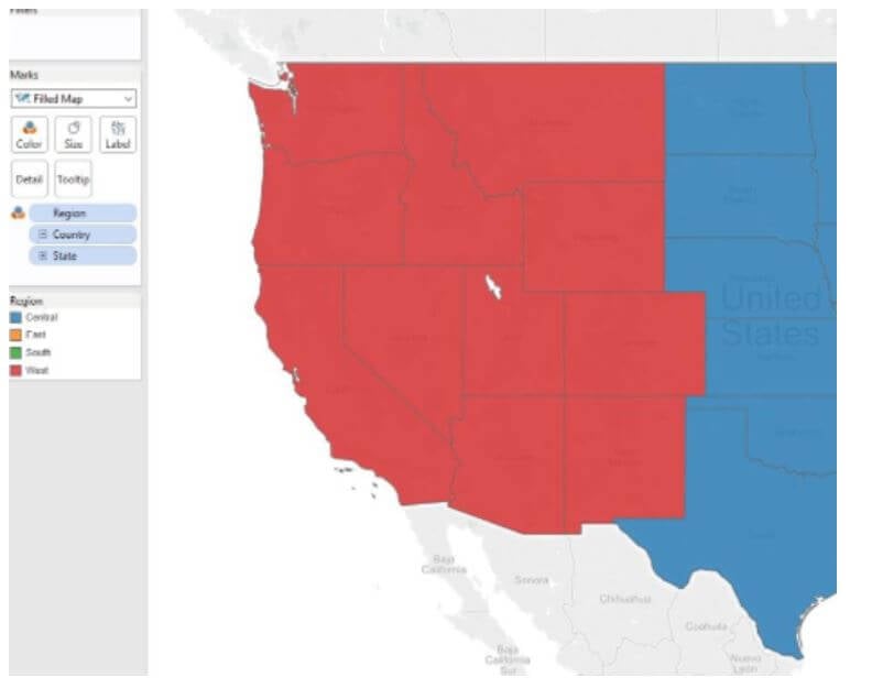
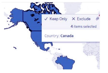
Establishing Territories
Suppose we desire to analyze the data using a map view. In that case, we may need to group existing locations to build our territories or areas, such as advertising territories for the organization. When Tableau customized territories are created, a distinct geographical cluster field is added to the information pane. Current geographic areas are left alone. There are three main ways to build regions in Tableau:
Select and organize locations on a map – Create a territory with geographic data – Geocode a territory filed with the help of some other geographical file.
Select Edit Alias from the context menu when users right-click the values in the color scheme.
Replace the aliases with the appropriate territories:
Import a Map Source
One can import a Map Source (.tms) into a Tableau workbook and utilize the same Map origin to create special map views.
Choose Map Background Maps Map Services from the drop-down menu. The Service dialogue box will open as a result. Import is activated. It will open the Import Connection Dialogue box for us. It will automatically guide users to the Tableau map source file (.tms) we want to import, which they can then choose and edit. This will shut the import connections dialogue box and the Map Services dialogue box, which has been placed on the Tableau map list.
Conclusion
In the data visualization sector, tableau has been a fantastic tool. Its distinct features and advanced information visualization techniques make the data display better understandable. For example, we’ve provided various mapping concepts in Tableau so far. Including maps in the research allows us to assess the data and respond to questions that would be difficult to answer otherwise.
Recommended Articles
We hope that this EDUCBA information on “Tableau Map” was beneficial to you. You can view EDUCBA’s recommended articles for more information.
