Updated March 21, 2023
Introduction to Sorting in Tableau
Sorting is a very important feature to analyze data. It helps us arrange data in the required order, viz. ascending or descending, or based on a combination of factors. The seemingly simple concept acquires importance in Tableau because the visualizations are presented in a particular way based on the sorting method applied. In Tableau, different sorting arrangements offer different insights into data through visualizations. Thus, Tableau doesn’t restrict itself to the traditional ways of sorting for data arrangement; rather, it applies it over visualization and helps us derive insights through the visual results. In Tableau, sorting can be worked with multiple dimensions.
Sorting in Tableau in detail with Illustrations
Now, let’s try to understand the depth offered for analysis by sorting in Tableau. For the demonstrations, we are going to use Distribution Volume data for a product. The dimensions in the table are the Distribution Unit, DU Code, Region, Mode, and City. Distribution Volume is a measure. A distribution Unit is a geographical unit smaller than Region.
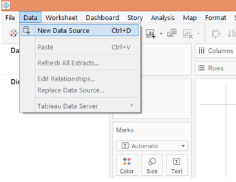
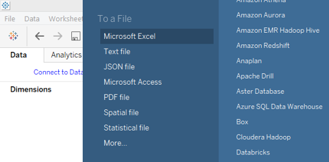
1. Let’s load the data first. In the Data menu, click on “New Data Source” or click on “Connect to Data”. The two options are shown in the following two screenshots. Selecting the appropriate data source type, load the data. In this case, the data source type is Microsoft Excel.
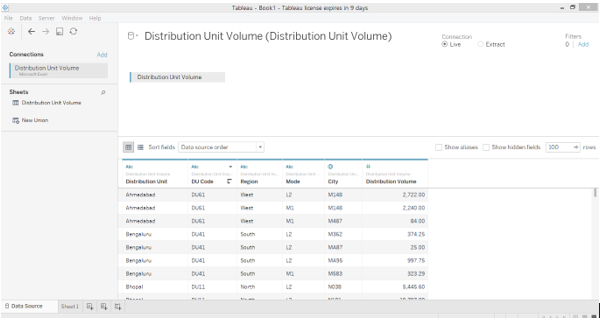
2. The data gets loaded, as can be seen in the Data Source tab as below.
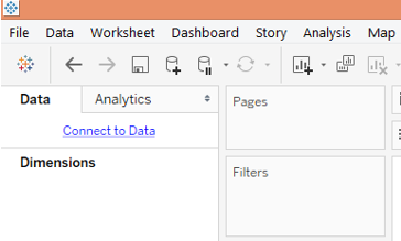
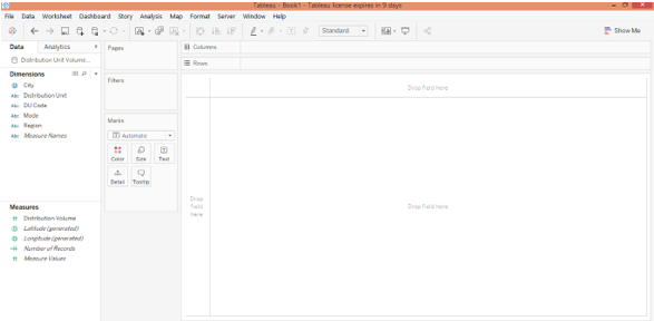
3. Now, move to the sheet tab. In the sheet tab, we can see the dimensions and the measure under respective sections, as shown below.
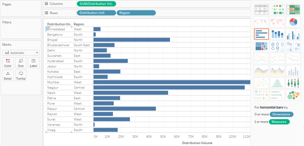
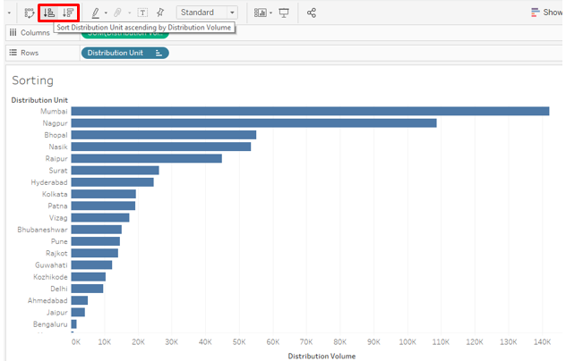
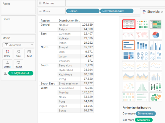
4. Now, drag dimensions distribution unit and region into rows region and measure distribution volume into columns region. Click on the horizontal bar graph icon in “Show Me”. The following visualization gets generated that shows distribution unit wise distribution volume and also the Region to which the distribution unit belongs. Initially, the result is sorted in alphabetical order of the dimension “Distribution Unit”.
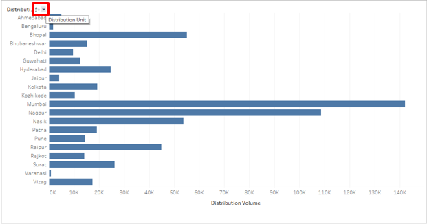
5. Now, we will go through various ways of sorting. One of the simplest ways is demonstrated in the below screenshot. Click on the AZ symbol near the dimension header. By default, the result is sorted in alphabetical order of the dimension values. Clicking on the symbol will sort the result in reverse alphabetical order.
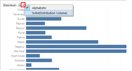
6. Click on the drop-down button as shown in the below screenshot. There are two options here, viz. Alphabetic and SUM (Distribution Volume). So, we can see that all possible ways of sorting are provided because the result can be sorted in Alphabetic order of the dimension as well as over a measure in ascending or descending order. Click on the SUM (Distribution Volume) option to facilitate sorting over the measure.
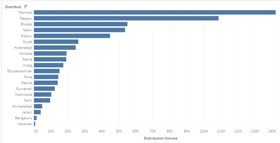
7. Following the above procedure, sorts the result as below. As can be seen, the result has been sorted in the descending order of the measure.
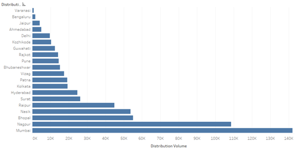
8. Just click on the sort symbol again, and the result gets sorted in the ascending order as below. Again clicking on the sort symbol will clear the sort.
9. The result can also be sorted by clicking over the sort symbol as below
10. Click on the sort symbol in Toolbar as shown below.
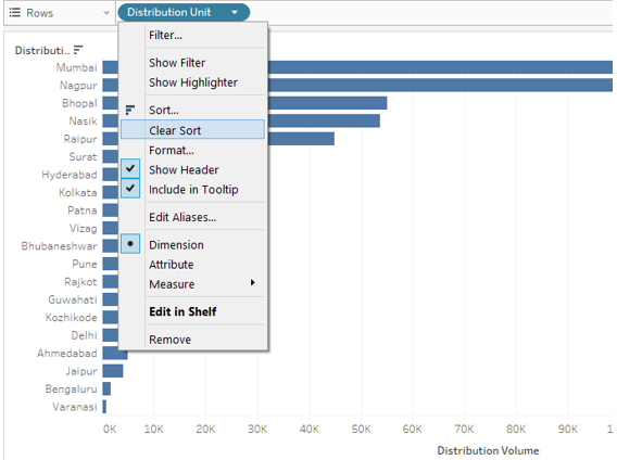
11. The above sorting techniques help us sort the data quickly and easily. Now, we will try to discover other options. In the drop-down menu of the dimension, click on “Clear Sort”. It will clear the sort that was applied earlier.
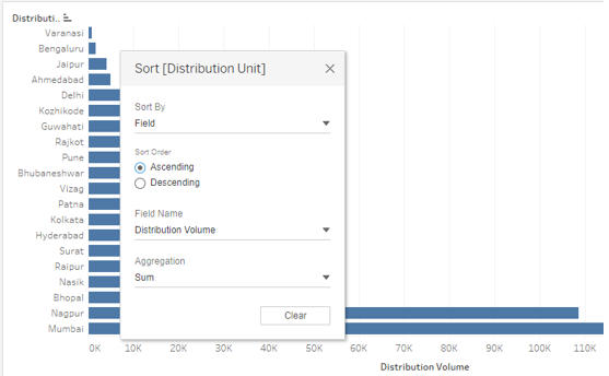
12. Once the sort is cleared, click on the Sort option just above the Clear Sort option in the drop-down menu. Clicking on the Sort option generates the dialogue box, as shown in the below screenshot. There are two options here viz. “Sort By” and “Sort Order”. They further will have multiple options. We will see them one by one.
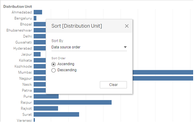
As seen above, the default Sort By is “Data Source Order”. This order is basically the alphabetical order.
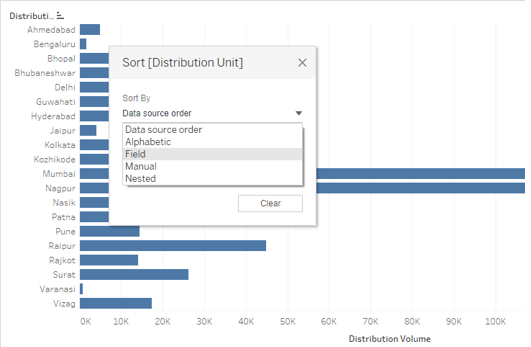
13. The Sort By drop-down menu shows multiple options. Alphabetical order sorts the result in alphabetical order of dimension values. Select the ‘Field’ option to explore more options.
14. When we select ‘Field’ in Sort By, two more sections appear in the dialogue box, which is “Field Name” and “Aggregation”. Field Name means over which field we intend to apply the sorting. Remember, if a field is not present in the visualization, then even selecting it in the Field Name section won’t affect the result. In Aggregation, we can select the required aggregation function. It means how we would like to aggregate the field in the final result, e.g., an average or median values. We will see that in detail in the coming part. Initially, the result wasn’t sorted over the measure, but selecting Ascending in “Sort Order” and Field in “Sort By” has sorted the result in ascending order.
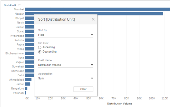
15. As seen below, the result has been sorted in descending order. This is another way in which results could be sorted.
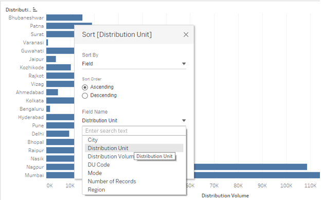
16. In the Field Name section, we can see that the currently Distribution Unit is selected. We can select any Field as per our requirement. Just ensure that the appropriate field is selected; otherwise, the improper result would be returned as below. Here, the Distribution Unit has been selected as the Field Name value, and sorting didn’t happen the way we want. This is because the Distribution Unit is a dimension value and not a measure, i.e. numeric variable. So, over it, Tableau automatically applied the Count function in the Aggregation section. At times, we may deliberately apply the Count function, but we need to consider a few things that we shall see in the following part for it to work correctly.
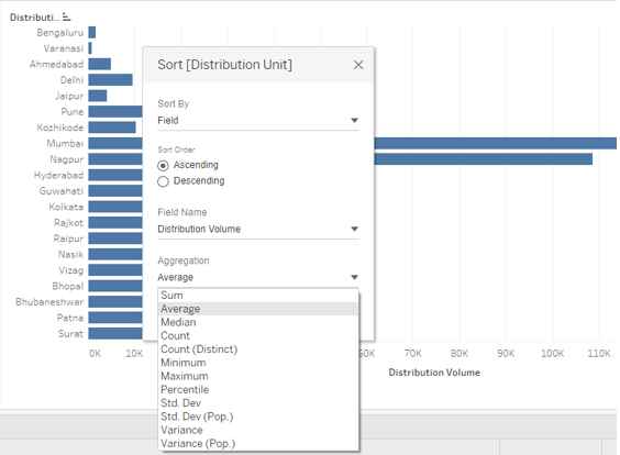
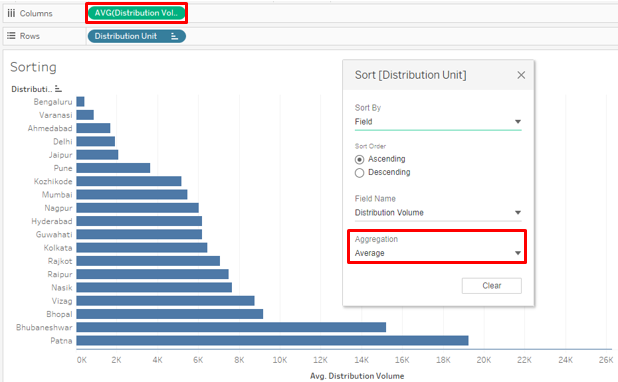
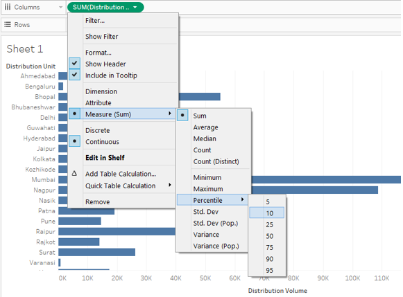
17. The below screenshot shows various mathematical/statistical functions or aggregation functions (in database language) that could be applied over the Field Name value. Applying appropriate function will only return the right result. If we apply the Average function as below, Dimension (Distribution Unit) wise average value for the measure will be calculated and incorporated in the output. As can be seen, the result is not sorted in ascending order of the average of the dimension values. This is due to the fact that, while selecting an aggregation function in the dialogue box, we need to ensure that the same aggregation function is applied over the measure everywhere, i.e. in the Columns region and the Marks card (if the measure is present in the marks card also).
The Median function will calculate the median value and sort the result accordingly. The count will count how many values for that field are there, and based on this count; the sorting will take place. When we select Count (Distinct), the count of all the values won’t be considered but of the unique values only. The percentile will take into consideration what values are below the specified percentage. When applying the function over the measure in the Columns region or Marks card, the function will ask to specify the percentage value. However, in the case of the Aggregation section, the default percentile value is 95%. Std. Dev and Variance are statistical functions. Std. Dev and Variance pertain to sample standard deviations and sample variance, while Std. Dev (Pop.) and Variance (Pop.) are concerned with population data.
18. The following screenshot shows that we have the AVG function applied over the measure (Distribution Volume) in the Columns region. As in the preceding screenshot, selecting Average in Aggregation for sorting will work only when this condition is met. Aggregate function at both places should be the same for obtaining the correct result.
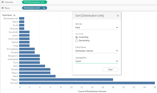
19. Another demonstration of how sorting can be worked with different aggregate functions is shown below. Here, we can see how selecting CNT, i.e. Count function over the measure in the Columns region as well under the Aggregation section in the Sort dialogue box, gave us sorted results based on the count of values for the Distribution Unit.
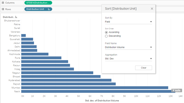
20. We will now apply the Standard deviation function in the aggregation section. As can be seen, the following screenshot shows how applying STDEV, i.e. standard deviation function, has sorted the result. As mentioned, it is essential to have the same function applied in the Columns region as well as in the Aggregation section. For certain Distribution Units, the standard deviation is zero. This is because the standard deviation takes into consideration squared deviations from the mean.
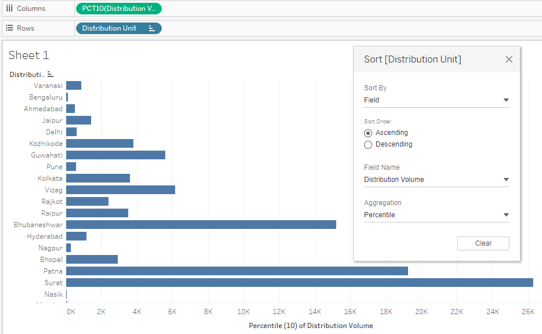
21. The sorting result through percentile function works based on the value of the percentile selected as in the below screenshot. Let’s select 10 as the percentile value. We’ll see if sorting using the percentile function works right.
22. We applied the Percentile function at both the places, i.e. Columns region and Aggregation section. However, the result is not correct. Notice carefully, over the measure, i.e. Distribution Volume, we applied percentile function with value 10. The default percentile value for percentile function in dialogue box is 95, which has caused the mismatch.
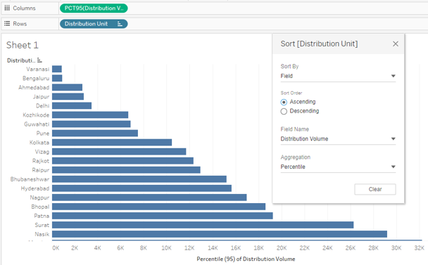
23. Now, we selected 95 as the percentile value at both places and got the correct result. The following screenshot shows the sorted result obtained by correctly employing the percentile function.
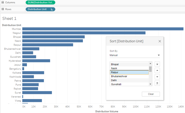
24. Now, we will see how the “Manual” option in Sort By works. As the name suggests, using the Manual option, we can move upward or downward a value based on the position we want. So, by dragging the dimension value up or down, we can move it as required and sort the result. Manual may not be the feasible sorting option when there several values for a dimension, like several categories, etc. The following screenshot shows how Manual sort works. The black line in the Sort dialogue box shows that the dimension value is currently being moved below.
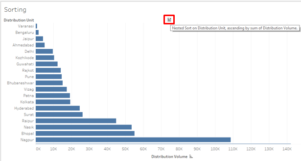
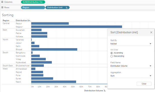
25. The last option in Sort By is “Nested”. In earlier versions of Tableau, nested sorting involved complex steps; however, now it comes as a ready-to-use option, as can be seen in the below screenshot. The Nested sort is useful if we intend to sort a dimension within another dimension over a measure. Like here, we will sort Region and Distribution Unit wise Distribution Volume in ascending or descending order.
26. In the preceding sections, we saw some standard methods to sort result in Tableau. We tried exploring every angle. Now, we will see an unconventional sorting technique. This technique enables us to sort the result in a quick manner, like sometimes we may be interested in the top and bottom or minimum and maximum values. The following demonstration illustrates the method.
First drag dimensions Region and Distribution Unit into Rows region, and the measure Distribution Volume into Columns region. Click on the text tables icon in the “Show Me” tab; it gives the following result.
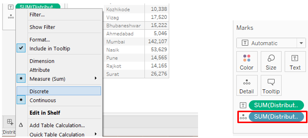
27. Now, drag Distribution Volume for the second time. This time drag it over the Detail in Marks card, as shown in the below screenshot.
28. Change the type of the measure Distribution Volume, which has been dragged over Detail in Marks card to “Discrete” as shown below in the screenshot to the left. The screenshot to the right shows that changing the measure type to Discrete will make the measure appear in blue color. Now, the discrete variable can be used as a dimension.
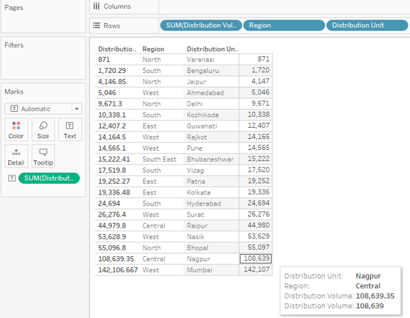
29. Drag the newly created discrete measure into the Rows region and place it before the Region dimension. As can be seen, directly, we got the sorted result. The result has been sorted in the ascending order of the discrete measure “Distribution Volume”.
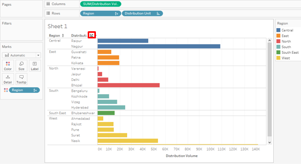
30. In case we want to visualize the Distribution Unit wise Distribution Volume based on the Regions in which they fall, sorted appropriately, we can follow the below way. Initially, we will drag dimensions Region and Distribution Unit into Rows region and measure Distribution Volume into the Columns region. This will create Region-wise groups. To distinguish each group, we will drag Region over Color in the Marks card. To sort the result in each group, we will click on the sort symbol near the dimension heading, i.e. Distribution Unit. Results will get sorted separately in each group, as can be seen in the following screenshot.
Conclusion
Sorting is an essential tool for analyzing data. Tableau offers various ways to sort the result right from the simplest to the most complex ones, combining multiple factors. The exhaustive options offered by Tableau for sorting the data and visualize them in dynamic ways imparts Tableau a unique character.
Recommended Articles
This is a guide to Sorting in Tableau. Here we discuss the introduction and in detail illustrations of sorting in tableau. You may also look at the following articles to learn more –