Updated June 26, 2023
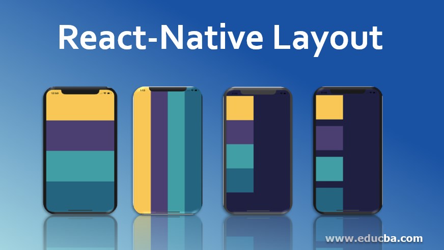
Introduction to React Native Layout
In react native, React Native layout helps us structure the application, making the user interface more attractive and inspiring for the users. React native component uses Flexbox to layout the applications based on React native. Flexbox works in the same way as it works over CSS, with some exceptions. The defaults are pretty different on react native like flex Direction defaults to column instead of row, and only a single number is supported by the flex parameter.
Properties of React Native Layout
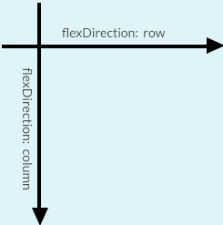
React native Flexbox uses the properties like align-items, flex-direction, and justify-content for placing the children in a layout. The flexDirection of a component is determined by the primary axis of the layout. The axis will be vertical if the flexDirection is a column; otherwise, it would be horizontal. Below is the diagram which will illustrate how flexDirection, primary and secondary axis are related to each other.
1. flexDirection
Syntax:
import React, { Component } from 'react';
import { View } from 'react-native';
export default class FlexDirectionBasics extends Component { render() {
return (
// Try setting `flexDirection` to `column`.
<View style={{flex: 1, flexDirection: 'row'}}>
<View style={{width: 50, height: 50, backgroundColor: 'powderblue'}} />
<View style={{width: 50, height: 50, backgroundColor: 'skyblue'}} />
<View style={{width: 50, height: 50, backgroundColor: 'steelblue'}} />
</View>
);
}
};
2. layoutDirection
Layout direction is used to specify the direction to layout the children and Text. Edge start and end are also affected by Layout direction. React Native is laid out with the LTR layout direction by default. The start is referred to as left, and right is referred for the end in this mode.
LTR, the default value, has the Text and children laid out from left to right. Margin and padding are applied on the left side of the element. RTL has the Text, and children laid out from right to left. The element applies margin and padding on its right side.
3. justifyContent
- justifyContent helps in aligning the children under the main axis of the container. Use this property to center a child within a container horizontally. Set the flex-direction to either row or column based on your preference.
- Flex-start, a default value, helps align the children to the start of the container’s main axis.
- Flex-end helps align the children to the end of the container’s main axis. The center assists in aligning the children to the center of the container’s main axis.
- Space-between provides even space between the children throughout the container’s main axis.
- Space-around provides even space around the children throughout the container’s main axis; it distributes the remaining space around the children. Unlike space between, space-around provides evenly distributed space at the child’s beginning and the last child’s end.
- Space-evenly provides Evenly distributed space along the main axis. The spaces are provided between the pairs of adjacent items.
Syntax:
import React, { Component } from 'react';
import { View } from 'react-native';
export default class JustifyContentBasics extends Component {
render() { '
return (
// Try setting `justifyContent` to `center`.
// Try setting `flexDirection` to `row`.
<View style={{
flex: 1,
flexDirection: 'column',
justifyContent: 'space-between',
}}>
<View style={{width: 50, height: 50, backgroundColor: 'powderblue'}} />
<View style={{width: 50, height: 50, backgroundColor: 'skyblue'}} />
<View style={{width: 50, height: 50, backgroundColor: 'steelblue'}} />
</View>
);
}
};
How to Create a New React Native Layout?
Let’s see how to create a new React native layout:
Code:
import React, { Component } from 'react';
import {
Platform,
StyleSheet,
Text,
View
} from 'react-native';
export default class App extends Component<{}> {
render() {
return (
<View style={styles.container}>
<View style={styles.firstrow}></View>
<View style={styles.secondrow}></View>
<View style={styles.thirdrow}></View>
<View style={styles.fourthrow}></View>
</View>
);
}
}
const styles = StyleSheet.create({
container: {
flex: 1,
backgroundColor: '#1f2041',
},
firstrow: {
flex: 1,
backgroundColor: "#ffc857"
},
secondrow: {
flex: 1,
backgroundColor: "#4b3f72"
},
thirdrow: {
flex: 1,
backgroundColor: "#119da4"
},
fourthrow: {
flex: 1,
backgroundColor: "#19647e"
}
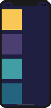
});Output:
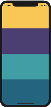
flexDirection
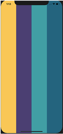
Let’s try and change the flexDirection of the parent component from the default column to a row.
Code:
const styles = StyleSheet.create({
container: {
flex: 1,
flexDirection: 'row',
backgroundColor: '#1f2041',
},
}
Output:
Now that we know how flex works, we will move over to justifycontent. The code snippet is below, and note that the only thing we will be changing is the justifyContent value.
Code:
import React, { Component } from 'react';
import {
Platform,
StyleSheet,
Text,
View
} from 'react-native';
export default class App extends Component<{}> {
render() {
return (
<View style={styles.container}>
<View style={styles.firstrow}></View>
<View style={styles.secondrow}></View>
<View style={styles.thirdrow}></View>
<View style={styles.fourthrow}></View>
</View>
);
}
}
const styles = StyleSheet.create({
container: {
flex: 1,
paddingTop: 40,
backgroundColor: '#1f2041',
justifyContent: 'flex-start'
},
firstrow: {
width: 160,
height: 160,
backgroundColor: "#ffc857"
},
secondrow: {
width: 160,
height: 160,
backgroundColor: "#4b3f72"
},
thirdrow: {
width: 160,
height: 160,
backgroundColor: "#119da4"
},
fourthrow: {
width: 160,
height: 160,
backgroundColor: "#19647e"
}
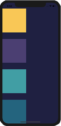
});justifyContent
The Justify component distributes child components in their parent component along the primary axis.
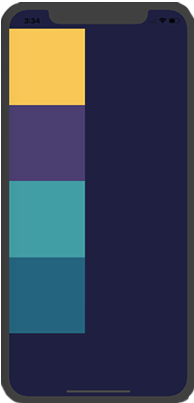
1. Flex-start
In flex-start, the child components align at the start of the page. The page has space remaining at the bottom.
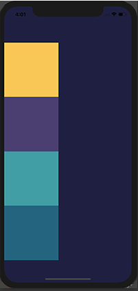
2. Center
When we pass a value of center as justifyContent, we can see that the child view is at the center of the screen, either vertical or horizontal, which depends on the primary axis direction. The page distributes equal space at the top and bottom.
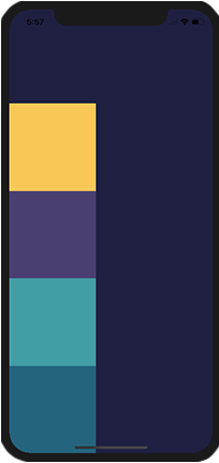
3. Flex-end
When we assign the value of justifyContent to flex-end, it will be the opposite of what we got when we used flex-start.
4. Space-around
The container will evenly space the child components when you use the “space-around” setting.
5. Space-between
By utilizing space width, the child components receive equal spacing between them.
Recommended Articles
This is a guide to the React Native Layout. Here we discuss how to create a new react-native layout along with properties. You may also look at the following articles to learn more-

